Feature Articles

What's your photographic kryptonite?

My post about being down and out over dance photography the other day garnered quite a lot of comments and more e-mails that I’ve had over a blog post in quite a while… So now I’m properly curious…  


Of course, there are lots of difficult things about different genres of photography. Portraits can be devilishly difficult, because it can be fiendish to get a good rapport with a model. Sports photography can be tricky because things are moving so fast – and indoor sports are even worse. Music photography can be a right bitch; landscapes are tricky because it’s all been done before; photographing fireworks is just plain hard; nude photography can be daunting because it’s a bit taboo, Food photography is hard because the photography subject spoils nearly immediately… and don’t even get me started on Macro

In fact, I can’t really think of a single genre of photography which doesn’t bring its very own set of challenges to the table… What I’d love to know, however, is which particular genre is which gets you every time… Cast your vote below, and sound off in the comments if you’ve got a particular arch-enemy!

What do you think is the trickiest photography subject?

View Results


Do you enjoy a smattering of random photography links? Well, squire, I welcome thee to join me on Twitter -

© Kamps Consulting Ltd. This article is licenced for use on Pixiq only. Please do not reproduce wholly or in part without a license. More info.

Picking an SLR camera

kid-with-camera

Back in April, I did a Top 15 entry-level camera round-up, and it’s one of those posts where the comments stayed relatively calm, but I got tonnes of e-mail afterwards, with suggestions, comments etc. I was surprised at the level of passion people had about that one single article, but it got me thinking: I love trying to come up with interesting ways of doing photography, but what if people really want some buying advice? I discovered long ago that this particular blog isn’t really the place, but still… I figured I could do better than a top 15…

So I decided to launch a new website to help you out.


Every week, I get a huge stack of e-mails from readers (well, I get lots of e-mails, I don’t actually print them out and put them in a stack, that’d be ludicrous) who want some help finding a Digital SLR camera. Every time, I have to send them away again, because, well, I’ll be honest with you: While I love, and know a fair bit about photography, my knowledge of actual cameras is limited.

Sure, I’ve used most of the DSLR cameras Canon have launched over the years, and I’ve probably given Canon more than their fair share of my money in the past decade, too, but the truth of the matter is that I’m reluctant to give people advice. I don’t want to re-spark the age-old Canon-Versus-Nikon debate every time I do so either, because frankly, cameras are so good nowadays, that it’s unlikely to be the camera that’ll be the bottleneck in your creative process – it’s the photographer.

On the other hand, I hate sending people away – I like to pride myself on being useful and helpful, and it bothered me that I was unable to help. So I decided to come up with a solution.

Some of you may have noticed that a list of D-SLR cameras appeared on the right of this page – well, that was part of a testing phase, which now is finished, and I’m proud to launch Photocritic SLR.

For every dSLR currently on sale, I have:

  • Researched it, and written an introduciton
  • Gotten a photo of it from the manufacturers
  • Found out what it costs, roughly
  • Found some of the best reviews of each camera out there

As I said, I willingly admit that I can’t give particularly thorough advice, but there are dozens of websites out there that can. As such, the Photocritic SLR site gives you a chance to get a rough overview of the market, and delve into the details in all the reviews that are out there.

Best of all, if you, in your journeys, come across a brilliant review that I’ve somehow missed, you can add the review to the right camera yourself! Fabulous.

So go on, if you’re in the market for a camera, check out Photocritic SLR. Let me know what you think in the comments!


Do you enjoy a smattering of random photography links? Well, squire, I welcome thee to join me on Twitter -

© Kamps Consulting Ltd. This article is licenced for use on Pixiq only. Please do not reproduce wholly or in part without a license. More info.

Dealing with negative critique

It is relatively self-explanatory that doing a photo critique is quite difficult. What few people stop to think about, however, is that receiving a photo critique can be as difficult – if not more difficult: When you move beyond mere snapshots and start putting more of yourself into your photographs, you are a lot more intimately involved with the work you are putting out there.

Putting your photos up for criticism – whether it is at your local photography club, via a site such as DeviantArt, or even when asking a good friend to give some feed-back – is like putting your own head in the guillotine and taking a chance.

Nonetheless, it’s one of the best ways to improve as a photographer, and one of the best lessons you’ll learn is to discover how to deal with negative photo critiques…  

Hayley in the 1950s
Hayley in the 1950s by Photocritic.org, on Flickr

1) It may come across as crass, rude, or wrong, but there may be a kernel of truth in it.

If someone tells you “LOL learn how 2 autofocus, you dweeb”, you need to do 2 things: Live in the happy knowledge that whilst your camera might have had an off day, at least you know how to string a grammatically correct sentence together.

And perhaps that picture is a little bit blurry, now that you look at it closely…

Take a step back, and take commentary on face value. If you honestly can’t say you agree with a piece of criticism, that’s perfectly fine, as long as you are objective enough to be able to try and see it from their viewpoint.

2) They might disagree, but they are your audience.

Ultimately, you are the photographer, and what you decide is how the final result gets done. Nobody can tell you what to do, and if you like your photo, then you’ve won one of the huge battles.

At the same time, it’s quite possible that the people ripping your photos to shreds are the people you were trying to target: whether you’re thinking about selling them as microstock, as art works, or just to give your mum a present is irrelevant.

Your photos are out there for interpretation, and if you care about the message you are sending, you’ll have to go the extra mile to make sure that they aren’t getting misinterpreted.

3) As soon as you let ‘em go, you no longer own ‘em.

It’s the curse of all writers and poets: They spend months – years, even – crafting their masterpiece, and then nobody ‘gets’ it. They all ‘get it’ wrong. Tell you what though, that’s where part of the beauty comes from: If you are taking a photo which you meant to symbolise the innocence of youth, and your first 10 commenters feel it’s a strong commentary on, say, child abuse, then they are per definition right.

It is not your job to interpret your own photographs, it is your job to take them. This is a good thing: if people can make up their own story to go with the photograph – their own connotations and bias, as it were – they are much more likely to connect emotionally with the photograph. If this is achieved; if someone is caused to feel something because of your photo; your mission is complete.

4) They talk. You shut up.

Remember that, just like you are not there to interpret your work, you’re not there to defend it either.

In a way, the best thing you can do is to never respond to any criticism. Let’s be honest – you will never be able to re-create the EXACT same image ever again anyway. Take the criticisms on board as points of reference for future photographs.

Learn from your mistakes, learn about what makes your audience buzz, and learn from your own opinions of your work.

5) Remember that the best works might be universally hated: Be thick-skinned.

Technical aspects of your photographs might be objective: A photo can be accidentally over-exposed, blurry, or have some rubbish in the background which makes your photograph less-than-perfect. Once you start killing the technical foibles of your photographic work one by one (don’t go too perfectionist on it though, it’s not useful to end up deleting all of your photos because of every little detail), the actual creative work starts shining through, and this is where the worst potential for getting hurt comes from.

You can kick yourself for small technical mistakes in your photographs (and you’ll continue making them for the rest of your photographic career), but if people start critiquing your artistic choices, it’s a different thing altogether.

The important thing here is to believe in your own work 100%: If you feel you’ve done it right, and if the image is an accurate representation of what you were trying to do, then all you can do is to shrug off their comments and move on.

Just think about it: Pink Floyd, The Decemberists, Pendulum, Metallica, Billy Joel, Leonard Cohen, Zero 7 – they’ve all been called ‘the best band ever’ by reviewers at one point or another, and yet it is never difficult to find someone who doesn’t care about – or even actively dislikes – them.


Do you enjoy a smattering of random photography links? Well, squire, I welcome thee to join me on Twitter -

© Kamps Consulting Ltd. This article is licenced for use on Pixiq only. Please do not reproduce wholly or in part without a license. More info.

How exposure works

To understand exposure in photographical terms, EV is probably the single most important number you will have to understand, to understand the theory behind the art of photography. This goes from your tiniest, least significant compact camera, to your cock-on-the-table style medium format camera with a digital back.

Non-technical

Let us imagine a value called TCE. This TCE (The Correct Exposure) does not exist, because you might for a variety of reasons want a different exposure than the TCE. But for the sake of argument, let’s assume TCE exists, and this is what you will want when you take a certain picture.

To get a correct exposure, you will want to have EXACTLY the right amount of light to capture your image. Not too much, and not too little.

So, what is it that might affect how much light comes to the film or imaging chip?

  • Shutter speed – Imagine a mug with a lid containing a mysterious source of light, and the room you stand in is covered in darkness. Shutter speed would be how long you open the lid.
  • Aperture – Same cup, same concept, but this time, how far you open the lid (if you open it a little – small aperture, i.e. high aperture numbers (for example f/22). If you open it all the way – large aperture – i.e. low aperture numbers (for example f/2.8)
  • These are the two basic ones. The last factor that comes into play is your film speed, or the light sensitivity of your surroundings while holding the cup if you will.

That’s all there is to it – these three factors combined allow you to manipulate the light in all kinds of ways (big depth of field through small apertures, freezing motion through fast shutter times, etc).

So, to get TCE, you will want to combine these three factors into JUST the correct way. Now, if you replace TCE with TCEV (The Correct Exposure Value), you understand what I have been on about.

EV is a number describing an exposure – any exposure – regardless of its “correctness”.

Technical

The definition of EV=0 is an exposure of 1 second at f/1 using ISO 100 film, or any equivalent thereof (2 seconds f/1.4, 4 seconds f/2.0 etc)

The technical definition of EV is 2EV = LS/C.

EV = the exposure value – explained above
L = field (or zone) luminance –
C = Exposure Constant – This is a constant that depends on what unit you are using to express the luminance (L)If you use candelas/ft2, it is 1.3. If you are using candelas/m2*, it is 12.5*. If you use apostilb, it is 3,98.
S = film speed following the ISO standard

*) some of you might know cd/m2 as lux or lumens/m2,

This also means that 2ev = A2/T

A = the f-stop number of the aperture
T = shutter time in seconds

Combining these two; EV = log2(A2/T) = log2(LS/C) – which is the only formula you are likely to need, if you want to understand the basics of mathematics behind photography.

So what is the EV number used for?

Ah. Well, the EV number is used internally in cameras – an EV number of 10, for example, would refer to all the combinations of shutter times and apertures that would give a given exposure using ISO 100 film. This is useful, because a camera only has to add one thing to this equation; A light measurement. A camera with a lookup table or an algorithm to calculate the correct EV is all set for using all the different combinations that are able to give you the exposure you want.

But why would I care, if the camera handles everything?

Because the camera doesn’t always get things right. You may also want to use alternative exposures for artistic reasons.

Most cameras have an EV compensation wheel/dial, allowing you to choose how much you want to over/underexpose an image. This is usually measured in +/- 2EV, 1/3 steps. This means that you can over- or underexpose an image by two whole EV steps (which, incidentally, would mean the same as two full f-stops either way), in steps of 1/3 EV.

I hope that made things a little clearer – if not, leave a comment, and I’ll see what I can do!


Do you enjoy a smattering of random photography links? Well, squire, I welcome thee to join me on Twitter -

© Kamps Consulting Ltd. This article is licenced for use on Pixiq only. Please do not reproduce wholly or in part without a license. More info.

Making Google love your photo site

title-tag

You’re working as a photographer, you take fantastic photos, and you’ve even got a pretty sweet website to show off your work… So why is your web server just sitting around in the corner, smoking a fag and nipping at a cup of coffee? Why aren’t the buyers running the door off its hinges, and, come to think of it, where are your damn groupies, already?

The internet is a cold and heartless place, and the biggest source of traffic to any website should be coming from search engines (Photocritic, for example, gets about 70% of its traffic from search engines. Mind you, it’s mostly people looking for pictures of nude women. Go figure.)

Just a bit of mischiefLuckily, there are quite a few things you can do as a photographer to make your site really zing in the search engines – and for the sake of making a nice round figure (and, of course, so the Digg and Reddit crowds will love it like a kitten loves tuna fish) – here’s a lovely top-10 list to get you started! 


For the sake of photography, you can basically optimise your site for two types of search: Text search (what most people think of when they think ‘search’) and image search (take a guess…).

It’s worth noting that this list is in no particular order – but the more of them you implement, the better you are likely to do.

First of all, check out the phenomenal SEOMoz, and check out their ‘Google Search Engine Ranking Factors‘ document. It outlines a lot of the stuff you need to know about making your site accessible to Google etc, the most important of which is ‘Don’t use Flash / Flex to build your site’, and ‘Make sure you haven’t inadvertently blocked search engine spiders from entering the site by using a drop-down menu for your navigation system’

1 – Update often

First off, you could do a lot worse than making sure to update your site frequently, no matter what kind of content you have. Many SEO experts have observed that Google tends to give higher ranking to sites that are updated more frequently.

That might mean that, instead of posting 100 new photos once a month, you post 10 or 12 every 3 days. Another way to have new content often is to have a blog. Sprinkle your photos throughout the blog content and the search engines will eat them up like the proverbial fat lady at a cake sale.

2 – Context and categorisation is king

Context is important. The search engines want to know what your site is about. You might want to use the word “photo” in all of your filenames, to keep the context of a photography website consistent.

The next step is to stop and think for a secon – what types of photos do you take? Try to organize them into categories and maybe even sub-categories, so that you have some context for each page. See Rolf Hicker’s Photography website for a good example of photo categories. Of course he also…

3 – Place text near your photos

Once you’ve placed your photos on their pages, the nearby text becomes important. Google gets clues about the content of images from the text near them. Consider using captions or quotes that have the same keywords as apply to your photos, and place them next to the photos for maximum value in the search engine ranking.

Linnea Lenkus Fine Art Portrait Studios website, for example, is an excellent example of good use of quotes next to the photo. Contrast this with the Chesler Photo site doesn’t come up on the first several pages in a “maternity” image search, despite having a whole gallery of such photos, probably due to not having enough textual content on the site.

The Digital Photography School website is another fab example of the use of text on a photography page.

4 – ALT tags are your friend. Use them

When you add an image to your website, you’re using an <img src="[URL]"> tag. You can – and should – add attributes to this tag, including an alt attribute.

Put an explanation of what the image depicts in your ALT tags. Not only do you make it easier for blind people to navigate your site (although why blind people would want to visit a photography site remains a mystery to me…), but it is one of the few sure-fire things that a search-engine has to go on when deciding what your photographs are about.

In addition to using keywords in your ALT tags, make sure that the actual file-name contains the same keywords.

Remember that your alt attribute can have spaces; use dashes to separate individual words if you want your filename to contain multiple words.

Don’t stuff the “alt” tag with lots and lots of keywords, however, or it will appear to be spamming; just describe the image honestly in the same way you would describe it to someone over the telephone.

Example: <img src="http://pixiq.com/images/kitten-eating-tuna.jpg" alt="Photograph of a black and white kitten eating tuna. Nom!">

The Mackins Design Studio website is an example of good use of descriptive alt tags as well as filenames. As a counter-note: PremierPhotographer Pat McNulty’s site doesn’t come up on the first several pages of an image search for “castles” despite having a castle category – there could be many reasons for this, but not using ALT attributes will be at least part of the reason.

5 – Add a blog to your site

You probably never knew that Photocritic started off as a blog-belonging-to-a-photo-site, but it’s the truth. I guess it says quite a lot about me as a photographer that the photography blog became at least a bazillion times more popular than my photography site(s), but I guess it was a godsent: I was always a better writer than a photographer anyway.

Maybe it’s because blogs are generally updated regularly, but images used in blogs are often numbered in the top of image search results, even for blogs which have as their regular topic something that has nothing to do with the keyword. See Mr&Mrsijunky’s blog for a good use of blog with photos. In addition, it’s a lot easier to SEO the hell out of a blog than to make an image-led site really fly. Sad, isn’t it?

6 – Start using the TITLE attributes

Use the image “title” tag. Similar to the “alt” tag, it isn’t compatible with all browsers, yet, but will be accessible to Firefox users, and the spiders from Google and other search engines will see it. You can put text similar to what you put in the alt tag in this tag.

Usability expert Roger Johansson explains:

[The ALT attribute] is not meant to be used as a tool tip, or more specifically, to provide additional information about an image. The title attribute, on the other hand, is meant to provide additional information about an element. That information is displayed as a tooltip by most graphical browsers, though manufacturers are free to render title text in other ways.

If you fancy geeking out about alt vs title tags, Johansson’s blog is the place to go…

7 – Keyword the hell out of your page title

Use keywords in the page title. The page title is a header tag that causes text to appear in the top bar of the window when the page is open in your browser.

Each page of your website should have a different title, a title that contains the keywords applicable to that page, but in title form, not as a list. Check out the browser window title of this very blog entry for a good example…

Also check out how the home page of Photocritic uses different keywords in the title tag, when compared to all the other pages on the site. This differentiation is designed to guide users (and, I admit, search engines) to the right place.

8 – Use keywords in the page URL

That really means the HTML filename for that page. Don’t name your pages page1.html and page2.html. A much better name would be castle-photo-gallery.html or dover-castle-panorama-photos.html

9 – Keep an eye on your directory structure

Use image folders and sub folders. Put all of your images into a folder called “images” when you upload them to your web host. Then, use sub-folders for common categories. The image named Sorbie_Castle.jpg should be in /images/castles/, for example. Not only does it make it easier for yourself, you’ll be able to

10 – Be smart when linking

Anchor text is the text that appears on a page when there is a link; it’s the text that is underlined and/or in a special color to denote a link. These anchor text links should be descriptive, and – if possible – contain keywords relevant to the page you are linking to.

If you put a link to your castles page somewhere else in your site, don’t say “click here” to see my castle photos. The text comprising the link should have the keyword in it, so it should say see my “castle photos” and the words “castle photos” would be the link to that page.

Do this on your own site and encourage others who link to you to do the same. You can even provide actual text they can use to link to you which contains your keyword. A good way to do this is to have a small note at the bottom of every page inviting people to link back to you, and including a link to a page containing the appropriate code with your keyword in the anchor text.


Do you enjoy a smattering of random photography links? Well, squire, I welcome thee to join me on Twitter -

© Kamps Consulting Ltd. This article is licenced for use on Pixiq only. Please do not reproduce wholly or in part without a license. More info.

Sharpening photos in the darkroom

img_2136

In the past, we’ve covered why it is important to sharpen your photos, and how you can use the Unsharp Mask tool in Photoshop to make sure your photos look their best.

I am a firm believer of understanding how things are done manually, however. If you are to take shortcuts, you have to know the long road to get there first. So… If you have a darkroom, how can you sharpen your images without letting the film go anywhere near a computer?

Here’s how… 


In the old days, limited film and lens quality kept the sharpness away from photography. When the negative techniques started evolving, and lenses and film became the bottlenecks, people started to experiment with ways to improve the image in various ways. Contrast became one of the first improvements, but this was comparatively easy to correct in the darkroom. Now sharpness was a different thing altogether.

The first cameras used horribly show shutter times; This increases the chance of camera and/or subject movement. Slight focussing problems also frequently occurred. Remember that a regular 24 x 36 mm negative is enlarged significantly, and even the tiniest blurriness becomes visual: Which is why some bright soul came up with a way to sharpen the final results.

How to…

If you want to have a go at using unsharp masking in the darkroom (heh – if you want to put yourself through stuff like that, let me tell you; I like you), here is a concise guide how it can be done. I have had a lot of surprises when using this technique – mostly positive surprises, but every now and then, things go very wrong. Even then, it looks interesting, if nothing else.

Right. Take the negative you want to have sharpened, and place it on a photographical-grade glass plate. Underneath the glass plate, put some unexposed film. Now, make a contact copy of the film, and develop the film from under the glass plate. That should leave you with a positive copy of your negative. This copy will be ever so slightly blurred (because of the glass plate), which is exactly what you want. Align the two film strips, and put them both in your enlarger.

Right – let’s have a look what has happened now. Theoretically – if the contact copy was 100% exact, you shouldn’t be able to see through your negative. Why? Well – what was light in your original negative should now be dark in your positive (effectively a slide), and all the gradations should be cancelling each other out. However, you don’t have (and didn’t want) an exact copy – you need the small differences. When turning on your enlarger, you will see a strange outline of your image.

This outline consists of the original highlights (which were black in your negative – cause it’s a negative, remember?), and the blur is introduced into the transitions in the shadows of the image. What this means? Well – your shadows will ‘take more space’ in the image, and eat into the blurred edges of your original negative.

So – what you’ll want to do is to just briefly flash this unsharp mask on your photographic paper, and then expose the paper normally, using only the negative.

You should be able to tell the difference between pictures that have / have not had this done to them.

So how long should you flash the enlarger? I wish I could tell you. I have spent endless days in darkrooms, and eventually it becomes second nature. You can tell approximately how much exposure a particular unsharped image needs – just keep practising, and bracket all your tries (yes – half step bracket your unsharp masked image, and then see what works best. Take notes to find out exactly how you can make it all come toghether perfectly.)

Good luck!

Nude photography 101

nude-thumb.jpg

Portraiture is one of the most exhilarating forms of photography. It’s rewarding, exciting, challenging, and a lot of fun. But people have a way of hiding from the camera: Clothes. Nude photography is essentially portraiture sans clothing, which is what makes it such a fun topic to explore and develop as a photographer. Personally, I’m completely convinced that a photographer who starts developing their nudes also becomes a better portrait photographer.

One of the things people frequently e-mail me about is how to get started in nude photography – some of you want to make a living out of it, many just want to have a go and experiment, but don’t know how to begin.

Of course, Photocritic already has a series of articles on the topic already, including an introduction, and an interview with acclaimed nude photographer photographer Renoux.

Well, today you’re all in for a phenomenal treat, as my good friend Tammy guest-writes an article on taking the first steps into nude photography, by inviting your girlfriend to model for you.

Needless to say, depending on what you do for a living, this article may not be ‘safe for work’.

Take it away Tammy…

nude-1.jpgLet’s start with the basics: You already know that your girlfriend is gorgeous. While you may not be a digital pro, you’re still pretty handy with a camera, and you’d love to be able to capture some of your girlfriend’s natural beauty – if you’ve never tried before, here are a few tips to get you on your right way!

Ask permission.

Much like that nervous first date, the prospect of nude photography can be a little scary and intimidating, both for the photographer and the model. Though most women enjoy feeling beautiful, they also realise there is only room for so many supermodels in the world, and many women are self-conscious about how they look, particularly in the nude. There is great security in clothing and taking it all off, even for a camera, can be like having an audience when you’re at your most vulnerable.

If you are interested in taking nude photographs of your girlfriend (or girl who is a friend. Or boyfriend, for that matter), make sure you sit down and really talk to her about this ahead of time. If she doesn’t appear convinced, perhaps it’s worth reminding her how beautiful you think she is and that you’d love for her to be able to see for herself and let you try some nude candid shots. She might not leap on the opportunity, but give her some space to mull about it.

nude-2.jpgSometimes the best things come to those who can wait patiently. Chances are good that if she didn’t have sex with you the first night, she might will not be ready to jump into nude photography the first time the two of you talk about it either.

Less is more.

Trust is an important aspect of every relationship, and there is definitely a deep kind of trust that needs to be present before a woman feels open to this sort of photography. Do not pressure her to do anything that she doesn’t feel comfortable with. In fact, do everything you can to make sure that she feels comfortable. Involve her ideas, discuss her fears and concerns, and find out what she might like to try.

Nude : Anonymous
Nude : Anonymous by Photocritic.org on Flickr

It might help to thumb through some photographs or magazines for ideas and possible poses. See what she likes. If she’s nervous about exposing a body part like her nipples, illustrate different ways that she can pose nude without having to show whatever part she’s shy about.

Of course, there’s myriad ways to get around the whole nudity thing – even if a model is naked, they don’t have to look it in the photographs. Come to think of it, even if they do look naked, you don’t have to show off all (or, indeed, any) of the ‘naughty bits’:

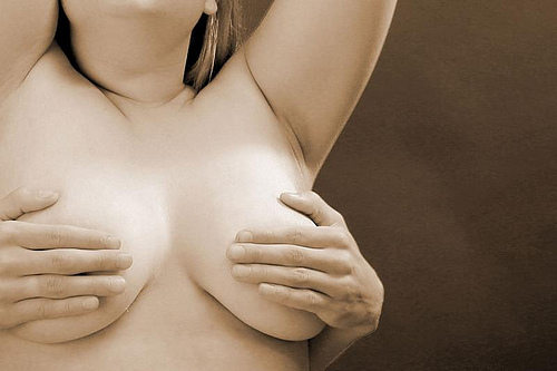
You can ask her to cup her hands around her breasts so that she feels less exposed. Or the first time she poses, let her warm up to the idea in a sexy lingerie outfit or a skimpy swimsuit in the bathtub. If she’s worried about her frontal view, she can pose on her stomach. Try shots that focus on the small of her back, her bottom, and her neck (they’re all vastly sexy bits of the body, if you photograph them right!).

If she’s worried about showing her face, allow her to hide it – get creative, and it doesn’t have to be of detriment to the final result. Try profile shots, silhouette shots in a dimly lim room, or experiment with black and white photographs. Often, you’ll find that subtlety is hot, and truly sexy photos are often the ones that hide more than they show, anyway.

If she’s concerned about anything, big or small, make sure to take her concerns seriously – I know we’re harping on about this point, but that’s only because it’s important: Listening and paying attention to detail are two of the greatest things you can do to help her relax and feel completely comfortable with the idea of being in front of the camera

nude-3.jpgGet Close. Closer. Nope, still not close enough.

The main focus of your photographs should be your girlfriend. Don’t be afraid to experiment with close up shots and interesting angles. If your girlfriend has a particular feature that you find very erotic or sensual, try to highlight that feature in the photo.

This is your chance to experiment and discover new sides both of her and what you think of her – and if the photos turn out as well as you hope, then chances are that she’ll appreciate your, er, appreciation as well!

Don’t act like an idiot.

After you find something she’s decided she’s willing to try, make sure to mention how beautiful you think she will look. Especially for a woman who feels shy or self-conscious, reassurance is a must. If she’s never posed nude before she may feel like she doesn’t know what she’s doing.

It’s important for you, as the photographer, to be prepared to offer assurance and encouragement, but most of all, instruction: you see how the photos are turning out, so you have to offer direction. Show her that you know what you’re doing, and even if you don’t, by all means at least act like a professional :)

nude-5.jpgRemember that she’s your girlfriend, not a porn star, and not a stripper (unless, of course, your girlfriend is a stripper or a pornstar, but in that case you’ll probably not really need this write-up).

If you are respectful and loving, chances are that she will relax and get more into this. Make it about her and about how beautiful you think she is, and she’ll return the appreciation.

Talk about how the photos will be used

A final word of warning: Taking the photos will be a learning experience for both of you, and you may end up with some mighty fine photographs. Nonetheless, take care to talk about how the resulting photographs will be used, and who will see them: Nude photographs might not be something that your girlfriend wants the entire world to see. Before you rush right out and upload them all onto your Facebook or MySpace pages, make sure you defer the control of the photos back to her. The photos are of her, so she should be the one to decide what you can and cannot do with them. Don’t be surprised if this is a private activity that she wants kept between just the two of you.

nude-6.jpgThat means that if she wants the memory card formatted, or requests that you delete certain images that she doesn’t like it’d be rather rude not to.

Once she trusts that you’re really not going to do anything with the photos that she isn’t okay with, the chances are good that the next time you experiment with a camera she’ll be more relaxed and more willing to try different things.

Have fun!

If you’re being tense and worried about the experiment, it isn’t going to work. if you have to, take the memory card out of your camera, and just shoot ‘blanks’ for the fun of it. Get used to seeing nude skin through the viewfinder, and make sure your girl is comfortable with the sound of the shutter, the lights of your flashes, and with taking instructions throughout the shoot.

Basic rule: If you’re not both having fun, someone’s doing something wrong.

Good luck!

Models: Preparing for a photo shoot

The modelling industry is very competitive. Every photo-shoot is a chance for a model to show herself at her best, and any model is only as good as their last shoot – so there’s a strong incentive to make each photo-shoot count towards

This article highlights some recommendations that a model may want to review in order to prepare him or herself for a photo-shoot. While digital photo processing software such as Photoshop can work miracles, neither a model nor a photographer will take as much pride in highly photoshopped pictures. If you take the time to prepare well in advance of your photo-shoot, you will feel more confident and as a result, look better. 


Part 1: Show your body and skin at its best!

1. If you work out, you may want to vary your routine to show off the muscles you’re most proud of. Or, a week before the shoot, you may want to increase the intensity of your workout. For example, if you usually do aerobics or body shaping, switch to working with gym equipment for a couple days. You will notice how well your muscles will respond. In no way does this mean you need to have a stereotypical fashion model’s body. Exercise can be great for any body and can boost confidence – and confidence is really what makes you attractive.

2. Moisturize: Hopefully you moisturize your skin regularly. If not, certainly apply moisturizer on the days before and morning of the shoot. To make your skin look smooth, supple and glowing, consider using with a hydrating cream containing exfoliators such as hyularonic or glycolic acid.

3. Remove: If you shave, do so 2 days before the shoot, in order to give your skin a chance to recover. If you do it yourself, follow the main rules of depilation to avoid irritation and ingrown hair:

- cleanse your skin and exfoliate before depilation
- do not stretch your skin when depilating
- do not apply too much pressure when shaving or using hair depilation cream
- do not run the shaver over one and the same spot several times or you can create irritated spots. If you have to, reapply shaving cream.

4. Color: Instead of using a solarium and prematurely aging your skin due to UV damage, consider using self-tanning creams and bronzing products. Choose a light type that gives you a chance to regulate intensity with each application and to avoid disasters like uneven color, lines and spots. Experiment with these products well in advance of your shoot, so you know that the color will look right for you. Try to avoid tan lines.

5. Watch it: Avoid too much salt and iodine in your diet. Salt can lead to water retention in the skin and the skin surface does not look smooth and tight but tired and bumpy. Iodine, for example in sushi and marine dishes, can trigger break-outs. Include more fiber into your diet it will help your body to get rid of toxins, and drink plenty of water.

6. Spots: If you do get a pimple the day of the shoot, do not touch it, as you will make it redder and harder to cover. Most photographers have no problem with one or two pimples as these can be easily covered with makeup or digitally removed by photoshop. If you have serious acne problems, be sure that your photographer knows this in advance.

Caution: Do not experiment with new skin treatments the night before the shoot. Any new treatment can cause skin irritations or allergic reactions. Test out the treatments well in advance of the shoot in order to know how your skin will react and how long your skin needs to recover.

Part 2:

Okay, your skin and body look great! What else you can do to prepare for a photoshoot?

1. Hair: If you dye your hair, make sure that you have had your roots recently treated. Studio lighting can exaggerate dark roots.

2. Nails: Make sure your finger and toe nails look clean and manicured. Use a clear nail polish which will go with any color clothing. If you must color your nails use a neutral white or cream. Red nails will look strange if your outfit is blue.

3. Makeup: If there will be a makeup artist at the shoot, arrive with no makeup on. Otherwise, you will loose time and potentially irritate your skin (and your photographer) when the makeup comes off. If you will be doing your own makeup, remember that photography lighting and the heat from the lights tend to make the skin look shinier than usual. Do not use any shiny or bright make-up that might cause reflection or glare during the photoshoot. Apply a base to smooth your skin and make it look consistent. Use mascara to bring out your eyes. Bring several colors of lipstick that you can apply depending on the color of clothing.

4. Wear antiperspirant. Avoid using any deodorant which may stain clothing.

5. Tattoos: If you have tattoos, experiment to see what make up will cover them naturally. If you are interested in being a traditional fashion model, don’t get tattooed, as many photographers don’t like them. On the other hand, tattoos can make a portrait more interesting – just make sure the photographer knows about them ahead of time.

6. Posing: Practice your poses before the shoot. This is especially advisable if you are a beginning model. Flip through some magazines and find the poses you like. Practice your facial expressions and poses in front of a mirror so you can see how you look at your best. Often exaggerated or unusual poses look most interesting. Wild and disheveled hair may be better for you than the well-groomed look. Do not be afraid to experiment and try new things. It will be much better than standing like a stick in front of the camera.

7. What to wear to the shoot: If your shoot is glamour, swimwear or lingerie, wear loose fitting gym clothes which have no elastic bands. Do not wear underwear. Underwear leaves lines on the skin, which can require 30-60 minutes to disappear.

8. Get plenty of rest: Have a good night’s sleep the night before the shoot. Avoid partying the night before a photoshoot. Alcohol and cigarette smoke, even smoke in the air, can make your eyes red and puffy. Also, if you are a smoker bring down the number of cigarettes your smoke or stop completely before the shoot. Smoking deprives skin of oxygen and nutrients and makes it look gray.

Invest the time to make yourself look the best you can be so you can feel confident during the shoot. If you feel great about yourself, you will exude confidence. Confidence shows and will help to make your photos the best they can be.

This article was written by Eden Fenrick for Photocritic. If you fancy writing a guest article, get in touch!


Do you enjoy a smattering of random photography links? Well, squire, I welcome thee to join me on Twitter -

© Kamps Consulting Ltd. This article is licenced for use on Pixiq only. Please do not reproduce wholly or in part without a license. More info.

Lens Flare - and how to avoid it

lenshood.jpg

I get a lot of people sending me images with ‘mysterious’ problems, and I figured it was only fair if I run a series of articles about how you can alleviate these problems. The most frequent problem is actually a lens-flare related problem, and there seems to be some confusion as to what lens flare actually is.

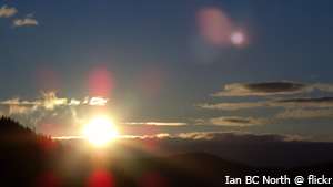
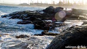
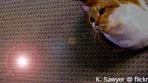
I suppose the first thing we should discuss is just what lens flare actually is. Most commonly seen in photographs, lens flare can appear as bright circles, smears of light or glimmering lines.

On some occasions, it can even appear as a thin film over the entire picture that makes the image itself lighter.

lensflare-2.jpg

Why does this phenomenon occur? Lens flare is normally seen because the photographer took the picture into the general direction of the sun. The basic idea is this – some sunlight gets into the camera lens at just the right angle that it bounces around the interior of the camera until some of it ends up on the film.

If that’s the case, then how can you test your camera to see how it deals with the lens flare issue? First and foremost, there is the obvious way of aiming it right at the sun and taking a picture. This is the most common way to get your lens to produce lens flare, but not the only way. In fact, some lenses have no problem taking photos towards the sun, but fail miserably in other tests.

lensflare-1.jpgA second way to test for lens flare is what is known as the ‘window test’. Aim the camera someplace indoors, but have a bright window just out of the view of the lens. If your image, upon developing ended up with the tell tale signs of lens flare, you know your camera can’t handle that sort of situation so well.

Another way that you can test your lens is the ‘bird in a tree’ approach. For this, aim your camera at a bird (or something of similar size and detail) against a bright sunny sky, but without aiming directly at the sun. Check for contrast loss at the edges of the bird or object. Generally, what you will see is the light ‘swallows’ up the outer edges of the bird. The more of the bird that is ‘swallowed’ up, the more lens flare is occurring in this case.

These aren’t the only ways to come up with lens flare. In fact, you don’t even need to have lens flare show up in your original photo to have it appear later. But why is this? Well, Photoshop has come up with its own ‘lens flare effect’ that you can apply to your images long after you’ve originally taken them. It offers a wide range of options to choose between to get you the look you are after.

lensflare-3.jpgOkay, so I thought we were trying to avoid lens flare. Why would Photoshop come up with something people try to avoid? For the simple fact that lens flare shouldn’t always be avoided. In fact, it can a little something extra to your images when used in the right circumstances.

Thing is, well, there are very rarely ‘right circumstances’ for lens flare: There’s an excellent reason for why photographers have been trying to avoid them for dozens of years, and it’s a bit daft to try and use software to put ‘em back in…

Is there an easy way to avoid lens flare?

Why yes, there’s a very easy way: Keep your lens-cap on your camera when you’re taking photos!

Okay, so maybe that’s not the most convenient piece of advice. It does have a kernel of truth, though: If you can stop direct light (from flashes, reflections, or sunlight) hitting the front element of your lens, the lens flare effect will be reduced significantly, or even eliminated altogether!

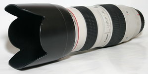
lenshood.jpgTo keep the light out of your lens, you can block it out with your hand (not particularly convenient, as you’ll need both hands to operate your camera most of the time), you can get a friend to block out the light with a reflector, or just by standing in the sun so the front of your camera is in the shade.

Alternatively, you can use a lens hood (it’s one of those attachments that go onto the front of your lens – on the picture above, it is the flowery-shaped attachment), which will go a long way to blocking out stray light. You can also get straight lens hoods (without the flower-shape), or you can even make your own.

Guest article by Amanda Stachowski (thank you, Amanda!). Photos are all CC photos from Flickr, by Ian BC North, Yuan2003, ratkinson and K Sawyer.


Do you enjoy a smattering of random photography links? Well, squire, I welcome thee to join me on Twitter -

© Kamps Consulting Ltd. This article is licenced for use on Pixiq only. Please do not reproduce wholly or in part without a license. More info.

Photocritic's Christmas Gift Guide

roadtrip.jpg

It’s that time of year, and all that, so I thought I’d put together something of a christmas list: What can you get your photography-addicted buddy for the holiday season?

But first, let’s help the readers of this post with a poll. Here’s your chance to tell people what you’d really like!

You are a photographer. What would you prefer to get for Christmas?

  • Add an Answer

View Results


Finding gifts for a photographer is difficult at the best of times. When you remember that photography gear is really bloody expensive, the truth hits home: What can you get for a photographer who’s got it all, without breaking the bank?

Up to £10 / $20

You cheapskate! Only joking. It’s quite difficult to buy for photographers on a tight budget, but on the other hand, it allows you to get creative. There are some photography books out there that cost less than £10, and there are a series of great magazines on sale. If you are on a limit, you could always buy one magazine now, and add a card saying that you’ll buy them the magazine for the next few months to come. It’s not quite a subscription, but at least you get off without bankrupting yourself!

Of course, there are other things you could do for very little money. If you are buying for a loved one, get a photographer mate to take photos of you, use the £10 to get the prints made, and give them a picture of you to carry around, hang on the wall, or add to an album – always a welcome gift! You could even use PhotoJoJo’s fantastic mailable photo frames. Stroke of genius!

Finally, it is terribly naughty to subscribe someone to a mailing list without asking them, but the best thing you can do is to subscribe your mate to PhotoJoJo. Those guys send out a couple of e-mails a month, and they really know their stuff. Best of all? It’s completely free!

It’s an unusual gift, for sure, but hey – no photographer should be without their own domain! Even if they aren’t interested in building up a website or blog for themselves, you can easily redirect most domains to a specific Flickr page or DeviantArt gallery. Combine the internet domain with some Moocards with the new domain printed on one side, and some of their photos on the other side, and you’re definitely going to get a smile out of them!

city-of-god.jpg£10 also gets you DVDs so you could could consider getting a film which is vaguely photography themed. City of God (Cidade de Deus) is a fantastic film which is about a Brazilian kid who turns into a photographer for a newspaper. Gripping, moving, not too expensive, and photography related – what more could you want? Of course, you get extra bonys point and street cred for buying a foreign arthaus film! (US / UK

Sure, it’s a cop-out, but if you’re really struggling – or if you’d rather contribute to a bigger gift – why not get vouchers for a big on-line store? Amazon, for example, sell most types of photography gear, along with books etc. Shoppers can combine several vouchers towards a big purchase, and they can even add some money themselves as well, if they’re after a bigger item. Get the gift certificates from Amazon US / UK


Up to £20 / $40
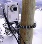
gorillapod.jpgIn this price group, the definite winner is the Gorilla Pod. Sure, it looks daft as a paintbrush, but it always gets looks. I got one for review from Joby recently, and I had to call them up and ask if I could please keep it – it really is that good. Basically, it’s a fully-fledged tripod that weighs next to nothing. Wrap it around just about anything (so far, I’ve had it around a car seat, around a desk, around a street lamp, and around a pub bar stool), and your camera is rock-solid. It beats the other micro-tripods hands down. Read more about the Gorilla Pod here, and then run off and buy one. The good news? It’s only $21.95 (around £19.99 in the UK), and it’s the best gift you can give to a photographer! Amazon US / Amazon UK

Photography are another brilliant idea – they generally come in two flavours: Coffee-table art books, or how-to guides. The former is great for inspiration, but might I humbly suggest that you consider the latter instead? Inspiration can be had from many sources, but a good, thorough how-to guide is more difficult. You can choose to buy a guide to something that you feel your giftee would like to learn more about, or perhaps something that they know nothing about at all.

Might I humbly suggest you buy a book from the excellent Photograhy Workshop series – My own book, Macro Photography Workshop (Amazon US / Amazon UK), teaches them everything they need to know about macro photography – fantastic both for beginners and intermediate Macro photographers.

Alternatively, you can to be a little bit less specialised about your book choice and consider a few other books from the same series: Composition (US / UK) or Lighting (US / UK). Hell, if you decide to buy one of those, they even do a special deal at the moment, where you get the second one at a massive discount. Strike while the iron’s hot!

You should also know that photographers can never have too many camera bags, in fact, Philip Greenspun wrote something to that effect here, and he’s damn right. If you’re pushed for an idea, a small backpack or similar is perfect! (Lots of different choices available – US / UK

Up to £50 / $100
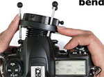
lensbaby.jpgPerfect for getting creative, a Lensbaby offers a whole new way of looking at photography. Basically, it’s a bendable camera lens, which gives a selective, narrow focus, and is essentially a freely movable tilt-shift lens. Not convinced? You should be – check out the Flickr lensbaby group for inspiration. Buy them from Lensbabies direct, or get them from Amazon (US / UK)

Finally, you should be able to pick up some pretty nice digital photo frames at this price, which never goes amiss.

Up to £100 / $200
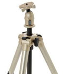
tripod.jpgUp to £100 / $200, we are in the territory of some mighty fine tripods. It’s the first thing you should have as a photographer –
Look for brands like Velbon (US / UK), Slik (US / UK) or Manfrotto (US / UK) for the best quality!
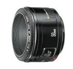
prime.jpgAround this price, you can also get prime lenses. If your photographer dearest one doesn’t have one, surprise them with a 50mm prime. No photographer should be without a good prime lens: They are nothing short of amazing, and for what they are, they’re complete bargains as well – I wrote about them earlier this year, if you’re curious!

If they don’t have a camera yet, this price group also encompasses the fabulous Nikon Coolpix L11 (US / UK). A bargain-priced heavyweight, if I ever saw one, I mean, just read the review on Steve’s Digicams – sure, it’s basic, but hell, it’s brilliant.

Note that even advanced photographers should have a small pocket camera – a photographer without a camera isn’t a photographer, just a mug without his tools. Since a compact is a lot easier to carry around than a dSLR, you’re likely to shove the small camera in your pocket. Hey, my Digital IXUS (known as ELPH in the US) has gotten me out of more clumsiness than I dare think about.

Up to £200 / $400

roadtrip.jpgFor this kind of price, you can buy a lot of tasty photography gear, but why not think out of the box? For £200, you can fly just about anywhere nowadays. Why not buy your favourite photographer an airline ticket to somewhere exciting? You can do a lot of picture-taking in about 3 days, you know.

Alternatively, how about giving them a tent, and a huge ‘petrol voucher’? If this is for a good friend, invite them along on an epic journey by car. Sure, the oil prices are rising, but £200 / $400 still gets you pretty far, and there’s nothing quite as inspiring to photography as a good, solid road trip!

Up to £300 / $600

In this price class, you can also buy some seriously exciting lenses, but you might be best off buying a gift voucher from Amazon (Amazon US / UK), or another photography retailer, because, well, your gift-receiver is likely to know what s/he needs, and it’d be very annoying if you end up buying something that overlaps with their current photography equipment, or if they have decided what they need already!

Up to £500 / $1000
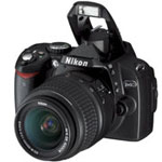
Nikon-D40.jpgOh my, now we are suddenly in proper digicam territory. You should be able to get a Canon 400D / Nikon D40 digital SLR camera body, and if the person you are buying for doesn’t have a dSLR, that’s definitely the way to go. The first step into the digital SLR world is definitely the most exciting, and you’ll be loved forever if you help them take that step!

So, I wanna buy someone a camera. What should I get?

Well, based on a poll we ran a while ago:

n

What is your main camera?

View Results

n

What brand is your main digital camera?

  • Add an Answer

View Results

… In other words, it seems as if most my readers have Canon dSLR cameras, so if you can afford it, get your loved one a Canon 400D, a Canon 40D or a Canon 5D – in that order of pricy-ness. Having said that, I have no beef with Nikon either, and their cameras are pretty much identical in quality, features, and price. Also read my post on choosing the right camera.

One thing I would say, though, is that if you are buying a compact camera, buy a camera from a company that is famous for making cameras, rather than electronics equipment. But I did a separate post about that a while ago, so you might want to go and read that, too.

Finally, remember that we tag all our stories quite cleverly, so if you ever want buying advice, check out all the stories tagged with buying advice. Clever, eh?

Oh, and finally: Happy Christmas! :)

A final note: You’ll have noticed that a lot of the links point to Amazon. This is partially out of laziness – I’ll probably do most of my christmas shopping via Amazon – but also because these links are so-called ‘affiliate links’. In other words, if you buy something after clicking on one of the links in this post, I get a kick-back from Amazon. That doesn’t mean you should only buy from them though – while they often have good prices, you can some times find better deals from elsewhere – shop around!


Do you enjoy a smattering of random photography links? Well, squire, I welcome thee to join me on Twitter -

© Kamps Consulting Ltd. This article is licenced for use on Pixiq only. Please do not reproduce wholly or in part without a license. More info.

When less is more

grzesiek

It can often be incredibly tempting to try and fit more information into a photograph. Understandably so – wherever you turn, you find a barrage of information. Minimalism truly is a lost art in photography, and you’d be surprised to find that it’s actually quite difficult to get right.

In this photo critique, I am doing things in a slightly new way, and I’m cherrypicking some of the best photos that have been submitted to me over the past couple of months. Together, we’ll explore photographic minimalism, and how you can make hellastrong photos with less.  


Showing emotions

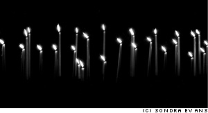
sondra-evans-01.jpgMinimalism is one of those concepts that’s difficult to wrap your head around – In one way, it can be described as just keeping it simple, but there’s a lot more to taking a good minimalist photograph.

Take this photo taken by Sondra Evans, for example: On the surface, it is just a photo of a series of cake candles on a black background, but look closer: despite of its deceptive simplicity, the image is telling a story… Some of the candles are burned down further. Why? Also, all the flames are pointing to the left, which gives me, personally, a feeling of longing. I read from left to right (as do you, I would hope, esnes yna ekam dluow siht fo enon ,esiwrehto), so the fact that the candles are left-oriented makes me feel as if they are pining for the past. I associate candles with romance, birthdays and love, but given the blackness and the sombre settings, I’m thinking candles of mourning: Are the candles on a grave? Or on a coffin? Is the photographer mourning the loss of a loved one?

So many ideas, thoughts and feelings, invoked by such a simple photograph. I love it.

Surrealism

grzesiek.jpgThe minimalist movement started in the late 1960s, which sort of makes sense: I’m all for the music of the era, but tie-dye would do my fucking nut – no wonder people were striving for simplicity. As a stepping stone to post-modernism, minimalism works very well when combined with surrealism – and that’s where Grzesiek’s photograph comes in…

Photographing a light-bulb upside-down, combined with the strong patterns created by the walls around it is a stroke of genius – and I love how the image causes you to re-think perspective, lighting, and photography itself. It has often been said (by myself, but more importantly, by people who actually know a lot about photography) that photography is all about light (hell, the word itself means ‘drawing with light’). Photographing a light source, then, becomes a documentation both of the method and the result of a photograph at once – that goes both for the photo of the candles, and this photo of the lightbulb.

This is a particularly good example of how you can use clean, simple lines, and a philosophy of ‘less is more’ to great effect. I’d be proud to have this hanging on my wall – wouldn’t you?

Playing with light

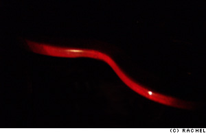
rachel-01.jpgTo me, minimalism is all about doing creative things with lighting: by being selective about what you light and how you have a fantastic opportunity to pick out details from a scene.

Rachel’s photo to the left, for example, illuminates the side of a coffee table (is it? or is it a chair? A cane? An electric guitar?). This particular photo has quite a bit of noise in it, sadly, and I would have cropped it entirely differently, for effect.

If you light something to make something disappear, or to allude that there is something more to the image, I always feel it is more useful to actually include the blank space in the image.

haje-rachel.jpgRather than making what you’ve carefully lit the center of the focus of the image, you’re essentially drawing the onlooker’s attention on what isn’t there – check out the image to the right.

What you are looking at is the same basic photograph as the one Rachel sent me, but re-coloured, and re-cropped in Photoshop. The large area of nothingness adds to the interest of the photo, because it’s practically jumping up and down, screaming ‘look at me! I’m mysterious! I’m an enigma! Try and solve me!’. Dunno ’bout you, but I find that strongly appealing.

haje2.jpg

The photo above is a simple egg in an egg-cup. Lit from the right and behind the photo, I’m particularly fond of this image (but then I would be – I took it), because around 96% of the frame is pure black – yet the 4% that aren’t give enough ‘feel’ that it’s perfectly possible not only to know what, exactly, you are looking at, but also add a sense of mystery and very strong visual lines.

fernando-adame-monkeysensei02a.jpgThe egg-in-eggcup is an odd one as well, because it conforms quite strongly to the rule of thirds, but the elements that fall on the dividing lines are not actually visible in the image. In effect, your eyes are ‘filling in’ the bits of the photo that are missing, and creates a pleasing visual image out of something that ain’t there. Call me a geek, but stuff like that makes me smile on the inside.

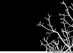
While we’re in the mood for crazy lighting schemes, do realise that side-lit subtlety is but one way of getting powerful images. The photo on the left, taken by Fernando (you might know him as MonkeySensei if you hang out on DeviantArt much), is a cheeky little example of how to do things differently. This image is almost Sin City-esque in its simplicity, but I love it.

The technique applied for taking this photo is so easy it’s almost embarrassing: Go outside on a dark night, find a tree, blast it with your flashgun on full pelt, et voila – a perfect photo. The composition in this image is what really gets me though – it’s almost as if the branches create a gradient feel to the image, as if they are cracks in an ice surface, propagating throughout the photograph. Especially amazing is that this photo barely has any grays in it: Everything is either pure white or pure black – you can’t get much plainer than that. Fantastic.

jasondeehr.jpgColour in minimalism

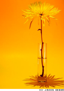
Of course, if you’re trying to keep things simple, going black-and-white is the easy way, but you can get some really stunning results by using colour, too. Jason Deehr, for example, sent me a photo which was minimalism with a twist: By using a background and a subject that are of very similar colour, suddenly the photograph becomes a celebration of colour, life, and warmth.

The tonality of ochre, light orange and yellow plays a careful, intricate game, turning what would be a rather sombre black-and-white image into a vibrant ode to life. There isn’t much of a story in this photograph, no pretenses, no deeper meaning, but it all just doesn’t matter – it’s gorgeous, simple, and full of optimism and innocence.

Of course, by varying the colours, you can create a whole series of moods – a yellow, an orange and a red panel in a triptych, anyone? It would make a great way to greet visitors to your house – hang three next to each other in the hallway!

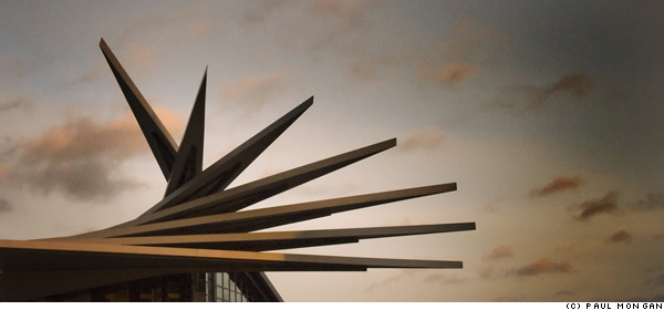
While strong colours are a good option, a larger degree of subtlety can also have desirable effects – take this photo by Paul Mongan, of an unusual building, for example:

paulmongan.jpg

roof-haje.jpgI was torn as to whether the photo can be labelled as ‘minimalist’ or not – but similarly, it’s easy to see how the very same scene could be photographed at a different time of day, for a much stronger impact.

The high contrast between a clearer sky (or, perhaps, just overexpose the sky so it becomes much paler) and the distinctive shape of the building roof, could be a strongly striking, and visually appealing, impactful image. Of course, in my mock-up (to the right) you do lose much of the colour, but you do re-gain a lot of the oomph that I feel an image like this should have: washed-out colours and low contrast don’t cut it when you have source material which is crying out for drama.

People, but less

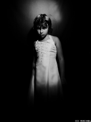
rachel-02.jpgObviously, there’s nothing to stop you from including people in your adventures in minimalism either – It’s just far more difficult.

One of the main reasons is that people are complicated shapes – faces are anything but minimalist, and there’s hair, ears, legs, arms – by the time you’ve taken a shot, you’ve got enough clutter in there that it’s difficult to fill an image with the tranquility and simplicity that minimalism is characterised by.

yorgos-haje.jpgRachel’s experiments in keeping portraiture simple, however are particularly effective. The style of the image on the right remind me of the work of the amazing Katie Cooke (who runs the Slowlight pinhole photography website), and is a good example how slight motion blur can actually smooth out an image quite a bit – certainly something worth further experimentation.

One way of simplifying portraiture is to go the high-contrast, slightly surrealist route (like my photo to on the right), but none but the nuttiest among us would concede that the picture is minimalist as such.

Challenge

So, it’s challenge ‘o’ clock, folks – can you take a portrait of a person that leaps off the screen, which is simple – even minimalist – yet captures a characteristic of the person you are photographing? If so, post it on DA, Flickr, or similar, and post a comment to this post with the link – I’d love to see it!


Do you enjoy a smattering of random photography links? Well, squire, I welcome thee to join me on Twitter -

© Kamps Consulting Ltd. This article is licenced for use on Pixiq only. Please do not reproduce wholly or in part without a license. More info.

Do snappers have a responsibility?

footie.jpg

For photographers who sell microstock, or who sell a photo every once in a blue moon, getting serious pay-outs for a single photo may sound as a dream. For those of us who deal in licenced photography, however, serious levels of payment aren’t unheard of. Personally, my best-selling set of photos have netted me a fair sum of cash: They’re very specific, and get sold again and again.

Today, I stumbled across the work of Thomas E. Witte, in a brilliant article over on Sports Shooter. Witte managed to snap a couple of photos that turned out to be pure gold dust: A high school football player who doesn’t have any feet. The photos netted him $12K.

What makes me wonder, though: Could it be argued that the photographers have an obligation to their subjects directly? Should Witte give the football player some of the money he earned in this case? Or does the opposite apply — like for photographers who cover conflict zones — that if you get involved, you are immediately unable to do your job properly? 


It could be argued, of course, that the photos of Bobby Martin – the football player in the photos – are exploitative. After all, the only thing he is doing is what he loves: To play Football. In the grand scheme of things, Martin is probably unlikely to make any money of his passion: The big bucks are in the NFL, but a legless NFL player is probably not going to happen in our time. The alternative is the Paralympics, which is at least partially sponsorship-driven, and has made stars of a few games (like Wheelchair Rugby, as shown in the highly recommended film Murderball).

So, as fellow photographers, how should we feel? Personally, I am torn. On one hand, I want to say “Good work, Witte, for creating a motivational icon of Bobby Martin”, I mean, hell – there aren’t a lot of people who would have the guts to face the big burly opponents on the football pitch if you’re half their size, and especially if you lack legs. Without Witte’s work, chances of anyone finding out about Martin are slim. By showing his strength to the world, Witte’s photos could be a motivation to a generation of less-abled people.

On the other hand, I’m tempted to say “jeez, Witte, this is just a bit harsh. You’ve made a lot more money out of these photos than you expected. How about you split the cash with Martin? Keep $6K for yourself, and give $6K to him. It’s only polite.”

And finally, the cynic and paparazzi photographer in me goes, “Sod it, it’s a white-hot photo, and you deserve every penny you can get. What happens to a photo after you’ve taken it isn’t your problem, congrats on making a nice pile of cash out of it”.

Do photographers have a responsibility to their subjects?

View Results

How do you feel about these photos? Do photographers have a responsibility to their subject? Vote above, and let me know your opinions in the comments, below!

The photo in this article is a thumbnail taken from the Sports Shooter website, used under UK Fair Dealing law. The photograph is © Thomas E. Witte. To see the full version and more photos by the same photographer, please check out the source article


Do you enjoy a smattering of random photography links? Well, squire, I welcome thee to join me on Twitter -

© Kamps Consulting Ltd. This article is licenced for use on Pixiq only. Please do not reproduce wholly or in part without a license. More info.

Case study: Selling your photos on-line

a-fotoviva-4.jpg

A lot of people take photos. No, seriously. A lot of people. But the number of people who actually do something with their photographs are an absolute minority. I decided to catch up with a friend of mine – Jason – to see how he turned his hobby into a multi-million, global sales success.

Okay, so I’m full of it: he barely even breaks even. But still – he’s found a cool way of trying to do something with his photos. And that’s worth taking a closer look at, methinks! 


a-fotoviva-2.jpgI’ve stumbled across Jason’s site, fotoviva, several times before I even got to know him. It goes to show that this global village of ours isn’t always as big as we think, I guess.

Jason is a web designer who’s an old-timer in the world of photography: He’s been taking photos for about 15 years, but always on a hobby basis. He’s a Nikon fan (Boo! Okay, just kidding), and shoots most of his photos with a modest D50. The results certainly make it worth it, however!

Occasionally, he takes photos that are so good that they deserve to be shared – but how? There are so many venues where you can show off or sell your photos, but Jason decided they weren’t good enough for him: Either they were a bit lacking, or they weren’t quite what he was looking for.

There are some great pieces of on-line gallery software out there, but they are limiting in that you can’t sell your work. The sales galleries? Well, they’re a bit crap too. So, being the ever-creative soul he is, Jason decided to just go ahead and start from scratch.

a-fotoviva-3.jpg“Basically”, he says, “I launched it as a site to try and sell my own pictures as canvas and poster prints 5 months ago. Then I realised that there are so many really good photographers out there, completely unknown, yet they have no idea about the internet or how to create a website to sell their work and earn some extra cash.”

So he opened up his website to other photographers as well. “When I find a photographer whose work I like”, Jason explains, “I ask them if they would like to try and sell some of their pictures using my site.”

It’s not exactly a new approach (it’s what I do over on 3Songs.org for concert photography, for example), but it’s a win-win situation. As Jason sees it: “This helps build up my site, and offers the other photographers an outlet to sell their prints”

I think Jason’s Foto Viva website is one of the more elegant photo gallery / sales solutions I’ve seen, so I thought I’d share it with you guys.

a-fotoviva-4.jpg

So, he’s got a successful website and is a pretty accomplished photographer. Surely, that means he’s had all his dreams come true? Not quite… “One day I would like to spend at least half my time taking photos”, he admits, “not only
in England but around the world, whilst continuing website and graphic design on a much reduced scale.”

Spoken like a true photographer, that is.


Do you enjoy a smattering of random photography links? Well, squire, I welcome thee to join me on Twitter -

© Kamps Consulting Ltd. This article is licenced for use on Pixiq only. Please do not reproduce wholly or in part without a license. More info.

Learn photography step-by-step

instruct2.jpg

I think it’s pretty safe to say that I’ve got a new favourite website: instructables! It uses a flickr-style, very web 2.0 approach to doing ‘do it yourself’ guides: Hover-over-image items for descriptions of what you are looking at, and many of the instructables available guide you through projects baby-step by baby-step.

There are a lot of them available already, mostly for geek projects. Luckily, there are some wicked photography DIY projects as well – well worth a peek!  


instruct2.jpgSome of my favourite instructables include Photographing in the Ultraviolet spectrum, how to make a macro attachment for a digital compact, converting your Holga to a 35mm (more about holgas), a pretty good guide to creating QuickTime VR panoramas (although, if I were you, I’d use CleVR instead…), a superb guide to taking infra-red photos with your digital compact cameras, building a light tent.

There are also a few truly cheeky guides, such as how you can use a condom to water-proof your camera (it works, but most condoms are not fully translucent, so you’d struggle to get decent-quality photos with this technique)

instruct1.jpgThe instructable to introduction to band photography is decent as well, and well worth a look – but it’s not as good as Photocritic’s discussions of the same, obviously :-)

A quick search on instructables for ‘Photography’ comes up with 51 DIY guides of varying quality – great reading material for a lazy sunday morning!

(thanks, sam, for reminding me to do a post on Instructables! He wrote the condom-waterproof guide and the IR photo guide. Give it some love!)

Oi! You! No pictures!

istock_000000880427xsmall.jpg

A few months ago, I ran a story on how the UK government was trying to restrict public photography. It seems as if they’re now playing the back-pedalling game in a big kind of way. Once the petition hit 60,000 signatures, the Prime Minister’s office issued a statement which can be summarised into ‘uh, no, we never intended these kinds of changes to be made’.

What I really want to know: Do you have any stories of instances where people tried to stop you from taking photos? Leave a comment!

Have you ever been stopped from taking a photo?

View Results

It’s hard to tell if the guy who set up the petition was, in fact, petitioning the wrong people (the government wasn’t imposing restrictions, but private security firms might have been), or if the government have gone ‘whoopsie, a lot of people feel strongly about this, let’s try and save our skins’. Either way, the text of the statement is as follows:

Thank you for signing the petition on the Downing Street website calling for the Prime Minister to stop proposed restrictions on photography in public places.

This petition has already attracted over 60,000 signatures from people who obviously share your concern. Not surprisingly, the idea that the Government might be poised to restrict your ability to take photos has caused some puzzlement and even alarm.

We have therefore decided to respond to this petition before its closing date of August, in order to reassure people.

The Government appreciates that millions of people in this country enjoy photography. So we have checked carefully to see if any Government department was considering any proposal that might possibly lead to the sort of restrictions suggested by this petition. We have been assured this is not the case.

There may be cases where individual schools or other bodies believe it is necessary to have some restrictions on photography, for instance to protect children, but that would be a matter for local decisions.

So… Do you have any stories of when you were prevented from taking a photo by slightly over-zealous security personnel? What happened? What did they say? What did you say? Did you have to stop taking photos?

(Photo © iStockPhoto)


Do you enjoy a smattering of random photography links? Well, squire, I welcome thee to join me on Twitter -

© Kamps Consulting Ltd. This article is licenced for use on Pixiq only. Please do not reproduce wholly or in part without a license. More info.

Portraiture: Borrow their soul!

mika31

A few years ago, I was part of a creative arts project in Arizona and southern Utah, where we did a lot of work with Native American people — a ‘world through our eyes’ type thing. One of the things that was brought up when we were dealing with more traditional tribes, was that we weren’t to take any photos. Perhaps surprisingly, some people believe that when you take photos of them, you steal a part of their soul.

Religions and superstitions aside, I think it’s a good way to look at portraiture. Stealing souls is a bit harsh, but if your photographs don’t at least borrow a little bit of soul from your subjects, I believe you may have failed as a photographer.

For this article, I’ve chosen to do a critique some of the photos submitted to me by Isaac – an USC film student with a passion for photography. His images illustrate very well how adding a touch of feel (or soul, if you will) can lift your portraiture.  


With his photos, Isaac included a note. Now, normally, I don’t pay much heed to what people say about their photos: if they can’t stand on themselves, they aren’t worth critiqueing. In this case, I made an exception: Essentially, Isaac is begging to be kicked to the kerb:

Compliments are nice, but for someone in my position they are useless – I’m a newb and I need people to tear my work apart so that I can improve. Please, please, I beg you, be as harsh as you possibly can. Thanks.

… Which I would have done, if his pictures were actually bad. Luckily, they aren’t. Without any further ado…

Isaac’s first photo has is titled ‘arms’:

arms.jpg

At first, I wasn’t quite sure what to feel about this photo. It’s terribly messy, and you can’t actually see anything of what is going on. I’m also not a big fan of the photographer being reflected in the camera, on a general basis. In this one, however, the expression of the photo comes together in a wonderful way.

To me, it seems as if this photo is taken in a changing room. The girls are performers, preparing to go on stage, perhaps. The girl on the left is showing a slightly worried expression, and is looking at the photographer through her hand in the mirror, while the other model is completely obscured in what seems like a dancer’s pose. Is she snapping her fingers? Is she fixing her hair?

The tension in this photo — and much of its soul — comes from the tension in the photograph. The photographer is intruding into a world where he doesn’t belong, and the way the models obscure their own face almost seems as a defensive gesture, even though the body language of both girls are very open.

Along with the tension and the colour repetition (there is only one accent colour, and it’s pink. It’s reflected in the light source, on the photographer’s shirt, in the left girl’s hair band and the right girl’s top), the thing that intrigues me about this photo is that you can follow the path of the light. Take the left model, for example, you can see her head, then her head in the mirror. You can then follow the light beam through the hand which is obscuring her face, which you can also see in the mirror, and then into the photographic lens. As a photographer, this multi-layered self-referential image is very appealing and exciting to me.

On a technical level, I would probably have tidied the image up a little bit. Darken the background more, black out the writing (on the mirror? On the photographer’s shirt?), and get rid of everything to the left of the left model, and to the right of the right model. Once that has been done, it will increase the focus of the photograph.

The final thing which makes this image really work for me, is that if anyone has had their soul ‘stolen’ in this image, it’s the photographer himself. The models are obscured, and the only person who you can connect with (despite the camera stuck in front of his face), is the person taking the photo.

A powerful, cheeky, and inventive photo indeed.

In Isaac’s second photo, entitled Mika, he’s using a different set of techniques:

mika.jpg

In a way, I really wanted to read a lot of meaning into this photo, but there’s something about it which doesn’t quite allow that for me. The car in itself is delightfully dilapidated, and the dirt, decay and entropy it and the background represents makes a fantastic backdrop for telling a story.

The model is beautiful, and very well captured on your behalf. The problem I have with the image, however, is that she just doesn’t look quite right in her circumstances. The way she is dressed and posed gives the photo an impression of ‘look! an old car! let’s take a picture on it’. If she was dressed differently, there would have been an opportunity for a whole series of different stories worth telling. Dressed very beautifully and glamorously, it could be a story of being lost / being out of ones element. With more frizzy hair, perhaps a scruffy, stained t-shirt, and with dirty, bare feet, it could be a story of despair, loss, and hopelessness. Open the bonnet and make her a spanner monkey, with some creative lighting and perhaps with a streak of oil on her cheek, and you have a classic ‘sassy mechanic’ shot. Sat in the car, perhaps in a bikini, or even nude, it’s a different story again.

I think this photo is an excellent counter-example of the above. All the elements are there: The model is attractive and sultry, the background looks bloody amazing and is well cropped, and the lighting is quite beautiful. However, you haven’t captured the ‘soul’ of the photo, and we’re left with an image that, whilst interesting to look at and quite pretty, doesn’t move me at all.

That doesn’t meant that the photo is beyond saving, of course — technically, it’s close to perfect (the only thing I’d address is the lighter area in the top right of the image. Getting someone to stand in the way of the sunlight, setting up a screen, or just cropping / editing it out in Photoshop would take care of that), and as I say, both the model and the setting have a lot of potential.

… Which semi-elegantly leads me to the last image of today’s critique. Another photo of Mika:

mika3.jpg

This photo fills me with wonder. What’s going on? Why is she stood in the sunshine in front of a half-pointed wall? Her eyes are kind of closed. Is she tired? Is she reacting to the sun? Is she on drugs? She does look sort of suspicious. Is she trying to hide from something or someone? Is she suspicious herself, of does she mistrust the photographer? Is she angry at the photographer?

With an initial impression like that, you’re bound to catch the attention of onlookers, which is a great start in the battle towards getting a photo noticed.

On a technical level, I think I’m not too fond of the sharp side-light. The shadow of her eyelashes on her nose is not particularly flattering, and while it does look as if you’ve used a reflector to lighten up the ‘dark’ side of her face (did you? Or is it merely light reflected back off the wall? It doesn’t look as if there is enough wall surface for that amount of light reflection), it isn’t quite enough. The main thing I have a problem with from a technical point of view, is that even in this photo, it’s possible to see that the model has absolutely gorgeous eyes. We want to be able to see them properly! A fill-flash would definitely have come in handy here. While you’re at it, perhaps a little bit more light on the wall behind the model as well — the sharp contrast between the white and the light olive colours carry this image — use it!

Right, with all that out of the way, let me say that this image is bloody good. Just like the first image, it harbours a lot of emotion and it tells (or rather, hides) a story. The light is low on the horizon, which to me says ‘evening’ or ‘morning’. Based on the make-up, I want to think evening. Or is it morning? Is her tiredness because she’s been out all night? But she doesn’t sweaty or messy enough to be out all night…

Obviously, I haven’t got the faintest idea who the model is, nor what her relationship to the photographer is, nor what her personality is like. Conflicting images of misspent youth, worry, intelligence, drug abuse, perhaps. Whatever it is, this photo oozes feeling, emotion, and — yes — soul.

Right, I do realise that this is the least useful critique I’ve done on here in a long time. There’s just something that really works in this image, and it drives me spare that I can’t put my finger on what it is. I have an idea I’ll come back to this image many times in the future, and every time, I’ll be left wondering. It’s a sign of unbridled greatness. Sort out the technical details, and you’re on to a proper winner. Thank you so much for sharing this.

Can anybody else add anything to the critiques? Do you agree? Not sure? Do you completely disagree? Well that’s what the comments are for.


Do you enjoy a smattering of random photography links? Well, squire, I welcome thee to join me on Twitter -

© Kamps Consulting Ltd. This article is licenced for use on Pixiq only. Please do not reproduce wholly or in part without a license. More info.

Keep the dust off your lens

ixus.jpg

If you’ve got a compact camera, you know how bloody annoying it is to have to clean your lens. It’s tiny, and it seems to attract dust as if it was a lamp, and the dust were moths, confused by the lovely, bright source of light. Right? Right? Right.

There’s a ridiculously simple solution worth trying: When you know you’re going to be in a particularly vulnerable situation (a desert, a dusty place, or a night on the lash*, for example), you could do some pre-emptive maintenance: Just cover up your lens with a piece of high-quality scotch tape!

Important: Obviously, only use the following tip if your front lens element (that’s the glass bit) doesn’t actually stick out further than the lens barrel. Otherwise, you’ll make your lens sticky and dirty and the whole point is gone! 


Sounds simple? Well, that’s because all the greatest solutions usually are. The better quality your tape is (i.e. the more translucent it is), the better. The best thing, obviously, is that the scotch tape is a hell of a lot easier to clean off than the crinkly, unreachable crevices of your digital compact camera!

Bonza.

*) on the lash is a Britishism for being pished as a newt. Hammered. Whacked. Smashed. Pissed. Fucked. Or, in the parlance of our times: ‘drunk beyond reason’.

Extra special thanks to CalebVaughn for this ridiculously simple, yet incredibly effective tip!


Do you enjoy a smattering of random photography links? Well, squire, I welcome thee to join me on Twitter -

© Kamps Consulting Ltd. This article is licenced for use on Pixiq only. Please do not reproduce wholly or in part without a license. More info.

Your photos, 300-style!

300-03.jpg

Movie audiences of the world are vastly and completely amazed by the beauty of the new movie 300. With its extremely distinctive style, quick-moving plot and — like Sin City, another of my favourites — relatively closely based on one of Frank Miller’s graphical novels, it’s got it goin’ on.

If you’ve seen the film, you can’t have failed to notice the amazing quality of the artwork involved: The CGI is amazing, of course, but even the live-action bits of the film is nothing short of stunning. So, how, exactly, can you recreate the effects? We interviewed graphic artist Jason Niedle to find out more… 


300-02.jpg300 was shot entirely using blue- and green-screen, which is a technology which allows you to create the backgrounds digitally. Of course, the actors use props etc, but the fact remains that nearly 90% of all the footage used in the film involves various types of visual effects. The film was in post production for nearly a year — ages, in film industry terms.
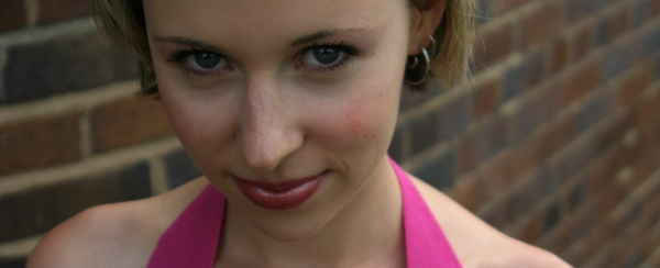
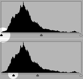
Oh, so you’re a tech geek, are you? Well, let’s find out what IMDB tells us about the technology used:

300-03.jpgThe film was edited on an Avid, with an HD cut also maintained in Final Cut Pro The 3D was made using Maya, XSI, and Lightwave The 2D composites were made with Shake, Inferno, Fusion, and Combustion. The film makers prefer Macintosh, but large portions of the movie were made under Linux. Asset management was handled by custom software written in the Panorama development environment, made by Provue. Color management was handled by Truelight software. The film was scanned on a northlight scanner and was recorded on the arrilaser. Most of the film was shot at high speed, between 50 and 150fps. Normal film is at 24fps. The film was transferred to HD SR tape and quicktime, and HD quicktimes were the basis for the HD preview cuts. The working resolution for the film was 2K, at a working aspect ratio of 2.11 and a projected aspect ratio of 2.35.

Err, right. If anyone fancies translating that into English, feel free to post a comment. That’s totally not why we’re here, though, and I’ve let my mind wander way off track (it does that a lot recently, I blame the fact that I’ll soon be visited by my lovely girlfriend, who I haven’t seen in more than two weeks. It does weird things to my mind. Oh, I’m waffling again. But then again, as a regular reader, I’m sure you’re used to that from me by now… Right?)

How did they achieve the special look of the film? As it turns out, the directors and film editors decided to do a ‘crush’ technique. This means that you extend the blacks (‘crush’) to up the contrast and make a scene look eerie.

Let’s illustrate. Starting with a straight-up photo of the lovely Christine, where she’s looking ever-so-slightly devious:

crush-01.jpg

crush-02.jpgNow, to apply the ‘crush’ technique, you need to adjust the levels on your image so the black comes out stronger. Obviously, you need to do these changes only to a selection of your image, otherwise, it’ll come out way too dark.
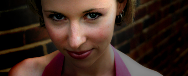
Now, with some careful selections and some drastic image editing, you can turn this photo into something that has far higher impact and offers up a lot more contrast to work with. This is important, especially because the contrasty style of 300 would be impossible to recreate without, err, contrast.

crush-03.jpg

ip-01-1.jpgWhen you’ve got the contrast right, you’ve got to start playing with the colour — it’s got to be right, after all.
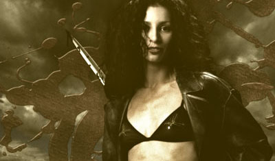
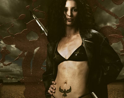
When Jason saw the movie, he explains, he wanted to re-create the effect. Re-visiting a photo he took a while ago, he combined the photograph with some stock stuff, and came up with the image to the right.

“I spent a little time balancing the brightness of the images”, he recalls, such as darkening the background and making the model stand out properly. Subsequently, he added a Sepia tone to the image:

ip-02.jpg

… Which brings the photograph in line with the colour feel of 300, apart from the whole ’300 being in colour’ bit. What next? “Well, I liked the effect quite a lot, but it didn’t quite cut it. For one, it wasn’t nearly colourful enough”, Jason explains, “so I took the base image, made a copy of the layer and put it right back on top”. By using the ‘multiply’ channel layer and fine-adjusting the opacity of the new layer in Photoshop, it adds some of the colour back into the image, and amicably imitates the ‘crush’ feel of 300.


ip-03.jpg

We’re getting close now, but the lighting- and director of photography of 300 had shot the film with rather dramatic lighting. In addition, a lot of the scenes in 300 has the models oiled up (or, at the very least, sweating like pigs. Wouldn’t you, in the heat of battle?), so the powerful lighting reflects off the models in a wicked way. “Basically, I added a motion blur to the background, and added it as a separate layer to the Photoshop file”, Jason explains.

The final result? Judge for yourself:

ip-04.jpg

Jason suggests that the original photo could have done with more powerful, side-on lighting, but the basic feel of the 300 movie posters is there… Wouldn’t you agree?

Jason is a graphic designer and photographer based in Orange County, California. Read more of his stuff on Jasontopia. The first three images in this article are used courtesy of Warner Brothers under Fair Use / Fair Dealing, for illustrative purposes. For full-res versions and more info about the movie, check out the official 300 website.

What's in your kit bag, and why?

canonelph.jpg

On Photocritic, I don’t generally bother talking too much about equipment, unless I’m particularly excited about something. My approach towards photography is that a good photographer can take good pictures with bad equipment. A bad photographer can only take mediocre photos with good equipment. In other words: If your technical skills and photographic insight aren’t up to scratch, you’ve already lost the game: No amount of equipment can save you.

Nevertheless, I often get comments and e-mails asking about what type of equipment I use. It’s an interesting question, but asked wrongly. My equipment list is boring. The argumentation for choosing each of these pieces of equipment is what is interesting, because it might help you pick which lens or gadget you buy next!  

1994_eos-1n-hs.jpgThroughout my photographic history, I’ve had a lot of different cameras. I started with a Canon A-1 SLR (which I still have!), and then went through a series of exciting cameras. I had a Canon RS, which used to be the fastest camera Canon ever made. I had a Canon EOS 1Nhs, which was pretty damn quick as well. Then I went digital, and had a D60, 10D, 20D, 300D, and now I’m on a 30D. Why such a quick succession? Well, I used to work as a photographer, and cameras get used a lot. They get bumped into things, they get dropped, and the shutter mechanism gets slack after taking tens of thousands of photos. Also, I’m a gadgets nut, and I love playing with a new camera. Sure, there are no massive differences between the D60, 10D, 20D and 30D, but for every upgrade, there was a little bit more speed, a few new toys, and they just got better and better.
So why do I use a 30D now, rather than, say, a 400D or a 5D? The simple answer is cost and timing. I love the fact that Canon brought out the 300/350/400 cameras, because they bring photography to the masses. I genuinely believe that every aspiring photographer should be able to afford a digital SLR, because it’s the single best purchase you can make. It doesn’t matter if it’s Canon, Nikon, or one of the other brands. It doesn’t matter if it’s the bottom of the line model. By their very nature, dSLR cameras are unlikely to be the bottleneck of your photography skills. Lenses, flash guns, studio equipment, and all that might be, but especially as you’re first starting out, it doesn’t really matter.

Personally, I’m a right clumsy git, so I decided to invest a little bit more money to get the 30D. When I was in the market for a camera again around the same time as when my book deal came through, the 30D just started to become available. I like its bigger screen than the 20D, and I like the fact that it’s sturdy, rugged, and looks like it can take a battering. Because I no longer work as a professional photographer, I take a lot fewer photos (and my stuff is no longer insured against any damage, so I take better care of it too), so in retrospect the 30D is probably a bit over-kill: I could have easily done with a 400D. My main argument for it now isn’t that it’s stronger and faster, but that it’s heavier. I’ve got huge hands and I’m not very good at holding stuff still, so a heavier camera is rather useful in that respect.

28-135.jpgThe first lens I bought for my kit was the 28-105 f/3.5 zoom from Canon. It is a decent lens, but in retrospect, I regretted buying it. I quickly replaced it with the 28-135 f/3.5 image stabilized lens. When I go travelling and have to pick a single lens, is the lens that gets to go on adventure with me. It’s wide enough to be useful for most landscape stuff, and zooms in far enough to be good for portraiture, wildlife, and all that. It’s also a macro lens, and it works surprisingly well at taking photos up close, too. It’s not a cheap lens, and it’s not all that sharp either, but it has a special place in my heart nonetheless…
sigma70-200.jpgThe next lens I bought was a 70-200 f/2.8 EX APO lens from Sigma. It’s bloody expensive, but it’s also one of the best lenses I own. Because it stays at f/2.8 throughout its zoom range (in general, zoom lenses that have the same aperture throughout their zoom range are of better quality for reasons that are slightly beyond this write-up, I’ll do that one as a separate article some day), you get a long lens that’s perfect for concert photography. Which, incidentally, is why I bought it. (more about concert photography here and here). The lens is quite heavy, but it’s really sharp, handles well, has a fantastic bokeh, and is great for all sorts of sneaky photography.
For work, I started doing a great deal of interior photography, and needed to go wider than the 28mm afforded by my other lenses. With my recent success with the Sigma lens, I decided to go with the Sigma 17-35mm f/2.8-4.0 lens. It’s a peach, what else can I say.

pringlesmacro.jpgOther stuff in my kit bag is the Lensbaby lens, which I’ve fallen completely in love with (as explained at great length here), a 50mm f/1.8 mk1 prime (as rambled about here), my home-made macro extension tube, and a Canon 135mm f/2.8 Soft Focus lens, which I to this date haven’t quite figured out how to use. Sure, it’s a great prime lens, but the soft focus bit is an absolute mystery to me.

canonelph.jpgFor parties, going out, and all that sort of stuff, I keep a nifty little Canon Digital Elph S500 handy, too. The battery life of it is absolutely amazing, and the lens is spot-on. Sharp and reasonably fast. The camera itself is virtually indestructable, too (I’ve dropped it more often than I care to remember, but its metal casing really holds its own), and it’s small enough to carry around everywhere.

My final gadgets are a Slik tripod, a standard Canon Speedlite 420 flash gun (my 550s kept breaking or getting stolen, it seems as if the 420 agrees with me better — knock on wood), and a LowePro Stealth Tracker photography backpack to lug it all around.

The last piece of kit worth mentioning is my Apple dual G5 2.0 Ghz with a 19″ Eizo flatscreen TFT monitor and Photoshop CS2. It’s not strictly photo gear, but I couldn’t be a photographer without it, so it obviously belongs in this list :)


So, where do I go from here? I’m currently drooling over the Canon 100mm f/2.8 Macro lens, as based on my experiences, and those of many of my friends, it’s supposedly one of the sharpest and best prime lenses out there. The fact that it’s a perfect focal length for portraiture, the fact that it’s a magnificent macro lens, and the fact that it’s not actually that expensive for what you’re getting, means that I have to fight hard to keep my credit card in my pocket. Must… save… up… money…

So, enough about me. What’s in your kit bag? Why? And what is your next purchase?


Do you enjoy a smattering of random photography links? Well, squire, I welcome thee to join me on Twitter -

© Kamps Consulting Ltd. This article is licenced for use on Pixiq only. Please do not reproduce wholly or in part without a license. More info.