Just because it's in my RSS feed, doesn't mean you get to steal it


These guys decided to steal my content, but apparently didn't even have enough pride in their work to not break their site.

I recently had an interesting exchange by e-mail with someone who had taken the Pixiq RSS feed and re-published it wholesale on their website. Of course, I'm not a big fan of people stealing my stuff, so I dropped the site editor a terse, but businesslike e-mail.

My E-mail

Hey there.

I note that on this page: (link removed), you are re-publishing my article "You can’t photograph your cake and eat it too…", originally published on Pixiq, here

Please note that I have not given permission for this, and you are guilty of a copyright infringement. Please ensure that this article (and any other articles written by myself that you may have 'borrowed') are removed within 48 hours. Failure to do so will result in a legal challenge and an invoice for any costs incurred.

Yours sincerely, Haje Jan Kamps

Usually when I send e-mails like this, they get ignored, and I roll out the big guns: DMCA takedown notices, invoices, and legal representation. This time, however, I received a response which I've had a few times now, and which I'm quite tired of these days, so I figured I'd write a separate post about RSS feeds and copyright.

The response...

Haje, that came in on an RSS syndicate. I didn't edit it, It was added automatically just as YOU included it in YOUR RSS FEED.

I don't like being accused of copyright infringment when it's your own stupidity that put the entire story up instead of an intro sentence taking you to your site. If you notice the link is there, you just put too much in your RSS feed.

So, no infringement occurred. I don't mind taking it down for you but not until you ask properly instead of jumping on your high horse and making laughable threats. Otherwise, feel free to take any legal action you think appropriate and I'll do the same.

(name removed), Editor

So, what's the problem?

Well, the problem is that this 'editor' apparently doesn't quite understands how copyright works. (As a sidenote: accusing me of "stupidity", and "jumping on [my] high horse and making laughable threats" would fly a lot better if you knew what you were talking about, mr Editor, but that's by the by).

As I wrote in my article What is copyright, and how do infringements harm you, it doesn't matter two hoots if I put everything in my RSS feed or not - it certainly is not an invitation to 'borrow', 'republish' or 'autimatically' my content on another site.

An analogy: If your corner shop has a mostly blind shopkeeper who can't keep track of what's happening in his shop, stealing candy from him is perfectly, obviously, and completely illegal, even if he makes it very easy for you by not looking out for his wares.

As the copyright owner, I’m fully within my right to create all sorts of conditions of use of my own content. In the case of my RSS feed, the only conditions are ‘personal use’ (so, don’t distribute it on- or off-line) and ‘non-commercial’, (so, don’t try to make money off my content).

The thing is, I'm not trying to be unreasonable. From my perspective, I’m not all that fussed if people e-mail each other copies of my articles: As long as I am not competing against myself in Google and other search engines, it’s not a fight I’m likely to find worth fighting.

The crux of the matter is that most RSS readers are ‘closed communities’ – Unless you are logged into Google Reader, you can’t see any feeds. This means that search engines don’t index RSS readers – as such, they are not in competition against my own site for search engine traffic.

Now, if someone re-publishes my content on their site, that’s a different matter altogether.

So, Haje, how did you respond?

As follows:

Dear Mr (Name Removed),

I'm frightfully sorry to break your bubble here, but only because something is available to copy, doesn't mean it is copyright free. For more details see the section under the heading "But you have an RSS feed! Isn’t that just begging for it?" in this article.

Pretty please with a cherry on top, take down my copyrighted content immediately.

~ Haje

Disclaimer

I have rudimentary legal training in UK media law, but my training is several years old, and you’d be insane to take legal advice from some random bloke off the internet anyway. Nothing in this post is meant as actual legal advice – talk to your solicitor, that’s what they are there for!

Further Reading

Further Reading

This is part of a 4-story series:

  1. What is copyright, and how do infringements harm you?
  2. Protecting your copyright in a Digital World
  3. Just because it's in my RSS feed, doesn't mean you get to steal it
  4. Ignorance is no excuse

In addition, you might enjoy Police Fail: Copyright, what is that? and Even Schools Don't Care About Copyright...

Hoppé Portraits: Society, Studio and Street

Tilly_Losch

It’s not often that I come out of an exhibition buzzing. Oh sure, I might smile quietly to myself and think that there were worse ways to spend an hour or so, but to feel, well, inspired maybe, or perhaps even exhilarated by something? That’s a rarity. It happened this morning, though. The NPG and their guest curator Phillip Prodger have brought together a super collection of images to make Hoppé Portraits: Society, Studio and Street a gem.

The earlier part of Hoppé’s career was devoted to studio portraits, and these form the first half of the exhibition. Cecil Beaton referred to Hoppé as ‘The Master’; these pictures make it easy to appreciate that epithet. Every picture gives you a clear sense of who the subject is, what she or he is like. Hoppé made it a part of his work to get to know the people he was photographing: he studied politicians’ speeches, he watched ballerinas dance, he read authors’ books. More than anything, he spoke with them.

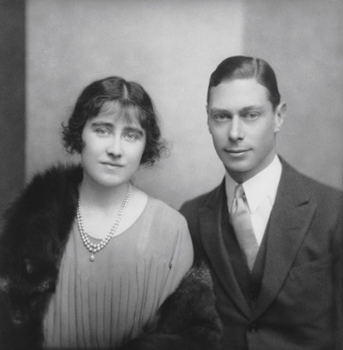
Duke and Duchess of York, 1923, © 2011 Curatorial Assistance, Inc. / E.O. Hoppé Estate Collection

He was able to leave behind Victorian pictorialism and embrace a more modernist approach to portraiture and still convey just who his subject was and what was important to her or him. The engagement photo of Lady Elizabeth Bowes-Lyon to His Royal Highness the Duke of York, who would later become Their Majesties King George VI and Queen Elizabeth, is a picture of a slightly diffident, somewhat nervous young couple. They’d grow into a formidable couple, but they weren’t there yet.

Then there’s Margot Fonteyn, taken when she was 16. She wasn’t famous yet, she’d only just danced her first big part. But she knew she was good. There’s a self-assurance in that portrait, taken incidentally when Hoppé had mostly stopped doing studio portraits and was concentrating on street photography, that can stop you dead in your tracks.

Margot Fonteyn, 1935 © 2011 Curatorial Assistance, Inc. / E.O. Hoppé Estate Collection

However he did it, Hoppé managed to bring out the personality of their subjects. Just so.

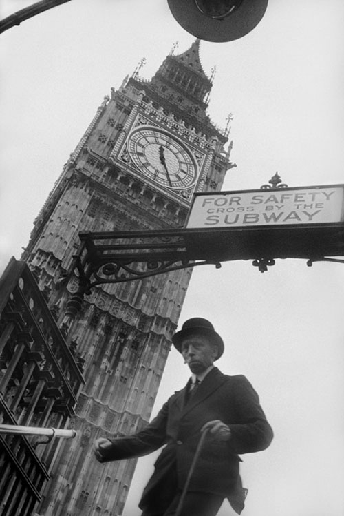
But Hoppé grew a bit bored with the studio, so he moved into the street, and that’s the second half of the exhibition. You’ve candid shots taken using a Kodak Brownie (it had the quietest shutter) concealed in a paper bag and more traditional street portraits. They’ve a mixture of humour and intense dignity. The lighting that quite clearly accentuated a lady’s bum as she exited a tube station made me smile; the photo of two men sleeping rough in Trafalgar Square highlighted their desperation but didn’t degrade them.

Westminster Underground Station, 1937 © 2011 Curatorial Assistance, Inc. / E.O. Hoppé Estate Collection

These pictures give you a real sense of how London was and who the people who lived there were between the wars. This is that slice of life that you want street photography to be.

Hoppé was quite clearly interested in people, and this shines through, whether he’s exploring different ‘types’ of people or by compiling his collection ‘Fair Women’ in 1922. That one ruffled a few feathers: for Hoppé, a beautiful woman could come from any class and have any skin tone. It wasn’t exactly received wisdom at the time, though. But portraits are about people and this exhibition gives you a masterclass in them.

There hasn’t been a major exhibition devoted to Hoppé in over 30 years. It was worth the wait.

Hoppé Portraits: Society, Studio and Street runs from 17 February to 30 May 2011 at the National Portrait Gallery, St Martin’s Place, London, WC2H 0HE.

(Featured image: Tilly Losch, 1928, © 2011 Curatorial Assistance, Inc. / E.O. Hoppé Estate Collection)

Instagram hits 2 million users

Screen shot 2011-02-15 at 09.19.08

Late last summer, we wrote about what we considered to be the 10 best iPhone apps for photography. Instagram didn’t feature on that list, for one very good reason. It hadn’t yet seen the light of day. Doubtless it was a bit more than a twinkle in its developers’ eyes, but the general public had yet to welcome its picture-sharing prowess onto their operating systems with open arms. Now they’ve had the chance, there’s no stopping them: it took three months to reach 1 million users; and six weeks (yes six weeks) after that, it has a decent-sized city of users at 2 million.

When you consider that Instagram is available only on iOS – not Android, not Blackberry, not anything else – that’s, well, astonishing. So now the question is, will they be releasing an Android-or-anything-else version?

PicPlz has been making in-roads into the Android instant-photo-sharing market. Are we set for a explosive battle for dominance, or a growling detente with a division of the spoils?

(Headsup to TechCrunch.)

Heading Back to the Future with your portraits

Lali, 1978 and 2010 in Buenos Aires

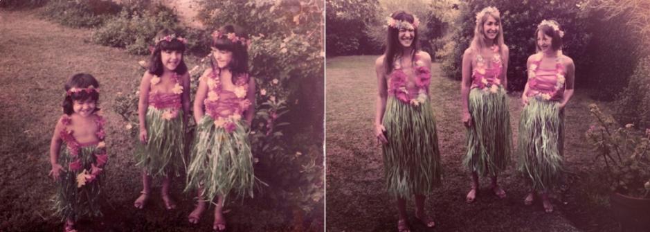
Take an old portrait and recreate it: same people, same place, same look. Sounds like fun, if a bit of a challenge, no? It’s the sort of thing that would complement ‘Dear Me’ (writing to your 16 year old self) or tweeting your 16 year old self, perfectly. It’s also what Argentinian photographer Irina Werning has been up to recently. It’s her project, Back to the Future.

As she says, she loves old photos and she’s a nosey photographer. So this is the hybrid: ‘…it’s imagining how people would look and feel if they were to re-enact them [old portraits] today.’ Well, I’m charmed and rather inspired by the quirky results.

Flor, Male, and Sil in 1983 and 2010, by Irina Werning

In fact, I know precisely which photo of me I’d like to try to recreate. I’m seven years old and I’m standing on the bonnet of a car, halfway up the road leading to the summit of Monte Corona, taking a photograph. It was the holiday when my father taught me how to use an SLR. Perfect!

Take a look at the rest of the Back to the Future project gallery on Werning’s website.

500 locks on toilets

I've written about my semi-sane project Locks on Toilets before - but today, I uploaded a few more photos to it, and noticed that I've reached a bit of a milestone.

With this distinctly un-artistic photo:

screen_shot_2011_02_10_at_222856.jpg

I reached the 500th post to my Locks on Toilets group on Flickr, by photographing the inside of a rather curious-looking loo in Can Tho, Vietnam (I'm travelling around South East Asia at the moment - as I'm writing this, I'm in Saigon, but am about to board a plane tomorrow, heading for Thailand after a month in Vietnam).

That's a lot of collecting photos, from dozens of countries. And it's been pretty good fun in the process, too.

What's your half-baked photography project? Post a link in the comments, I'd love to hear about it!


Do you enjoy a smattering of random photography links? Well, squire, I welcome thee to join me on Twitter -

© Kamps Consulting Ltd. This article is licenced for use on Pixiq only. Please do not reproduce wholly or in part without a license. More info.

Fisher Price's new kid-proof camera

Kid-Tough-See-Yourself-06

That I’m pretty much evangelical about kids using cameras is no secret. I’m always on the look out for cameras that I think are suitable for them and ideas that I think will get them hooked on photography. But, I’m not so enamoured by the idea of cameras designed specifically for children, much the same way that children’s menus in restaurants make me cringe. However, when I read about the new Kid-Tough See Yourself camera from Fisher Price, I was intrigued.

My interest definitely wasn’t piqued by its either garish (black and white) or insipid (pink and lilac) colour schemes, more because it has a rotating lens that allows kiddies to take pictures of themselves easily. Not that I want to encourage narcissism, but it seemed pretty nifty. Think about it this way: it might be the perfect solution when you want pictures of you and your friends on a messy, drunken night out: it’s tough, it’s durable, and you’ll be able to get everyone in the shot.

If you’re wondering about the camera’s spec, it has a 1.2 megapixel sensor, a 4x zoom, an SD card slot, and runs on four AA batteries. All for around $70.

(Headsup to Engadget, who have all the groovy pictures, too.)

You can't photograph your cake and eat it too...


Image-manipulation and photo touch-up – these are common processes in the world of fashion photography, and generally accepted because the genre itself is one of dreams and fantasy. But food is different. Food is a necessity of life and an ingredient of good health, not just an indulgence. Our food choices are influenced by our trust in a product. And this is where we are so badly abused by the food industry, with an extreme form of image falsification that is manipulative and deeply unethical. Welcome to the World of Food Styling.

What is food styling?

In its simplest definition, it is the art of creating attractive, appealing and enticing photographs of food for the use of advertisements, packages, menus and cookbooks. Professional photographers working with food will either use a food stylist or do the job themselves.

“I can’t believe my eyes!”

 . . and you shouldn’t! In the world of advertising and packaging, many food images are not what they seem. And many are not even edible, using non-food substances to create artificial effects. For example:

maple syrup – the delicious, luminescent and sticky syrup perfect for pancakes; taking good photos takes time, and the syrup quickly turns the pancake into a soggy mess. So food stylists substitute this unphotogenic substance with motor oil, using spray-on fabric protector to make it stick to the pancake’s surface during the shoot.

freshly picked grapes? Nope – just old grapes with a coating of spray deodorant. A newly baked cake? Again, no, just a clever trick with hairspray. Yet another artificial way to convey ‘freshness’ is with glycerine or white glue (the glue has many uses, including fixing collapsing food and representing delicious thick milk on breakfast cereal).

Fancy that burger? Even when the bun’s covered with glue to keep the seeds in place? Famous food stylist, culinary educator, author and consultant Delores Custer, has even been quoted as saying, "The nice thing about Elmer's is it dries clear." If glue doesn’t work, the alternative is Vaseline or a similar petroleum jelly.

Appetising isn’t it? I've written in more depth about the dirty tricks of food photographers in the past - it may be worth a read!

(Don’t) try this at home...

So, the food images we see are not always what they seem. But the deceit goes even further when we are inspired to create a dish at home. Recipe books and food packaging should provide consumers with a realistic image of how their food will look once out of the oven or plastic wrapper.  The average cook might not expect to deliver cookbook quality looks at the dinner table.

But even so, people who follow the recipe step by step, breath by breath, don’t realise that the real reason they can’t recreate what they see is because it is not actually food. It is not the collection of crafted ingredients it pretends to be. The image has been manipulated and manicured even more than a fashion photo.

Unethical business practices and exploiting the innocent?

Corporations and cookbook writers hire food stylists with the specific intention of making their product more desirable than it actually is, simply to make money. This is dishonest advertising.

The County of Los Angeles Department of Consumer Affairs defines a false advertisement as “untrue or misleading information given to [consumers] to get [them] to buy something, or to come visit their store." Food styling is guilty of this. Also, the American Association of Advertising Agencies declares that its members will not “create advertising that contains false or misleading statements or exaggerations, visual or verbal." Food styling is very clearly initiating a false and misleading visual statement.

Food styling also contravenes marketing ethics. The American Marketing Association Statement of Ethics states that advertisements must "represent products in a clear way in selling, advertising and other forms of communication; this includes the avoidance of false, misleading and deceptive promotion."

Against each of these standards, food styling breaks the codes by using false advertising and presenting misleading information.

Using chemical and inedible products, illusionary tricks and photo editing software hurts the innocent, in particular children and their parents. Naive children are coaxed into buying products they would otherwise have no interest in. Parents must either give in or face the dilemma of confrontation. And if they give in, just as with glossy cookbooks that never ‘deliver’, these irresistibly presented products  are never actually what they seem;  they provide false hope and, later, feelings of disappointment. Exploiting the weak or vulnerable in this way is completely unethical and immoral.

And the final word...

... goes to a philosopher, the nineteenth century British philosopher, John S. Mill, famous for his stance on utilitarianism: "The happiness which forms the utilitarian standard of what is right in conduct, is not the agent's own happiness, but that of all concerned.” Mill clearly believes that it is not the individual's own needs that should take priority, but rather the larger group's satisfaction. Also, the biblical message to do as you would be done by is intrinsic to the spirit of the ethics of utility.

Compared to other forms of image-based promotion, food styling can be a practice of deceit leading to nothing more than the practitioner’s satisfaction at the cost of the helpless recipient’s misery and disappointment.  This is an ethical issue that needs to be further looked into and learned about by greater society. While it is indeed a creative and fascinating process, it is one that the people, both adults and kids alike, should be taught and made aware of. Until then, it will remain exceedingly unethical.

This article was based on an academic essay titled "Ethics of Food Styling", written by Allyson Schwartz for a coursework assignment in late 2010. It was edited by Rupert Waddington and myself for publishing here on Pixiq.


Do you enjoy a smattering of random photography links? Well, squire, I welcome thee to join me on Twitter -

© Kamps Consulting Ltd. This article is licenced for use on Pixiq only. Please do not reproduce wholly or in part without a license. More info.

Temporal aliasing in video

You have seen it in countless car advertisements and well-polished movies / programmes about cars: As the car is accelerating, the shiny metal alloy wheels seem to slow down, and briefly turn backwards, before becoming a big blurry mess again.

But how? How? And how come have you never seen that happen in real life before? And why does the article-writer insist on using braindead rhetorical questions instead of just getting on with the blasted article?

Anyway, this effect is known as the 'wagon wheel effect', or 'temporal aliasing'

You can see it in many different circumstances, where something rotates. Take this fantastic example:

Why?

Imagine a 3-spoked alloy wheel. The wheel is symmetrical, which is quite important. Now, imagine that you are looking at the wheel as it is fixed on a car, rolling along at high speed. You won't be able to even tell how many spokes the wheel has, as it is all a blur. If you were to take a picture of the car with a very short shutter time (1/1000 of a second usually does it), and look at the image, you can see and count the spokes, because you will have frozen the motion.

When working in film or television, you aren't actually capturing the motion, you are capturing a series of still frames. In the case of television, 29.9 frames per second (let's call it 30 fps, for the sake of simplicity). That means that if your camera happens to take a picture every time the wheel has turned a 1/3rd, 2/3 or full revolution (because the axis of symmetry is every 1/3rd of the wheel. A 4-spoked wheel would require 1/4th of a rotation etc), it would appear that the alloy wheel is standing still, while the tyre is whizzing along, pulling the car with it.

If your camera's shutter aligns perfectly with a rotation that can be devided by 1/(the number of spokes), the wheel appears to stand still. If there is an offset, it appears to turn slowly forward or backward, depending on the timing difference.

How?

The easiest way to capture the effect on film is to accelerate slowly - that way, your car's alloys will definitely align with the camera's shutter time, and you will get the slowly-forward-to-still-to-slowly-backward motion. You could also let the car roll, so its deceleration causes the same effect.

A more advanced way to do it, is to use mathematics. You will need to find out how long the circumference of the wheel is, and how many spokes the wheel has.

If a wheel has a circumference of 2 meters (that would be normal for a regular saloon car, I believe. Corrections welcome), it will do a full revolution every 2 meters travelled. On a 3-spoked alloy, the wheel crosses the axis of symmetry every 2/3 meters. When filming with a camera that shoots 30 images per second, that means that you will want the car to be travelling 2/3 meters every 1/30 second, or a multiple thereof. In other words: at 20 meters per second, or 72 km/h (45 mph)

The formula:

Required speed = (circumference / number of spokes) / (fps)-1

Why never in Real Life™?

Actually, it is possible to see this phenomenon in real life. If you look at a car through the safety barrier (guard rail) between two directions of traffic, you might be lucky. If it is dark, and the streetlights flicker (they normally do, at either 50 Hz or 60 Hz, depending on the electrical system of the country you are in), you might also see the effect. In full daylight and with unobscured view, however, it is a theoretical impossibility.

A different example

Now that you know how it works for cars, you should also be able to explain how this awesome video works:

stunning bass-string shot from urbanscreen on Vimeo.

I'll give you a hint: The strings on a double bass vibrate somewhere in the region of  40Hz - 180Hz or so, and the camera this was shot with (the Canon 5D MarkII) shoots video at 30 fps or so...


Do you enjoy a smattering of random photography links? Well, squire, I welcome thee to join me on Twitter -

© Kamps Consulting Ltd. This article is licenced for use on Pixiq only. Please do not reproduce wholly or in part without a license. More info.

48 hour film project: Behind the scenes


Hollywood-star Martin Freeman starred in our 48-hour film project

One big name actor. 12 crew. 48 hours. One award-winning movie.

When I was approached by my good friend Joe (the guy who filmed and edited all the Nokia Photo School videos I did for Nokia in connection with the launch of the Nokia N8), saying that he was going to be involved with a 48 hour film project, I declared him insane. My next phrase, I believe, was "How can I help".

One film, 48 hours

mugshots.jpg

It turns out that they needed a stills photographer, both to document the ongoings, as a memory, and to get some shots for the film itself.

Now, if you have never been part of a film production before, you should know that 48 hours isn't enough to make a film. It's completely insane, in fact - and that's partially why it's so much fun. The pressure was up doubly, of course, because we had managed to enlist a Hollywood celebrity to star in our movie. If you've never heard of Martin Freeman before (which sounds pretty unlikely, really - check him out on IMDB, you've almost certainly seen one or more of the films he has been in), you certainly will when The Hobbit comes out in 2012; Martin plays Bilbo Baggins.

For this project, we were shooting with dSLR cameras (Canon 5D mk II's, if I don't recall wrongly), and the results look nothing short of awesome.

At the London 48 hour film festival screening, the film picked up a handful of awards, including Best Film, Best Acting, Best Script, and the Audience Award... And in March, it's off to Miami for the international 48 hour film festival Filmapalooza - where it hopefully will pick up a few more prizes.

Behind the scenes

The unneccessarily talented Sam Sapin was there as well, and shot a behind-the-scenes video documentary, which surfaced on the web a few days ago - it gives some lovely insights about the ordeal of trying to create a movie in less than two days, including some of the laughs and some of the frustration, too.

Behind The Scenes: The Girl is Mime from Sam Sapin on Vimeo.

More production stills

If you fancy looking at some of my production stills as well, they're available over on Flickr, in the The Girl is Mime production stills gallery. I took all my shots with two lenses: My trusty Sigma 70-200 f/2.8 lens, and my Canon 50mm f/1.4.


Do you enjoy a smattering of random photography links? Well, squire, I welcome thee to join me on Twitter -

© Kamps Consulting Ltd. This article is licenced for use on Pixiq only. Please do not reproduce wholly or in part without a license. More info.

Samsung adds to the mobile phone megapixel monster

Samsung sensors

Whether or not the megapixel race has cooled down, or at least reached a simmer, in point-and-shoot cameras remains to be seen, but it seems to be hotting up in mobile phones. Last autumn Sony unveiled a 16mp sensor; now it’s Samsung’s turn, with 8mp and 12mp imagers for use in a smartphone. Because we all obviously need that much resolution in a device with the photographic control of an earth-bound asteroid.

The catchily named S5K3H2 is the 8mp sensor. It has back side illuminated technology, which will go some way to helping get a picture that is actually of something, especially in low-light conditions, as well as the ability to capture 1080p full HD video images at up to 30fps.

The S5K3L1 (now I feel as if the Samsung engineers are misplaced megalomanic chemists with naming conventions like these) is the 12mp sensor, which improves on the 8mp sensor with an optional RGB-white colour filter and a video capability of 1080p HD video at 60fps and 720p at 90fps.

They’ll be rocking and rolling later this year. I think I can probably contain myself until then.

When heads and cameras don't mix

bilal

In November, David wrote about Wafaa Bilal, the New York University lecturer who had a thumbnail-sized camera surgically installed into the back of his head. The idea was that it would snap one picture every minute for an entire year and the feed would be displayed in the Museum of Modern Art in Qatar. Except that Bilal’s body wasn’t too impressed by the foreign body stuck in his skull and rejected it.

Whatever the cocktail of steroids and anti-biotics that Bilal was taking, it couldn’t stop the implant from becoming unbearably painful. So out it came. Still, Bilal is planning on continuing with his experiment. He’s going to strap a camera to the back of his neck, instead.

I know that there’s this weird idea of suffering for art, but wouldn’t that have been the more sensible option in the first place?

(Headsup to Engadget.)

World Press Photo of the Year announced

Bibi Aisha, by Jodi Bieber (Institute for Artist Management for Time magazine)

The winner of the 2010 World Press Photo Contest has just been announced as South African Jodi Bieber. Her winning image is of Bibi Aisha, an 18 year old Afghani woman whose face was mutilated by her husband and brother-in-law after she fled their violent treatment but was subsequently tracked down by the Taliban. The picture featured on the 1 August edition of Time magazine.

According to David Burnett, who chaired the judging panel: ‘This could become one of those pictures – and we have maybe just ten in our lifetime – where if somebody says “you know, that picture of a girl…”, you know exactly which one they’re talking about.’

Bibi Aisha, by Jodi Bieber (Institute for Artist Management for Time magazine)

It’s an astonishingly dignified portrait of something entirely horrid. As judge Aidan Sullivan put it: ‘…this photo makes people ask “What on earth…?” “What’s going on…?” “What has happened…?”‘

Bieber’s image took the prize in the portrait category of the awards, as well as the overall award. She’s only the second South African to take the top prize, but she’s won eight other World Press Photo awards before now. And no, she’s not related to Justin!

As for Bibi Aisha; she fled again after her nose and ears were sliced off, spent time in a women’s refuge in Kabul before moving to the US, where she’s undergone reconstructive surgery.

Take a look at the World Press Photo website for some of the other entries.

(Photo: Jodi Bieber, Institute for Artist Management/Goodman Gallery for Time magazine.)

Taking a peek inside Lightroom


Tom Hogarty looks after Lightroom, the Digital Raw Plug in and the DNG file format. Small Aperture interviewed him.

When I reviewed Lightroom 3 back last year (such a hard life, I know), I realised that I was amassing a bundle of questions for the people who developed it.

Everything from 'What was the starting point?' to 'Which camera do you use?' Adobe very kindly agreed to let me loose on one of their developers, and I was even allowed to put some of your questions to him, too. This is what Tom Hogarty had to say about Lightroom.

Tom has worked for Adobe for almost six years and he's the Principal Product Manager for Lightroom, the Camera Raw plug-in, and the DNG file format.

Before then, he worked in New York with commercial and fashion photographers, helping them to transfer from film to digital workflow. Ever get the feeling someone knows more about your workflow than you do?

The best photo-editing package available?

Team Small Aperture are all Lightroom users, and right now we can't see us trying anything else. When we asked Tom if Lightroom's founding principle was to be the best photo-editing package out there, he was very modest about it and reminded us that Mark Hamburg was responsible for the concept behind Lightroom.

Read the rest of Daniela's post over on Small Aperture: Lightroom from the Inside.


Do you enjoy a smattering of random photography links? Well, squire, I welcome thee to join me on Twitter -

© Kamps Consulting Ltd. This article is licenced for use on Pixiq only. Please do not reproduce wholly or in part without a license. More info.

Lightroom from the inside

Tom Hogarty

When I reviewed Lightroom 3 back last year (such a hard life, I know), I realised that I was amassing a bundle of questions for the people who developed it. Everything from ‘What was the starting point?’ to ‘Which camera do you use?’ Adobe very kindly agreed to let me loose on one of their developers, and I was even allowed to put some of your questions to him, too. This is what Tom Hogarty had to say about Lightroom.

Tom has worked for Adobe for almost six years and he’s the Principal Product Manager for Lightroom, the Camera Raw plug-in, and the DNG file format. Before then, he worked in New York with commercial and fashion photographers, helping them to transfer from film to digital workflow. Ever get the feeling someone knows more about your workflow than you do?

The best photo-editing package available?

Team Small Aperture are all Lightroom users, and right now we can’t see us trying anything else. When we asked Tom if Lightroom’s founding principle was to be the best photo-editing package out there, he was very modest about it and reminded us that Mark Hamburg was responsible for the concept behind Lightroom.

But, he did say that he and his team are committed to creating a product that’s easy to use and maintains the highest image quality possible. Whilst Photoshop has a rich history of serving the photographic community, it also caters to a diverse set of customers ranging from pre-press professionals and graphic designers to medical imaging experts. Lightroom, on the other hand, focuses solely on the photographic experience.

And it isn’t just for professionals, either. It might be engineered to meet and exceed a pro’s expectations, but it is meant to be approachable for anyone who’s interested in photography. That degree of professionalism is of course reflected in its price. There are a heap of other editing suites available, at all different prices, but Tom rightly points out that photography is an industry that is full of choice. (In the first six weeks of 2011, over 100 new cameras have been launched.) Lightroom’s another choice, and one that the team believes offers value commensurate with its price.

Editing that pushes creativity

I was really interested to hear Tom’s response to the charge that editing packages are the spawn of the devil and the clamour that they’re detrimental to the art of photography because people are so reliant on software rather than their own skill. He said that in the film days, people might have said the same about roll film, automated film processing, darkroom densitometers, and the introduction of robust in-camera metering systems.

For Tom, it’s all about the expansion of the art form as technology supports creativity and experimentation, and that’s a good thing. And he’s fortunate to work with a bunch of incredibly talented engineers who seem to have no limit to their imagination to push editing software as far as they can.

Consumers, cameras, and snack-foods

Seeing as Lightroom is about the user experience, I wanted to know how much of the alteration from Lightroom 2 to Lightroom 3 came from consumer feedback, as well as the team’s own experience of using it. It turns out that a whole heap of different sources contribute to each iteration of Lightroom, from quantitative customer satisfaction research, customer visits, public beta releases, discussions with industry leaders, internal engineering efforts to discover where technology can take the product, and of course the team’s own daily use of Lightroom.

If you’re wondering what camera Tom uses so that he can test out his own work, he has access to the photographic lab at his office and he can, and does, swap equipment quite regularly. (Are you going green yet?) He’s biased towards anything that captures in RAW and has HD video, but most importantly, seeing as he has two small children, it’s about having a camera at all, so that might be his phone. But that doesn’t stop him from picking up a film-based medium format rangefinder every now and again!

So, with all these cameras at his disposal, where would he most like to go in the world to take photos? (Don’t ask me this question. I still don’t know the answer.) Well, actually he’d really like to be able to open his eyes wider and see the images that are all around him. He’s been lucky enough to go all over the world shooting people and places, but is still amazed by the ability of his colleague Kelly Castro to find more compelling images on his way to lunch in San Jose, than he can find in a year!

And finally, I rather flippantly asked what snack-foods sustained Tom when he was up against a deadline. He admitted that he’s a chocolate fiend, and there’s a jar in the kitchen at the office. As well as a fridge of Diet Coke. So now we know that Lightroom runs on sugar. I’d always thought it was hamster-powered.

Your questions

Tom very kindly agreed to answer some technical questions from Small Aperture and Photocritic readers, too. He couldn’t manage all of them, so here’s a selection.

Jacob asked: ‘What makes Lightroom 3 better than Aperture 3?’
Tom: I prefer not comment specifically on other products. But I do know that Lightroom’s focus on image quality, application performance and community interaction has made it a favourite of the professional community. You can read more on that here.

Jonathan Bourke asked about the future availability of some features. Tom replied he prefers not to speculate on future feature direction. But, he could point him in the direction of some solutions to some of the points:

  • Export to FTP (not the web module) – This is provided as part of our SDK and has been productised here
  • Export to WordPress – A WordPress plug-in is available here

Sorry, looks as if you’ll have to wait to find about face recognition and the ability to customise keyboard shortcuts!

Edgar Malle asked: ‘What is the purpose of the extra checkbox “Enable Auto Import”. Why not just auto-import it?’
Tom: Through our testing and customer feedback we realised this functionality needed an on/off switch.

Many thanks to Tom for taking the time to respond to us. If you’d like to follow what he and the Lightroom team are up to, check out the Lightroom blog and Tom’s Twitter feed.

Re-visit your older photos


Every now and again, I may be doing something completely different, and a photo I took many days, months, or even years ago, springs to mind. Occasionally, I decide to dig through my archives and take a look at it - and some times, this leads me to re-edit a lot of the photos I've taken a long time ago.

This happened again recently. Many years ago, I did a photo shoot for a theatre outfit which is called Tmesis Theatre these days - a physical theatre troupe consisting of a couple of deeply impressive physical theatre performers.

Adobe Lightroom to the re-rescue

By the power of Lightroom, I decided to see if I couldn't do a re-edit of these photos, and turn them into a coherent set of photos. The great thing about Lightroom is that you can create a set of edits, and then copy them onto a whole batch of images - which is what I did here. I edited one of the images very carefully - I decided to use two-toning, with a particular amount of grain, and a very specific 'look' to the images.

I copied the settings from that one image to all the others in the set, before cropping the images one-by-one, and tweaking the settings for each image (mostly for contrast and/or exposure).

The resulting gallery looks nothing like the original set of images I took - and yet, as a set, it works incredibly well. I'm currently looking into seeing if I can't make them work as an exhibition.

So, what's the lesson that can be learned from this? You're never finished with your photos: Keep them around, and re-visit them from time to time on (as the case is at the moment) a rainy day. You never know what hidden treasures you haven't yet tapped into, from the deepest depths of your archive!

10 Amazing Stories Told in a Single Photo

A great photo can work on many levels, and though it needs no words to tell its story, it can inspire volumes. A good picture, in other words, tells a story. But a great picture tells many. Each of us is given a pair of cameras when we're born, and each of us, willing or not, houses a great gallery.

Our selections bring about emotions of fear and joy, of deep sorrow and free refills of laughter. The best photographers understand this. They know about how fireworks make day at night and how Porches accelerate through our dreams. They know what images do to us.

#1

stories_01.jpg

Porsche 365 by Mr Analog

Passers-by gaze at the fusion of post-war engineering and timeless art, trying to remember the days when Berlin was still divided and no one knew which way the wall would fall.

The car has survived much. It doesn't mind the rain.

#2

stories_02.jpg

Untitled by Junichiro AOYAMA

In the ashes and rust of abandoned Soviet Factories, in the long shadows of ruined concentration camps, in the yellowed, moth-eaten edges of forgotten prospects, hope is stubborn.

Like a dandelion whose seed lays long dormant in a tomb of soil, hope will return.

#3

stories_03.jpg

Running ahead of oneself by Dan Foy

Trust comes easy at the outset, when all things are soft and green and cool.

Then the thorns and stones appear, and we wonder if it is worth going back to our safeguards, or if we should just let the adversity thicken our skin.

#4

stories_04.jpg

Back At Ya by Mel Stoutsenberger

His gloves are strictly for grip. Cold and dirt and inconvenience are long forgotten, caught back to shore on tides of winter grass and adrenaline.

The single piston hammers out a rough anthem of exhilaration.

#5

stories_05.jpg

The Flick Family by Kimberly Woods

"Do you remember how new everything was?"

"Not really. I wish I could."

"It scares me sometimes, just the size of it all."

"I still get that. Don't worry, though. I'll be right here."

#6

stories_06.jpg

Fireworks (ts) by Kimberly Woods

The whole town assembled once a year and turn their faces toward the unreachable sky.

A glorious vision filled the zenith, and they remembered the hot shrapnel and dirt geysers as if they'd been there.

The ones who had been there drained their tears and smiled.

#7

stories_07.jpg

Untitled by Kimberly Woods

Spring tugs our eyes from our screens and drags us outside toward a healing that all the world's genius and productivity could never offer.

We set down our things so we can pick up the beauty.

#8

stories_08.jpg

Friends by Jason Whiteley

Many sharp situations draw us together, though we differ so sharply.

And at the end of the road, the simple and cunning, the peaceful and bellicose, the classic foes of all the ages, unite under death.

#9

stories_09.jpg

Rocket Jet View by Jason Whiteley

I'm still ready to go. Gravity's coming on, I can feel it. But wake me and I'll show you everything. Years, years since I've felt the plugs firing in my gut.

The oxidized cancer spreads. But I'm still ready to go.

#10

stories_10.jpg

Reflected Reflection by Troybert 2007


The reflection in the pool seems so much cleaner, so much simpler than the deep and visceral world we breathe.

But the present is a work in process. The air will be cleaner, the hearts wide open on that day.

Epilogue

The images in this post are used under 'criticism and review' of Fair Dealing, and are reproduced in small versions in this article. Please click on the lins to see them in high resolution.


Do you enjoy a smattering of random photography links? Well, squire, I welcome thee to join me on Twitter -

© Kamps Consulting Ltd. This article is licenced for use on Pixiq only. Please do not reproduce wholly or in part without a license. More info.

Never judge a book by its cover

Screen shot 2011-02-05 at 11.23.53

You should never judge a book by its cover, right? Definitely right. It’s not just that you might pick up a guide to traditional olive harvesting techniques when you were expecting a steamy tale of love and seduction that crosses ethnic divides in the Levant, but that you might be looking at a different book entirely. Have you ever noticed how often stock photos are recycled for book covers? No? Don’t worry, not one but two websites have.

The Rap Sheet has been calling out publishers on their copy-cat covers for over four years now (amongst many other literary things). They’ve amassed an impressive selection of images that get used again, and again, and again on books. Some images seem to be especially popular for a particular genre of books, Russian crime novels, for example. Other pictures manage to span genres with remarkable ease: from private investigator thriller to guide to getting a tattoo.

From investigation to ink

Euro Crime focuses on European crime literature, film, and TV, but every now and again it turns up some cover clones. It shows you publishers’ penchants for snow scenes highlighted with red, lightbulbs, bound hands, and the colour turquoise. Is it just that these things work, or that they can’t be bothered to be a bit more original?

Enough with the bound hands already!

Obviously the greater variety of pictures that gets used means all the more work for photographers, but a bit of definition is what authors need, too. I don’t want to walk into a bookshop and be confronted with yet another sepia-toned shot of a gaunt woman shrouded in fog beneath a gas-lit street lamp. Maybe it’s a damning indictment of literature; if you’ve read one book with the malnourished miserable mysterious woman on the cover, you’ve read them all. If that is the case, don’t admit to it! Do something about it. And if it isn’t the case, then credit authors with the originality that they deserve.

Dammit, one day, when my cookery book gets published, it won’t have a stock photo on its front cover. Do you think I want it being mistaken for some chest-heaving instalment in an insipid saga of teenage vampirism?

(Headsup to the Steampunk-tastic Wondermark.)

Keeping your photos safe whilst travelling


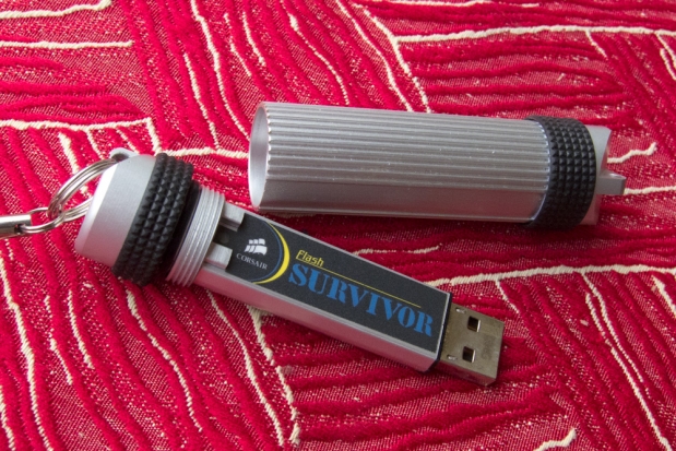
the Corsair Survivor is a near-bulletproof USB drive. Perfect for backups!

 As some of you will know, I'm currently travelling around the world for a few months, and I'm writing this from a rather lovely balcony outside our hotel in Hoi An, Viet Nam.

As a traveller, I'm worried about many things; I've had a ton of vaccinations, I'm on malaria medication, and you're living with a healthy suspicion of the food you're eating (no problems so far; knock on wood). There is one thing that is a bigger worry to me than any of this, however: Losing my data.

I've written about my backup routines when I'm back home in the past, but when you're on the road, you're living with all sorts of other challenges. My internet connection is slow and flakey at best (non-existent at worst), and Vietnam's government has taken to blocking various websites (including blocking Facebook). Given Egypt's most recent insanity (blocking all internet access for the whole country) and the ongoing shenanigans of China's government... Basically, it's not safe to assume that you'll be able to take backups in the cloud whilst travelling.

So, what else is a poor traveller to do? As a writer and photographer, I cannot risk losing all the photos I've taken, and the work on the books I'm currently writing on.

Offsite backups, on-site

My solution goes a little bit like this: Every day, I take a back-up of my stuff, using Apple OS X's built-in backup solution, Time Machine. I take this back-up onto a fantastic little drive, the Iomega eGo Helium. It's a tiny, palm-sized, USB-powered 1TB harddrive, that cost a paltry $130 from Amazon - certainly one of the better investments I've made.

Because of the way Time Machine works, I know I'll have a completely up-do-date copy of my entire system, my software, my writings, pictures, music, and all my financial information (even though I keep my finances and accounts in the cloud using Xero anyway, it's good to know that I have a separate backup, too) on that little big hard drive.

Whenever I leave the hotel, I take the hard drive with me: It lives in my day-pack, which I 'lock' (i.e. use the waist strap to fasten it) to the table, chair, or motorbike wherever I go. This means that my back-up drive is probably safe. It'd better be: I also keep (some of) my travel money and my passport in that backpack. Meanwhile, back at the hotel, I have all my data on my laptop, either hidden in the hotel room, or locked in a hotel safe, if there is one.

The idea is this: If I lose the backup drive, I can buy a new one, and go back to keeping backups. If I lose my computer (i.e. it gets stolen, or it breaks in one way or another), I have to find an Apple store and buy myself a new one. It'd be expensive, but that's what travel insurance is for: And all my data would still be safe on my laptop.

What about when you are with your laptop?

There are times, obviously, where me, the backup drive, and the laptop will necessarily have to be in the same place. When I'm flying, for example, I make sure that the hard drive is in my checked luggage, whilst my laptop is with me.

When I'm sleeping, the Iomega drive lives under my pillow - next to my passport and a spare credit card. The idea is that even if somehow a thief manages to steal every single other thing I own, I still have my data, a way of getting out of the country, and a credit card to help me solve any bad problems.

What about the really important files?

I have a small subset of files that are so important that if I lose them, I'm buggered. It includes the manuscripts to my unpublished books, copies of my passport and credit cards, all that sort of fun stuff.

Those files are about 2GB in size in total, and I back them up religiously: They are automatically backed up to DropBox, an online backup service, whenever I do have an internet connection. In addition, I back it up to a Corsair Survivor, a shock-proof, water-proof, and extremely rugged USB thumb drive. It lives in my pocket, and looks inconspicuous enough that I think I should be able to hang on to it even if I were robbed (knock on wood) in the street.

Finally, I e-mail manuscripts in progress to my Google Mail account whenever I have an internet connection.

Dude, are you paranoid or something?

Probably. But I think this is one of the situations where the phrase "Better safe than sorry" comes in ringing true.

I decided to be paranoid after doing the worst-case-scenario maths: If I were to lose my data and my laptop at the same time, the only way I can continue working and get the books done before deadline, is to get on a plane back to the UK, get my backups from storage, buy a new laptop, restore it all, and head back to Vietnam. It would cost me thousands and thousands of dollars - and probably cost me at least of week of time.

Put simply; if the worst were to happen, I probably wouldn't be able to afford to continue my nomadic lifestyle - which I'm rather enjoying at the moment, and would like to continue for a while!

This article was first published on Small Steps, my travel blog.


Do you enjoy a smattering of random photography links? Well, squire, I welcome thee to join me on Twitter -

© Kamps Consulting Ltd. This article is licenced for use on Pixiq only. Please do not reproduce wholly or in part without a license. More info.


From Hipstamatic to Kodachrome

Faroese Whale Hunt, Adam Woolfitt

Two exhibitions are drawing to a close next week, which, if you happen to be in London and have a bit of time to spare, it’s worth dropping in to take a look. Given what they’re displaying, they also make an interesting compare and contrast exercise.

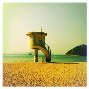
You might want to start with Hipstamatics at the Orange Dot Gallery in Bloomsbury. Six inch by six inch pictures taken on a mobile phone, where blue takes on a green hue, greens look yellow, and yellows turn orange. Even if you took the picture yesterday, it can look as if you pulled it out of a shoebox of prints you found in your attic.

Cara Gallardo Weil

Then head down to Shoreditch, to the Association of Photographers Gallery, where there’s an exhibition celebrating the colour-perfection produced by the now-discontinued Kodachrome film; from seas dyed red with blood to desolate railway tracks extending across the plains. There’s a selection of images from AoP members, as well as the public, and you can even walk away with one of Adam Woolfitt’s slides. (Mine’s of a butterfly.)

Ian Dawson

Some people might say it’s unfair to mention them in the same breath. Think of it this way, though: It’s a quick reminder of the diversity of photography, from how pictures are taken, to who takes them, to how they’ll look, maybe even to why we take them. Enjoy what you can do with a camera.

Hipstamatics is showing at the Orange Dot Gallery, 54 Tavistock Place, London, WC1H 9RG until Friday 11 February.
A Celebration of Kodachrome is showing at the Association of Photographers, 81 Leonard street, London, EC2A 4QS until Thursday 10 February.

(Featured image: Faroese whale hunt by Adam Woolfitt.)