Reviews

42nd Street Photo: One to Avoid

New York is a city that's the home to many a fantastic photographic retailer. Between the rather fantastic B&H, the solidly competent Adorama, and - if you're going to shop online anyway - the ever-reliable Photo & Video section at Amazon, there shouldn't really be any reason to go anywhere else... ...As aptly confirmed by the nightmare of an ordering scenario a friend of mine, Sarah, had just before Christmas at the tail-end last year.

What happened?

Sarah lives in London, but her parents live in California. She decided to order a couple of cameras (given how much cheaper camera equipment is in the US, that makes sense), and have it shipped to her parents address. Sound pretty straightforward, right?
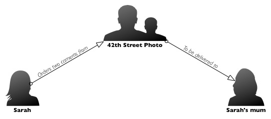
kerfuffle.jpg

It probably would have been, if it hadn't been for the fact that she decided to try and use 42th Street Photo to place her order. Here's what happened;

On December 17, Sarah ordered a Canon Powershot S95 and a Canon EOS Rebel Digital T2i, but because her shipping address (in California) was different from her invoice address (in London), the order was blocked. Fair enough, I suppose, there's a lot of credit card fraud out there.

Dodgy card charges

So instead of trying to confirm with Sarah that this was a genuine order, they call the shipping address, where her mother answers the phone. Now, I don't know much about credit card security, but it sounds to me as if they are worried about that, they should call the invoice address - not the shipping address. I'll leave this thought for you: If you were a fraudster, would you be at the shipping or the invoice address? Exactly.

Interestingly enough, Sarah's card was charged on Friday December 17th, so they clearly didn't care much about the security anyway. Also, by the time the 18th rolled around, the order status on 42 Photo had already updated to 'shipped'. So why did they call? Well.. when they spoke to Sarah's mother on the 21st (four days after the card was charged and the cameras had supposedly shipped), they tried to upsell to faster shipping (even though their website, they said that shipping was only going to be 'less than 10 days') so the order could get there in time for Christmas. Then, they tried to add memory cards to the order, stating that "the camera wouldn't work without them".

Weird upselling

Parents come in all sorts of shapes and sizes - and amounts of photography knowledge. It just so happens that Sarah's mother's photography knowledge is, well, shall we say, somewhat lacking. So when somebody calls her and tells her that Sarah must have made a mistake, and that she must have forgotten to order a piece of the camera which is needed for it to work, what should she do?

I find it curious anyway, that a phonecall to someone at a delivery address should potentially be enough to add additional charges (shipping; memory cards) to a credit card that was already charged and authorised via a website, but that's by the by.

In addition, if you check the 42nd street Photo website, you'll find their terms and conditions state "Although you have received an email confirming your order, we do not charge your credit card until the item is ready to be shipped and all customer adjustments if any are applied" (emphasis mine). Since the card was charged on the 17th, and 42 street Photo started calling Sarah's mother on the 21nd, that was clearly ignored as well.

Shipping... Too late.

Then, eventually, Sarah receives a shipping confirmation on the 22nd of December, via UPS, stating that the items had been shipped, and were scheduled to be delivered on December 30th - 3 days later than expected.

Now, most people are perfectly happy to wait for another three days, but there was an itsy-weeny problem: Sarah was going to leave the country on the 29th, and needed her cameras with her. Since the order was placed on the 17th, and the 42 Street Website promised a 10-day delivery (at most), Sarah figured she would have a couple of days leeway. Instead, the cameras would arrive two days too late.

What have we learned?

Between the slow shipping (5 days to ship an order of cameras that are marked in stock?), charging the credit card too early, breaching their own terms and conditions, trying to upsell memory cards and shipping (the latter, presumably, to cover their own ass for being too slow in shipping the items in the first place), trying to get a person unrelated to the transaction to authorise additional spending on a credit card, rude one-line replies to genuine customer service woes, and an apparent lack of care about fraud prevention...

I don't know about you, but I don't think I'll be turning to 42 street photo for my photography needs in the future.

Book review: The Focus series from Lark

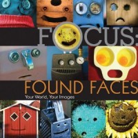
Lark Foudn Faces

Ooh, I’ve just been flicking through a series of photobooks that I’ve found, well, delightful, I suppose. (I’m trying not to sound too much like a Jane Austen character describing afternoon tea taken with her newest female confidante.) Anyway. They’re the Focus series, published by Lark. They picked some themes, they got involved with some photo-sharing communities, and then they produced some books. Simple.

The result? Five themed photobooks: found faces, letters, love, passages, and reflections. I honestly couldn’t choose which book I like best. Letters makes me want to pick up my camera and race off into my little corner of east London, hunting down random qs and sleeping zs. My soft-spot for reflections is well known, so that’s an easy score with me. And as for found faces – pictures of mundane, or not so mundane objects, that mysteriously look like faces, from surprised eggs in an egg poacher to miserable looking handbags – it just makes me smile. Yes, even when I look at the grumpy ones.

As the images have been drawn from photo-sharing communities, they come from all over the world and have different attitudes and perspectives. You’re not confronted with one photographer’s quest to shoot the perfect door, or an exploration of images of love from someone who’s disgustingly smitten. There’s variety – and inspiration – in many different forms.

What’s more, these books are worlds away from pretension. There aren’t acres of text from the photographers, explaining what they were attempting to convey through the photo, how it made them feel to shoot the images, and what they went on to have for lunch afterwards. They’re just collections of images bound by a common theme and presented with the photographers’ names, the images’ titles, and where they were taken.

Okay, so occasionally there is a sentence or two of blurb to add some context, but nothing gushing. Something like this: ‘This image was shot in a place called Graffiti Alley. The entire alley is a painter’s canvas, and it changes on a daily basis.’ The focus (ahem) really is on the pictures.

The Focus series are cute and quirky and bursting with gorgeous images. They make super presents; even if the recipient isn’t a photographer she or he would have to be a pretty miserable sod to not appreciate the fun images. And if you’re looking for a bit of inspiration for a photo project of your own, you’d do well to take a look.

They’re all available on Amazon, and they’re all under £10 (or US$15); go and peruse.

Review: SeaShell SS-1 Underwater Housing


A nudibranch (colourful sea slugs!)

Life, as most of us are all-too-well aware, can be rather surprising and unpredictable at times. A great example of this was exactly two months ago, when my girlfriend and I left Bangkok to go to Koh Tao - a tiny island in the bay of Thailand - to go do our Open Water dive certification.

Long story short - it's two months, nearly 70 dives, and a whole lot of exams later, we're still on Koh Tao, and I am about to complete my PADI Divemaster certification. Needless to say, I sort of fell for this diving malarkey.

So, what is a poor photographer to do, when you rock up on a little island that doesn't do internet deliveries, and only has a limited number of camera shops? You try your damndest to get the best photos you can with the equipment you have available. In my case, I had a beautiful Canon PowerShot S95, but no underwater housing...

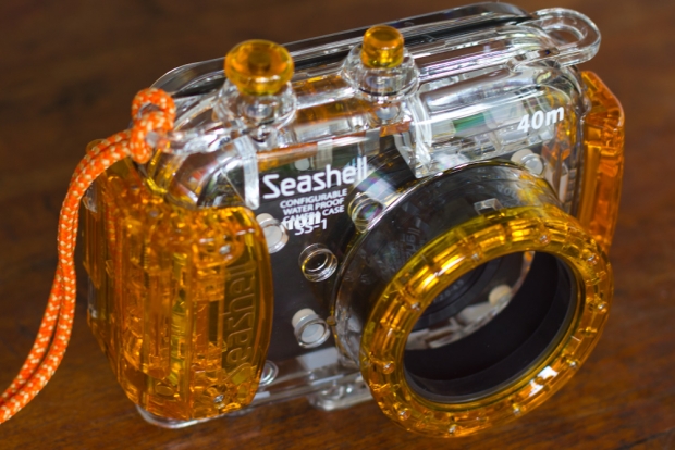
The local shop did have a curious little creature, though: An 'universal' camera housing for compact cameras, made by a company I'd never heard of: SeaShell.

haje_jan_kamps_20110228_img_5166.jpg

How it works

I was rather sceptical at first... Was I really going to put my several-hundred-dollar highly cherished camera at risk by shoving it into an 'universal' camera body? I decided that yes, it would be worth a shot, so I bought the housing for 6,800 Thai Baht (Around £140 / US$225).

The first thing I did was to close the housing and take it to 18 meters for about 15 minutes. It turns out it was as water proof as I had dared hope for... So it was time to put my camera inside.

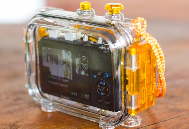
The SeaShell SS-1 only has two buttons, and both are at the top. It allows you to control a power button and the shutter, only. It sounds very limiting, but it turns out that, just to snap some snapshots under water, it's all you need. This two-button limitation is also the reason why about 25% of cameras don't work in the housing: If the power button is a slider, or is placed too far away from the shutter release button, the camera housing's little rods can't move it (or reach it).

Setting up the housing

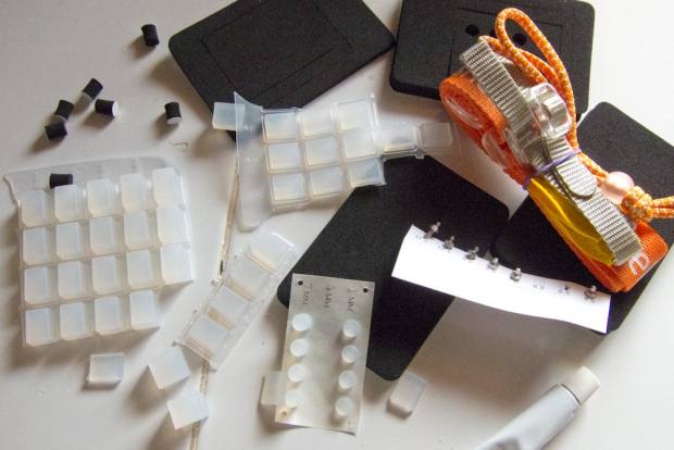
Before you can use the housing, you have to set it up. That sounds like it should be easy, but the manual is next to completely bloody useless, and instead I resorted to trial and error. The SS-1 comes with a metric boatload of little rubber feet of different thicknesses. You have to use 12 different rubber feet (2 at the front of the camera, 2 on each side) to attempt to make your camera fit snugly inside the camera housing.

haje_jan_kamps_20110228_img_0868.jpg

Next, you need to adjust the buttons so the camera housing's buttons align with the buttons on your camera, by using a tiny little wrench and a nut to move the button pistons left, right, and front and back. It all seems just a little bit fragile, and fiddly to set up, but - as we'll see in just a minute, it does actually work pretty well.

In use

In underwater photography, you're taking photos in a medium that's 800 times more dense than air, and that robs your subjects of their color. Reds start disappearing at about 5 meters, and are all but gone a few meters deeper - depending on how turbid the water is etc. As such, you want to get as close as possible to your subject, to ensure there the light has to travel as little as possible before it hits your camera's sensor.

haje_jan_kamps_20110228_img_5167.jpg

Imagine, for example, that you are 5 meters down, and 2 meters away from your subject - suddenly, light has to travel 7 meters before you can capture it, and your reds are just about gone.

Having to get really close is the main reason why this housing works pretty well: You won't have access to your zoom buttons, but who cares: The Canon Powershot S95 has better apertures when zoomed fully out anyway - so you may as well leave it zoomed out, and get close.

Of course, since you'll be spending most of your time under half a meter from the things you're trying to photograph, you have to be a pretty good diver. It's bad practice to touch the corals and wildlife, so perfect buoyancy control and good control underwater in general is an absolute must - but then that's true for any underwater photography.

The biggest downfall with the SS-1 in combination with the Canon S95, is that the S95 has a flash that pops up, but the housing is too small for the flash to have enough space to do so. This means that you're limited to natural light photography, which turned out to be a blessing and a curse.

It's a lot harder to get photos that look 'correct' without using a flash, but I ended up writing a camera profile for Lightroom that matches the Canon S95's underwater profile, and the fact that the S95 shoots in RAW helped hugely - I was able to recover the reds even from relatively deep depths (12-16 meters), where the human eye can't see them, but the camera somehow managed to record the colors anyway.

Compared with an official housing

I met someone here on the island who had a S95 as well, and he had the original Canon underwater housing for the camera. Whilst I was envious of his additional control and the ability to use flash, it did look as if my photos were as good as his - and in some cases better.

Verdict

I'll be honest with you - the Canon WP-DC38 (the official underwater camera housing) doesn't cost that much more than the SeaShell SS-1 (list price is $240, you should be able to find them much cheaper - on Amazon, they're currently going for $180), and if I had the choice of one or the other, I would have put down the extra cash to buy the official housing.

On the other hand, the SS-1 can be reconfigured to fit any number of digital compacts, and whereas the official housing would be useless with another camera, the SS-1 would probably still fit, and you can keep snapping pictures.

The truth of the matter is that there was no way the official housing was going to be available on a little island like Koh Tao. Realistically, the choice wasn't between an official housing and the SS-1, but between the SS-1, and not being able to take any photos at all. Seen from that point of view, I'm pretty happy I bought the SS-1. It kept my camera safe under water, and the quality of the pictures I was able to capture


Do you enjoy a smattering of random photography links? Well, squire, I welcome thee to join me on Twitter -

© Kamps Consulting Ltd. This article is licenced for use on Pixiq only. Please do not reproduce wholly or in part without a license. More info.

Sending postcards from your iPhone with ShootIt


Using your own photos as postcards? Genius! Shame ShootIt's service doesn't work...

There are a few providers who offer the ability of sending postcards directly from your Apple iPhone (or the web) when you're out and about. I decided to give ShootIt a shot (forgive the pun), because their app seemed particularly sleek, and because I'm currently travelling a lot; seemed to make a lot of sense to trust the web to get my cards sent quickly, rather than relying on the local postal system.

ShootIt (shootit.com) have a clever business model: You upload an image via the iPhone app or their website, write your message, and click 'send'. They take care of the rest, including the printing of the postcard, and, as they say on their website, "shoot it! mails postcards First-class the next business day", which means "they will be produced overnight and delivered across Western Europe in just a few days".

Tragedy strikes

Whilst I was travelling, my family suffered a minor tragedy - my grandmother, who turned 90 last year, got ill, and it didn't look as if she would be able to pull through. My father asked me if I would please send a few postcards from my travels, as grandma - who usually was very active - would be locked to her chair and/or bed for the foreseeable future (in retrospect; for the rest of her life).

Anyway, I figured that the best way to start sending a lot of cards would be to leverage ShootIt: By taking photos and sending postcards frequently, they would arrive much, much faster than sending them by snail mail, right? So there I went, sending a total of 5 post-cards between February 1st and 18th.

Then, an inevitable, yet sad sad thing happened; on the 21th of February, my grandmother passed away. I called my parents, and asked them if they could please place my postcards on her coffin during the funeral. "Postcards?", my dad asked me. "What postcards?". It turned out that by the 21st of February, not a single one of the postcards I sent via ShootIt had arrived. Luckily a postcard I sent in the regular (notoriously unreliable) vietnamese postal system around the 4th of February, arrived just in time for the funeral, and I was able to 'be present' via a postcard after all.

"The postcards were all addressed perfectly", I thought, "Why the hell weren't they delivered?". Then, Daniela (who edits the Small Aperture site) e-mailed me to thank me for her ShootIt postcard... on the 11th of March. It was sent on the 4th of February - so the postcard took a mind-numbingly month-and-a-week to arrive to the UK.

As for what happened to the postcards sent to my grandmother in the Netherlands? Who knows - as far as I know, they're still scurrying their way across the atlantic.

ShootIt? More like 'shove it'.

It's such a cursed shame; post-cards sent from your iPhone (or computer) is cost-effective, and ought to be bloody fast. But when it ain't (and especially since none of the messages I wrote to my grandmother arrived before she passed away), it's useless.

If anyone knows of a service who does what they promise, it may be worth a shot - but I'd give ShootIt a miss, if I were you.

Update #1

I just received an e-mail from my mother, who tells me that 5 postcards arrived all at the same time on the 17th of March. She tells me the quality is great, but notes that " This is sort of like it used to be many years ago: You buy the postcards in the country where you are on holiday, forget to post them, and then send them when you get back home, with your normal stamps. Although that would probably have been faster than using the online service".


Do you enjoy a smattering of random photography links? Well, squire, I welcome thee to join me on Twitter -

© Kamps Consulting Ltd. This article is licenced for use on Pixiq only. Please do not reproduce wholly or in part without a license. More info.

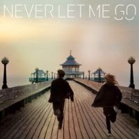
Never Let Me Go

Never Let Me Go

Mostly because I can, I thought that I’d treat you to something a tiny bit different today. My brother was giving me his review of Mark Romanek’s latest film, Never Let Me Go, the one based on Kazuo Ishiguro’s novel, and starring Andrew Garfield, Keira Knightley, and Carey Mulligan and he was doing it so well I thought that you guys might enjoy it, too. So without further ado, here’s what the young Mr Bowker has to say about it. It’s not particularly spoiler-y, but there are some key plot elements in it. Just so that you know.

Last Monday (yes Valentine’s day, no not in a romantic context) I went to see Never Let Me Go. I went in a group of six people and to say opinion was divided wouldn’t be, well inaccurate. Three people liked it, a lot, three did not; I was one of the latter.

The film focuses on the lives of three characters, Kathy, Tommy and Ruth (portrayed by Carey Mulligan, Andrew Garfield and Keira Knightley, respectively) and their lives as people cloned for the purpose of becoming organ donors. Specifically, it focuses on the love triangle between these three occurring over three decades, beginning in 1974, moving to 1984 and then finally 1994.

For me, skipping between decades, while necessary for the plot, didn’t encourage any great emotional connection with the characters, so I found their tribulations boring. I had no stake in them. I thought the film was too short to get to the bottom of the relationships properly; perhaps if it had taken time to build the characters and make them more multifaceted with more layers to find interest in I would have found myself more engaged.

The film’s based on a book, and a few of the differences between novel and script seem to have had an influence on the portrayal of the characters. The most important difference is the addition of tracker wristbands in the film. In the film the characters are kept captive to their lives by these wristbands that, ehm, keep track of their whereabouts; in the book they are nonexistent, leaving more room to play with the concept of freedom and captivity as a major plot device.

Of course, if this had been in the film, it’s possible that many people would have gone away thinking it was a huge plot hole saying ‘Well, why didn’t they just run away?’ but if the film were based around the concept of freedom, choice and the ethics of breeding clones to be used as organ donors (which was only covered briefly towards the end of the film) it would have been far more impressive. At least, I think so. It seems to me the writers have taken a thoughtful and contemplative book and reduced it to a simple story of a love triangle.

As for the cinematography, I thought it simple but effective. It matched the story line well; when the characters were young and carefree it was bright and sunny, but as the story progressed and their lives seemed more bleak so to did the visual side of the film. (I probably would have found it even more impressive if the projection had not been awful, with wiggly green and black lines flickering down the screen for much of the film.)

The shots didn’t come over as too artsified, with needless bokeh or camera glare, either (not that there is much opportunity for either of those things in any of the scenes). The camera work simply tells the story, which is no mean feat. On many occasions, art is what you leave out rather than what you try to cram in; restraint and skill can go hand-in-hand. And Never Let Me Go is definitely restrained and all the more beautiful for it. Still, it is pretty hard to make things ugly when they’re filmed on the Norfolk and Sussex coastlines, not to mention the St Andrews University campus.

In conclusion, while the film was pretty, it was far too one dimensional and didn’t quite do enough for me intellectually or emotionally. It felt as if there were something missing, and as if things moved a bit too fast. It all trundled along in an inevitable fashion to the conclusion you knew it would have from early on. It’s by no means a bad film – and it is definitely very beautiful – it’s just disappointing, because it could have been very, very good.

(Guest written by Josh Bowker.)

Hoppé Portraits: Society, Studio and Street

Tilly_Losch

It’s not often that I come out of an exhibition buzzing. Oh sure, I might smile quietly to myself and think that there were worse ways to spend an hour or so, but to feel, well, inspired maybe, or perhaps even exhilarated by something? That’s a rarity. It happened this morning, though. The NPG and their guest curator Phillip Prodger have brought together a super collection of images to make Hoppé Portraits: Society, Studio and Street a gem.

The earlier part of Hoppé’s career was devoted to studio portraits, and these form the first half of the exhibition. Cecil Beaton referred to Hoppé as ‘The Master’; these pictures make it easy to appreciate that epithet. Every picture gives you a clear sense of who the subject is, what she or he is like. Hoppé made it a part of his work to get to know the people he was photographing: he studied politicians’ speeches, he watched ballerinas dance, he read authors’ books. More than anything, he spoke with them.

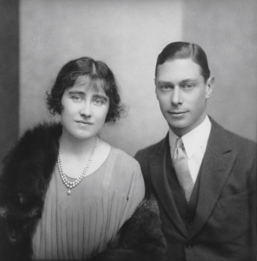
Duke and Duchess of York, 1923, © 2011 Curatorial Assistance, Inc. / E.O. Hoppé Estate Collection

He was able to leave behind Victorian pictorialism and embrace a more modernist approach to portraiture and still convey just who his subject was and what was important to her or him. The engagement photo of Lady Elizabeth Bowes-Lyon to His Royal Highness the Duke of York, who would later become Their Majesties King George VI and Queen Elizabeth, is a picture of a slightly diffident, somewhat nervous young couple. They’d grow into a formidable couple, but they weren’t there yet.

Then there’s Margot Fonteyn, taken when she was 16. She wasn’t famous yet, she’d only just danced her first big part. But she knew she was good. There’s a self-assurance in that portrait, taken incidentally when Hoppé had mostly stopped doing studio portraits and was concentrating on street photography, that can stop you dead in your tracks.

Margot Fonteyn, 1935 © 2011 Curatorial Assistance, Inc. / E.O. Hoppé Estate Collection

However he did it, Hoppé managed to bring out the personality of their subjects. Just so.

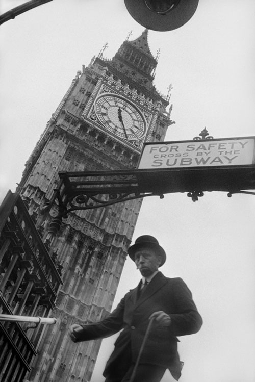
But Hoppé grew a bit bored with the studio, so he moved into the street, and that’s the second half of the exhibition. You’ve candid shots taken using a Kodak Brownie (it had the quietest shutter) concealed in a paper bag and more traditional street portraits. They’ve a mixture of humour and intense dignity. The lighting that quite clearly accentuated a lady’s bum as she exited a tube station made me smile; the photo of two men sleeping rough in Trafalgar Square highlighted their desperation but didn’t degrade them.

Westminster Underground Station, 1937 © 2011 Curatorial Assistance, Inc. / E.O. Hoppé Estate Collection

These pictures give you a real sense of how London was and who the people who lived there were between the wars. This is that slice of life that you want street photography to be.

Hoppé was quite clearly interested in people, and this shines through, whether he’s exploring different ‘types’ of people or by compiling his collection ‘Fair Women’ in 1922. That one ruffled a few feathers: for Hoppé, a beautiful woman could come from any class and have any skin tone. It wasn’t exactly received wisdom at the time, though. But portraits are about people and this exhibition gives you a masterclass in them.

There hasn’t been a major exhibition devoted to Hoppé in over 30 years. It was worth the wait.

Hoppé Portraits: Society, Studio and Street runs from 17 February to 30 May 2011 at the National Portrait Gallery, St Martin’s Place, London, WC2H 0HE.

(Featured image: Tilly Losch, 1928, © 2011 Curatorial Assistance, Inc. / E.O. Hoppé Estate Collection)

From Hipstamatic to Kodachrome

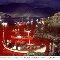
Faroese Whale Hunt, Adam Woolfitt

Two exhibitions are drawing to a close next week, which, if you happen to be in London and have a bit of time to spare, it’s worth dropping in to take a look. Given what they’re displaying, they also make an interesting compare and contrast exercise.

You might want to start with Hipstamatics at the Orange Dot Gallery in Bloomsbury. Six inch by six inch pictures taken on a mobile phone, where blue takes on a green hue, greens look yellow, and yellows turn orange. Even if you took the picture yesterday, it can look as if you pulled it out of a shoebox of prints you found in your attic.

Cara Gallardo Weil

Then head down to Shoreditch, to the Association of Photographers Gallery, where there’s an exhibition celebrating the colour-perfection produced by the now-discontinued Kodachrome film; from seas dyed red with blood to desolate railway tracks extending across the plains. There’s a selection of images from AoP members, as well as the public, and you can even walk away with one of Adam Woolfitt’s slides. (Mine’s of a butterfly.)

Ian Dawson

Some people might say it’s unfair to mention them in the same breath. Think of it this way, though: It’s a quick reminder of the diversity of photography, from how pictures are taken, to who takes them, to how they’ll look, maybe even to why we take them. Enjoy what you can do with a camera.

Hipstamatics is showing at the Orange Dot Gallery, 54 Tavistock Place, London, WC1H 9RG until Friday 11 February.
A Celebration of Kodachrome is showing at the Association of Photographers, 81 Leonard street, London, EC2A 4QS until Thursday 10 February.

(Featured image: Faroese whale hunt by Adam Woolfitt.)

Fracture: pictures printed on glass

Screen shot 2011-01-31 at 14.16.06 How does having your photos printed on glass sound to you? A minimalist photo-and-frame-rolled-into-one deal, if you like. It’s what the guys over at Fracture can do to your pictures. No, there’s no paper involved; the image goes on the glass. No, I’ve not a clue how they do it. But I really wanted to know what they’re like, so I checked them out.

Fracture was dreamed up by Abhi Lokesh and Alex Theodore in summer 2008. They happened to be in Swaziland at the time, but they’re not anymore. Now they’re back in the US and run a very hands-on team of ten, printing, packaging, and mailing people’s photos on glass. No, no robots there. Knowing all these important details, and more – such as Abhi’s love of peanut butter – I sent three of my images for fracturing.

Hanging on the wall, they look as if they're floating

It was all rather easy. You upload your images (or you can email them), you choose the size of your prints (with a handy wineglass for comparison), you edit your pictures a bit if they need it, you select a border from about a billion options if you want one (I didn’t), and then you pay. At $12 for a 10″x8″ fracture, plus shipping, I thought it was quite reasonable. There are plenty of options, though; things start at $8 for a 7″x5″ and go up to $25 for a 14″x11″. They can be square, too. Oh, and then you wait with bated breath for your fractures to arrive.

In its packaging

Taa-dah!

Foamy protection and a hook for hanging

Did I like them? Definitely. The colours are great and when mounted on the wall, which is super-easy as the hook comes along with the picture, it looks as if it’s floating. There’s an option to have them mounted on a stand, too, and that looks pretty cool.

A stand-mounted Fracture, in the living room at the Small Aperture mansion

Would I order some more? Absolutely.

Fracture, pictures printed on glass.


Disclaimer: Fracture provided me with three prints gratis for the purposes of this review

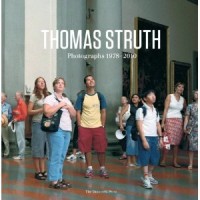
Book review: Thomas Struth Photographs 1978-2010

51tXODOr9EL._SL500_AA300_

Thomas Struth is one of Europe’s most exhibited and collected photographers. I got myself pretty excited about reviewing this offering from the Monacelli Press that showcases several of his series of work: cityscapes, family portraits, images of science and technology, museum photos, and nature pictures. There are also some essays examining Struth’s work. This is one hefty book. Does it live up to its weight?

I have a soft-spot for cityscapes and architectural photography. Why? I don’t know why. Why do I prefer lemon ice cream to vanilla and why don’t I like chocolate at all? But Struth’s cityscapes left me cold. What was I looking at? What was he trying to convey with his perfectly centred images of tower blocks? I’m really not sure. Nothing in these pictures, to me, conveyed the sense of place, the interaction of the people who live and work there, any feeling of vibrancy. They were just images of tower blocks. (Albeit one of them is in Pyongyang, which I thought was impressive.)

These empty and cold cityscapes did form an interesting juxtaposition with his images of museums and places of worship. These photos are full, busy. They depict school groups looking bored in the Louvre and people eating their lunch on the steps outside the Duomo in Milan. It’s not how you expect to see these places photographed, and that in itself is thought-provoking.

The images of science and technology are interesting, but they are not exactly anything that I’d be rushing to hang on my wall. In some instances they make good documentations of places or things, but that isn’t what I expect from fine art photography. It just a bit too, well, mundane, for me.

Struth’s famed for his family portraits and I was hoping that they would elevate my enjoyment of the book. Supposedly, he uses them to explore underlying social dynamics. Maybe I was missing something, but they looked pretty much like family portraits to my eye. I couldn’t detect whatever statement it was that Struth was trying to make.

So did the essays clarify anything for me? I thought that I was going to drown in the gushing hyperbole that one of them was spewing forth like an over-active geyser. They somehow managed to leave me feeling somehow inferior for not appreciating Struth’s work. That probably wasn’t the aim, but it was the outcome.

As a book, it’s a beautiful presentation of Struth’s work. If you like his photography, you’ll relish it. But what if Struth’s photography doesn’t set your heart racing and you struggle to connect with it? It’s one of those books that you’ll feel that you ought to like, but just can’t bring yourself to. It’s one of what my brother – who’s a musician – and I refer to as our ‘innocent pains’. My brother has Bach. It seems as if I now have Thomas Struth to add to Die Zauberflöte.

Thomas Struth Photographs 1978-2010. Published by The Monacelli Press and available from Amazon UK and Amazon US.

My best from 2010


A realy fun photo shoot outside a public swimming pool

One of the great things about a new year is that it gives you a bit of time to breathe and consider what has happened over the past 12 months. Myself, I like going back over the photos I've taken over the past year, and have a look at what I've  learned. 

I'm just going to throw this gallery out there - have a poke around (and follow me on Flickr if you're interested in keeping up to scratch with what I'm up to, photographically), and have a dip into your own archives. Who knows what lovely memories it brings up!

Stay awesome, keep snapping, and have a well-exposed 2011!

~ Haje


Do you enjoy a smattering of random photography links? Well, squire, I welcome thee to join me on Twitter -

© Kamps Consulting Ltd. This article is licenced for use on Pixiq only. Please do not reproduce wholly or in part without a license. More info.

The photos of our year

Haje's niece

Although you might know all of us here more by our words than by our photos, we are all photographers and we wield our cameras with overwhelming levels of enthusiasm. This of course produces prodigious quantities of pictures. You might get to see some of them alongside our articles, but we don’t tend to talk about them much. So to wrap up 2010, we thought that we’d let you see the world through Team Small Aperture’s photographic eyes. These are our favourite pictures that we’ve taken this year.

We hope that next year’s pictures will be even better. But until then, we all wish you a happy, healthy, and peaceful New Year.

Daniela

I’ll let you into a secret, I almost deleted this photo. No, not accidentally, but deliberately. Honestly.

I took it in a bead emporium in the souk in Marrakech. Immediately after I’d taken it, I didn’t examine it that closely because I tried not to draw too much attention to myself and my camera. It’s not exactly discreet to stand around critiquing your own work in a bustling market. Later in the evening, when I did stop to look at it, I was a bit disappointed. I’d not really captured what I wanted, but seeing as the chances of me finding that particular bead shop again were slim-to-none, I held on to it.

Back in the UK, where mint tea and haggling over leather goods were but a distant memory, I began to sift through my photos properly. Suddenly, somehow, the picture looked different. The colours seemed vibrant and the depth of field was intriguing. I actually liked it. I even liked it enough to have it printed. It’s on the wall of the library in the Small Aperture mansion. It’s a reminder of an awesome trip, and not to make hasty decisions.

Matt

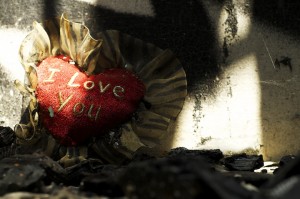
It was honestly really hard to choose. I feel this is my favourite because it is one from my first series, Our Choices, which is a series of four photographs that depicts the choices we make as human beings, and the possible repercussions that can come with them.

Burning My Heart explores our emotional need as human beings, to be loved. Even though our emotions most certainly have been ‘burnt’ repeatedly by failed relationships, we continue to seek out other relationships, searching for our ‘one true love.’

Although, the photo may appear staged, it is not. All the photos in this series were hunted for months until I found the perfect image that I felt best showcased my ideas. You can take a look at all of them here.

David

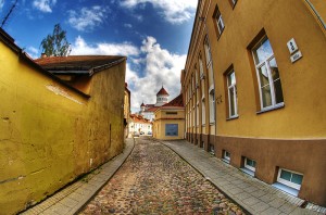
I have a few favourites from 2010, but this one is definitely at the top of my list. This photo was taken on a random side street in Vilnius back in August. I went to Lithuania with my girlfriend to visit her mother. It was my first visit there and it was amazing.

What I love about this picture is that it describes Vilnius exactly how I remember it… the narrow cobblestone streets, the beautiful architecture of the churches, and just the overall feel you get of being in Lithuania. I can’t wait to go back again and I hope to in 2011. More of my Vilnius pictures are here!

Gareth

I found it nigh-on impossible to pick my favourite image I’ve taken this year. To clarify, I don’t mean that in an egotistical way – I didn’t sit at my laptop, scrolling through countless images, crying ‘but they’re ALL magnificent!’ What actually happened was I spent a miserable morning picking holes in every single image I’ve taken, thanks to my somewhat self-critical approach to reviewing my own work. To resolve this, I decided to go for the image that I remember being the most excited about before, during and after the shot itself.

This was a promotional image for a female wrestler who wanted to look simultaneously strong and feminine. The idea actually came to me on the day of shooting, moments before my client was due to arrive. It turned out exactly as I’d hoped – a spot of superheroine magic combined with evoking ideas of weightlifting and strength. The magic dust (also known as bread flour) created this perfect arc just as I hit the shutter release, so a combination of sudden inspiration, a great model to work with and a spot of luck makes this my favourite shot of the year.

If you fancy looking at some more of my pictures, you’ll find them here.

Haje

This is one of my favourite photos of 2010 – it came about more by luck than by anything: I was at the top of a climbing wall, and my niece was climbing up, too. I took a photo, and then realised that the light was absolutely gorgeous. So I kept snapping. She was a fast climber, and I only had about a minute to get the shot, but what came out was entirely worth it.

You can find more of my ‘best of’ on Pixiq.

Book review: Haunted Houses

Haunted Houses

A couple of weeks ago, I mentioned the deserted villages that lie scattered across the British countryside, and how I thought that they could make beautiful photo subjects, a slightly different take on urban decay. Following on from that, someone mentioned to me that I might want to take a look at Corinne May Botz’s book Haunted Houses. Now, I don’t usually go in for the mystical or spiritual, so I wasn’t entirely sure what I was letting myself in for, but I shall admit to being pleasantly surprised.

Whilst the theme that unites all the pictures in the book is that they are of haunted houses, and there are ghost stories interspersed amongst the images, that’s as far as the spookiness factor goes. Nothing is shot so as to convey eeriness or document strange goings-on. What you have, really, is a book of sumptuous photographs taken at over 80 houses, some abandoned, some inhabited, across the United States.

Botz sets the scene with some gorgeous landscapes and some lovely architectural shots, but where the book really comes alive is when she focuses on interiors, and pays attention to the little details. You get to see books scattered by bedsides, paint peeling on staircases, tables set for supper. For a book about something that supposed to be other-worldly, it has a very human element to it.

My personal favourite is the corner of a four-poster bed canopy reflected in a dressing table mirror, but then I’ve said before how much of a sucker I am for photos that use reflections. Still, page after page, I found myself appreciating Botz’s use of light and shadow in her photos.

Yes, I can see how some people would dismiss the book as some gushing hybrid of a luscious interiors’ magazine and a millionaire’s estate agent’s brochure. True. But don’t overlook it. For the right person, this book is perfect on their coffee table.

Haunted Houses, by Corinne May Botz. Published by The Monacelli Press and available from Amazon UK and Amazon US.

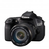
Canon 60D reviews round-up

EOS 60D w EF-S 17-85mm FSL

There seemed to be a great deal of consternation when the Canon 60D was released. It didn’t appear to offer a reasonable upgrade for 50D users and what Canon was trying to achieve with it wasn’t necessarily obvious. Now that the dust has settled and people have had the opportunity to play around with it, it’s become clearer that Canon have developed a camera that sits perfectly between the entry-level 550D and the higher-spec 7D. And a rather yummy piece of camera it happens to be, too.

Camera Labs says ‘Ultimately if you forget about its predecessor, the EOS 60D is a successful DSLR which sits comfortably between the models on either side of it and is very enjoyable to use. It fulfils its brief of offering a decent step-up over an entry-level model without the cost, weight or complexity of a semi-pro body, and if you’re into video you’ll love the articulated screen and manual control over audio levels.’ – Read the full review on Camera Labs.

CNET UK says ‘The Canon EOS 60D is a pumped-up powerhouse of a digital SLR. It’s crammed full of class-leading but consumer-friendly features (we’ve only been able to touch on them here), and it may be the only camera that an amateur photography enthusiast will ever need.’ – Read the full review on CNET UK.

DigitalCamerainfo says ‘The Canon EOS 60D represents the middle of Canon’s SLR lineup, but it is a top-notch camera in terms of performance, handling and flexibility. We found that it had excellent color accuracy and took sharp images, although the 18-135mm kit lens that Canon sells with it has some issues.’ – Read the full review on DigitalCamerainfo.

Digital Photography Review says ‘The 60D is probably best understood as a ‘super Rebel’ – it’s a more comfortable, more flexible and faster-to-use version of Canon’s justly popular entry-level DSLRs.’ – Read the full review on Digital Photography Review.

Engadget says ‘Overall the 60D scores highly and easily bests the 50D it replaces, but the real competition is Nikon’s D7000…’ – Read the full review on Engadget.

ePHOTOzine says ‘If you were previously tempted by an upgrade to the EOS 7D but don’t really require the weather sealed magnesium build, faster continuous shooting speeds and better autofocus and certainly can’t justify the cost, the EOS 60D could be the camera for you. Likewise if you feel you’ve reached the limits of your entry-level Canon camera but don’t fancy biting off more than you can chew.’ – Read the full review on ePHOTOzine.

PhotographyBLOG says ‘Ultimately the 60D takes some of the best features of existing EOS models and blends them together to create a DSLR that challenges the likes of the Nikon D90 more directly than the previous 50D did.’ – Read the full review on PhotographyBLOG.

Pixiq says ‘All in all, the EOS 60D offers the best value for serious shooters in the Canon DSLR line. If you’re considering an upgrade, you should be impressed with its versatility, speed, convenience of operation and image quality under most types of conditions.’ – Read the full review on Pixiq.

The Digital Picture says ‘The bottom line is that the Canon EOS 60D turns in very good performance, has great image quality and comes in a very affordable package. It is a camera that many of us will be happy to own.’ – Read the full review on The Digital Picture.

Book review: 365 Photography Days

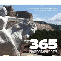
365

‘All I want,’ I moaned to a friend ‘is to be a sent a book to review about which I can be positive.’ I know that there are good books out there, you see, but none of them had made its way into my review pile recently. But it seems as if someone, somewhere, was listening to my plaintive calls, for I was sent what is a rather beautiful coffee-table photography book for review. (Whilst I seem to have someone’s ear, perhaps I should put in calls for world peace and an end to oppression, too?)

It’s 365 Photography Days, by Phil Gould. It charts Gould’s year-long around-the-world trip that he decided to take after escaping with his life from a plane crash in Alaska. He mapped out just where he would like to go, and being a photographer, set himself the challenge of capturing a defining image for each day of the journey. From South Africa, to South America, to North America, to Australasia, and back to South Africa (often via London) he gave himself the opportunity to get some fabulous shots. He didn’t disappoint, either.

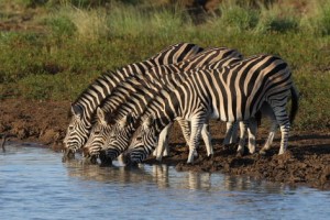
Day 314: Zebra at the waterhole, Pilanesberg National Park, South Africa.

For me, the best shots were certainly his wildlife ones, whether chipmunks, cheetahs, or kangaroos. It seems to be where he’s most comfortable practising his craft. However, that doesn’t mean his portraits or architectural photos aren’t worth looking at. They definitely are, and even more so when viewed in the context of such a remarkable travelogue. Even the photo of the toilet roll holder in his bathroom, the day that he had food poisoning and couldn’t go anywhere, contributes to the vast horizon that he experienced.

This is a coffee-table book, and the photos are given centre stage accordingly. Still, there is also the requisite degree of commentary along with a photographic tip for each image. It’s the photos that tell the story, though, just as Gould intended.

For anyone who states travel or photography as their interests, I could recommend this book as a gift. Do take a look.

365 Photography Days, by Phil Gould. Published by Book Guild Publishing and available from Amazon UK and Amazon US.

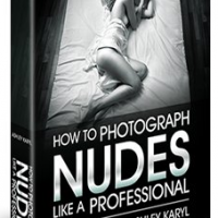
Book review: How to Photograph Nudes Like a Professional

How to Photograph Nudes

Photographing people without any clothes on. It’s pretty popular. (Mmhmm, people really are interested in getting it right; Try Nude Photography is one of Photocritic’s most popular articles.) It takes lots of different forms and if you’re good at it, there’s money to be made from it. But, like many things, it can be hard to get right, which is why Ashley Karyl, a photographer with 25 years’ experience taking pictures of people wearing nothing, has published his book How to Photograph Nudes Like a Professional.

Wanna know what I thought of it? Sure? Okay then!

Technical, practical, and philosophical

At 328 pages, this book contains masses of information. It covers the technical: cameras, lenses, lighting, editing, and retouching. The merits of colour or black and white are compared. The superiority of digital over film is debated. It tells you everything you need to know about lighting a shoot with candles. And it gives you lots of post-processing information.

It looks at the practical: finding and working with models, comparing shooting on location with in a studio, makeup and hair, and printing. You get anecdotes about the models Karyl’s worked with as well as guidance to find the right model for the job. There are some very helpful tips for shooting on location. You’re reminded not to interfere with the makeup artists and hair stylists because they’re professionals, too.

It even gets philosophical and talks about photography as a medium and a profession. Some of his advice here doesn’t relate to the photography world alone, it is sound for anyone who works as a freelancer. (Yes, it reminded me when I was working past midnight that I ought to be in bed, or at least not working.)

And all of this is backed up by Karyl’s experience in the business.

Personal but not so practical?

It is aimed at amateurs who are on the verge of turning professional or professionals at the beginnings of their careers, but in many respects it reads much like Karyl’s autobiography. Karyl talks you through how he came to nude photography, how it has changed over the years, the people and the projects he’s worked on, and what he has experienced and learned through this. It’s full of anecdotes and observations which give the book a personal feel. In fact, he prefers to think of it as being a conversation with him because he didn’t want to write a step-by-step guide.

Unfortunately for me, this is where I think that the book falls down. It contains so much information that its largely unstructured and unsystematic form makes it unwieldy. A step-by-step guide might not be what he wanted to create, but his information still needs to be accessible to the reader. Karyl is a photographer, not a writer, and it shows. He has a great deal to relate and would have benefited from the guidance of a ruthless editor to help him express it all. Ironic, really, considering that he covers editing ones photos so extensively.

And despite it already being 328 pages, the book could do with more pictures. There are barren wastelands of pages with no images. It’s a book about photography, after all.

And finally

So what do I think overall? I want to like this book. I want the gems of information and the anecdotes to sparkle. I want an editor to take to it with a scalpel so it can live up to its potential. And I want more pictures.

How to Photograph Nudes Like a Professional, by Ashley Karyl. Available for download at nudeprophoto.com at $29.

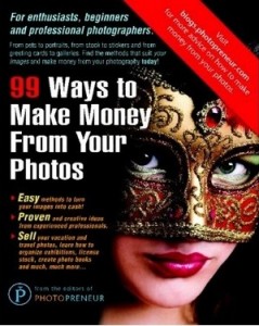
Book review: 99 Ways to Make Money From Your Photos

99ways

If you’re a half-decent amateur photographer, making a few extra pennies on the side from your photos is always gratifying. It might not be enough for a holiday in the Maldives, but it’ll buy you a few sundowners on the beach when you get there. Have you considered all the different ways that you could make money from your pictures, though? Apparently, there are at least 99…

99 Ways to Make Money From Your Photos has been produced by the editors of Photopreneur. The title is fairly self-explanatory, but what did I think?

What did I like about it?

Well, most importantly for a book trying to give you ideas for making money from your pictures, some of its suggestions were things that I’d forgotten you could do, never considered, or even heard of. How about bartering your pictures or photographic services? Turning your pictures into colouring books for kiddies, anyone? What about helping people looking for love online present better images of themselves? Yep, some of these ideas were pretty original.

However, it also started in the obvious place—selling pictures to stock houses—and explaining the difference between royalty free and rights managed sales, which is fundamental, I think.

I also appreciated that each idea was laid out so clearly, with a summary box, a series of tips, and a getting started box. The book gives you practical advice and points out things you really ought to consider before taking on a project. It also allows you to judge if the elbow grease that you’ll have to plough into an enterprise will justify its overall return by rating the difficulty, earning potential, and competition for each idea. That’s all rather neat.

What didn’t quite do it for me

A great gift, but probably not a book you'd buy for yourself

There’s a bit of a difference between selling the odd photo that you take in your spare time, and embarking on a career as a professional photographer. This book doesn’t draw that distinction, and mixes up quirky small-time stuff, like selling on Etsy, with serious photographic challenge, for example becoming a forensic photographer. For me, making it a bit clearer for whom each idea is intended would improve the book’s usability.

Obviously, 99 ways to make money is far more enticing than 45 ways to make money from your photos. However, I thought that some of the ideas were scraping the barrel. I wasn’t convinced that using doctors’ surgeries, local cafes and restaurants, and hair-dressing salons as potential sales venues for your photos warranted three individual entries. How about combining taking school photos with dance school photos? What about one entry for the different types of stock photos? The title might not be quite so exciting, but the book will be easier to navigate.

The final thing that I found very odd: for a book about photos, it doesn’t contain a single one, save for the front cover image. Curious.

So what do I really think?

I think it’s a great book to buy as a gift for someone you know who takes great pictures and could make some money from them. It has creative ideas and is honest about how much you can expect to make turning your photos into greetings cards. But at £21.87 (US$34.95), I’m not sure I could justify it for myself.

99 Ways to Make Money From Your Photos, by the editors of Photopreneur. Published by New Media Entertainment Ltd and available in lots of places that sell books.

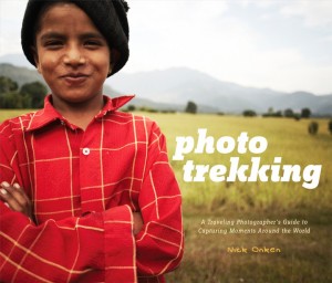
Book review: Photo Trekking by Nick Onken

Fantastic photos - but Ella Bowker finds that she'd prefer it was a proper cofee-table book, rather than a half-way house between how-to guide and photographer's portfolio

As a semi-prominent photography blogger and photo writer, I occasionally am sent books to review. It’s pretty exciting, actually, because it gives me a great insight into what’s happening in the photography publishing world, and hey – it’s always a great idea to keep an eye on the competition. The problem is that I’m frequently not the target audience of these books: I’m an advanced photographer; I love to write for all photography audiences, but if my ongoing photography course for newbies project has taught me anything, it’s that photography looks very different through other people’s eyes.

So, this time, I decided to ask a friend of mine – the always lovely Ella Bowker takes a closer look at Photo Trekking: A Traveling Photographer’s Guide to Capturing Moments Around the World, by Nick Onken.

Take it away, Ella…  


I recently came back from a long weekend in Italy with my family (check out the pictures on Flickr!). I schlepped along a collection of books to entertain me on the plane, and I’d like to tell you about one of them: Photo Trekking: A Traveling Photographer’s Guide to Capturing Moments Around the World, by Nick Onken (Amazon.co.uk or http://amzn.to/dsjv9O ">Amazon.com. Travelling with a travel photographer’s book seemed highly appropriate. It’s not as if one needs much inspiration to take beautiful photos in the Tuscan hills, but perhaps this book would be able to help me take even better photos. Flicking through the glossy pages of exotic photographs, I noticed that he’d taken some shots not all that far from where I was staying, too. How exciting!

Uhm, so who is it for?

Unfortunately, I found the subtitle of this book to be a tiny bit misleading. It turns out this book isn’t aimed at the general travel photographer – those of us who take fairly good photos above the standard of the usual holiday snaps and want to do it a bit better. Instead, it is aimed at amateur photographers who wish to spread their wings and give professional travel photography a go.

Fantastic photos - but Ella Bowker finds that she'd prefer it was a proper cofee-table book, rather than a half-way house between how-to guide and photographer's portfolio

Call it a bugbear of mine, but it really bothers me when writers haven’t fully identified their audience. Or rather: Onken has identified a very specific audience here, but delivers a book which goes too far in some areas, and not far enough in others. Now, I’ll be perfectly honest: I’m not nearly good enough a photographer to aspire to do it in a professional capacity. To be entirely honest, I don’t think that I’d want to even if I were. Having said that, the premise of the book piqued my interest, and I threw myself at it in an attempt to learn about the life of a professional travel photographer and where exactly I’d need to start in the unlikely event that I did decide to pursue this as a career.

Perhaps I wasn’t the designated audience for his book, or may be I was slightly disappointed to discover that the content wasn’t actually what I thought it would be. Either way, I finished it and was left feeling that Onken hadn’t quite delivered what the book’s covers seemed to promise. Don’t get me wrong, the book shared some very useful information, such as what the different markets for travel photographs are,how to make initial contact with them, and how best to promote yourself and your work. However, all the while I had this feeling that the book didn’t go far enough. It was scratching at the surface of life as a travel photographer and not telling you enough of what you needed to know.

What’s it got?

The book is divided into five chapters: the world of travel photography, preparation, shooting on location, tips for taking great travel photographs, and after the shoot. Onken takes you through planning your shoot to ensure that it evokes the right feel for the client and includes anything that is a ‘must see’ for that location. The ‘How to budget for a travel shoot’ section was interesting, and discusses everything from airport transfers to local guides. But when it came to issues such as local etiquette and cultural nuances, coverage was rather thin. There was one more thing which struck me as odd: I’d have thought that if someone is seriously considering a career in travel photography, the chapter looking at photography tips is likely to be well below their level of expertise.

Each chapter, with the exception of thetips for taking great travel photographs chapter, contains at least one ‘Traveler’s Journal’ which gives the back-story to a series of photos taken in locations ranging from The City of God in Rio de Janeiro, Brazil to Kyoto in Japan. These sections worked well to communicate the human element of Onken’s photographs and his experiences in order to take them. If each chapter had been built around these journal entries, they might have achieved the degree of depth that this book needs.

I do feel that more could have been said about the grueling travel schedule and exhausting days of a travel photographer; the shots that made the cut and those that didn’t could have been examined; and the outcomes of that particular trip could have been looked at, too. Yes, it would have been a very different approach to the book, but one that I think could have worked.

Onken’s book feels more as if it were an exercise to get his photos on to people’s coffee tables. In order to do so, he settled on the niche audience of wannabe travel photographers. But there’s nothing wrong with a photo book for a photo book’s sake; Onken is clearly a talented photographer – but it just seems a bit curious to have them presented in a setting like this book.

It’s a cursed shame, really – there aren’t any books out there that covers this section of the market all that well, and after reading this book, I can’t but conclude that, well, there still aren’t any. But if there was one, I’d buy it.

Photo Trekking: A Traveling Photographer’s Guide to Capturing Moments Around the World by Nick Onken. Published by Amphoto Books, New York, available from all sorts of lovely book shops everywhere.

About the guest writer of this post

Ella is an avid amateur photographer based in London. Her Flickr stream is a documentation of her process of becoming a better photographer. She wrote Teaching Photography to a 5-year-old and Taking photos for the future for Photocritic.org


Do you enjoy a smattering of random photography links? Well, squire, I welcome thee to join me on Twitter -

© Kamps Consulting Ltd. This article is licenced for use on Pixiq only. Please do not reproduce wholly or in part without a license. More info.

The 12 best photos of 2007

earthshots.jpg

I first covered Earth Shots, the photo of the day contest, back in November 2006 and ever since, I have displayed their photo of the day widget in the side bar of Photocritic (see right!). Even when there’s a rather long time between updates, I keep checking back on my own site just to have a quick look at what the talented Earthshots submitters are up to.

It’s surreal to think about it, but this week Earth Shots celebrated their first birthday, and what an incredible first year it has been! Scanning through their archives you can see 365 fantastic images of our planet and among them are some truly spectacular shots.

To celebrate, I got the guy behind Earth Shots – Will – to pick some of his favourites. 12 months, 12 pictures – makes perfect sense, yes? 


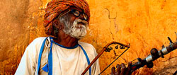
1. Music Man of Jaipur by Sam Stearman »
Music Man of Jaipur
Will: This was one of the first images to be shown on Earth Shots. For me it epitomises a great travel photo; it’s exotic, vibrant and full of character.

Haje: I love the colours in this shot – there’s something incredibly passionate about it. Gritty, well-composed, and genuine. Oh, and did I mention the colours?

2. Rainier Fall by Dean Zulich »
Rainier Fall
Will: This was the most viewed photo of the year on EarthShots.org (mainly thanks to StumbleUpon). It is technically excellent and has been processed to perfection; it is razor-sharp, vivid and well composed – a textbook landscape image.

Haje: I can’t fault Will on this one – it’s a positively stunning photograph. There are so much potential for screwing this one up, but the composition is flawless, and yet again, the colours are wildly attractive.

3. A Potter Wasp by Poras Chaudhary »
A Potter Wasp
Will: This is a wonderful macro shot that has been perfectly set up and executed by the photographer. The lighting, composition and timing are all top-notch.

Haje: As some of you will have noticed, I know a thing or two about macro photography, and this photo embodies everything I love about the genre. I wish the background was slightly differently coloured to make the foreground stand out better, but that’s nitpickery – a masterpiece!

4. Eagle Snatch by Mart Smit »
Eagle Snatch
Will: This is a spectacular photo which illustrates both the power and grace of nature. Another well-timed and technically excellent shot – it takes a skilful photographer to keep a fast flying bird in the centre of the frame with a telephoto lens and to snap such a sharp image!

Haje: There is nothing shy about catching this photo – it must have taken the photographer days of patience and scores of attempts. Boy, did it pay off: I’d be very surprised if they didn’t make a small fortune of it as a stock photo.

5. Tse Bighanilini by Hans van de Vorst »
Tse Bighanilini
Will: There is a strong sense of both art and earth in this image… it is the perfect expression of Earth Shots.

Haje: I’m a sucker for unique textures, crazy colours, and inventive lighting, and this photo really ticks all the boxes. It captures the true beauty of the earth, ironically, by making it look like what I imagine a martian landscape would look like.

6. McNaught’s Comet by John White »
McNaught's Comet
Will: This photo adds an extra-terrestrial dimension to Earth Shots. It is a reminder that our Earth is just a small part of an infinitely large and wonderful universe that lies out beyond our reach.

Haje: Night-time photography is a past-time that many photographers give up all too soon. It’s truly inspiring to see White’s interpretation of what happens at night captured this beautifully. Of all of these photos, I think this is the one that got my shutter-finger twitching the most. I may just have to dust of the ‘ole lenses, and see if I can capture something similar some day. I doubt it though.

7. Dancing Japanese Cranes by Simone Sbaraglia »
Dancing Japanese Cranes
Will: Art and the grace of nature again meet in this exquisite shot of dancing cranes. The symmetry and monotones make it all the more striking.

Haje: This photo agrees with my sense of minimalism and high contrast. I find it a bit disturbing to look at, actually: the first impression I had of this photo gave me images of melodramatic death – not really a picture I want to associate with cranes.

8. Looks Like Hail by Steve Wall »
Looks Like Hail
Wil: This image shows an incredible natural phenomenon that looks like something out of a sci-fi movie. These striking clouds helped make this the second most viewed photo on Earth Shots (again thanks to StumbleUpon).

Haje: This has been one of my all-time favourite Earth Shots photos. I described it to a friend on the bus once, as ‘imagine a flock of sheep captured in a supernova, but with a wind mill in front of it’. Okay, perhaps not the greatest of descriptions, but it’s one of those photos that really stick with you in your mind. Fantastic.

9. Tea Plantation by Katie Doran »
Tea Plantation
Will:A beautiful abstract photo; the shades of green, the curve of the hill and the patterned plants makes this one of our most delightful images.

Haje: There is something stunning about combining a monotonous colour palette with wildly varying hues, textures, and the grandeur of rolling hills. I adore this photo for so many reasons, but I think my adoration of it doubled when I discovered what it actually depicts. Black, two sugars, please.

10. Viper by Gunter Leitenbauer »
Viper
Will: Another technically excellent photo; the background blur (bokeh) is to die for! You almost feel like the snake could jump out of the photo at any second.

Haje: A great example of how carefully applied narrow depth of field can add a tremendous sense of speed and urgency to a photograph. It is as if the photographer had to take this photo and get the hell out of the way. The tension is really what makes this picture work, and there’s plenty of that.

11. Jurassic Park by Dennis Walton »
Jurassic Park
Will: This is like looking back in time at a world that is still being forged by the elements. The shadows created by the low sun emphasise the scarred texture of the barren land. It is a spectacular vista.

Haje: Another unbeatable landscape, serving as a very firm reminder that everything that seems important probably isn’t. Sometimes, I feel as if a photo like this really helps put things into perspective: Those mountains have been there for a million years before I was born, and they’ll be there for another million after I die. I can’t quite make up my mind if that’s a comforting thought or not, however.

12. Great White by Terry Goss »
Great White
Will: Earth Shots has had many great underwater photos but this one is one of the best because it has so much character… here you go, meet the ocean’s top predator!

Haje: SharQ has been my nick-name on-line for a very long time and I have always had a strong connection with the beasts. Normally, people go out of their way to make sharks look like savage creatures, and in a way, I much prefer this version. The notion of implied threat is as scary as a gob full of teeth, and yet, there’s also the subtle play of light, water, sunshine, and all the shark’s food swimming around it, waiting to be transformed into supper. Glorious.

Of course there are many more great images on the EarthShots.org. If you fancy it, take a look through their archives! Also, why not post links to your favourite EarthShots photos in the comments below?

If you fancy your chances then why not submit your photos to Earth Shots… anyone can enter and if you win photo of the day three times you’ll get $50. If you want to follow Earth Shots then you can subscribe to their photo of the day by rss feed or email. Or, y’know, just keep checking back here at Photocritic – Earth Shots have proven to be well worthy of their space of honour in the side-bar.

I raise a finely prepared Gin and Tonic to Will and the boys at Earth Shots – here’s to the next year, fellas!


Do you enjoy a smattering of random photography links? Well, squire, I welcome thee to join me on Twitter -

© Kamps Consulting Ltd. This article is licenced for use on Pixiq only. Please do not reproduce wholly or in part without a license. More info.