Don't get cocky, now...

My relationship with Flickr goes back a long way; all the way to late 2004, in fact. I kept going back out of curiosity, deciding it’s not for me, and then leaving again. In the meantime, I spent a lot of time on PhotoSIG (but I decided the community was a bit too hostile for my liking) and Deviant Art (awesome, but too childish on the whole), before turning back to Flickr. Again.
My cycle kept going on until 2008, when I realised the community feel of Flickr had grown strong enough to be un-ignorable. By January 2009, I had collected a lot of amazing Flickr streams; and I wanted to share my finds with you guys. 50 amazing flickr streams was born.
I don’t know about you, but January 2009 seems like a very long time ago, so I decided that perhaps it was time to revisit the concept. Of course, 50 flickr streams had already been done. What could I possibly do to top that? Why, I’m glad you asked.
Ladies and gentlefolk; in no particular order (apart from, y’know, alphabetically)…
100 Flickr streams made of pure awesome
 Abhinav shoots spectacles, not the optical type but the spectacular type like the Commonwealth Games in Delhi. Look at this amazing comp of the ceremony which captures the scale of the event magnificently and, using a higher ISO I guess, Abhinav also captured this beautiful shot, rich with color. Staying with his marvellous sense of color this balcony shot has an “Arabian Nights’ quality to it and finally, who would have guessed that one could create something out of this location. Very cool stuff!
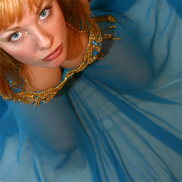
 Airgartens’ Flickrstream is not as prolific as most, but it’s a very good start. There are ‘bohemian’ undertones to her style of photography, a captivating decadence. People appear to be living in a make-believe world of stage make-up and costumes. Harsh light throws dark shadows on white faces. There are people trapped in bubbles, immersed in water and seen through shiny plastic, also some great surreal set ups too. Clever use of props and lighting create a wonderfully imaginative world.
 Andy gets some really different styles going in his portfolio which is really very absorbing to browse. Check out the jump from this beautifully composed shot to this leap of imagination, very cool. And here, once again a masterful comp and capture. Not shy to experiment and explore digital boundaries, this iPhone shot processed in Photoshop is yet another example of his innovative style. There are a many more, take time out to catch up on an inspirational browse.
 Anrapu has a great eye with a fish-eye lens, which is not one of my favorite lenses unless used in the right situation, but Anrapu certainly puts it to good effect here. The definition he gets is outstanding and the coloring very rich, in fact the National Gallery shot is almost comic book-like. Browsing through his other pics I was particularly impressed with the clarity he achieves, this rock pool shot is a good example, quite intense.
 Antonio Merini is an exceptionally talented photographer. In fact ‘photographer’ is the wrong word to use for a man with the ability to draw out such emotion and depth of feeling from what are, essentially, a lot of cold pixels. Figures appear half-formed and vague against incredibly textured backgrounds and sometimes they appear to be seen as if in a window reflection or an imperfect mirror. Tangible textures overlay his photos and combined with his dark, rich color sense, create a viewing experience that leaves you ‘touched’ in some way.
 Artie Photography has an HDR series in his portfolio so I’ll select a few takes from there. The two I like most are the field and the seascape. I’ve included the plane as an example of taking HDR a little too far I think. For HDR fans he gives a breakdown of his workflow which is always worth checking out. He also has a number of OOB shots, however this style of presentation is no longer a photograph for me, it’s moved into the realm of graphic arts. All in all some very exciting work from someone who likes to shoot ‘n share.
 Ashu Mittal has a sensitive feel for her subject that really comes through in her work.The festive colors of India, beautifully captured in all their exuberance, sit side by side with exquisite flower portraits in her portfolio. Shallow depth-of-field smudges color and shape into a satisfying background palette. Not only has Ashu a keen eye for color and detail, she also has a sense of the occasion with her insightful comments. Her work is a visual feast with shots that intrigue and inspire.
 Atavachron has a varied collection of work on his photostream. I particularly liked his feel for landscapes and wished there had been a lot more. Note the graphic quality of his shots in these pics for example, great comp and light. I’m a sucker for great texture and Atavachron has some really cool shots like this bridge texture, boat and tree. Some of his other pieces show the trademark of someone who is not afraid to experiment.
 Bizarro has an enviable talent when it comes to capturing skin-tones. This particular shot blew me away with its’ ethereal atmosphere and lighting set-up… the face has the quality of fine porcelain and the light just striking her back is masterful. His other work deserves equal praise too for different reasons. Portraits that could have easily turned out quite banal have been captured with an unusual effect/lighting to lift them from the ordinary. Way to go Bizarro!
 Bluresque brings a visually different feel to photography, some of his shots remind me of the American illustrator Brad Hollands’ magnificent art. The smudged color and unfocused shapes he achieves create a sort of ‘other’ world, a world just on the edge of reality. There is a blurred line between his color and shape, they appear to become inseparable, the one becomes the other to create an air of mystery. Bluresque deconstructs the perfect world of digital photography to the point of suggestion, a sort of non HDR reality.
 Brett Walker is another innovative photographer whereby the capture of the shot is only the beginning. His numerous overlays and juxtaposition of unrelated images create a fascinating if not unsettling body of work. His Meatsucker series in particular. It’s not all weird though as his talent reveals itself in some acutely observed ‘character’ shots. The depth of tone Brett manages to capture is quite extraordinary and brings new life to B/W.
 Bumble-Bee has a very mixed selection of shots to her credit. There are some great location shots of abandoned building interiors/model but I have already covered a similar body of work elsewhere. I really liked the coloring and texture of this old Gazebo with its’ wintery feel, The abandoned asylum shot is stunning, everything comes together on this, even to the wet road, to portray the grimness of the location, great compo. The other pic that appealed to me was this floating figure I wish this idea had been developed further, it’s very intriguing.
 Cabbit is a photographer with many sides to his work. What impressed me immediately as I flicked through his shots was the range of subject matter he handles with comparative ease. Very cool black and white pics with great tonal quality also there are some finely seen portraits and candid shots of friends and others. Out of the studio and away from controlled lighting set-ups he reveals a documentary style with a reporters eye. Short technical specs are generally given with each shot.
 Cadchapela comes across as a very experienced shooter with a great mix of shots to his credit. Get this pic up and check out the tonal quality of the study… then from there jump to this sea scape, amazing. But we’re not done yet, I’ve saved the best for last, one can only admire the sheer elegance of this composition. Basically the diversity of his work and the discipline required to achieve this level shows an amazing control and understanding of the medium.
 Carlotardani is a man who shoots everything… horses, people still life, kids, happy snaps you name it. He also has a Flickr portfolio packed full of images that will amaze and amuse. However Carlotardanis’ strength lies in his landscapes, they are without doubt stunningly beautiful. Apart from the logistics of finding these out-of-the-way locations and choosing your spot… waiting for the right light requires the discipline of a Jedi Knight. As a photographer you should see this, whether you’re into landscapes or not.
 Cept_id, unlike many other photographers who have a distinctive ‘look’ about their work, seems to waver between photography graphics and art, not that it’s a negative observation. In fact I would like to see a whole series of this Francis Bacon type imagery with his acidic colors or the minimilist landscape feel. The “graphic” style has been explored and represented more fully in his portfolio and is very striking, a digital form of scraperboard… ( ask your grandfather what the word means ). It’s incredible what a bunch of pixels can do in the right hands.
 Chenroom, I hope that’s his name, ( not brushed up on my Chinese lately ) has captured the definitive cloud shot I have seen in awhile… wonder how he got his flash heads up there? Love the blue! Chenroom is no slouch when it comes to capturing great sky shots, this one is pretty cool… day on one side and night on the other. And finally, another nicely seen comp, with a great sky need I add, is this one. Looking at Chenrooms’ profile I see he lists some great gear that he puts to good use for the rest of his portfolio.
 Chloe Gauntleys’ photos have a gentle classical appearance, almost romantic ( especially the later images featured here ). Her earlier work has a harder more illustrative edge to it with an an overtly surreal approach and appears to be the foundation out of which this newer, softer style has evolved. Multi-layered images and textures play a large role in the final comp. She has a wonderfully exciting imagination and infinite patience in order to create these complex and often thought provoking images. Let Chloe take you on a magical journey.
 Daphne Kotsiani‘s landscapes evoke a feeling of loneliness in me. I have seen plenty of desolate outdoor shots, however their technical brilliance generally dominates and overshadows the emotional aspect. Daphne imparts a nostalgic feel to her work… birds wheeling in the sky, a lonely horse in the mist or an old tree surrounded by water all speak to me of fragments of time, all fleetingly seen as if from the window of a passing car. I can still remember standing on an open plain and gazing up in silence at the towering clouds.
 Delphine is a digital surrealist artist with a very delicate touch to her work. I have only featured a few pieces here from her main stream but take a look at her series entitled “Another World”, very absorbing. Her captures are a mix of digital manipulation and photography, almost 50/50 I would guess, but she achieves a gentle ‘story-telling’ look which is a pleasure to view. There are down-to-earth shots too in her porty, but I would say that this lady has a very impulsive creative spirit that wants to fly.
 Douglas Griffin roams the highlands of Scotland taking us to places we would otherwise never see. Lonely castles silently speak of another era, while storms rage on deserted shores, unseen and unheard. It’s only this landscape photographers’ dedication to his subject matter… and others like him, that reveal these remote locations to us. Read the descriptions that accompany each shot and you soon realise Douglas had to plan ahead to get the best light. Great stuff McDouglas!
 Duarja is an artist, there is no question about it and one look at this shot will convince you of that. He captures an unbelievable texture of nostalgia in his work, almost timeless. One can almost feel the silence in this shot of a simple washing machine or hear the wind whispering on the wind bent grass in this beautifully composed landscape. And once again the style of the “dutch masters” springs to mind. Duarja has created a very unique “old world” style of capturing images in todays digital world.
 Dubonnet is definitely a “flower child”, maybe not in the ‘sixties’ sense but photographically speaking. I liked his straightforward approach to capturing these delicate forms. Obviously aperture is crucial with plants that are sometimes only 1 inch across and finding the most satisfying composition amongst a profusion of shapes is no mean feat. I particularly liked the compo and tonal qualities on this one. If botany is your passion then check out his ‘Lensbaby’ set, there are some nice creative captures.
 Ele Noir‘s quirky sense of cut and paste photography appeals to me immensely. For her it’s not a case of seeing photography as an art, it’s more like seeing art as photography. Her graphic approach has a naive/Warhol feel about it, however Ele is no novice, underlying these seemingly thrown together images is a very strong sense of design and conceptual thinking, the camera merely becomes a brush to convey the paint to the canvas. Fresh and original.
 Entelepentele is essentially a portrait photographer – strikingly seen faces are a feature of her Flickr stream. Gently mixing image-manipulation with some of her work brings an introspective quality to the piece, another aspect I liked was the color/tonal variations she has running over certain portraits, very innovative processing! This cheeky capture is almost Flemish in style with her bobbed hair and rouged cheeks, but for many of the other images moody lighting brings a beautiful brooding atmosphere to her portfolio. Her work is a sort of back-to-basics approach… very nice.
 Federico Bebbers’ portrait portfolio, using the standard head and shoulders framing, captures an incredible range of facial expressions and emotions with minimal props and effective lighting. Fragmented faces, bandaged faces, contorted, sad, wistful… all stare out at you from their digital prison. Portraiture is a genre not seen that often and Bebber really explores it in depth with competent image manipulation and varied styling. Sometimes it’s like looking into a mirror, there are days when you feel exactly like this.
 Fesign is a multi-award winning photographer, National Geographic 2008 and Press Photo 2008 amongst others. His work is exceptional even though image manipulation does play a part in the final result, in his own words… “To me, photography is all about the final image, regardless of the journey, whether it is through a traditional medium or image manipulation. To capture the perfect shot, there should be ‘no limitations’ on one’s creativity”. And yes, creativity should have no bounds so enjoy the journey and the destination.
 Fifi Patchouli is a photographer/model in that she shoots herself a lot, though not in the foot. She explores a wide cross-section of photographic styles and seems to enjoy just inventing scenarios. I love her self portaits and off-hand approach to her work, underlying this approach however is a serious side, as many of her pics are artistic accomplishments and could have easily fallen into the ‘happy-snaps’ category. Her work has been published in magazines and she is widely followed on Flickr.
 Fr Antune takes us on a mountain hike in this series of shots. We’ve had cityscapes, landscapes and now you can check out some cool mountainscapes. Antune is clearly no armchair photographer, he gets out there with the wild mountain thyme and captures some very rewarding views. His work is very “clean’ with no evidence of ‘over processing’ that can sometimes take precedence over the natural beauty of the subject. A lofty view of the world that not many get to see, you can see it here, like me, from your armchair.
 Greg Easton is a lensman who knows how to set a mood – rich colours leap out at you from moody backgrounds, industrial settings set the scene for great lighting set ups. And check this out… Greg also shares some great advice from time to time with mini-tutorials on how he adds a “look” or “weathering” effect to his pics. Not shy to hide his talents or advice Greg sure knows how to make color work to his advantage. Cool dude.
 Heather Smith‘s imagery is reminiscent of the Romantic Period in art. Her love for photography stems from “that certain slant of light”, or a melody that evokes a visual response. Her philosophy is to tell stories with her pictures, stories that come from life, like recently discovered old postcards, their images frozen in time. A much-loved project of hers is the “My Beatles” series of which the Lady Madonna shot is the latest addition at the time of writing. Her Flickr stream should definitely be bookmarked and browsed at leisure.
 IHP has a set in Flickr called “Depopulated Landscapes” which is essentially shooting architectural detail. The architects vision is generally seen as a ‘whole’ on completion, however IHP believes that there is a certain graphical beauty in many architectural settings that surround us and he sets out to explore this. Its a revealing and rewarding exploration as he captures some exquisitely beautiful shapes and colors on the journey. We often hurry in and out of buildings taking them for granted, IHPs’ creativity makes us stop and see them with a more appreciative eye.
 Irma Haselbergers’ images reach back into the past with their monochromatic tones and two-dimensional rendering of light and dark shapes. Understanding B/W photography is essential to the art of photography, as concepts of shadow detail, contrast, tonal range and highlights are best understood by studying black and white images. In this Irma has excelled, for example, in this shot color would actually detract from the cold, overpowering ‘greyness’ of the day. Her shots carry the feeling of real life about them, unlike the shallowness of glossy color magazines.
 Jamie Heiden is an artist with a camera, in that her work appears more as ‘painted‘ art than photography. Her series of mid-west barns will amaze you. Using freely available textures, the original photo is overlayed with them in Photoshop, then using blend commands to the point of deconstructing or redefining the original photograph another effect is achieved. An exceedingly innovative technique, pioneered by Jewell, texturing and custom brushes bring a wonderfully naive look to the photo.
 Jayphotoworks‘ stream has a pretty interesting addition that I’ve not seen elsewhere. Check out this shot first, nice capture… and the birds are a great touch. Now browse to this shot. This is the unretouched/out of the camera pic with Jays’ explanation as to how he arrived at the final image in the form of a mini Photoshop tutorial – very cool. One more thing… mood he created with this series and would have liked to see more. Nice!
 Jeff Gaydash is a photographer who loves to shoot digitally and experiment with different post-processing techniques. An example of his vision is seen in this shot where he attempts to age his Piezo prints and replicate that look in the digital file as well. Sometimes I feel that digital photography can be too intense in appearance and deconstructing this cleanliness can achieve a very satisfying end result. Jeffs’ Flickrstream contains some very well observed subjects, he has a good eye for composition and, combined with a strong graphic sense, has achieved a portfolio well worth a visit.
 Johnny loves a sunset and his Flickr stream has some stunners. A number of his shots have made the ‘Explore’ page on Flickr so take time out to explore for yourself. His landscapes are generally dawn or sunset takes and are ablaze with color, on some pics he makes mention of using Lee Filters but unfortunately doesn’t expand on his experience, this sort of info always helps the aspiring photographer. Landscapes take up a large percentage of his portfolio which includes HDR and manually blended shots, well worth a viewing.
 Jone Reeds’ grunge style of fashion photography is incredibly striking with it’s Warhol type silkscreen/solarised color effect. Two shots in particular caught me immediately… this one with its’ electrifying colors shimmering in the light as if on a soap bubble in the sun, and the bathroom comp with it’s exceptional coloring and texture. Magnificent. The bulk of her portfolio is a mix of varying styles and subject matter, all worth a look just for the sheer diversity.
 Kakhabad is a young Japanese female photographer with a very refined and delicate approach to her work that only the Japanese seem to master. Beautifully styled subjects and low key lighting impart a serene atmosphere to these fashion shots. However the Japanese flair for intricate detail is beautifully captured in this delicate pic. Her work appears to be mainly fashion based but there are some very nice landscapes and a fair amount of surrealism. East meets West on Flickr and it is a refreshing experience to say the least.
 Kantryla tackles architecture with a dedication one can only admire. If you read the accompanying text to some of these extremely elegant shots you’ll realise he stayed the distance waiting for the right light, or the clouds to break, or tried again and again shooting the same building to get exactly what he wanted. When I visited her flickr site he was on holiday and no wonder. Kantryla has created an ethereal world out of steel and glass.
 Karto Gimeno takes the ordinary and turns it into the extraordinary. Looking through his work is like emptying a childs box of toys, all manner of objects spill out… broken dolls, stones, faded pictures, drawings, the list goes on. Assembling them into highly imaginative compositions Karto creates a fascinating series of still life, sometimes overlaying them with childlike drawings. Could he be the recurring figure of a little boy doll with striped shirt we see in many pictures? He also captures landscapes with an equally creative approach. Note Fellinis’ red ball in this.
 Kevin McNeal, a nature photographer based in Washington State, has a philosophical approach to his work which he tries to impart to the viewer. Nature has fleeting moods, he says, and is never the same twice, by attempting to capture these ephemeral states and share them he hopes to make people more aware of our fragile planet that most of us take for granted. Well his shots have got me convinced, thick rich color permeates his work creating some eye popping contrasts and visual treats. One of the best I would say
 Kevmex68 is a digital artist in the romantic style. Beautiful old world images float in shades of pastel colors on misty landscapes, almost ethereal. These images are conjured up from archival shots originally taken by Kevmex, then, using self-taught techniques in Photoshop he recomposes the scene with layering, opacity masks and selective lighting. No HDR is involved. For all aspiring landscape photographers I would urge you to browse this unique series of images. Full color prints are on offer from Kevmex so what are you waiting for!
 Lomokev is a real ‘freewheelin’ shooter, his flickr stream abounds with a cross-section of shots that intrigue and amaze. Lomokev is actually Kevin Meredith, Photographer, Teacher and Author. He is the originator of the ‘Street Style Montage Portraits’ with his almost irreverent style of photography… it’s more like a streetwise photoblog style. Nevertheless there’s some excellent work here. Look at the life he brings to this in what is essentially a simple shot. Lomokev appears to be a very busy man attending phoot camp, giving talks at Google and holding exhibitions.
 Lucimas’ bodyscapes ( as opposed to land/urbanscapes ) are a welcome find as not many photographers exhibit or even shoot highclass fashion. Studio fashion shots are entirely dependant on the lighting skills of the individual, unlike outdoor photography where one is subject to the whims of nature, and Lucima is obviously very skilled in his craft. The skin tones on his B/W captures are as smooth as silk with sculptural tonal qualities. Imaginative poses and equally beautiful color shots make this a visually exciting viewing opportunity.
 Luis Chacon captures people beautifully. There is a Cartier-Bresson like quality to his shots, a sort of ‘decisive moment‘ approach. His Flickr stream consists mainly of B/W, some very tasteful duo-tone and color portraits. The color work is beautifully seen and I was very taken by this shot, for me it is the embodiment of all that is Spanish… the red against the dark ground, the styling, etc. Even the composition is classic, just look at the relationship of the door frame to the subject, how it contains and holds your eye on the figure, masterful!
 Manlio_k has a sort of retro/fifties airbrush look with a lingering feel of old postcards and slightly washed-out color about his work, ( if you know what I mean ) which looks really cool. It never ceases to amaze me how different photographers manage to draw out of a landscape a completely different interpretation to the next guy, and Manlio’s captures are exceedingly different. There’s a painterly quality about them that’s hard to define, in the ‘hayfield’ pic I kept looking for brush strokes! It’s true. Check it out.
 Marc Benslahdine creates landscapes you can breathe in. With his stunning evening shot entitled “When The Lake Catches Fire”, you get the sense and stillness of the dying day etched in superb tonal values. Mood is essential in landscape capture and a good photographer can make even a bare stretch of water come alive. Marc definitely has this ability, plus a sense of timing to be at the right place at the right time. His work is like a breath of fresh air!
 Marta has a magical or mythical quality to her work, she conjures up wonderfully imaginative fantasy scenes, almost dreamlike. I studied the more complex shots trying to figure out how one would approach these set-ups, as everything just falls into place beautifully, the look, the light, the angle ….very cool. Included in her Flickr work are “Mosaic” sets which appear to be experimental, however they certainly don’t have the elegance or conceptual ability she is so obviously capable of. Check it out for yourself.
 Mattijn is truly a master of his digital craft. I spent ages poring over these shots, completely absorbed by the detail, the lighting, the concepts and the creative wizardry employed here. Clearly Photoshop has a part to play but the conceptual work is not the work of a computer, it is the sheer artistry and genius of Mattijn. Whether you like fantasy or not you will browse through this mans entire work. Some set ups may work better than others, but the one thing they all have in common is Mattjins’ magic touch.
 Matt Toynbee is almost in a class of his own, his mono and split tone work is absolutely superb. The sheer graphic quality of this pier is nothing short of amazing, shot with the famed Canon EF 80-200mm f/2.8L Magic Drainpipe. But what really caught my eye is the silky smooth water and steel grey tones of the sky. it doesn’t get much better. Matts’ capture of Kingsgate Castle is masterful in his choice of POV and as for the cloud formation he must have friends in high places. Excellent.
 Meghimegs’ compositions and unbelieveable colors have got to be seen to be believed. The human eye contains three types of color receptors, each receptor responds to a different wavelegth of the color spectrum, Meghimegs’ work exceeds these bounds. As you browse through his portfolio the colors leap out and assault your cone cells. Shadow areas fall into dense black which further enhances the extreme color feel. Not all his work is captured in this fashion however, so it’s safe to venture forth and leave your sunglasses at home.
 Mendis takes photography to another level… the insect level. As we all know photography is a passion, however, specialised photography is that and more. It is a love for your subject matter and infinite patience which will reward you with a shot like this. Technically, this type of photography requires pin sharp focus ( check out the depth-of-field on this, awesome ), spotless lenses, rock steady mounts and split-second timing. Unlike a studio shoot, you are working in an unpredictable environment. Nature calls and Mendis answers.
 Michael Greene‘s landscapes really make me want to get out there and do outdoor photography for myself. The clarity and coloring of his shots imparts a sense of the smell of dust and Desert Lavender and the crunch of your boots on the gravel. What I always find fascinating are the descriptions these outdoor guys give on how far they go to get a particular shot, not easy. However, breathtaking views and beautiful colors are clearly Michaels’ well deserved reward.
 Midnight-digital‘s shots are a futuristic blast. Sci-fi does not appeal to everyone but if you love innovative photography and give credit to visionary set-ups and ideas, then take a look at the shots I’ve posted here. This post-apocalypse shot is nothing short of art with its’ Magriitte-type bowler hatted figure. Stunning comp. Midnight-digital is also a published photographer whos’ work has appeared in magazines and on CD covers. For the second time this year he won the 1st prize ( B&W category ) in the french photo magazine “Réponses Photo”.
 Miguel CDs’ landscapes are like plunging into a refreshing mountain stream. Vivid primary colors etch abstract shapes onto a distant hill. A lonely church sits in a field of brilliant yellow, reminiscent of Van Gogh and the Eilean Donan castle at dawn is a classic landscape capture. These and many other images are part of an impressive portfolio of work by Miguel. Follow him on his journey through the stunning beauty of Scotland its a trip you don’t want to miss.
 Miss Loisy has a very entertaining and extremely colorful Flickr stream. Not shy to clash colors as loudly as possible she brings a very fresh, exuberant and noisy look to photography. Her series of ‘Fight Girls’ is a little rough for me, but painfully interesting. Miss Loisy also likes to startle and amuse, I love the colors on this take. As always there is a serious photographer hiding behind all the dayglo colors and her talent shines the brightest of all.
 Mistybliss is the mother of six children so what better subject matter to use than your kids! There are absolutely gorgeous portraits of her children to be found on Flickr. Using a Canon EOS 5D Mark II and an EOS 40D Mistybliss demonstrates a natural feel for portraiture. Check out how a well-used lens flare can add something to a quite ordinary shot, great! But it’s not all kids and family, Mistybliss puts her stamp of creativity on the inanimate too, proving that true talent will out.
 Mr Flibble is a really serious photographer that you can only laugh at. A crazy sense of humour and great conceptual thinking combine with a very competent shooter to create a fresh body of work. Mr Flibble is no slouch when it comes to Photoshop either, in fact many of his shots rely on it which in no way detracts from his photographic savvy. Jokes aside though, Flibbles’ serious side goes unsung because while were chuckling at his humour were not taking in the great lighting set-ups he achieves or the detail in the styling… serious stuff!
 MutantRock has a heavy metal style of photography that comes at you loud and clear. Here’s a photographer that doesn’t pull any punches, check out his great gritty black and white pics shot live, no posing here, you either get the shot or you don’t. Equally impressive are the color photos, and you can almost smell the leather in this one. But don’t think it’s all just hard rock, there is a softer side to this artist… architecture and portraits, would you believe! Great shot.
 Nasa is obviously not strictly “a photographer” in the true sense of the word but certainly deserves a mention in the annals of photography. A lot of the shots are clinically observed, more “for the record’ than artistic merit, yet who can deny the beauty of colliding galaxies, the breathtaking views of Earth ( to go boldly where no landscape photographer has ever been ) a cannibal star or the sun in all its’ majestic power. Technology has changed the face of photography forever. Once we were amazed at the attempts of Joseph Nicéphore Niépce, now we capture light from billions of years ago.
 Night photographer as his name implies shoots a lot at night. Great stuff here with time delays, tilt-shift and loads of experimenting. The man has a fetish for phone boxes and produces some stunning versions with very funky lighting set-ups. Also check out his skateboarding light painting series ( yes, all done at night ) for some amazing effects. Night photographers’ talent however doesn’t only shine at night, his Flickr stream has daylight portraits and conventional set-ups too – all competently handled.
 Nikkidelmont as photographer and model, takes mainly figurative shots of herself and others. The female form as a work of art and on public display has been an ongoing debate since Adam and Eve but I must agree with Edmund Burke ( 1757 ), who sees the female form as “potential perfection”. Well, Nikkis’ photos would certainly please Edmund, as she certainly achieves perfection in her outstanding series of beautiful self-portraits with skin-tones smooth as silk and striking poses. When you’ve got it, you’ve got it. And she’s got it!
 Olivier Burnside has a great many shots on his Flickr site that show how incredibly versatile he is. Check out the ambiance and comp in this street scene ( I love the way the light blows out at street level and how the buildings go dark at the top ) and the minimalist approach in this shot. He has a superb graphic sense of composing and draws something exceptional out of even the simplest of set ups. Simple but effective photography.
 Paul C Stokes is another landscape photographer, but not just any old landscape shooter, this boy has really got some serious captures. What impressed me the most is the purity of the light and air. The compositions are very clean and the angle and depth of field are extremely well considered. Browse to the shots you like and you’ll find Paul has taken the time to share his set-ups with you, plus a little bit of history. They say ‘composition’, the ‘quality of light’ and ‘exposure’ are the defining keys to great landscapes… well, whoever ‘they’ are must have just seen Pauls porty!
 Paul Grand does some very classy still-life … and I thought the world is moving so fast, no-one would have time for still-life anymore. Well, here’s Paul. One of my favorites is this shot, I love the use of space as it’s always a temptation with still-life to get in close for the textures. Space, like silence, can say more. With his landscapes Paul works in the old ‘pictorialist’ fashion utilising Flypaper textures in many of his shots, probably as a reaction against the perfect digital imagery that proliferates today. Grand work Paul!
 Peterspencer49 is a sea/landscape photographer with exceptional ability. This shot of Kimmeridge is one of my favorites, he achieves an almost oily/liquid feel to the water and rocks in the foreground. It’s a great comp with beautiful colors. Here’s another masterpiece, the elegance of this shot can only be admired, awesome. Moving away from seascapes check out this take of a location in Dorset, the camera is set up on the faint tyre tracks in the grass leading your eye further in. Might sound obvious, but how many take time to recce the area for the best angle, especially when under pressure. A true pro.
 petiteChose‘s surreal portfolio is definitely worth a lengthy browse. It’s virtually impossible to discuss the shots in conventional photographic terms however as they begin to transcend photography, which is not a problem for me as I love a visual feast. PetiteChose has a wonderfully unfettered imagination, a great eye for color, composition. texture, and has loads of talent.
 Photomas’ journey to Nepal was not only a photographic journey of discovery but also one of ‘discovery of the self’. Her sensitively seen portarits of this mountainous country are incredibly revealing. In photos of the older people a timeworn past stares back at you, most strikingly captured in this shot. Children stare wide-eyed with all the innocence of youth and older men look inward with all the wisdom of their years. Browse her Flickrstream and take this journey yourself.
 PhotosEcosse captures moody landscapes and to understand the conditions relating to this particular set featured here, in her own words… “A set to illustrate the qualities of Northern Light, as experienced in the far North West of the Scottish Highlands. Not easy terrain to negotiate, and the fleeting light can last but seconds. You have to be fast to capture it, it can be a challenge, but a rewarding one.” Fleeting light and difficult terrain are just a few of the challenges that every good outdoor photographer deals with but only the great ones overcome.
 PhotoSenseDatum shoots elephants in India beautifully, photographically speaking that is. She is concerned with human/animal rights, the preservation of the Earth and is a member of many photographic groups. These worthy sentiments are expressed in her diverse portfolio as she captures street scenes in India or the wind-swept plains of Mongolia. Her journey takes us to other countries like India, Africa, Portugal, Greece, China and many more… the pics are generally ‘out of camera’ images with minimal photo-manipulation. PhotoSenseDatum is a very busy and creative soul who uses her talent to enlighten and amaze.
 PrairieEyes wanders the back roads of historic Alberta searching for small towns that time has forgotten. And find them he does, boarded up and overgrown but still standing as a reminder to modern day wanderers of their heritage. PrairieEyes captures these wooden structures with a feeling of affection, and to enhance the historic aspect he ‘ages’ his takes with textures. The old barns and silos are reminiscent of Andrew Wyeths’ paintings in particular ‘Weather Side’ and ‘Christinas World‘. Browsing his portfolio is like taking the back roads.
 Rastaschas has some very excellent black and white shots to his credit. The grain/contrast in this genre always seems to bring a ‘lonely’ element to the work, in that the high contrast values appear to alienate the subject from his surroundings… color fills in the gaps. Because it’s pretty easy for B/W to look flat, Rastaschas has chosen contrasting light and strong graphic shapes with isolated figures critically positioned to lift the pic. Check how the light in this shot points down the stairs to the foreground figure. Great vision!
 Rebecca Parker in another era would have been a painter maybe Vermeer or a Rembrandt with her classical style of photography. Some of her formal studies have a medieval quality about them… their deep shadows and single source window light remind me of Vermeers’ “Girl With A Pearl Earring”. Exterior shots are handled with the same ‘feel’ and attention to detail. This girl one could imagine bumping into at the local country fair on the arm of a Morris Dancer. Beautiful work my fair lady.
 Red Mouse portrays the ‘ordinary’ in a unique and individual way. Scenes the average photographer would walk past, while searching for that perfect sunset, Mouse turns into art. He has a natural eye for abstraction and uses the visual language of line, form and color to create compositions which exist independently from visual references of the world. Abstraction indicates a departure from reality, yet when we see these images we say… Hey! I can do that… well Red Mouse has done it, he has turned garbage bags into art.
 Robbie Swans’ photography stream is a laugh… not technically that is. Swans’ brand of humour mixed with his excellent work makes it a worthwhile browse. With this shot, taken with an iPhone, he captures a beautiful box Brownie 127 feel ( complete with light leak ) … you’ve got to see it. His other amazing captures using conventional gear, are at the other end of the scale in terms of lighting and tonal values. For example there is no HDR on this magnificent comp, just pure talent and the same goes for this. Go on, have a laugh!
 Robb North has managed to capture a melancholy air with his photos. One almost senses the atmosphere of a late Sunday afternoon as the shadows lengthen in the fading light and the breeze gently stirs the grass. Or the lonely silence of someone waiting for a footfall that will never come. The way light falls at a certain angle can trigger these emotions in sensitive people. Robb has managed to capture this light, along with the serenity and solitude of his locations.
 Rustyphotography is back with a very dark series featuring abandoned buildings, incredibly dramatic skies press down on decaying walls and a feeling of utter silence permeates the shots. Once again here’s a body of work that needs time to study with care as there are some unbelievable captures. With no specs available one can only speculate on the dynamic range that has been combined into a single file, still it gets my HDR award. Rusty is definitely back, was he ever away?
 Sarah Sitkin has a refreshing imagination that runs riot across her portfolio. Vivid images tumble across your eyes as you scan her work, Often one has to enlarge a piece and study it to admire the thinking process behind it or wonder at the time it took to set up before the first shot could be captured. However it’s not all a mad hatters tea party there is a serious side to her work too. I still think she eats sugar coated pixels for breakfast.
 Servalpe covers urban landscapes with a passion. If you are into the tech info on set ups, locations and HDR workflow techniques, this is definitely the site to browse. Although Servalpe outlines his approach in shorthand form it’s still valuable info for those who wish to achieve this level of expertise. Servalpe is an extremely competent photographer with some very impressive captures to his credit. Analysing his work, one can see that he chooses his subject matter with care in order to arrive at his initial vision. A Pro.
 Shexbeer has produced an absolute goldmine of rich, moody shots in the Potters Manor House Series. There are not enough specs accompanying the shots but natural light seems to be the order of the day. Shexbeer has captured a dark brooding quality to the shadows, with daylight picking out the details. The toilet capture could be the first toilet shot to be classified as art! Excellent stuff, almost surreal. I realized afterwards that I hardly even looked at his other work but I will go back!
 Sigi K, shooting in the wilds of South West Africa produces some very interesting work. Surrealism sits side by side with conventional shots’ that show a very strong creative force at work here. She has an enormous diversity of styles and deliberately imitates the photographic techniques of her other Flickr contacts in order to expand her processing/photographic skills and knowledge or IOL as she calls it (Imitation Of Life series ). Sigis’ captures are a visual delight plus her list of Flickr contacts are a goldmine of creative expression.
 Silke Seybold. I absolutely adore Silkes’ work for the graphic quality she brings to it, and I love how the textured borders echo the feel of the locations and enhance the concept. Although some purists would dismiss her style as a form of graphics, here’s a shot that shows she’s a photographer with exceptional ability. In fact one needs a lot more space to discuss and go through her work as I have not touched on the color aspect, nevertheless take some time and check it out for yourself.
 Snailbootys’ images have a very strong ‘Dada’ philosophy underlying them. Ridiculing the meaninglessness of the modern world and anti everything, Dadaists used an early form of shock art to carry their message. Snailbooty with his over-active, fertile imagination and inventive set-ups appears to be applying the same tactics by ridiculing the technical precision and clarity of digital photography. Experimenting in an ‘anything goes’ fashion, he has created some truly amazing images. A free-wheeling portfolio that’s definitely worth a browse.
 Solarixx has a wild and very compelling portfolio. Her style veers across different genres creating waves in their wake. Some of her B/W work reminds me of the avant-garde photographer Man Ray, these images are very powerful and to a degree disturbing. Solarixx is obviously touching a nerve in the human psyche. Browse her work and you’ll find a restless enigmatic spirit here searching for a way to satisfy her creative curiosity. You like, you don’t like. Me, I like.
 SoWhat captures minimalist landscapes ( eg. one tree in a vast field ) beautifully and with all this empty space around it’s very soothing to view.This type of compo however relies heavily on a good sense of design, coupled with great lighting conditions for it to work successfully, and SoWhat pulls it off neatly. There are also some cityscapes on his site which show a wonderful feel for light and framing, I absolutely love the light in this capture, for instance. The rest of his porty is a mixed bag but worth checking out.
 Stella Brazil is a lady that shoots beautiful ladies, beautifully. But that’s not all she shoots beautifully. Bright eyed children, pottery, food, portraits, landscapes… all caught in captivating color, there are definitely no language barriers here as her photographs speak for themselves. I was particularly drawn to her photos of the Brazilian women, not merely for their exquisite features, but for the softness and quality of the skin tones she has managed to capture. No matter the subject, Stella Brazil brings the feminine touch to her work.
 Stevacek has a couple of shots in his flickr stream that border on scenes from a big budget sci-fi movie. These are beautifully conceptualised surreal views of objects that are basically mundane. Other works in his photo stream include domestic animals… portrayed in a very unique way, cars and landscape/architecture. He achieves an amazing richness and depth to his color, and coupled with a very ‘graphic sense’ of composition he arrives at an impressive body of work.
 Steve Rutherford has a very clean style of capturing, almost clinical. Using just one model and simple locations he has managed to create a very slick feel. I particularly liked the tonal look of this shot, the framing is great and I had to look twice before I noticed that the young man was in the air. He also shares some ideas on his lighting set-ups and thought process behind the motivation for the shot. His choice of model is superb, as somehow I don’t think the intrigue would be there if this was Harry Smith ( sorry Harry )… most inscrutable!
 Ste-peg has some unbelieveable pics of industrial decay here. Where this man finds all this stuff is beyond me, are there that many abandoned pieces of real estate standing around falling down in silence? Nevertheless, I was totally absorbed by it all and went slowly from one shot to the other trying to imagine what sort of life went on there, and the people … did their hopes and dreams begin and end there? It’s a very varied and moving series with many great natural light set-ups and textural qualities. Check it out you’ll be amazed!
 Surrealize brings yet another look to landscapes. I must say I’m staggered at the variety of interpretaions that one finds in this field. However before we look at that, check out the beautiful colors in this shot, the water reflection moves this compo to another level, great. Surrealize continues with his incredibly vivid treatment with this cityscape and towards the end of his comments under this shot he gives some interesting tech details. The Tower is comprised of 9 different bracketed exposures to achieve this effect, really cool! What I really like about some of these guys is the inside info they’re willing to share with you plus an insight into the way they work and think.
 TheWalkinMan sure had me crawlin’ all over his work. I found some very intense portraits there which left me amazed at the detail, ( for a moment I thought they were super-realist paintings ha ha ). Caitlin is a honey, isn’t it incredible how this pic actually captures the childs personality… maybe life imitates art! Still staying with the portraits, because I feel this guy gets it right, I was also knocked out by the tomato shot. Look at how the red pops, very intense… mmm, are you sure these aren’t super-realist paintings?
 Velvet‘s Flickr stream is exceedingly diverse and a little bit difficult to pin down, she has a reportage type feel to her work generally but what I really liked is this pic and the thick color she has achieved here. Some of her offbeat portraits appeal to me like this one which would look amazing as a fashion mag DPS. Then there is a lovely moment captured here. It would be great to see this portfolio edited down, some great work is being swamped.
 Visualechoes takes us on a breathtaking ride with a photo stream packed full of car shots ( some bikes and a few girls too ). It’s refreshing to see someone so dedicated to a particular subject that he explores it again and again with night shots, rigs, sunsets, dawn shots etc… you name it. Cars can be hell to shoot as so many elements come into play, for example unlike landscape photography, movement adds another dimension to the capture. Plus the many different facets and reflections require a discerning eye to capture the essence of the design. You don’t have to be car enthusiast to love this.
 Walkinginspace creates his own visual language with some awesome architectural shots. These are not conventional photographs of buildings however, Walkinginspace has selectively composed his photos to create an abstraction of color and form, in fact, the color and form become the subject of the composition. His work is fascinating in that ordinary buildings of no architectural significance are imbued with a stylish elegance, he sees beauty in a balcony and form in telephone wires. Thanks to Walkinginspace I’ve come to realize we are surrounded by works of art.
 Weirena captures flowers unlike any other photographer I have encountered. Her incredibly delicate photographs, once captured, are then enhanced with soft layers of background textures, borders or other images for which she displays a natural flair. Nature has its own HDR as this beautifully seen composition shows and the sunflowers rival Van Gogh’s palette. Weirenas’ work is a welcome respite from abandoned buildings and, I am sure, she would agree with Claude Monets’ sentiments who once said, “I owe having become a painter, to flowers”.
 Wink shares a few short processing tips with us on his Flickr site that’s worth checking out like this Photamatix and Topaz comparison of a raw shot ( Straight Out Of Camera ). He has a good eye for composition as can be seen by the following shots, these set-ups are essentially very simple but look at his interpretation! Wink also experiments with a $50 fish-eye for fun and comes up with some pretty cool shots. Lots of interesting stuff on his site that’s worth a view.
 Xaomenas’ still-life gallery is like an invitation to the studio of a Dutch master in the Golden Age. Much like 17th Century still-lifes, the objects portrayed are essentially mundane but it requires an outstanding technical and creative skill to bring these compositions to life. Xaomena has that skill plus a superb eye for light and form. Still life is a genre not often found on Flickr so I would take the time to travel back with her to the 17th century.
 Xavibarca‘s pano shots of Hong Kong are a technical and visual triumph. For those of you who are interested in this genre of photography this is not only a visual experience but a rewarding insight into the pano approach, as Xavibarca gives invaluable advice from his own experience in the field. The colors and clarity are stunning and he achieves a seamless whole from what are essentially different frames/exposures ( sometimes up to 15 different exposures ). The rest of the portfolio is equally impressive as he carries through his wonderful color sense and ‘look’ to create a cohesive style.
 Yannick has a very inspirational and highly imaginative set of shots, combining his photographic expertise with Photoshop he manages to capture some unbelievable images. There is a flawless quality to his work and he seems to enjoy sharing set ups and tech info, which is invaluable advice coming from a photographer of his calibre. Photo-manipulation appears to play a big part in the more unconventional captures which doesn’t detract from the viewing experience. Well worth a browse.
Phew
Phew, that was quite the list. I guess all that’s left for me to say is that if you want to take a look at my stuff on Flickr, go right ahead – do say hello, and I’ll have a peek at your Flickr stream, too!
Do you enjoy a smattering of random photography links? Well, squire, I welcome thee to join me on Twitter - Follow @Photocritic
© Kamps Consulting Ltd. This article is licenced for use on Pixiq only. Please do not reproduce wholly or in part without a license. More info.












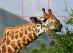
 There are a lot of ideas around regarding what size things should be. ISO 7810, for example, specifies the size and shape of a credit card, the aspect ratio of which many people find is a comfortable, conceivably because its official size (85.60 × 53.98 mm) is pretty close to the aspect ratio of a
  4:3 is the aspect ratio of a normal television, which is of course another size we have become used to over time, and it is the aspect ratio used by most computer monitors. Some digital camera manufacturers took to – including Canon: my Digital Ixus / Elph takes photos in the 4:3 aspect ratio. Some cameras – including the
