Uncategorized

Beginnings in street photography

Flute Player at Picadilly Circus (click image for large version)

Sometimes, I learn more about photography when I teach about photography, than when I learn about photography. Bear with me, it does make sense, honest.

I have one friend – Daniela – who is a n00b at this whole photography things. Some of the questions she asks, and some of the comments she makes, sound like stupidity in my ears. ‘Of course not’, I want to burst out… And yet… that’s a learning moment for me. What is ‘obvious’ to me isn’t necessarily obvious to others – especially if you’re just trying to come to terms with photography and how it all fits together.

Anyway, Daniela was recently in Belgium, and had a go at some street photography. I’ve written about Street Photography many times before: A shot at Street photography, Katie Cooke’s The return of Street Photography, Brad’s Street Photography and the Law, Street Photography in Montreal, Prime Lenses, and why you need one, Oi You! no Pictures! and it’s also mentioned in my article about insuring your photography gear.

What I had never stopped to think, however, is how a beginning photographer looks at street photography. Daniela offered some insights… 


Flute Player at Picadilly Circus (click image for large version)

Flute Player at Picadilly Circus (click image for large version)

When I was Belgium I had a go at some street photography. I wasn’t entirely happy with what I produced, but it doesn’t mean to say that I won’t try again. In fact, I think I’m rather looking forward to having another go. These are some thoughts on the experience, from someone who is not nearly as talented – technically or artistically – as the Photocritic. I’m not sure if my ramblings are of any help to you, but they might be….

Aside from the obvious, being a camera, what you need most for street photography is confidence. That’s not confidence in your photographic abilities, it’s confidence to walk around holding however many pound’s-worth of camera equipment it is that you own and to take photos. If you don’t have the confidence to point and shoot, you won’t get the pictures that you want. The more photos that you take, the better you’ll become. That’s obvious. So don’t be put off by your attempts not working. They can only work if you actually try it.

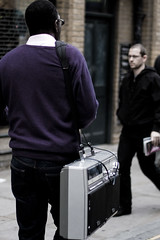
Sometimes you catch the most amazing sights on the streets - like this guy with his 1970s ghetto-blaster (click image for bigger)

Sometimes you catch the most amazing sights on the streets - like this guy with his 1970s ghetto-blaster (click image for bigger)

Make sure that you know the rights and wrongs of taking people’s photographs in public places. If someone stops you, you need to be able to respond confidently and accurately about what you’re doing. Even if you don’t know what you are doing, be confident and act as if you do. It goes without saying that being polite and respectful is something you should be doing, and be careful taking photos of kids.

As much as I know you are anti-automatic settings on DSLR cameras, when you start out it can be helpful to use the automatic setting. Until you are accustomed to it, it’s easier to let your camera do the hard bit whilst you’re getting to grips with the concept of street photography. When you’re more experienced and more comfortable with what you’re doing, you’ll want more control over what you’re shooting and you’ll have a better feel for what you need to do. Don’t overwhelm yourself initially with the technical aspects, concentrate on getting a shot.

Daniela first wrote for Photocritic with her Teaching Photography to a 5-year-old article.


Do you enjoy a smattering of random photography links? Well, squire, I welcome thee to join me on Twitter -

© Kamps Consulting Ltd. This article is licenced for use on Pixiq only. Please do not reproduce wholly or in part without a license. More info.

Get a photo critique!

3430730319_a928c4be00

I have been doing Photo Critiques on this blog in the past, but it’s starting to dawn on me that perhaps a blog isn’t quite the right way of doing these, so instead I’d like to start doing them on Flickr.

If you would like me to critique your photographs, here’s how to get on the list… 


Follow these steps

1) Get a Flickr account (you should probably do this anyway, it’s free, and Flickr is awesome)

2) Upload 3 photos you’d like me to critique It’s important that you choose three photos, because it’s difficult to give systemic advice on a single photograph. Also, it may be worth not necessarily taking your 3 best photos, but do pick photos that you are proud of, but which you feel might be improved – and yet you don’t know how. NOTE: Nudity and similar themes is perfectly OK, but remember to mark your links with (NSFW) – I don’t want to get my readers in trouble at work or with kids just because they clicked on a wrong link

3) Check your Flickr settings Please ensure that you allow notes on your photos, as these make critiquing much easier for me. Also, the photos have to be of a reasonable size – I can’t critique thumbnails :) If you haven’t turned on notes, I’m afraid I won’t be able to do a critique.

4) Add a comment to this post where the URL leads to your Flickr stream. In the comment itself, please tell add a link to the 3 photos you’d like critiqued on Flickr

5) Pay to skip the queue (optional). You may have spotted that there’s a pretty long wait on these now – I simply don’t have the time to do them all as quickly as I like. If you would like to skip to the top of the queue, and receive your critique within a week – guaranteed – make a donation of $50 via PayPal.

What happens next?

As far as possible, I will follow the structure I’ve outlined in my Doing a Photo Critique article – it’s worth a read if you haven’t yet.

Finally, remember what I said in my ‘dealing with negative photo critiques‘ article – you may not like everything I have to say, but my intention is to help you become a better photographer. If you only want to hear that your photography work is ‘OMG AWESOME LOL’, then you’re not in the right place :)

Also, it’s worth nothing that despite of persistant rumours of the contrary, I’m only human, and I will only do critiques when I feel I can actually make a useful impact – sometimes I may do 3 people in an evening, other times I won’t do any for a while. Partially, it’s because I’m crazy busy with work some times, but sometimes, I’m just plain lazy – do forgive. If you’re desperate for me to critique you immediately, check out step 5 above to find out how you can skip to the top of the queue.

The boring bits

By following the steps above, you give me a non-exclusive license to use your 3 photos as illustration images to a photo critique, if your particular critique somehow works well as a separate article on Photocritic. I will not use your photos in any other circumstance without conferring with you first.

I will pick and choose which photographers to critique first – it’s not meant as an insult if yours sits there for a while while I pick off newer entries first – it may just be that I haven’t got much useful to say about your photos because they already are perfect, or perhaps I’m struggling to vocalise what I like / what I would improve about your particular photos. Don’t take it personally!

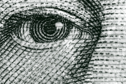
Portrait of Queen Elizabeth II
Photo: Portrait of Queen Elizabeth II by Photocritic.org on Flickr  

Photo Critiques Competed so far

You don’t have to submit your own photographs for critique, of course, it’s entirely possible to learn huge amounts about photography by reading good critiques of other photographer’s work, so here, I’ve collected the criticisms and praise I’ve done on Flickr so far:

Oct 8 ’09: solofotones - Man with Paper, Street performer and Juntos
Oct 8 ’09: MondoUNCSweater Weather, The Virgins and Cupcake.
Oct 1 ’09: ooomidgetmanoooPortrait 1 and Portrait 2
Oct 1 ’09: HoneyJarAutumn Leaves, Como Lake from Bellagio and Tulips
Jul 7 ’09: HeraldKAdmiration, Shadows and Irish Coastal Road
May 25 ’09: Jacob WightonAnts!, Flight of the Birds and Sneaking!
May 1 ’09: Jack Makio Ugandan Mother and Child, Dasiy and Plazma light
May 1 ’09: JeffThe Remarkables and Milford Road
Apr 28 ’09: Jack FusselSpeckled, Bar Bar Bana and Stunning.
Apr 27 ’09: MrSimbolManila by the bay, Business as Usual and High and Dry
Apr 26 ’09: PerHeavy Lifting, Bench and Martin Luther King Memorial.
Apr 26 ’09: Ilan(Final) Rest, Man and Together and Alone II
Apr 26 ’09: MarkHoly Trinity Silhouette, The Long Drive Home and Autumn
Apr 25 ’09: AdricvJean-Claude, de Haiti, Puppet Shop and Moving Sculpture
Apr 25 ’09: Gary KurtzPhoto 1, Photo 2 and Photo 3

There is also a hyper-exclusive invite-only Flickr group where you can see some of the photos I’ve critiqued, called, imaginatively, Critiqued by Photocritic.


Do you enjoy a smattering of random photography links? Well, squire, I welcome thee to join me on Twitter -

© Kamps Consulting Ltd. This article is licenced for use on Pixiq only. Please do not reproduce wholly or in part without a license. More info.

Recovering lost images from a memory card

Some photos are less valuable than others - but if yours are a matter of life and death (say, you lost someone's wedding photos), then get professionals involved!

The biggest ‘Oh… Shit’ feeling I’ve ever had on a photo job was when I had a rush-job: Press deadline was at 5pm, and I had to photograph an event at 3pm. The event was meant to last until 4pm, which would give me half an hour journey time back to the office, half an hour of Photoshopping… Tight, but doable. Then the worst thing imaginable happened: The event was delayed in starting, and my time was ticking away.

When I finally got in the taxi on my way back, I decided to clean out all the photos I knew I wasn’t going to use from the memory card, using the camera itself, so I could spend less time downloading and sorting, and more time just fixing it, so we could drop in the images and get the magazine to print.

I selected a batch of photos. “keep that one, lose that one, keep, keep, lose, keep, that’ll do, Format. Yes, of course I want to format. Yes. Confirm.”. I sat back in the cab, mentally going through what I had to do when I made it back to the office. Then it suddenly hit me.. ‘Format?’ Shit! No! Surely not… NOOOO!!!!

Here’s what to do if you are as big a plum as I am… 

The first rule of data recovery

If you fear something Bad might have happened, take your memory card out of the camera immediately, and stop using it. (Click on pic for bigger version on Flickr)

If you fear something Bad might have happened, take your memory card out of the camera immediately, and stop using it.

It has happened many of us: that ‘oh, no…’ feeling that occurs when you realise that you have just lost your pictures on your memory card. The good thing is that all is not lost and there are some ways to get that data back. We are going on a mission called ‘saving our asses’ and here is what we will need to make this a successful mission.

Once you have lost data on a memory card you need to quarantine that card and stop using it immediately.

I know I wrote that in bold, but let’s repeat it, because it’s the single most important thing you’ll learn from this article:

If you lose data on a memory card, take it out of your camera, and do not use it for anything else.

You may have to exhaust different options with that card to try to recover those photos so don’t keep adding pictures to it. Continuing to use the card can be detrimental to you actually recovering those photos.

How are images deleted from a card?


Image deletion operations – and, indeed, formatting a card – is normally not what most people think of as ‘proper’ deletion. Instead, you’re merely re-setting the file allocation table. Imagine your memory card as a chest of drawers which has 20 drawers, and can hold 20 photographs. When you take a photo, it’s put into one of the drawers, and you stick a little lable, like IMG_1234.RAW on the front of the drawer. It’s safe there. When you need it, you open the drawer, and you take the picture out.

When you delete a photo, something interesting happens: The photo isn’t removed from the drawer, all your camera does, is to peel the label off the front of the drawer. That means that this drawer is now ‘free space’, so if you had a full set of drawers, and ‘delete’ three photos, you now have 17 full drawers, and three ‘empty’ ones. When you take a new photo, your camera puts the photo into one of the free drawers, on top of the old photo.

Your old photo doesn’t disappear off the memory card until a new photo is put on top of the old one. Even if your card reads ‘empty’, all the old photos are still there, just not easily accessible.

Recovering data from your memory card

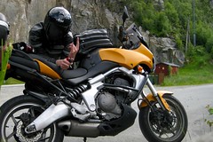
I was half-way around the world (Well, 1,400 miles into my motorbike tour of Europe) when I took this photo - while the picture itself isnt that unique, it represents a fond memory for me - Id be gutted if I had lost it, but I was able to recover it off my memory card. Phew. (Click on pic for bigger version on Flickr)

I was half-way around the world (Well, 1,400 miles into my motorbike tour of Europe) when I took this photo - while the picture itself isn't that unique, it represents a fond memory for me - I'd be gutted if I had lost it, but I was able to recover it off my memory card. Phew.

Lost data recovery operations happen with some type of third party software, in fact this is probably the method you are going to use to retrieve your data. There is a problem though, which software option should you purchase?

There are literally hundreds of options to choose from in this area, both paid and free choices. It would be close to impossible to tell you exactly which one is the best for you, because the focus of the programs can vary. Depending on how you lost your photos that could determine which product will be best suited to solve your problem. However before you go out and purchase a product make sure you take these steps:

Try a demo version first – Many programs (like the very popular Photo Rescue, which is available for both Mac and Windows) will allow you to use a trial version before you have to purchase a full version. It is strongly recommended that you test the trial version with your camera and with your specific problem: For these types of software, the trial software will usually show you which images could be recovered with the full version of the software.

Leaving it to the professionals

Some photos are less valuable than others - but if yours are a matter of life and death (say, you lost someone's wedding photos), then get professionals involved!

Some photos are less valuable than others - but if yours are a matter of life and death (say, you lost someone's wedding photos), then get professionals involved!

Professional data recovery is many orders of magnitude more expensive than doing it yourself, but it’s incredible what can be recovered…

And if your photos are truly invaluable (losing the photos as a wedding photographer, for example, could prove hideously expensive if you get sued by the couple as a result… Which has been known to happen, and this is why there is separate wedding photography insurance out there), you might have to find a local professional service (try googling for it).

If you have to go down this route, go to the corner shop and buy some beans and toast off the internet, because if you have to get someone to manually pick the card apart and read the chips inside your card directly, you’d not going to be able to afford to eat anything else anytime soon – I once helped someone find a data recovery service, and they paid over £3,500 to get a dead hard-drive resuscitated for long enough to copy it over to a fresh drive. On that note – when did you last back-up your photos?


Do you enjoy a smattering of random photography links? Well, squire, I welcome thee to join me on Twitter -

© Kamps Consulting Ltd. This article is licenced for use on Pixiq only. Please do not reproduce wholly or in part without a license. More info.

How to organise your own photo exhibit

Picture 3

A year ago, the Oxford Flickr Group, a group of slightly geeky amateur photographers, were sitting around a table in a pub somewhere in Oxford. This is not at all unusual, but the difference was that, on this occasion, they decided that it’d be a marvelous idea to hold an exhibition. None of them had had any real experience of organising or taking part in an exhibition but hell, why not give it a go?

Jump ahead to the present day, a year later, and their exhibition is about to open. So how they get this far? How on earth do you go about organising this sort of thing from scratch? Anna Badley explains…

The Big idea

We hold regular photo meets and pub social meets in Oxford, and at one of these meets it turned out we’d missed the deadline for the annual Artweeks event that takes place locally – so we decided that we’d go it alone. We’re quite an active social group, there are probably 40 or so people who turn up to the meet ups so we thought it might be worth a go. That was about 12 months ago.

The first step was finding out where we might be able to stage the exhibition as that would determine the space, how many pictures people could hang and how much that might cost per person. We found a helpful bar/restaurant/gallery that suited our informal group better than a very formal space, and worked out that we could hang 30 fairly large pictures in the space they had – so, 30 exhibitors.

The next step was to find out who in the Group might be interested in exhibiting. There are around 1,500 members at the moment and we had no idea how many of those might be actually located in Oxford and interested in putting in a picture. We thought we’d get loads of people expressing an interest who would then drop out things really got going, but that didn’t happen. Also rather surprising was that quite a few of the final 30 had never been along to any of the meet ups and we had no idea who they were – we’d never met them. This did make us a little nervous at first; what if they didn’t pay up? What if they didn’t turn up with a picture?

The plan takes shape

The poster for the Flickr exhibit in Oxford

The poster for the Flickr exhibit in Oxford (click on the image to see it full-size)

By the end of March this year we were pretty much set on what we were doing, we’d got our 30 exhibitors, and 5 organisers (not quite sure how they were elected, it just sort of happened).

We had a bit of a break in early Summer then got the money in from the majority of the exhibitors during July and August. That was far less of a hassle than we’d imagined it might be, but apart from putting the money down on the venue not a lot else happened over the Summer months.

The exhibitors had a theme to work to; we wanted to show a different side of Oxford to the one the tourists see when they visit. So we’d asked everyone to try and show their own perspective on the city, and tried to give them as much freedom as possible.

Oh my God it’s only 8 weeks away, how did that happen?

With only 2 months left before opening night, there was a sudden flurry of activity. A summit was held with the five organisers and a horribly large task list of things that needed checking, fixing, chasing, designing and printing – the whole lot.

By the time the summit had finished, we’d divided up the tasks; collecting the high res jpg files to put in the accompanying book, keeping in touch with the venue, writing the press release, designing the map for the photos to be placed on and setting up the email address were some of the more major ones. Somewhere along the line the exhibition also got a title – Made In Oxford – and suddenly we were almost ready to go!

One of the group also had a tame graphic designer who immediately set to work on making us a fantastic poster. It was definitely worth having someone professional do this because as soon as we saw how good it looked it was pretty clear none of us had the design skills to even get close to that.

Final tweaks

The Made in Oxford book is available to purchase via Photobox for £21

The Made in Oxford book is available to purchase via Photobox for £21

Finally, we arranged a meet up (mainly as we were really intrigued as to who our mystery exhibitors were) and had a frankly scary meet-up that felt more like a board meeting than a group of photographers! Thankfully we managed to fix that problem later in the evening with a few ales, once all the important information had been dished out.

The book was proof-read by three of us (not taking any chances there) and is now available to buy from Photobox!

When we first looked at all the pictures together it became apparent that the majority of photos had nobody, or just a lone figure, in them. Many were taken at night or very early in the morning. Even the usual tourist traps and colleges look deserted which is not something you ever see during the day. It was really exciting seeing a completely different side to the city and we were happy that the theme we’d chosen had actually been okay to work with.

So we’re currently four days before opening night. We’ve had plenty of local press interest and the posters are starting to appear round town. We have 29 pictures ready to go and the last one is almost there so it looks like everything is ready to roll.

Once all the pictures are safely hanging on the wall in the venue we’re intending to get the beers in and sit back to enjoy what’s been achieved, and maybe even start thinking about next year’s theme – well, maybe not quite yet.

The exhibition is open 7 days a week to the general public from 3rd-31st October 09, at the Jam Factory, Hollybush Row, Oxford, UK OX1 1HU (map).

Hang on a minute. What on earth is the Oxford Flickr Group?

We’re an offshoot of the online photo-sharing site, flickr.com. We love taking photos, finding interesting things to shoot here where we live and welcoming new people to our city. There is normally a degree of photographic geekery happening but it’s certainly not a pre-requisite for joining in; we don’t care if you use your iPhone, a dinky little point-and-shoot camera or a fancy-pants film SLR with all the lenses. We certainly don’t compare mega pixels (okay, most of us don’t do that).

There’s no charge for joining and we’re a friendly bunch so if you’re interested in saying hello, come and find us on Flickr!

Oh, and of course if you’re not in Oxford, UK, there are loads of other local Flickr groups all over the world. If there isn’t one where you are, nothing’s stopping you from starting your own – get busy!

This article was written by the inimitable Anna Badley (Flickr / website), who in the past has written the Beginning in Portraiture article here on Photocritic. If you would like to get involved and write a guest article, drop me an e-mail!


Do you enjoy a smattering of random photography links? Well, squire, I welcome thee to join me on Twitter -

© Kamps Consulting Ltd. This article is licenced for use on Pixiq only. Please do not reproduce wholly or in part without a license. More info.

Insure your camera stuff!

Broken Camera

Insurance for your camera equipment – I can barely think of a less exciting topic, to be honest. In fact, I highly recommend you skip this post, because it’s going to be hideously boring. Before you to, though, I’d like for you to think about one little thing:

“If your camera vanishes today, can you afford to buy a new one?”

If the answer’s yes, great, go look at amazing photography to spark your inspiration. If not, read on…  


You’ve probably insured your house, the contents of your house, your health (if you’re unfortunate enough to live in a country where they don’t take care of you properly, that is), your car, and your pets.

Why do we insure all these things? It’s simple – because if you don’t, the life you’ve spent so much time and money building up is only one minor disaster away from slipping away from you. Yeah, that is probably the most emo thing I’ve ever written on my blog. So sue me (I’ve got indemnity insurance!).

I know for a fact that people reading this blog do all sorts of different things with their camera equipment. Some of you work as professional photographers, some of you don’t know which way is up on a camera – but most of you do own cameras which you use a lot.

Insurance as part of your home policy

Truth is, though, that photography is one of those hobbies where you, by its very nature, take your equipment out on the road with you: there’s only so much you can do in your living room or kitchen, after all. If your camera stuff is at home, it’s probably covered by your home insurance (but not always…) – but what happens when you venture into the world to capture slices of time on your film or imaging chips?

n

Have you insured your camera equipment?

View Results

Insurance is really only about one thing: peace of mind. It is the type of product you buy and hope you never have to use because, well, it means something bad has happened. When it comes to photography insurance, there are a few ways you can go about insuring your equipment. Some provide more protection than others but you need to decide what will work best for you.

Watching life go by

If you do a lot of street photography, you may wish to take out extra camera insurance, because the risk of your camera getting damaged or stolen is much higher. Photo by Photocritic on Flickr

When considering your options the first determining factor is the way you use your camera. If you are a professional user and are getting paid for your services then you need to consider a commercial policy. If photography is your hobby then a homeowners or rental policy may be enough but there are some limitations there. When you add photography equipment to a homeowners / contents insurance policy it will typically cover if the equipment is stolen or there is a fire in your home. Coverage outside of the home may or may not be included so you need to check your policy to be sure of the coverage you have. Also if you drop your camera or damage it yourself then this type of policy may not be all that useful.

For a higher level of peace you can add a ‘floater’ (an especially insured item as part of the main policy) to your homeowners / content insurance policy. Floaters range in price but are relatively inexpensive and will generally protect your equipment against all types of calamities, both fire and theft – and sometimes even accidental damage you may cause to the camera.


Dedicated camera insurance

Broken Camera

It doesn't bear thinking about, but it's better to consider insurance before you might need it than after...

If you are not a homeowner or don’t have renter’s / content insurance, then another option can be to get personal camera insurance. This type of insurance for your camera is like every other insurance policy offering a varying amount of coverage limits, deductibles and premiums.


There’s a lot of disagreement among photographers whether this type of insurance is worth it – Insurance especially for your camera equipment is usually quite expensive, and often assumes that you are a professional photographer – or at least that you are making money with your photographic equipment.

Some argue that it is not worth it, yet other photographers will say it is highly necessary. What side of the argument you fall on really depends on you and the value of the equipment you have, how often you replace your equipment anyway, and how high-risk your photographic behaviour is: If you do a lot of street photography in the evening, you’re at high risk; if your camera rarely leaves your studio, then perhaps you’re less likely to get mugged (but nothing stops you from being butter-fingered, of course)


Using equipment that doesnt look as expensive (like a smaller 50mm prime, instead of a big L-series zoom lens) can help you stay out of trouble

Using equipment that doesn't look as expensive (like a smaller 50mm prime, instead of a big L-series zoom lens) can help you stay out of trouble

If you decide to go this route then your goal should be to choose the limits that fit your specific needs. Also make sure you identify all of the types of things the policy covers, especially things like liquid or water damage. Ask about what other things you need to be insured. For example if you do any type of underwater photography, it may invalidate your insurance, or you may have to pay a higher premium for your insurance to apply. Again knowing your needs and how you plan to use your camera will go a long way in to determining if this is the right option for you.

Camera policies are not entirely dissimilar to car policies; At first, it’ll be very expensive, but the cover drops in price after a few renewals, as you get a no-claims bonus – some companies offer up to a 80% bonus built up over 5 years, but of course building up a bonus can take quite a long time, and if you think you’re at very low risk of anything happening to your camera, then perhaps you don’t need a policy in the first place.

When looking for companies to purchase from like most people you can search online and find a variety of options. If you belong to any photography organizations, clubs or groups you can always see if they provide any type of group discounts that you may be able to capitalise on – also check the back of photography magazines, there’s always some good offers in there!

But…

Here’s to sincerely hoping that whether or not you have your camera covered, that you never end up in a situation where you have to use – or wish you had – your insurance cover.


Do you enjoy a smattering of random photography links? Well, squire, I welcome thee to join me on Twitter -

© Kamps Consulting Ltd. This article is licenced for use on Pixiq only. Please do not reproduce wholly or in part without a license. More info.

Under-water photography

1971625267_67f3e5de52_m

If you thought photography out in the open air was tricky, you’ve got a surprise coming – Underwater photography represents one of the most challenging and specialized segments in the photography world. It’s fun, it’s creative, and it surrounds you with water, which only has one purpose: To ruin your expensive pride-and-joy photography equipment!

Two thirds of the world is covered by water, and while much of it is quite boring and un-photogenic, there are still vast opportunities to capture what is happening beneath the surface. There is a combination of equipment and tecnique required to make this type of photography work for you, include choosing the right camera, making sure it stays safe from water, and finding some way of lighting it all.

Picking a camera

Vivitar underwater cameraWhen searching for cameras, knowing your budget and the types of photos you want to take will go a long way in determining the right option for you.

Photo, right: Vivitar underwater camera by Anetz on Flickr. This photo also shows the ‘sports finder’, which is much more useful than a viewfinder once you’re underwater

Your options will change depending on whether you want this to be a vacation hobby or you want to become a gadget-tastic underwater photographer with all the bells, whistles, and a bathysphere with an espresso machine in the corner. Don’t get me wrong, underwater photography can become very expensive, very quickly so it is imperative that you identify what your goal is.

NikonosImage, left: Underwater Nikon Nikonos-V with 35/2.5 by Mikesub on Flickr

If you just want to dip your toe in, you could actually use a cheap, single-use disposable underwater camera… It won’t give you the greatest quality images but it gives you some photos to show friends, family, and Flickr-admirers back home.

In selecting the right camera there are a billion options to choose from. More or less. Probably less. Both digital and film cameras can each perform well underwater however the major disadvantage for film cameras is that you can only shoot one roll of film at a time. Having to swim back up to change the roll of film is infuriating, to say the least, so stick with the megapixels for photography zen.

Naked Lady
Naked Lady by Arno Gourdol on Flickr

If you are a beginner than a point and shoot may be a good place to start. Try to get a cameras with a nicely sized LCD screen which will simplify your picture taking experience – don’t plan to be able to look through your viewfinder much, because between your diving equipment and your (hopefully) water-proof enclosure, it’s not going to be much use. Whatever you decide make sure the camera matches what you are trying to accomplish.

Also, be aware that some cameras marketed as ‘water proof’ may work when they are wet but they may not be designed to withstand the high water pressure in underwater photography – as with most things, you generally get what you pay for, so a £99 waterproof digital camera probably isn’t. Water-proof, that is.

Keeping it dry

Miss Underwater
Miss Underwater by Kal.LKL on Flickr

To prepare your camera for underwater use you will need housing. Housing provides a waterproof encasement for your camera to dwell in making it able to function underwater. As there are a variety of cameras you will find a wide load of different housing options available ranging in price from $100 for one to cover your pocket-sized compact jobbie, to going in to the thousands of dollars for more professional units.

Many of today’s cameras come with manufacturer-designed housing units, however they may not be as reliable as speciality third party options. Make sure the housing you decide to use will support the water pressure at the depths you want to take your pictures.

When considering housing you should consider the controls on your camera. Some housing will limit access to (some of) the controls on your camera, so look for models that will support all of the functions you want to use on your camera when taking your pictures.

Lights, camera…

UnderwaterOne of the biggest challenges in underwater photography is lighting. As a beginner venturing into this new world you may want to start taking pictures using just the built in flash on your camera.

Photo, right: Underwater by Sagicel, on Flickr

Once you become comfortable taking pictures underwater then it is highly recommended that you purchase an external strobe light. Strobes give you more control over the way you bring light to the subject you are shooting.

With the improved light you can highlight various qualities and details that you want to bring out of your subject. You also can angle light toward or away from the subject. By angling away you can help keep backscatter, which are reflected particles in the water, from cluttering your shot.

Dive right in

Underwater in the Pool
Underwater in the Pool by Brian Marshall on Flickr

As you can see the options are great when it comes to underwater photography from cameras, housing and lighting, not to mention other accessories we didn’t even mention. Walking into this blindly can be an expensive proposition so start slowly and build your way up but most importantly know what you want to accomplish. Since it is both a scuba diving and photography activity rolled into one, make sure you include the time and cost of scuba diving lessons into your learning curve and your budget.

Some scuba schools also hold photography classes for beginners and might rent / loan you some equipment to get started, so that’s worth a look before you splash the kids’ college fund on something you might not enjoy as much as you thought!

Lastly, have fun and enjoy the underwater world waiting for you.


Do you enjoy a smattering of random photography links? Well, squire, I welcome thee to join me on Twitter -

© Kamps Consulting Ltd. This article is licenced for use on Pixiq only. Please do not reproduce wholly or in part without a license. More info.

Photoshop Makeovers

combined-mediumsized

So there you are, taking rather fantastic photos, and then, one day, you realise that everyone else seems to be getting better results. Unfair? Possibly. Or perhaps they’re just handier in Photoshop. Like my old friend Maxwell. I recently came across three of his photo-shopped portraiture sessions (one, two, three), and was rather impressed.

For the purpose of this article, let’s shelve any reservations you might have about the ethics of photoshopping the hell out of a portrait or fashion image (you’ve all seen this video, right?), and have a look at how it can be done. As a wise old man once told me, only if you have the skills to do something do you have the skills to choose not to do it…

Maxwell graciously accepted the challenge to talk us through how he edits his portraits, and is using a photo of himself to go through the process… Take it away Max!  


Step one – process the raw

step1My first step with every photograph, including this one, is to adjust the raw file to an exposure and look that I like. Normally it’s a little more contrasted and artistic than this one, but since we are going for a simple beauty shot (or as close as we can get with me!) I want an image that is pretty balanced and a little flat.

When doing this retouching process, my last step is always to photoshop the image as I would normally (i.e. change contrast, colour, detail, blur, etc.) and because every step I do that loses information in the image I highly recommend waiting ’till the end for any artistic choices.

Once I have that, it’s on the manipulation!

Step two – the healing brush and the spot healing brush.

step2At this point I like to get rid of all of the really obvious blemishes. I don’t get too nit picky, seeing as I do all the fine tuning later on, but make sure to get all the big ones (pimples, moles, unwanted facial hair, lines under eyes).

To do this I jump back and forth between the healing brush and the spot healing brush, the difference – the spot healing brush tool samples for you, whereas the healing brush tool you select the sample area.

I find that usually I have to play around a bit determining which one to use for specific things. In my experience the spot healing brush works great for smaller blemishes, such as pimples and moles, and the healing brush works better for thing like wrinkles.

Usually I use the spot healing brush until it stops working and then switch in order to have more control.

Step three – eliminating the double chin.

step3Seeing as I was teaching myself as I went along, this was probably the hardest part for me. I tried a bunch of things before realizing that transform was the easiest option. I use transform a lot for the whole process actually.

I made a selection from just below my mouth to about halfway down my neck. I used transform to stretch the selection upwards to have the double chin line align with my actual jawline. I then created a layer mask and used a very soft edged brush to paint my chin back in and to get rid of harsh lines around my selection.

Effectively this step is pulling up the double chin to hide it behind the first one.

Step four – manipulating all my facial features.

step4Here comes the fun. I made five or six different layers in this step, one for each facial feature we want to change. For me (and most other people, I suppose) we are going to want to change them all. I made a layer for my mouth (and surrounding area), my nose (and surrounding area), one for each eye (and surrounding… you get it) and a layer for each side of my face.

This step is very similar to the previous, in that it is all transform and masks. I made my eyes larger and changed the placement, made my nose longer and thinner, and made my mouth larger and moved down a bit. I also changed the shapes of these features a little, using the warp transform option. (cmd + T = transform and ctrl-clicking or right-clicking gives you the transform options).

The warp option is very useful when you want to pinch in just part of your selection or change one side, etc. I used the warp option to pull in the sides of my face, in order to make them appear even and slim my face a little. I then used masks to paint in the original image around the edges of the selections, once again to get rid of lines. I then used all these tools to tweak what was left of my face (stronger jaw thinner neck, etc).

Step five – skin.

step5I know there are a lot of ways to smooth skin, and I alternate between a lot of them. For this image I combined a bunch. First, I merged all my layers into a new one (shift+ opt+ cmnd+ e), duplicated it and applied a surface blur to the duplicate layer. I don’t remember my surface blur settings, but it’s really a personal taste thing (I like to still be able to see pores). I also paint out the facial features in a layer mask when I use surface blur, because I don’t want it to touch the sharpness of the eyes and mouth. I then created three new blank layers, one for darks, one for mid tones, and one for light areas.

I used the eyedropper tool to select a good colour to represent the dark tones and painted very subtly (maybe 5-10% opacity) over the shadowed areas of my face. I did this for mid tones and lights also. The reason I made three different layers is because I wanted to be able to adjust the opacity of each tone separately. The image here looked too fake for me, but had nicely smoothed out all of my skin. I wanted to bring some of the highlights and shadows back, so I copied the layer underneath the surface blur layer to the top of my palette.

I changed the layer blend mode to luminosity and dropped the layer opacity down to 38%. Again this would be a personal aesthetic moment, but 38% looked good to me.

Step six – adding depth.

step6At this point the image looked too flat for me so I selected my highlights (cmnd-click a channel) and created a curves layer set to screen @ %40 to bring out the highlights more and give more depth.

Then comes the dodging and burning. The way I do that is not with the dodge and burn tool; I create an overlay layer and use a really faint (<10% opacity) soft brush to dodge burn.

Black for darkening, white for lightening. I always do this on two different layers so that I may go back and change the opacity of them afterwards.

I also use this method to get rid of any remaining overly dark or light areas.

Step seven – cleaning up the edges.

There are many ways to do this. I jumped back and forth between the healing brush and just using a soft paintbrush to create and sculpt the outline of my hair.

Step eight – colour.

step8Again, everyone has their methods.

When adjusting skin tones I use a hue/saturation layer to adjust the saturation of the yellow and red tones until I get something I like.

Also to smooth out the colour I use the eyedropper to select the skin colour I want, create a solid layer of that colour and change the blend mode to colour.

Turn down the opacity or paint in the layer mask to change the strength and affected area.

Step nine – finishing touches and artistic processing.

I used the same transform and mask technique to apply some finished touches at this point. I elongated my neck and thinned it more as well as changed the size and shape of my mouth a little.

I did some more dodging and burning using some curves layers set to screen and multiply (I alter my dodge and burn layer using the blend if slider in the layer menu when you double click a layer), in order to only have it apply to the high- or low- lights of the image.

The final step was to merge it all together on a new layer and unsharp mask it a little. And there you have it, a beautified me!

combined-mediumsized
See a higher-resolution version of this image here (or, y’know, click on the image)

About Maxwell

Maxwell Lander is a queer photo-based digital artist and emerging graphic and website designer currently living in Toronto, Canada. Maxwell has been immersed in artistic photography for many years and is constantly seeking out new ways to express a passion for contemporary creativity, including and engulfing fascination with the abilities of the digital photograph and the control/choices it provides photographers.

As one of Canada’s leading emerging artists, Maxwell has exhibited works across Ontario and is continuously developing new photographic series. With a string of awards and accreditations – most recently Runner-Up in the emerging talent category of the 2008-2009 Nikon Photo Contest International and a publication in Photolife Magazine’s emerging artist special issue (September 2009) – Maxwell participates in the political and social sphere of the Toronto artistic community, contributing to the ever-changing art world.

Maxwell’s photography is intended to draw a thin line between beauty and vulgarity, restriction and hedonism, decency and decadence – to expose them all as interconnected and subjective experiences.

In addition to focusing on personal photographic art, Maxwell is available for commercial hire as a photographer, graphic designer, and web designer. To learn more, visit maxwellander.ca, check him out on Flickr, or follow @maxwellander on Twitter!

The man behind the blog.

self-portrait.jpg

The other day, I received an e-mail Stephan D, one of my readers, with a load of questions about me and my photography career. I occasionally get questions about who I am and why I run Photocritic, so I figured that I might just do a post about the man behind the blog, as it were.

What photographer(s) inspires you to create images?

There are a lot of photographers out there who really do it for me. I’m particularly fond of Philip of Lithium Picnic fame, and Ilyssa (isky on dA) also has a beautiful portfolio of photos. I love collecting my fave photos on Flickr (as you can see in the side-bar of this post).

To be honest, I take inspiration from lots of different photographers. The ‘best of’ or ‘most popular’ images on Flickr and DeviantArt are always a good place to star the flow of creative juices. Of course, Earthshots is also a great starting point… 


How did you get your photography business started?

I got quite lucky, actually. What happened was that I just went and picked up a lot of free and paid-for local magazines in the city where I lived, and I started calling them and sending e-mails. One of them needed a photographer soon after, and suddenly I had a regular flow of income. After that, I continued adding more clients, and finally ended up with a thriving freelance photography business.

In the end, my business failed because I got a little bit too sure of myself, took my eyes off the ball, and lost a couple of clients to no fault but my own (I lost some important photos once, which put me on rocky ground, and I completely failed to show up to a big photoshoot another time – both completely unforgivable sins as a photographer, and ones I’ve learned a lot from). Personally, I blame being scatterbrained, but in real terms, if you know that’s one of your weaknesses, you just have to find a system to deal with it: Carry an alarm clock with you, send yourself e-mails, or be better about diary-keeping. And suchlike :)

What type of equipment do you use?

I’ve used Canon equipment since I started as a photographer – more by chance than by design: My dad’s Canon A1 is still going strong, and I just sort of stuck with it. Throughout the years, I’ve had a EOS D60, an EOS 10D, an EOS 20D, an EOS 30D, and EOS 40D. I used a 300D and a 350D back-up cameras for a while, and shot with a Canon EOS 1N HS when I was still shooting with film. These day,

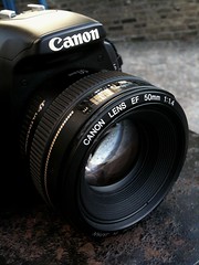
I’ve had a whole series of different lenses as well, but the Canon EF 50/1.4 lenses remains one of my favourites (check out some photos I’ve taken with that lens, if you need convincing :) – if you haven’t tried a prime lens, you really should. But then, I could ramble on about that for ages (in fact, I already have…). I’ve also got a 70-200mm f/2.8 which I’m incredibly fond of, especially for concerts (you can see some of my concert shots on flickr, and I did an article about how I shoot them, too), and a couple of wide-angle lenses. Apart from these, I frequently rent lenses such as tilt-shift and specialist macro lenses: Owning them myself is just too bloody expensive.

Having said all of that, I don’t believe that the equipment you own is all that important – it’s what you do with it, and as long as you’re comfortable with your equipment, you’re on your way. It’s been said before, but it can’t harm to repeat it: A photographer with vision and a disposable camera can come back with better result that someone who doesn’t know what they’re doing, but carry the latest bells-and-whistles D-SLR…

What type of lighting situations do you enjoy most?

I really love working with natural lighting, but studio work can be a lot of fun as well – it all depends on what you’re trying to do. It’s important to experiment with different types of lighting.

The most important part is that, through experimentation, I’ve come up with a style that I’m comfortable with, but I also notice that my tastes and whims change a lot. I used to do a lot of landscapes, but haven’t taken a landscape photo for a long time. I had a phase of doing macro photography (which resulted in my book), but I have barely looked at a macro photograph since. Recently, I’ve had an interest in doing more portraiture work – a genre where I feel I still have a lot to learn – so perhaps that’ll be my next experiment into lighting: some studio lighting might well be my next investment!

What background do you have in photography?

I’m entirely self-taught, but I’ve done a lot of reading and experimenting to get the technical and creative skills that I feel I need. I was like that in school as well, however: Having a teacher drone on at me drove me bonkers, but if they somehow managed to spark an interest, I’d be on the internet or in the library, researching the topic well beyond I was supposed to.

I don’t really see any harm in being self-taught, as long as you’re creative, inquisitive and thorough.

If you could pick another career than photography, what would it be and why?

Heeh, interestingly, I haven’t worked as a photographer full-time for years. The past few years, I’ve worked in publishing as an editor, I worked in television for a while, but I’m now back to life as self-employed, working as a writer. I’m currently working another book about photography (here’s my first one)

So I guess, to answer your question, I do have another career, and I like running for Photocritic, of course, but it seems I haven’t quite got enough time to do all it takes to keep the hamster wheel spinning ’round here – nonetheless, it’s good fun!


Do you enjoy a smattering of random photography links? Well, squire, I welcome thee to join me on Twitter -

© Kamps Consulting Ltd. This article is licenced for use on Pixiq only. Please do not reproduce wholly or in part without a license. More info.

The International Exhibition

xao

The internet has a funny way of erasing the feeling of the world being of any useful size at all – I regularly get visits from nearly 190 different countries, for example. In an exchange with the lovely (Swedish) Håkan Dahlström recently, I mentioned that his funky-looking photograph XAO wouldn’t have looked out of place in an East London wine bar. We joked about a bit, but I was suddenly thinking: What is stopping us, photographers, from creating ad-hoc photography exhibits all over the world?

So, in an epic effort of internet crowd-sourcing, I want to be the first curator in the entire world who creates a truly international art exhibition: The International Exhibition, or TIE for short.  


To participate in TIE, it’s really easy, go on Flickr, find a photograph you love (if you’re struggling, you haven’t been looking hard enough, but there are some suggestions below), print it out (or, even better, have it printed out using a service like Photobox in the UK or AdoramaPix in the US (thanks, @JohnMilleker) ), stick it on your wall, and take a photo of it. Then stick the photo on Flickr, with the tag ‘TheInternationalExhibition’. Then, if you want, stick a comment on this post :)

XAO by Håkan Dahlström, for TIE

Struggling to find a photo which would fit on your wall? Flickr’s Explore is usually full of wall-worthy photographs, or you can go look at the photos of all of your friends (or all of my friends, for that matter), or if you really want to enlarge my already unnecessarily buoyant ego, one of my own photos.

Let’s see what a big group of awesome photographers can come up with together, but I sense it might be pretty awesome.


Do you enjoy a smattering of random photography links? Well, squire, I welcome thee to join me on Twitter -

© Kamps Consulting Ltd. This article is licenced for use on Pixiq only. Please do not reproduce wholly or in part without a license. More info.

The 1% club of amazing photos

earthshots-thumb

Today, it’s exactly 1,000 days ago since my good friend Will started a little website called Earth Shots. Its concept is pretty simple; invite people to submit some of the best photos in the world, and let them stand as a glowing beacon of inspiration for other photographers to aspire to, one image per day. A couple of years ago, I did a run-down of some of the best photos that had come in so far, and it was fantastic.

I still visit Earthshots frequently, and if you’re a photographer who hopes to improve your work and your eye for a good photo, you could do a whole lot worse than doing the same. Why? Well, I’ve 10 excellent reasons (or 10,000, if we are going to agree that each photo is worth a thousand words) for you right here… That’s right, out of the past 1,000 day’s worth of photos, we’ve picked the 1% we think are the most amazing, the funniest, and the ones we think will make you reach for your camera and go “Hells bells, time I took some photos this good”.

Oh, and before you scroll down, you might want to put a pillow on your desk, otherwise you might get injured when your jaw smacks open against it…

10 of the best from the first 1000 days

Descending Mt Rainier by Joel Schenk

Will says: I really love this image! It captures the spirit of adventure and the solitude of the climber. Looking out over the sea of beautiful white clouds, it is easy to imagine that heaven might look a little like this!

Haje says: There is something really awesome about photographs depicting an epic battle between man and natur – the clouds threatening to engulf them where they stand, plus the hint of colour along the horizon – a fantastic capture. Not so sure if it’s about solitude though; someone was there to take the photo after all :-)

Turtle by Thomas Vignaud »
Turtle by Thomas Vignaud

Will says: This was one of the most popular Earth Shots winners ever and it is easy to see why; the jaunty angle, the expression of the turtle, the vibrant colours and the palm in the corner ñ all the elements come together to create a wonderfully engaging and striking animal portrait.

Haje says: Wow. Just wow. I have no idea if this is a HDR shot, if this is even a real turtle, or what in the world is going on here, but one thing’s for sure: it’s a stunning photograph. Such a truly fantastic detail and clarity, coupled with great colours and fantastic framing… An obvious winner

Salmon Netting by Fiona Halliday »
Salmon Netting by Fiona Halliday

Will says: The composition of this image breaks all the rules… but that’s why I like it! With two thirds of the frame filled by tumultuous, black water, the viewer becomes totally immersed in this Scottish salmon farmer’s unforgiving world.

Haje says: This photograph is purely and exclusively about the action: The water streaming against him, the fish fighting in the net, the quick-flowing water. He’s wearing a hat, so it’s easy to understand it’s cold, and you can just see the wet, cold rawness on his hands – an ususual framing, that’s for sure, but I’m feeling the struggle, here. Great stuff.

In The Beginning by Stephen Oachs »
In The Beginning by Stephen Oachs

Will says: This is an incredibly atmospheric image, reminiscent of the dawn of time. The abstract shapes, blurred spewing water and wonderful dawn light all contribute to the primordial, otherworldly sense of place.

Haje says: I have no idea what is going on here – but it looks as if someone broke into China Mieville’s world, and took some photos while they were there. It happens quite rarely that you’re able to capture pure magic, but I think that might very well be what you’re looking at here, folks.

Fields of Gold by Allard Schager »
Fields of Gold by Allard Schager

Will says: This is possibly the most vibrant photo ever to have appeared on Earth Shots! The strong colours and straight lines are very sticking and the people in the background give you a great appreciation for the scale of this incredible Dutch tulip field.

Haje says: I think the people in the background are what really make this photo – I’ve seen these tulip fields before, and they’re stunning, but notoriously difficult to photograph in such a way that you get a feeling for what you’re looking at – the people add a little bit of a break from the monotony of colour – and it’s bloody awesome to boot.

Highway to Heaven by Santi Banon »
Highway to Heaven by Santi Banon

Will says: This is another image that is reminiscent of heaven (assuming there are cars in heaven)! The warm light, flowing clouds and strong composition make this a beautiful and very unusual image.

Haje says: This is just fantastic – the light, the clouds, the mountains; the way the clouds seem to be welling up against the motorway without actually breaching across it in the foreground, while completely engulfing it in clouds and light towards the end. The title might be called ‘highway to heaven’, but if Tolkien had written Lord of the Rings set in the modern age, that’s what I envision the highway to Mordor to look like.

Taj Mahal by Thamer Al-Tassan »
Taj Mahal by Thamer Al-Tassan

Will says: As travel photos go, this is a pretty good one; we have all seen a million photographs of the Taj Mahal so it is quite an achievement to get a picture that makes you go wow! There are several elements that come together to make this image so good – the textures accentuated by the choice of black & white, the different shapes all mirroring each other and the lonely figure in the doorway.

Haje says: The Taj is a very, very stressful place to visit, and it happens incredibly rarely that you see it devoid of ten billion tourists; it’s easy to forget that it’s a spiritual place to many, and the person sitting here, seemingly meditating on its beauty is a gorgeous reminder of how that is still the case. I love the contrasts, the framing, and its subtlety.

Cold Morning by Kevin McNeal »
Cold Morning by Kevin McNeal

Will says: The expanse of ice, the blue tones and jagged mountains in the distance are so cold they almost make you want to shiver! However, it is the luminous ice-fissure in the foreground that makes this image so interesting and striking.

Haje says: This is such a contrast-rich photo that I scarcely know where to begin – it’s the peaceful skies vs the dramatic ice. The cold tones of the blues and whites at the bottom vs the warm reds and yellows and pinks of the sky. The rounded shapes of the ice vs the pointy mountains. Fab.

Bee-Eaters by Edri Shimon »
Bee-Eaters by Edri Shimon

Will says: We see many bird images submitted to Earth Shots but this one really stands out from the crowd. It is not just that these bee-eaters are ridiculously colourful, it is their poses and expressions that make this photograph so engaging and comical!

Haje says:This photo would make for a great entry for a caption competition: The dude on the left saying something outrageous, whilst the fellow on the right goes ‘well, I don’t really know, my good man’. I love the diagonal composition, the strong colours, and the hazy background which contrasts so well with the action in the foreground. Great stuff.

Climbing During Sunset by Lukasz Warzecha »
Climbing During Sunset by Lukasz Warzecha

Will says: I have saved one of my all time favourites for last… where do you even start with this image?! The sense of isolation, scale and drama – it really is jaw-dropping!

Haje says: … (what can I possibly add to this?)

Go on, you know you want to…

For more fantastic images of our planet, check out the current photo of the day or have a look through the EarthShots.org archive.

This post was co-written by Will Burrard-Lucas – checkout his blog or follow him on twitter.

All photographs are strictly © their respective owners, and are used here by permission of Earthshots.


Do you enjoy a smattering of random photography links? Well, squire, I welcome thee to join me on Twitter -

© Kamps Consulting Ltd. This article is licenced for use on Pixiq only. Please do not reproduce wholly or in part without a license. More info.

Laser-engraving my MacBook

blackbook

Those of you who follow my Flickr feed will have seen a couple of photos of my Black Macbook (affectionally known as BlackBook the Second), as it’s going through the process of getting the Photocritic.org URL engraved on the back – WITH LASERS! Obviously, everything to do with lasers has to be in all caps. Those are the rules.

Sadly, it seems as if something Bad Happened when I had my laptop engraved – luckily, the technician who did it has a solution: Why not colour it in with a Sharpie?


Back story

I’ve had my BlackBook for quite a while now, and I was considering replacing it in favour of one of those rather tasty-tastic new 13" Macbook Pro computers… One of my friends recently bought one, and my credit card has been sizzling in my pocket ever since. On the other hand, my current BlackBook is still relatively current, and it’s been upgraded to the max (I don’t remember what it started its life as, but it’s now a 2.0Ghz/4GB RAM/250GB HDD monster, which is perfectly adequate for most task, and still has reasonable battery life). So instead of plunging £1300 on the 13-inch MacBook Pro I’m lusting after, I decided to keep the BlackBook for another few months – or at least until the Apple Care runs out in March 2010.

To celebrate potentially saving £1300, I decided to spend £100 on getting the BlackBook laser engraved, because, well, lasers are reason enough in themselves.

BlackBook Laser Engraving 8: The original designI did a bit of Googling, and settled on using RazorLab; For one thing, if it’s good enough for Apple, it’s good enough for me, but also, they were among the first to get back in touch with me with a coherent response, and they’re based only a 10-minute motorbike ride from my house.

I drafted in a good friend of mine to try and help me design the logo; and while his design was absolutely wicked, it was a little bit too complicated. Instead, I ended up getting a vector graphic off istockphoto, and using that as the basis of my design.

At Razorlab

BlackBook Laser Engraving 2: Preparing the printSo, I booked my appointment, and went to see the lovely Soner who runs RazorLAB – he’s a true inspiration of a man; some of his product designs that were kicking around his office were positively brilliant. He took a look at my mock-up design, and discarded it out of hand; turns out that the machine can only handle vector graphics – luckily, I had also sent him the font I use on the logo and the vector, so we re-created it on his computer.

Then, a whole lot of precise measuring, placing the laptop inside what is, essentially, a fancy laser-printer (literally! It even uses printer drivers, which really amused me for some geeky reason) which can burn through all sorts of material. Thankfully, the engraving on the laptop was done at 30% power; I didn’t fancy having ‘photocritic.org’ permanently etched into my motherboard either.

About 45 minutes, a lot of interesting discussions about lasers, product design, Life as a Laser Etcher and £95 later, I was back on the street outside of RazorLab, with a freshly engraved MacBook and a renewed spring in my step.

The results

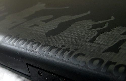
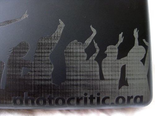
BlackBook Laser Engraving 6: The whole laptopWhen we were doing the etching, Soner did warn me that engraving large surfaces could cause some streaking; he also showed me an aluminium casing which had some slight streaking on it – not so much that I would be worried about it; it still looked pretty awesome. On my laptop, there was some white on some of the engraving, which Soner said was dust – so when I got home, I tried to clean it off, but to my surprise, it was going nowhere – whereas half of the laptop is very subtle (in fact, it looked bloody awesome – you can tell something is engraved on there, but you have to look quite closely to see what is engraved; it looks brilliant), the other half is streaked and milky white.

I tried cleaning it a couple of times, but the streakyness continued – so I e-mailed Soner to find out what I should do. Not much, as it happens: He said that “The problem with engraving big areas is that as the laser head moves away from the origin point (in this case top-left), the engraving results in different streak patterns -because of acceleration and speed changes at far corners”. It seems as if the problems are quite rare, too: “so far, we did not have any complaints with regards to this issue as people usually treat this as part of the process -it is within laser engraving’s nature to do these kind of effects.”

Of course, I knew I was going to be writing this review, so I tried to find out if there was any way to solve the issue – To be honest, and as I told Soner, I don’t mind the streak patterns, I actually think they are sort of cool, the issue is that they aren’t really even across the whole back of the laptop – the other thing that confuses me is that when you do a quick search on Flickr for ‘blackbook laser engraving’, you’ll see that there’s loads of people who have quite elaborate engravings on the back of their laptops – both with big areas and smaller areas – and while streaking is evident in some of the photos, it’s never uneven from one side of the laptop to the other; also most blackbooks seem to go a bright white when they are engraved (see this one, this one, this one, this one and this one, just to get a feel for it).

I spoke to Soner about trying to find a solution, and he said that while it would be possible, in theory, to re-do the engraving; in practice it’s impossible to line-up the laser with the previous engraving, so there wasn’t much that could be done.

What to do, then? “The only suggestion I could give is to paint the white areas with a permanent black marker. That should help to get rid of the gray gradient.”

So there we have it, I guess – As high tech as laser engraving is, if something goes wrong, the only thing you can do, it seems, is to break out your Sharpie.

Needless to say, I’m not particularly happy with the final outcome of the laser engraving, but as you can see from the Flickr links posted above, it’s possible to get gorgeous results. If anyone know what went wrong here, feel free to post a comment below – in the meantime, I’d probably recommend thinking twice about getting your expensive equipment laser engraved.

Photos!

For the photo gallery, check out these here pics on Flickr; or keep on scrollin’:

BlackBook Laser Engraving 8: The original design
The original design I came up with, before we had to re-create it as a vector

BlackBook Laser Engraving 1: preparations
The design is ready!

BlackBook Laser Engraving 2: Preparing the print
Soner preparing the LASER

BlackBook Laser Engraving 3: Close-up of the results
Results close-up

BlackBook Laser Engraving 4: URL close-up
Results close-up: the URL

BlackBook Laser Engraving 5: Back of the Laptop
The back of the laptop

BlackBook Laser Engraving 6: The whole laptop
I completely love the subtlety of the left-hand side of the laptop – just such a shame about the white streaky mess on the right-hand side of the lappy, where the logo is :(

BlackBook Laser Engraving 7: Good(ish) PR when I'm working in a cafe!
Looks pretty good when I’m working in a cafe – shame the logo is a bit lower than I had hoped (it is not really visible when the laptop is standing on a table – I’d hoped it was about 2 cm higher)

Featured on the Consumerist!

Seems as if one of my favourite publications – The Consumerist picked up on this story and did a short feature on it – which in turn attracted some good advice from Shane (see comment #2, below). Thanks for your help everyone!


Do you enjoy a smattering of random photography links? Well, squire, I welcome thee to join me on Twitter -

© Kamps Consulting Ltd. This article is licenced for use on Pixiq only. Please do not reproduce wholly or in part without a license. More info.

King of the Road!

picture-1

As some of you will have caught via Twitter or Facebook, I’ve recently left my job as a Senior Producer at Channel Five, and am about to set up on my own, as an editorial consultant. Sounds posh, means very little indeed, beyond the fact that I’ll be spending a lot of time writing books, and being a freelance journalist / writer / busybody and MAN OF LEISURE.

Before I embark on my new career as the boss of the freshly minted Kamps Consulting Ltd, however, I’m going to ride my rather awesome yellow Kawasaki Versys (FAQ: No, they don’t come in yellow. Yes, I painted it myself. No, it’s the kind of paint they use to paint lines on the roads with. Yes, I did paint it with paint rollers. Well, if you don’t come too closely, it looks quite good) all around northern Europe.

I’m setting off in exactly a week (the 10th of June), and will be gone the rest of the month, so there won’t be too many tweets or Photocritic updates in June – apart from this page, of course, where you can keep track of my progress! 


Where are you right now?

Self with Bike IIBy the power of the rather awesome BrightKite, you can keep track of my journey as it goes down.

I’m hoping to post some photos, updates, and – of course, my location so you can keep track.

If you’re particularly curious, subscribe to the RSS feed, or you can follow my progress on Twitter – I’ve set up @3500miles as a special account for this trip.

On the map below, you can to click ‘next’ and ‘previous’ to see how the trip has been progressing!

(Update: The map below only shows the 20 most recent updates – I’ll try to figure out how to make it show all of them, but for now, to read back in time properly, check out the BrightKite page for this trip)


Photos from the trip

These are the photos I’ve added to the Grand European Tour set on my Flickr stream:


Itinerary

Put simply: London – Dover – Dunkirk – Netherlands – Germany – ferry to Gothenburg – Oslo – Bergen – Kristiansand – Oslo again – Roskilde – Den Helder – Dunkirk – London… With a whole load of breaks and stops in between to visit friends, visit sights, and do whatever catches my fancy. I reckon it’ll be about 3500 miles (hence being able to follow me on @3500miles on Twitter, you see).

You can look at it below or open it up in Google Maps.

View Larger Map

So… When are you back?

I should be back in the beginning of July – so until then, have a very lovely summer, and stay awesome, everyone!


Do you enjoy a smattering of random photography links? Well, squire, I welcome thee to join me on Twitter -

© Kamps Consulting Ltd. This article is licenced for use on Pixiq only. Please do not reproduce wholly or in part without a license. More info.

Photographers on Twitter Database

twitter-logo

Sorry about the twitter-focussed posts as of late; I have been very busy with work (I have to wrap a lot of things up before I’m leaving there to look after Photocritic and being a writer), and I haven’t had much time or energy to do a lot of photography writing.

On the bright side, after the ‘twitter on photography’ thing became so popular, I decided to do a bit of PHP/MySQL magic, and I’ve integrated the list with Twitter itself.  


On The fancy automatic version of my ‘photographers on twitter’ page, you’ll find loads of photographers who use Twitter – and the list is your chance to tap into an exciting, active community of some very talented photographers indeed. And the occasional talentless snapper, too, I guess, but I’ll leave it to you to separate the wheat from the chaff.

So, check out the new twitter photographers page here on Twitter. If you check back often, you’ll be glad to know that I’ve given you the option of sorting by most recent, which should make it easier to find only the photographers who’ve been added to the list since the last time you did a sweep.

Finally, if you want to be added to the list, all you need to do is to follow @TwitTogs – within a few hours, the little robot will do its little robot thing, and you’ll appear on the list :)

Follow me!

You can check the latest of my posts in my sidebar, on Twitter, as an RSS feed, or you can follow me by clicking ‘follow’ on the @photocritic page.


Do you enjoy a smattering of random photography links? Well, squire, I welcome thee to join me on Twitter -

© Kamps Consulting Ltd. This article is licenced for use on Pixiq only. Please do not reproduce wholly or in part without a license. More info.

Name your Dream Assignment - Winners!

name-your-dream

If you can remember back to mid February, I did a post called If you can dream it, you can do it – which, among other things, called out for entries for the Name Your Dream Assignment competitions.

I was one of the judges, and Christ with a jetpack, if people didn’t come up with some absolutely awesome ideas…

The winner, Picture Hope is a well put together bid for a photographic project full of hopes, ideas, and more than a little bit of passion for a cause – and a well-deserved winner, in my opinion. Also check out the two runners-ups!

Incidentally, the Lenovo laptop the 3 winners win is pretty damn awesome – a huge 17-inch screen and a built-in Wacom tablet to do your photo editing on might actually be enough to (gasp) make me consider having a closer look. Now if only I could run Mac OS X on it somehow, I’d be a very happy bunny indeed…

Anyway, a huge congratulations to the winners, and if you didn’t win – go ahead and fulfill your dream assignment anyway. Especially you, Doubletrax – your Changes in Latitude project deserves a special mention here, because it was the one I found myself telling people about in the pub!


Do you enjoy a smattering of random photography links? Well, squire, I welcome thee to join me on Twitter -

© Kamps Consulting Ltd. This article is licenced for use on Pixiq only. Please do not reproduce wholly or in part without a license. More info.

Photocritic Logo: The Making Of

clicked-all

I’ve had a lot of great, very nice comments about my new logo, and a few questions – Oliver, who made the logo, kindly agreed to talk about it a little bit.

If you don’t care much about design or logos, feel free to skip this post :)  


Oliver, do your thing:

It starts off pretty simple. I lean back in my rocking chair and wait until things come to mind which are related to “photography”.

A lens, eyes, a finger pushing the shutter release button, aperture, light, photos, my DSLR, photographic history, the photo development process and other things. Then i pick up my pen and throw all this on
paper.

While doing this I might start with quite complex shapes, but I keep simplifying over and over again if I like an idea and follow it.

For the Photocritic logo I first thought of the people that make photos. I used simplified shapes of a finger pushing a button, a person holding a camera, a human head which contained a camera… but
this was a dead end.

Then i focused on the photos. I drew a piece of paper with a stylized glow, a polaroid and some more paper-like items that didn’t work as well. Here you get a bit of frustration. On the 2nd idea already!

But the ideas will not stop flowing through my mind. Some results looked rather weird and totally out of context: Film rolls, crippled fingers, human heads with lenses as eyes, some alien hand holding a
head… that’s enough!

Then I drew a stylized eye just for fun and started modifying it… suddenly it clicked!

clicked-all

CLICK! I remembered my focusing screen I bought a few weeks ago. I wanted it because of the grid lines which makes composition a lot easier. Bam! I thought of my first camera and the focusing screen that
was inside. Those were the times… looking into the viewfinder and then match the two half circles to get a sharp image. High Tech!

I sticked to that idea pretty quickly and liked it from the start. I was sure that the “distortion” inside the focusing screen could add a nice element, but won’t be very easy on the eye on first glance. At this point I turned to Photoshop and started the design in there. The design was already done in my head (after looking up what those focusing screens actually looked like haha).

And then there was the word “Photocritic”. Hmm. What should I do with it? I just used “PC” and put it inside my design. It didnt work. Changing fonts. Hmm. Another font. This one is good! The font was the hardest part. But luckily I had hundreds to choose from. I was still a bit sceptic if people would misunderstand the letters as “PC = Personal Computer”. But hey, people are not stupid – they are one a photo blog and will make the connection quickly.

Then I was satisfied and started on the colour palette. I picked the colours from the photocritic site and made variations of the surrounding circle, the PC letters and the other elements. Its just a matter of finding a good contrast, I have no specific rule when I like a certain colour combination. Haje liked one combination in particular and me too. So I sticked to it and submitted the final design.

Haje then spent quite a bit of time fiddling with the logo, but ultimately decided that it worked very well as it originally was: After a few emails it was agreed that the logo worked fine. Nothing was really changed afterwards. I hope you like it too ;-)

Thank you!

Check out Oliver’s work on Flickr, stalk him on Twitter, and check out his website while you’re at it!


Do you enjoy a smattering of random photography links? Well, squire, I welcome thee to join me on Twitter -

© Kamps Consulting Ltd. This article is licenced for use on Pixiq only. Please do not reproduce wholly or in part without a license. More info.

Taking fantastic photos with an iPhone

Back when I was doing my Top 100 amazing iPhone photographs, a few photographers’ names kept returning again and again – one of them was the amazing Sion Fullana, whose Flickr photography stream is full of absolutely fantastic street photography; mostly in New York, all taken by iPhone.

After gawping at his photos in incomprehension, I just had to ask him if I could interview him about his technique, and see if I could get some tricks of the trade out of him – luckily, Sion was happy to oblige.

So, if you have an iPhone and want to learn how to put its camera to good use, or if you just want to find out how you can take incredibly moving photographs even with inferior equipment, you’re in for a proper treat…

King of the Castle
King of the Castle by Sion Fullana on Flickr

1) Why do you take photos with your iPhone? What other cameras do you
have, and why don’t you use them?

There are various reasons why I love using the iPhone for photography. I guess the most basic is that you carry it on your pocket all the time so you have a photographic device always ready if the opportunity shows, instead of having to wear a big bag with a heavier camera.

Secondly, even though I know the 2MP lens of the phone is not too much for quality, I am convinced that under the appropriate amount of light and holding the iPhone very still, you can get images that would put to shame some great SLR cameras. It’s something about the colors and the light that the iPhone captures beautifully, and it allows you to go for certain type of shots that may be less perfect but with a very special and distinct signature.

Last but not least, since I do mostly street photography, the iPhone certainly allows me to get some good “sneaky” shots of people without them noticing. Something that with my bigger camera I couldn’t be able to do.

When I don’t shoot with my 3G iPhone, I take out my Panasonic Lumix DMC-FZ50, a camera that despite being considered a point and shoot still, has all controls and zoom manual, like an SLR. I use that one mostly when I cover journalistic events, or when I’m exploring a new area in the city where I want to take some wider shots or some street portraits from a bit further, zooming in.

Gentleman on a rainy day
Gentleman on a rainy day by Sion Fullana on Flickr

2) How long have you been using camera phones for photography?

Well, my iPhone was my last birthday’s gift from my boyfriend, on July 2008. So I’ve been using iPhone for 8 months, and taken around three thousand pictures with it. Almost 400 per month. Not bad, i guess.

3) Your work is quite amazing – your iPhone photos (despite all the limitations of the iPhone) are better than many people would be able to do with a DSLR – can you pick one of your favourites and talk us through your process step by step, from fishing the camera out of your pocket to people being able to see it on Flickr?

Oh, thank you very much!! Let me actually use for this the last photo I have uploaded on Flickr, as I really like it.

So here’s the story: I was on my way Uptown for a birthday dinner and I take the subway towards Times Square. In front of me, on the platform, I see this beautiful, elegant girl with her boyfriend. They both look awesome and I decide to take their picture, using the Camera Bag application, Helga Style (my favorite!). Unfortunately, the app decides it’s one of those times when it will crash and force you to restart the phone, losing your good image.

A bit down, we all enter the train, super packed in rush hour. The girl is sitting right in front of me, while I stand up. And suddenly, even with the movement of the train running, I see her using her pocket mirror to put some make-up on, and I’m fascinated. So I quickly snap the photo and off we go, Times Square…

Hours later, back home, I download the photos to my MAC, I see and like the image of the girl, and I go straight to Picnik, my favorite processing software. I tweak the image a bit by using the Cross Processing and the Orton-ish effects, and I upload it to Flickr and start spreading it around in my favorite groups.

before-after-sion-fullana

So you can see here the original image and the final result (which you can also see (and comment on / favourite etc) on Flickr, as “Paint my eyes in blue“). I love post-processing and what you can achieve sometimes with it. It’s a fascinating part of the process of taking photos, for me.

4) What are your top tips for people trying to wrangle some sense out of the iPhone as a camera?

I would say “Don’t stop trying”. Shoot, shoot, shoot. Experiment. Look for reflections, seek for rays of light in the hours after lunch on a sunny day, stay quiet for a while in a corner and hold your iPhone very still and snap at everything that crosses your path. Try movement effects. And also, do not hesitate about using photo applications.

My truly favorite had been VINT B&W, that allows you to get some beautiful black and white images, with the right contrast and tone… until I have recently tried and fallen in love with the CAMERA BAG app, specially the Helga and 1962 styles.

5) What would you improve about the iPhone to make it a better camera?

Obviously, there are things that could improve the experience of iPhoneography, indeed. Giving it some extra resolution wouldn’t be bad at all (more Megapixels for better quality). Some settings straight from camera (some control of shutter speed, or white balance) would be great too.


Woman on Heels by Sion Fullana on Flickr

6) Are you a professional photographer? Tell us about yourself!

Mirror of Soul by Sion FullanaWell, when do you get to call yourself a professional photographer? When you work exclusively taking photos? When you have made any money with them? When you are famous because of your images? :-)

Right: Mirror of Soul (Self Portrait) by Sion Fullana on Flickr

Let’s just say for now that I have become more serious about photography in the last year and that I love documenting the world through my lens, and that I have been selling my first images recently. My greatest goal with photography is try to raise awareness of the small details and the special moments in daily life that surround us but we tend to overlook in our rushed lifestyle.

When people have told me that this is one of my strengths, I feel I’m on the right path. Whatever the future may bring me with photography, let it be welcome!

The Yellow Line will Take you Home
The Yellow Line will take you home by Sion Fullana on Flickr

As for my background, I am originally from Majorca (Spain). But I have also lived eight years in Barcelona, two in Cuba (where I graduated in filmmaking) and now I reside in New York, where I am currently since 2006. I am a journalist, writer and filmmaker.

I work freelance as a reporter / photographer, and I’m currently in the very early steps of investigating a documentary film project about GLBT homeless kids in New York. You can see some of my previous work on my Youtube page and -if interested- purchase some of my photos on my website.

Thank you!

Thanks for helping us along and explaining your work, Sion! you’re a star!

If you liked this article, why not take a closer look at Sion’s work on YouTube, Flickr, or his own website?


Do you enjoy a smattering of random photography links? Well, squire, I welcome thee to join me on Twitter -

© Kamps Consulting Ltd. This article is licenced for use on Pixiq only. Please do not reproduce wholly or in part without a license. More info.

Photocritic Greatest Hits vol.2

building

Early last year, I did an article titled ‘Photocritic Greatest Hits‘ – which basically just listed the most popular articles on this site.

The reason for repeating it is down to a comment by Sharon on Twitter, who mentioned that she loved Strobist, but hadn’t really gone through much of its backlog – which is a shame, really, since the Strobist blog is positively awesome. While I’m no Strobist, I’d like to think that Photocritic also has some articles in its history that are worth visiting – so hereby, a list of ‘if you read nothing else, read this’

Most commented, most viewed, and most awesome – all for you!

Most popular in 2008

Hayley in the 1950s
Photo: Hayley in the 1950s by Photocritic.org, on Flickr

Missy in Liverpool1 – Extreme Macro Photography on a budget
2 – The dirty tricks of food photographers
3 – Nude Photography 101: Photographing your Girlfriend
4 – Try nude photography
5 – Top 50 Photography Websites
6 – The top 15 digital SLR cameras
7 – Concert photography
8 – Creating a photography portfolio
9 – Nude photography Avec Renoux
10 – The Ultimate guide to HDR

Above right: Missy in Liverpool by Photocritic.org on Flickr

Most popular of all time

Glass, wood, brick, sky and lens flare
Glass, wood, brick, sky and lens flare by Photocritic.org on Flickr

The Darkness in concert1 – Extreme Macro Photography on a budget
2 – Photographing Smoke
3 – Try nude photography
4 – Concert photography
5 – 100 amazing iPhone photos
6 – How to win a photography contest
7 – The dirty tricks of food photographers
8 – The 12 best photos of 2007
9 – Top 50 Photography Websites
10 – Your Photos, 300-style

Above right: The Darkness in concert by Photocritic.org, on Flickr

Haje’s favourites not in the above list

Freedom in Black and White
Photo: Freedom in Black and White by Photocritic.org, on Flickr

Just because an article is popular doesn’t mean it’s necessarily best. You’ll notice there’s a lot of nude photography stuff in the list above, so it’s obvious what kind of things people were searching for to find it :-) I have some more ones that are worth reading, though, if you fancy it.

In general, I turn my favourite articles into ‘featured’ articles, which means that they get ‘featured’ on the Photocritic home page that you can see all of them by checking out the Featured category. If you can’t be bothered, though, then check out these 10:

A Very Sharp Photo1 – Creating your own photography blog
2 – Teaching yourself photography
3 – Lens Flare and how to avoid it
4 – The return of Street Photography
5 – White balance explained
6 – Prime Lenses and why you need one
7 – Dealing with Negative Critique
8 – Expose for the highlights
9 – Teaching photography to a 5-year-old
10 – How to do a photo critique

Above right: A Very Sharp Photo by Photocritic.org, on Flickr


Do you enjoy a smattering of random photography links? Well, squire, I welcome thee to join me on Twitter -

© Kamps Consulting Ltd. This article is licenced for use on Pixiq only. Please do not reproduce wholly or in part without a license. More info.

Photocritic's new logo

pc-new-logo

If you’re a regular to the Photocritic site, you’ll notice that this page looks a little bit different than usual – well, if you’re reading this on the page, that is. If you’re reading it in a feed reader, then it’ll look perfectly normal, but in that case, just this once, come have a look, because I’d like to show you something I’m a little bit proud of; the new Photocritic logo.


It’s a while ago since I asked now, but after I redesigned this site in the beginning of February (Yup, everything you’re looking at here is my heavily modified design-hack based on the B Social theme for wordpress), I’ve been meaning to get a new logo. I haven’t had one for quite a while, actually, and I figured it was time to change that.

Trickier than it looks…

The problem is that it’s actually damn tricky to design a logo which screams ‘Photocritic’. What does a photo critic look like? Is this site even about photo criticism anymore? It started off as a DIY blog – but that was mostly because the first article I posted on here was about DIY stuff. pc-new-logo

Since, as you’ve been able to tell, Photocritic has been a lot less about equipment (although we do have a lot of articles about equipment – if you’re curious, check out the equipment category list), and a lot more about doing fun things with photography.

In trying to design a logo, then, I was stuck with the ‘how the hell do you illustrate ‘fun with photography’. I had some ideas, tried them out, and subsequently threw them all out. I don’t know if you’ve noticed this, but I’m not much of a designer (I’m not much of a photographer either – for proof, check out my Flickr account), so finally I gave in and asked for help via Twitter, which got me a few responses, including one response from the amazing Oliver Ruehl.

Logo concept

His idea was to get a lot more abstract with the logo – moving away from the idea of ‘pictures’, and towards the idea of ‘taking photos’, which was a shrewd idea. From here, he came up with some interesting concepts, including the idea of using a split-image focussing screen as the main element of the logo.

This has a couple of benefits: If you have no idea what one of those things is, then the logo still looks distinctive and recognisable. If you do, you’ll probably be overcome with nostalgia and reach for your analogue SLR camera, just to re-experience the brilliance of manual focussing without the guesswork.

Applause!

Check out Oliver’s work on Flickr, stalk him on Twitter, and check out his website while you’re at it – he’s a legend and a gentleman. Hereby publically; Thanks for making me an awesome logo, Oliver!


Do you enjoy a smattering of random photography links? Well, squire, I welcome thee to join me on Twitter -

© Kamps Consulting Ltd. This article is licenced for use on Pixiq only. Please do not reproduce wholly or in part without a license. More info.

Manual Exposure week

rusty

For the coming week, here’s a challenge for you: Abandon the safety of Program (P) mode. Shy away from Aperture priority (Av) or Shutter priority (Tv) modes, and reach for the holy grail of photography: The M of Miracles, Magic and other alliterative phrases. Yes, kids, it’s time to stop letting the machine do the thinking for you, and do all the hard work yourself.

I admit it; I’m as bad as the next man. “Hell, I’ve earned this”, I tell myself. “I paid a lot of money for a camera that has a good light meter, who am I to second-guess it”? And I’m right of course – Programme mode is great for snapshots. I use Aperture priority mode frequently when I want the fastest possible shutter time. And I override the light meter too, by setting a -2/3 Exposure value, because I’m petrified of over-exposures.

Rusty
Rusty by boliston (Creative Commons) on Flickr

But here’s how the boys are separated from the men, and the girls from the women: Unless you have an instinctive feeling for how shutter times and apertures work in perfect harmony, you’ll be struggling to really realise your visions as a photographer. Opinion? Fact? Who knows, but what have you got to lose? Go on, go manual, and add your photos to the Manual group on Flickr while you are at it. (Or you could, y’know, start the manual mondays challenge!)

For one week only, set your camera to Manual, and take photos only like that. Don’t cheat even once. At the end of the week, if you still don’t like it, then you’re welcome to switch back.

But I bet a good few of you would benefit greatly from making the switch, if but temporarily. I know I will.

Good luck!

Big thanks to @Patryk for the idea, and to boliston for the illustration image.


Do you enjoy a smattering of random photography links? Well, squire, I welcome thee to join me on Twitter -

© Kamps Consulting Ltd. This article is licenced for use on Pixiq only. Please do not reproduce wholly or in part without a license. More info.

Wedding photography 101

twicky-fave

If everything goes to plan (what with the ‘until death do us part’ bit, and all), most people only get married once. And even if someone gets married multiple times, a wedding day is a pretty big deal. A lot of people spend a frankly ridiculous amount of money on getting married too, so they are keen to be able to re-live the moments as often as they like to.

Every reasonably enthusiastic photographer eventually gets asked if they wouldn’t mind photographing a wedding. That, my good friends, should be your cue to run. Run for the hills, run for the bus, run for you life, just get the hell out of there. Leave it to the professionals or those with worse judgement than yourselves. Just don’t do it.

Ah, what am I saying, as if any of you were going to take my advice on that point anyway. Right – so if you really have to do a set of wedding photos, remember rule number 1: Get it right. No, seriously. Get it right the first time. Don’t screw it up. It’s a big deal.

To help me convey quite how big a deal it is, I’ve got some help from the amazing Tom Wicky, who has taken some mighty fine wedding photos in his time.  


Isn’t it just portraiture on steroids?

Signing the RegisterWell, yes, sort of – Wedding photography is a lot like most portraiture: Your job as a photographer is to capture people. Capture the spirit of the events, the tears and laughter, and the raw, sheer emotion that comes bubbling to the top whenever two people get married.

It’s more complicated than that, though.. “Wedding photography is different than most types of photography because there are no retakes.”, Wicky explains. “Sports photographers know the pressure I’m talking about. In fact, wedding photography gets me in to a very similar state as sports. As a former swimmer, I get the same butterflies/nervousness in the church as I did on the starting blocks.”

And he’s not wrong – there’s something magical and awesome about wedding photography: you get to see people at their most intimate (okay, perhaps they get more intimate later in the evening. About as intimate as they’ll get with their clothes on), but the moments are very, very short indeed, and if you miss them, they’re done.

When I photographed my very first wedding, I was absolutely bricking it, never been so nervous in my life. What if my camera fails? (I brought a spare). What if my autofocus didn’t work? (I shot the whole thing on manual focus). What if my memory cards got corrupted? (I went out and bought some very expensive SanDisk Extreme cards to safeguard against that). What if… What if… I couldn’t sleep the night before.

Stealing a glance
Stealing a glance by Photocritic.org on Flickr

In advance, I’d met the bride, who was a friend of my then girlfriend, and seemed nice enough. Then I met the groom, who was a friendly guy indeed. But then I met the parents, who were intimidating, including a mother who, during the 20 minute introduction, managed to ram home ‘this is a once in a lifetime experience, you know, I’m very worried that you’ve never photographed a wedding before’ about seventy eight times.

Wicky experiences weddings much in the same way: “I even have a pre-shoot ritual like in swimming that I do to get ready for the event to get my mind clear and focused. It sounds nuts, but if you’ve every been lead on a wedding gig, you know the butterflies and sweaty palms I’m talking about.”

But don’t let me scare you out of it, because – as with every other harsh test of reality you’re likely to come across – there’s gold at the end of the rainbow. “Funny thing about weddings is – and here’s the good part – when all is said and done, all the wonderful food, dresses, the location, the atmosphere, the huge budget… it will all slowly fade over time… only the pictures will remain”, Wicky explains, and summarises in a few words how I feel about wedding photography: “I’m proud and honored that people trust me to record these memories for them.”

Formal wedding photography

If you get over the first hurdle, and you’ve decided that, yes, it’s worth going through all of this, then you’ve got another barrier to scale: There’s a lot of etiquette and expectations around wedding photography. I’ve shot one formal shot where I was asked to reproduce the bride’s parents’ wedding photo from the early 70s – both of them standing on a stairway, one step up from each other, in glorious 1970s dresses. It sounds god-awful, but the result was bloody awesome, because it meant something, and they both wanted to nail this one particular shot. I’ve done other photo shoots (thankfully not as part of wedding shoots) where the well-meaning art director had a brilliant idea which Just Didn’t Work – because one of the models was too tall, and another model was wearing a skirt where (I’m sorry there’s no truly polite way of saying this) there was no way of photographing her without showing off her girly bits.

Till death do you part
Till death do you part by Photocritic.org on Flickr

Anyway, do excuse my rambling – the point is, as Wicky points out, that “at first glance it appears that the photographer is limited in creativity. Every has seen the stereotypical bossy obtrusive wedding photographer, who all get the same shots. It’s like getting your picture taken for your high school yearbook – but you don’t have the text or your senior quote to set yourself apart.”

As for myself, for one of the weddings I photographed, I was approached by the bride’s mother, who had a neat Excel spreadsheet with a list of the shots she wanted – 45 of them. Of which 30 were various combinations of ‘bride, groom, family member A who doesn’t like family member B’, followed swiftly afterwards by “… and family member B and C who can’t be seen in the same photo as A”. I got through it (and subsequently – most unprofessionally, I admit – drank a prodigious amount of strong brandy from the free bar to get over the ordeal), and vowed never again.

Don’t get me wrong – wedding photography can be lucrative business, a lot of fun, and perhaps even both – but your biggest strength as a photographer will always be to know your weaknesses. Me, I’m not much for patience, and I much prefer doing things my own way, so I can’t give much advice on the formal shots.

Stolen kisses
Stolen kisses by Photocritic.org on Flickr

But seriously – think about it this way: you were asked, chosen, or blackmailed into doing wedding photos for a reason, right? That reason is probably that they like your photos, not that they want you to operate as a technician. The key thing is to be clear, frank, and upfront about this with the bride and groom: Tell them clearly what you can and can’t do (and what you will and won’t do, even if you can), and then it’s up to them to decide whether you’re the right photographer.

As my favourite wedding photographer Wicky puts it: “I think as photographers, all this parity in the marketplace is the opportunity to set yourself apart”. Amen.

Documentary style wedding photography

Trash the Dress by TufferMost of the weddings I’ve photographed have been 90% documentary style (as in – everyone, please get on with what you’re doing, and please ignore the camera altogether). I guess perhaps that’s why I was drawn towards Wicky’s style as well, as it’s similar in philosophy (As he puts it: “I like to think of my photography as natural and intimate. My best shots are emotive with a journalistic, street photography edge to them.”), yet quite dramatically different in execution.

Right: Trash the Dress by Tuffer on Flickr

So, how do you shoot ‘documentary style’? I find that it’s useful to let everyone know what you’re doing, and why you’re there: That you’re taking photos, but that you just want people to ignore you. At first, this is a little bit tricky for people to accept, but the trick is to shoot a lot of photos in the beginning of the event – even if you don’t see anything worth photographing. Once the initial edge wears off, people become more off-guard, they get used to the incessant clicking, and you are able to blend in much better.

Once people are used to your presence, the time has come to do what you do best: Observe.

The Bridesmaids
The Bridesmaids by Photocritic.org on Flickr

Wicky explains it best: “I get my best photos by looking for things and observing things that most people miss. Whether that is a pattern in the audience, a background hiding somewhere, interesting lights sources or color arrangements – I try to exploit these differences so my work stands out from other photographers.”

Wedding photography, like portraiture, is a constantly changing landscape where people are the chief ingredient. Observe, and you’ll find the most amazing pieces of theatre playing out right in front of you – all you have to do is to catch a sixtieth-of-a-second slice of the action.

The key is uniqueness – every wedding is different, and so every set of wedding photos will be special, unique, and exciting. But you’d be amazed at how much of the photographer you see in the photos. “It is very hard to get shots that truly differentiate themselves from my competitors”, Wicky muses, “but that, make no mistake, is the goal.”

twicky-1
Photo by Tom Wicky

Play to your strengths – I, for example, have a lot of experience with doing live gig photography, and so I feel most at home with a long, fast zoom lens (my preferred weapon is a 70-200 f/2.8) or a fast prime (I’ve been using a cheap-as-chips 50mm f/1.8 so far, and can’t wait to put my new 50mm f/1.4 in use, if I’m ever invited back to photograph anyone’s wedding, but that’s a story for later in this article)

In short, if you’re used to working in a studio, then set up a makeshift studio. If you prefer high-ISO, tricky-light situation shots, then stick to that. By all means, get creative and explore, but ultimately, someone else’s wedding is probably not the right place to try out a new lens. As Wick illustrates: “I wouldn’t know what to do with a softbox or an umbrella if you gave them to me – besides the obvious.”, and so he has the wisdom to just leave them be.

twicky-5
Photo by Tom Wicky

Is that a Canon in your pocket…

When it comes to equipment, you have to be quite clever, but ultimately, if you’re comfortable shooting street-style with a Leica M-series, if you love shooting film instead of digital, if you think it’s a wise idea to shoot a wedding with a Lomo (and, I guess, if your bride and groom agree), then have at it, and knock yourself out.

The most important thing is comfort: You don’t want to pick up a hired top-of-the-line Canon digital SLR only to discover that it’s too heavy for you to operate comfortably, or set out to take a set of photos with a lens that turns out to be too wide (or too much of a tele, for that matter).

Father and Bride
Father and Bride by Photocritic.org on Flickr

Personally, I shoot weddings – as already mentioned – with whatever Canon EOS dSLR body I’m currently using (right now, a 450D because I’m not working professionally at the moment and my 30D wasn’t too fond of being dropped from a great height), my 70-200mm f/2.8 lens and a fast prime. I’m itching to photograph a wedding where the starring pair are willing to let me experiment with a Lensbaby – which could cause some absolutely awesome photographs, but may also end up with a load of photos that are a little bit too wacky to be useful, and I haven’t been brave / stupid enough to try.

Wicky shoots with a Canon 5D MarkII and a Canon 450D, with a variety of Canon L-series lenses.

Top 10 wedding photography tips

Tom, who has far more experience than me in all of this wedding photography lark, helped me put together Photocritic’s top 10 tips of type absolute golddust – if you take away nothing else from this article, go ahead and memorise these – they’ll come in handy some day, I promise:

1 – Create your own style

Be yourself. Post authentically. Don’t try and be someone you are not. Find a style and vision that is your own. Make sure it matches what you believe in and stick to it. Study others but let that influence translate into your work and push your work to a new level.

If you don’t have a style yet – keep shooting! Following on the sports metaphors, the more at-bats you get, the more time you spend on the range, the better you know your equipment, the better your results will be.

Make a Wish
Make a Wish by Photocritic.org on Flickr

2 – Build your portfolio

When starting out it is vital to gain experience, so build your portfolio carefully. It is a bit of chicken or egg dilemma but eventually someone will let you shoot their wedding for free. Once you have one, use that work to get another one.

At first, look for unique weddings (e.g, exotic locations, ethnic weddings, unique style of wedding, etc.) to shoot – this will allow you to distinguish your work more easily. Be prepared to shoot many wedding for free as you build your portfolio. When you have enough excellent shots, put together your portfolio and begin telling your story.

Dance little sister by katialo
Dance little sister by katialo on Flickr

3 – Use color

Many ‘experts’ insist on B&W and many clients will tell you they only want B&W – I don’t buy it. At times will B&W give a better feel? Sure. But not always. Use color as an additional element in your work. Watch how the light hits colors in your frame and capture it. Look for patterns in colors or color sequences and see let them work for you…you can convert to B&W anytime.

Touched
Touched by Photocritic.org on Flickr

4 – Use the internet

I can’t imagine building a wedding photography business without it. The internet is a great equalizer. it let’s you broadcast your message, your style, and your work just as wide and far as the other professionals in your field.

Leverage Twitter, Facebook and weddings sites where potential customers hang out online. Build a blog and update it often with valuable information. Spend time and energy in building your online portfolio – this is your virtual handshake and look in the eye. It better make a good first impression.

A Bride (HDR)5 – Use a Second Photographer

As there are no timeouts and no retakes, consider using a second photographer. Be sure you can work with him before jumping into a partnership. It is very important his style meshes; if his style is highly post-processed with studio lighting and equipment – probably won’t mix well with your handheld photojournalistic style.

Right: A Bride by Neona on Flickr

6 – 3 G’s – Get Good Glass

Lenses – buy the best glass possible. Digital cameras might be the biggest marketing hoax in the history of marketing – buy the glass. Going from standard kit lenses to professional series lenses is a watershed change in quality. Forget megapixels, forget sensor size – it’s all in the glass boys and girls…

If you can’t afford Canon L-series (or whatever Nikon’s top-of-the-line equivalent is), try using high-end Sigma or Tamron lenses (their cheap lenses are even worse than Canon’s own kit lenses, but the top-end stuff is 90% as good as L-series glass at 40% of the cost). Failing that, buy yourself a couple of nice prime lenses.

7 – Be Ready

Adrenaline junkies apply here. You’ll love shooting weddings. You should always be ready to shot – keep your finger on the trigger – you never know when the shot of the wedding is coming. Without fail, the shots that are the best are never the ones you think they are or going to be. I almost always find them when searching through pics afterwards….

8 – Know your bride

Well, yes, and the groom as well. Getting to know your bride/groom/wedding party is critical. The better you know them, the more comfortable they will be with you and the easier time you will have make them at ease and getting your shots. As you get to know them, you will feel more and more comfortable moving them around and asking them to try different things.

Most importantly you will be more likely to get authentic, true emotion. Like here:

twicky-2
Photo by Tom Wicky

If I had not been on good terms with this wedding party – I never could have gotten them to light up like this. That emotion makes the shot.

9 – Be Prepared

Go to the venue(s) ahead of the big day, get them to provide you with a brief about who the key people are (Bride and Groom are obvious, but can you tell the groom’s mother from the groom’s mother’s best friend?), and find out if there’s any issues or frictions you should be aware of. I (Haje) once screwed up really badly in one wedding by asking the groom’s mother to pose with the groom’s father – only to discover that they hadn’t been married for 20 years, had gone through a deeply acrimonious break-up, and scarcely were able to stay in the same room together. Needless to say, the photo didn’t come out very well.

The last wedding I did – for a good friend of mine – I didn’t actually make it to the wedding ceremony in time. I blame my satellite navigation system, London Traffic, and the weather, but nonetheless: If you think it may take you 5 hours to get somewhere, plan 10 hours. There’s absolutely no excuse for not showing up at least an hour in advance – in fact, I’m damn lucky they’re still talking to me.

10 – Visualise

Would you let you shoot your own wedding? If the answer is ‘no’, then don’t even embark on this particular adventure – but if it’s ‘yes’ – how would you shoot it? What would you want to have photographed? Which of your guests would you definitely want to appear in the photos somewhere?

Go on, storyboard the top 10 photos you’d like of your own wedding – and then do the same for the wedding you’re about to do. Whatever you do, don’t show these storyboards to anyone, but the process of putting them together will go a long way towards thinking up new ideas ahead of a photo shoot.

Walking down the aisle
Walking down the aisle by Photocritic.org, on Flickr

Recent favourites

So, of course, between Tom and myself, we’ve got a couple of favourites up our sleeves.

Tom knows what his recent top shot was… “My favourite has got to be this one from the mountains in Austria. We were in a little village in the middle of the Austrian Alps. The church we were in had no heating and was poorly lit. Outside, the fog rolled in the morning of the wedding and was thick as soup. I was worried I might not get 10 ‘keepers’ from the entire job. But about 10 minutes after the church ceremony ended, a crack of sun broke through the clouds. The ray of sun was there for literally 5 minutes. I quickly got the bride and wedding party out behind the church in the snow and the outcome was magical. The white dress on pure white snow with a peek of sun through mysterious clouds was truly a once in a lifetime shot. The bride and groom were thrilled.”

twicky-fave

My shot has a similar story behind it – this is by far my most favourite wedding shot I’ve ever taken. They wanted some photos done in a field with sheep (they’re both from Texel in the Netherlands, which is famous for sheepswool). All the way at the end of the shoot I had an idea – which came perfectly true in this shot. Needless to say, they loved it.

I pronounce you...
I pronounce you… by Photocritic.org on Flickr

About Tom Wicky

Tom’s love for the lens developed in 2001 over a six-month trip through Europe when his Canon 2-megapixel beauty was his only currency. His days consisted of documenting his travels and finding creative ways to offload images from his 128MB CF card in remote places that had never seen a digital camera before.

Tom is the publisher of popular photoblog ZoomVienna - a photoblog detailing his life as an expatriate living in Vienna, Austria. In 2005, Tom captured an image a day for a year documenting a year in his life on the road. Since then his works have appeared in various travel books and magazines, music CD covers, textbooks, and in United Nations brochures. National Geographic considered ZoomVienna a top photo resource on Vienna in its November 2008 issue.

Tom brings his vibrant street photography style to weddings which allows him to cover different angles than those typically seen from other traditional wedding photographers. Although happy to shoot the compulsory ‘formals’ of the wedding party, he prefers to blend in with the guests letting his photojournalistic style document the action as it unfolds. Check out his website – Tom Wicky Photography, or find him on Tom can also be found at tomwicky.com, zoomvienna.com and on twitter!


Do you enjoy a smattering of random photography links? Well, squire, I welcome thee to join me on Twitter -

© Kamps Consulting Ltd. This article is licenced for use on Pixiq only. Please do not reproduce wholly or in part without a license. More info.