Giving feed-back on something is really easy. Giving useful feedback on a subjective matter — such as photography — is, in fact, extremely difficult. That’s why I’ve created sort of a check-list with some tips as to how I like to do critiques.
Myself, I’ve spent a lot of my days critiqueing stuff. Back in the day, when I did a lot of writing, I went to Folkehøgskole. (kind of like an artistic boarding school where you faff about for a year while you decide what to do with your life. As far as I know, it’s a Scandiwegian concept — I’ve written more about the folkehøgskole over on Everything2.com). Part of the school's idea for improving its writers was to give each other feed-back on writings done in class.
Since then, I've given hundreds (if not thousands) of photography critiques (hence my old blog name, 'Photocritic'), and over the years I've slowly developed a template of sorts that means it takes as little time as possible to do a critique, whilst giving the photographer as much useful information they can use to become better photographers as possible.

Photo: Valencia by Photocritic.org, on Flickr
Why?
The first question you have to consider is this: “Why are you doing a photo critique?”. After all, by the time you’re doing the critique, the photo has been taken. It might be hours, days, even months or years since the photo was taken. Perhaps it was taken abroad, or in a situation where the photographer will never be again. In other words, it is important to remember that a photo critique isn’t about a single photo: it’s about how a photographer can develop as a snapper, both technically and artistically.
“I like this photo, the contrast is cool” means nothing to the photographer, it only means that you like this particular photo, and that you feel that contrast is a good thing. “I like this photo, because it shows you’ve thought about the lighting, and the increased contrast adds to the overall impression of the amount of time you’ve put into lighting this item”, for example, would encourage the photographer to continue putting more work into their lighting. They’re on the right track, and you're pushing them along. It's easy to understand which of the two is most useful!
Photos in context
So, when you’re writing a photo critique, try to break away from the single photograph, and try to take a wider approach to the way you look at photos by a particular photographer.
Also remember that there’s no right or wrong in photography. Gross technical errors (vast exposure problems, for example) can be universally wrong, but artistic considerations are not universal. Personally, I have a strong affinity for tightly cropped black and white photos. I have a friend who loves to do landscapes in colour, and I find it really difficult to give him useful critiques, because it’s not my style of photography…
Finally, if you’re the photographer getting critique, don’t get defensive. If fact, just shut the hell up. Getting people to talk to you about your photos is a rare opportunity, so don’t waste it. Let people talk (even if you think they’re full of shit), it’s their opinion, and your target audience should be important to you. Let them rant, and if you really have to, defend yourself afterward, once it’s all finished. Although — honestly — if you feel you have to defend yourself, you might want to take a step back and consider why :-)

Photo: Valencia II by Photocritic.org, on Flickr
Right, so how can you do a photo critique?
1) Look
First of all, take a close look at the photograph. Let your eyes scan it closely: Make sure that you’ve caught every possible detail of the photo. If something jumps out at you as being really good or really bad, note it, but don’t say anything
2) Interpretation
Now, talk about the photo for a little bit. This is the thing that is most frequently overlooked when doing critiques, but is actually one of the most useful things you can do to a photographer. For the interpretation, start off by saying “When I look at this photo, I feel…”. Explain what sort of emotional response the photo raises in you. Follow up with “I think this photo is about…”. Any symbolism you spot, tell the photographer. If you aren’t sure, let them know that.
3) Technical points
The next thing to take care of, is the technical points. Is the photograph technically okay? Did you spot dust, is the exposure okay, is there any unwanted blur (wrong focus, motion blur, zoom blur etc)? Are the colours accurately represented? What’s the contrast like? Could the photographer have used lighting differently? Would a bigger or smaller aperture have been beneficial?
4) Artistic points
What do you think about the crop and aspect ratio? If the photo is in black and white, should it have been in colour and vice-versa? Is there a good balance between the foreground and the background? Would the photo have worked better with a different prop / model?
5) Good points
This is where you point out what you like about the photograph, and why. The why bit is most important: If you can’t tell why you like X, Y, or Z, there’s no point in mentioning it. “I like the sky” is useless. “I like the colour of the sky” is better. “I like the deep blue colour of the sky because it contrasts nicely with the yellows and reds in the photo” is perfect. Put some thought into this.
6) Points worth improving
This point is saved for last, because you’ve made the photographer more confident about their photograph by now. It is still important to remember that the photo has been taken, and that this photo can’t really be changed anymore. As such, there’s no point in slating people for their photographs. Tell them one or two specific points that could be improved on this particular photo (‘clean up dust’ and ‘turn into black and white’ are useful suggestions, as they can done in the darkroom), and perhaps one or two points that you would have done differently, if you were the one taking the photograph.

Photo: Orange tree in Valencia by Photocritic.org on Flickr
7) Overall
How did this photo appear to you overall?
An example critique
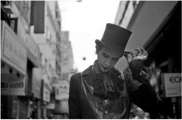
Take Untitled, by Solofotones on Flickr, for example:

When I look at this photo, it makes me think of... street performers everywhere.
I think this photo is about... the people who go out of their way to inject some random into your life, and who, in the process, remind you why you're alive; it's not just to trudge through it all, it's to be surprised, amused, and bemused by the world. This photo illustrates all of this
Technically... I think this photo is weaker than some of your others. His hand is in perfect focus, but his face is just a big haze of blurriness. The shallow DOF is very important in this photo - otherwise the background would be a mess of impressions, fighting for your attention
What I like about this photo... is the archaic hat-tip the young gentleman is doing, and the feeling of him being an outcast in a world that is raging around him. He clearly doesn't give a damn, which makes him awesome.
If I were to improve or change anything, I would... tweak this photo quite a bit. His face is too hazy for my liking, which is obviously a very subjective thing, but in my opinion, street photography is all about people - their eyes and faces are the be-all and end-all of street photography, and if you haven't captured it properly, then - no matter how awesome the photo is otherwise - it doesn't cut it.
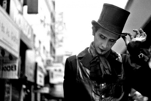
Of course, I don't have access to your original negatives or prints, so I had to make do with the Large file - I made a few changes: I ramped up the contrast a lot, I removed the lamp which is hovering in thin ear next to his head (and a couple of bright white dust spots, too, because I was out there with with the clone tool anyway), and re-cropped the photo to give it a different focus. I'm not 100% happy, but I think it illustrates that if you go back to the source material, there's a lot of potential for this shot

Does it have the X-factor? Overall... I think this photo has a lot of charm and intensity - The suggested changes are very subjective, obviously, and you might not agree with the ascertations. The shot itself is a gem, though, and I think a slight re-edit could do wonders to make it as good as it deserves to be. Give it a shot!
Your turn!
Right, now you've got a taste for one way you can do a photo critique (although obviously you can adapt it to suit your critique style and the photo you are critiqueing) along with an example... Why not pick a photo by your favourite Flickr friend, and give it a good thorough critique?
Finally, you may be interested in Attracting Better Feedback and Dealing with Negative critiques - you never know when those skills may come in handy!
PS: You may have seen an earlier version of this write-up before on my blog (I first posted it in February 2007). The version you have just read is vastly expanded (it's nearly twice as long), and I have changed my mind about some aspects of doing photo critiques in the meantime - so consider this version 2.0 of this blog post. Enjoy!
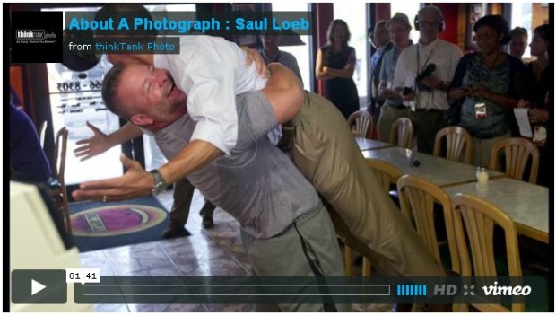 Do you ever look at a photo and think 'Heavens-to-Betsy, how did the photographer manage that?' Not necessarily the geeky 'What aperture did you use?' type of questions, but the 'Where were you standing? You were standing, weren't you?' or the 'How did you see that one coming?' startled enquiry. Think Tank Photo, the guys who make the Really Good camera bags, have just started a three-weekly video series called 'About a Photograph', which answers those sorts of questions.


