Those of us who’ve been around cameras for a while pretty much know what we want out of our magical lightbox machines when we come to upgrading or getting a new toy. But if you’re new to photography, or not surgically attached to your camera, buying one is a tricky business. There’s more choice out there than Imelda Marcos faced on a daily basis selecting a pair of shoes, from price, to spec, to how they look and feel. It’s headache-inducing. Small wonder, then, that I love things that can make choosing a camera easier for people, and I got a bit excited when I trundled over to the Fuji website and saw its new-fangled camera comparison widget.
I was all set to find the right Fuji camera for me, or more likely my camera-phobic mother. I was expecting a few simple check box questions, asking about my camera needs, my proficiency levels, and my budget. And then, whizz-bang, it’d spew out a few suggestions. But no, that was a bit too much to hope for.
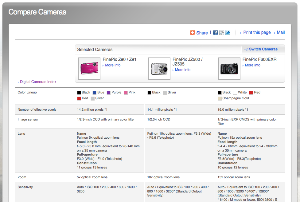
Instead, you get to compare the specs side-by-side of three different cameras. You can filter your selections by series, zoom, how wide the lens is, pixel count, stabilisation, and even heaven love us, by colour. Once you’ve made your choices, you can see how your three cameras’ of choice resolutions, lenses, sensor types and size, sensitvities, screens, video capbility, and about 15 million other specifications match up against each other.
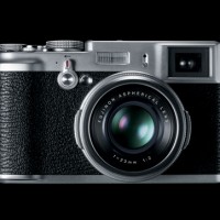
Now that is, in itself, a fairly useful feature. But it assumes that you’ve already a good idea of what you’re looking for. Different types of camera aren’t explained. It doesn’t take into account that people might not know the difference between the X100 and the F600. It doesn’t accommodate people who aren’t sure if a bog-standard point-and-shoot is what they need, or if something a bit more zoomy will suit them better. And price doesn’t even come into it. I can imagine a first-time camera buyer taking a look at it and exclaiming something along the lines of ‘Wuh?’
Seeing as I’m being a bit picky, too, it’s usually a good idea to standardise units of comparison. So I wasn’t thrilled seeing some sensor sizes given in imperial and some in metric.
It’s hard to say that Fuji has missold this widget entirely. The tagline is ‘Find the right camera for you, review camera specifications at a glance.’ It compares camera specs, dead on. But it doesn’t really help people to find the right camera for them. Still it’s a shame. With a bit more thought, Fuji could have a developed something actually useful for its consumers, instead they’ve produced a gimmick that’s vaguely useful for some of us, and doutless overwhelming for a whole lot more.
Pity. You can go judge for yourself on the Fuji website.

