News

Falling out of love with the Taylor Wessing Portrait Prize

I had just opened up a new compose window to write my review of this year's Taylor Wessing Portrait Prize exhibition (in short: uninspiring and hackneyed) when someone sent me a link to this BBC article. Suddenly, my lamentation of a rather bland competition exhibition took on a new complexion. This year's Taylor Wessing Portrait Prize was won by Spencer Murphy for his photo of mud-spattered jockey Katie Walsh at Kempton Park racecourse. When I first saw it, I felt quite non-plussed by the image; it didn't seem to convey any of the energy or determination that I know fires jockeys. They're steely people, but they're driven by adrenaline. Even when they're exhausted, they still buzz. If you can convince one to sit still, or you can capture one in motion, jockeys are great subjects. It was an image that I knew I should have loved but I didn't; somehow it fell short.
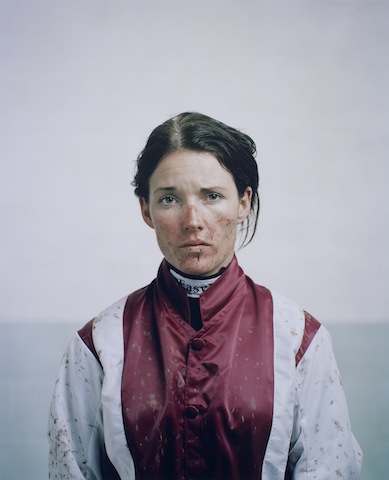
Katie Walsh by Spencer Murphy

Murphy said that he wanted Walsh's portrait to convey 'both her femininity and the toughness of spirit she requires to compete against the best riders in one of the most demanding disciplines in horse racing.' National Hunt jockeys are extraordinarily tough and to portray this along with Walsh's feminity would have made for a glittering image. My interpretation of the portrait, though, was that Walsh appeared nothing more than miserable. It was a lovely picture and there is a gorgeous depth to it that Murphy had hoped to achieve by using a medium format camera, but I wasn't convinced by its characterisation. Now, I'm wondering if one line in that BBC article explains it. Walsh hadn't ridden at Kempton the day the photograph was taken. It's made to look as if she's just unsaddled and weighed-in, but that doesn't seem to be the case. 'Spencer Murphy took the shot of jump jockey Walsh at Kempton Park, although she had not raced there that day.'

So is the mud, the rosy cheeks, and the skid-lid hair nothing more than a contrivance? My friend who sent me the link to the BBC article felt very strongly that Murphy should not have been awarded the £12,000 prize. I don't want to put words into his mouth, but I was under the impression that he felt in some way deceived by the image. It wasn't telling the story that it purported to tell. A portrait of a jockey in silks is one thing; but a portrait of a jockey in mud-spattered silks that makes it look as if they've just ridden a driving finish on soft ground, when they haven't, is another.

This is potentially problematic for a major prize, depending on what's expected by the judges. Should the judges want nothing more than a beautiful image that tells a story, it might not matter how it's achieved. If the photograph is meant to be telling the subject's story, we might be venturing into more difficult territory with respect to portraiture and prizes when an image has been staged. I don't wish to state if Murphy's photo should be eligible or ineligible for the prize: I'm insufficiently familar with the competition's rules to make that judgement. But having seen the portrait of Walsh in the flesh and not been especially moved by it, I think that it might be more problematic for the art of portraiture.

When I was wandering around the exhibition this morning with Gareth, we commented on how many of the photos' subjects felt more akin to puppets in the thrall of the photographer, rather than as people being photographed. When you looked at these images, it felt as if they were lacking a crucial element, a certain something that was able to elevate them from being 'a picture of a person' to being a portrait. Portraiture is about capturing spirit. It's about distilling the essence of an individual into pictorial form. When a photograph moves away from capturing someone's spirit to something more manipulated by the photographer, is it still a portrait? Perhaps I set too much stall in the notion that a portrait isn't just a photograph that happens to have a person as its subject. I believe that it's meant to be more than that.

Photos are meant to make you feel something; a portrait needs to leave you feeling what the subject feels, too. I'm left wondering if it were the contrivance behind Murphy's portrait of Walsh that left me feeling hollow.

If you'd like to explore the exhibition for yourself and decide if I'm being nothing more than a cynical and overly-pricipled misery, it runs until 9 February 2014 at the National Portrait Gallery, London.

My Adobe account was one of 150m compromised. I'm not a happy camper.

I started off with a headline that said I was livid with Adobe over the hacking debacle. I realised that 'livid' was a gross exaggeration—there are many other situations in this world that make me angry, and this is not one of them—but I am displeased with the manner in which Adobe has conducted itself. I believe Adobe has handled this security breach abysmally and treated its paying customers with contempt. A recap of the facts: on 3 October 2013, Adobe's systems were attacked. It was initially reported that 2.9 million customers suffered the theft of their their user name, encrypted payment card number, and card expiration date. Adobe also had some proprietary sourcecode stolen. Later in the month it was revealed that upto 38 million customers' IDs and encrypted passwords had been taken, with the potential for this number to be even higher, and some Photoshop code went, too. As of last night, we're looking at 150 million stolen users names and encrypted IDs.

Any company that holds millions of users' personal details and credit card numbers is going to be a target for nefarious types who'd like to waltz away with free money and the ability to create havoc elsewhere on the Intergoogles. We saw it happen to Sony. Companies that don't hold users' credit card data are still targets for attack. Twitter knows this to its cost. We all know it's possible. This is why we expect companies to implement robust security protocols in addition to practising adequate password hygiene ourselves. We do our bit to protect ourselves and when we part with money for the privelege of goods or services, we expect those taking our money to safeguard our personal details that they acquire in the process.

But when the worst happens—and never forget that if you can make something, you can break it, too—how a company handles the investigation, responds to the crisis, and communicates to its customers or users becomes all-important. The attack itself was a failing on Adobe's part, but its reponse has been a more significant failing.

I received an email from Adobe on 4 October informing me that its systems had been breached, attackers 'may have obtained access to your Adobe ID and encrypted password,' and I was advised to reset my password. Details were also made available in a blog post by Brad Arkin, Adobe's Chief of Security. I reset my password pretty damn quick. Since then, however, there has been no further communication with me as an Adobe customer either through email or blog. This is despite last week's revelation that the breach was far larger than previously believed and discovering yesterday evening, via LastPass, via Mashable, that my account was one of 150 million that were compromised. There have been no updates, no confirmations, no reminders, and no progress reports. I do understand Adobe's position of only wishing to provide updates on verifiable information, but if such a persistent silence isn't indicative of a complete lack of progress, it lends itself to the suggestion that Adobe would rather that we forgot that this happened.

This veil of secrecy and hope of collective amnesia via silence is in complete contrast to Buffer's response to a security breach at the end of October. Buffer's a social media management system: it allows me and its millions of other users to schedule posts to Twitter, Facebook, LinkedIn, and Google+. On 26 October 2013 it was attacked and several accounts were compromised; they started to spew spam. As soon as the Buffer team became aware, they emailed all of their subscribers, detailing what had occurred to the best of their knowledge, what steps they were taking to rectify the situation, what we needed to do as users, and where we could find updates on the developing situation. Since then users have been provided with an analysis of the breach and the steps taken to secure Buffer.

As far as I can tell, the Buffer team has responded to every email, Twitter post, and blog comment concerning the attack. Buffer's response has been an exercise in transparency and honesty, which appears to have endeared it to people who now feel more confident in the service. I cannot speak similarly of Adobe.

In a professional capacity as a writer, Adobe has corresponded with me further. On 29 October, I published an article covering the increased extent of the breach. Heather Edell, Adobe’s Senior Manager of Corporate Communications, emailed me on 30 October requesting that I make a clarification to the article. She also confirmed that Adobe had chosen not to divulge further details of the attack until they could be verified. Adobe appears to have chosen a path of damage limitation, but with every revelation made by companies or on blogs and websites that aren't Adobe, it is growing increasingly exposed and less in control of the situation.

Adobe has a responsibility to its customers to handle their data securely; when there's a breach, they can expect to be kept informed of what has become of their information, and most importantly, what they can expect Adobe to do now to maintain their security and privacy. This expectation of security is even more important now that many of Adobe's products are issued on a rolling subscription basis, rather than being available in stand-alone, single purchase format. If customers want to use Adobe products, they have no option other than to hand over their credit or debit card details. But I'm left wondering how safe it is to do that. Silence doesn't breed trust, transparency does that.

2013 UK Picture Editors' Guild Awards winners announced and on display

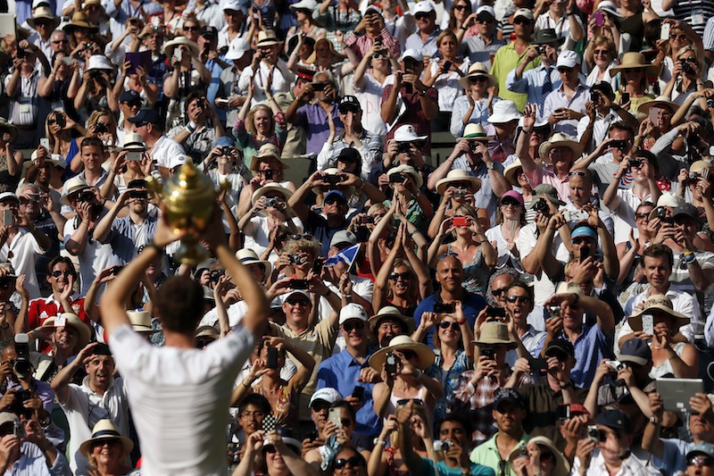
The 2013 UK Picture Editors’ Guild Awards winners were announced on 5 November and now a free exhibition of the winners' and runners' up images is on display in the rotunda of the Museum of London. This year's overall prize, the SABMiller Photographer of the Year, went to Stefan Wermuth of Reuters. Alan Sparrow, UK Picture Editors' Guild Chairman, said: ‘This year’s entries produced some of the closest scoring amongst our judges, but a clear winner emerged early. I think that the work of Stefan Wermuth makes him an outstanding SABMiller Photographer of the Year.’

Andy Murray of Great Britain holds the winner’s trophy up to the  spectators after defeating Novak Djokovic of Serbia in the men's  singles final at the Wimbledon Championships.  © Stefan Wermuth / Reuters

Entries were received from over 400 photographers across the UK and in addition to the Photographer of the Year prize, twelve further categories had prizes awarded. These included the Genesis Regional Photographer of the Year, which went to Anthony Chappel-Ross of The Press, York; the Nikon Sports Photographer of the Year, won by Adrian Dennis from Agence France-Presse; and the UK Picture Editors’ Guild Photo Essay of the Year taken by Jack Hill of The Times.

CO Vaudin of 2 Signal Regiment embraces his son, Nicholas, 12,  on his return from Afghanistan. Anthony Chappel-Ross © The Press, York

The exhibition runs until 16 March 2014 at the Museum of London, 150 London Wall, LONDON EC2Y 5HN.


The full list of winners:

SABMiller Photographer of the Year - Stefan Wermuth, Reuters

Bloomberg Business Photographer of the Year - Jason Alden, Bloomberg/The Independent Highly Commended - Stefan Wermuth Commended - Leon Neal, Anthony Devlin

British Airways Fashion and Entertainment Photographer of the Year - Dave Benett, The London Evening Standard Highly Commended - Jason Alden Commended - Lia Toby, Jon Enoch

BT Citizen Photographer of the Year - Björn Olsson Highly Commended - James Wood Commended - Eleanor Bennett, Ian Barstow

Fixation Young Photographer Bursary - David Hedges, South West News Service Highly Commended - Chris Fairweather Commended - Daniel Mullan, Jack Taylor

Getty Royal Photographer of the Year - Mark Stewart, Freelance Highly Commended - Chris Jackson Commended - Andrew Parsons, John Stillwell

Genesis Regional Photographer of the Year - Anthony Chappel-Ross, The Press, York Highly Commended - Frank Dwyer Commended - Stephen Garnett, Mike Tipping

Nikon Sports Photographer of the Year - Adrian Dennis, Agence France-Presse Highly Commended - Ian MacNicol Commended - Mike Egerton, Rebecca Naden

Nikon Videographer of the Year - David Hedges, South West News Service Highly Commended - Julian Simmonds Commended - Edmond Terakopian

OpenText News Photographer of the Year - Stefan Wermuth, Reuters Highly Commended - Justin Tallis Commended - Jack Hill, Dave Thompson

UK Picture Editors’ Guild Photo Essay of the Year - Jack Hill, The Times Highly Commended - Rick Findler Commended - John Giles, William Wintercross

UK Picture Editors' Guild Chairman's Award - Paul Delmar, Press Photography/Photo-Journalism Consultant

The Nikon Df has people talking. That's a good thing.

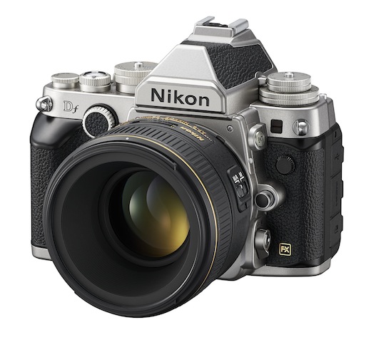
Sitting back and watching the comments unfold about Nikon's Df camera has made for a mildly entertaining distraction today. For anyone who's missed out on the announcement or the teaser videos released in the run-up to its unveiling, this is it: I think it's ugly, but that's me.

The Nikon Df has a 16 megapixel full-frame sensor powered by an EXPEED 3 processor, giving it the same guts as the Nikon D4. Sensitivity ranges from ISO 100 to 12,800, and is extendable to 204,800. It has a maximum continuous shooting speed of 5.5 frames-per-second, 39 point auto-focusing system, and pre-AI lens compatibility but no capability to match its retro-looks. It (and a 50mm ƒ/1.8G) also comes with a £2,750 ($3,000) price tag.

Mostly, the comments have ranged from 'Oh my good freaking deity of choice and all commensurate attendees, I have to own this camera right now and will sell a kidney to fund it!' to 'What a stinkingly ugly camera! Anyone prepared to pay that much for something that looks as if it has been welded together for spare parts must have more money than sense!' They do, however, go via: 'It had me until I saw the price,' and 'No video? It's not for me.' Even the more tempered comments are laced with a sense of disappointment or disbelief.

It's a camera that has divided opinions and caused people to talk. Lee Morris, over on FStoppers, has described it as a camera that exemplifies everything that is wrong with photography right now. That's not to say that the camera itself is terrible and awful, but that the current retro-obsession has maybe gone too far and that cameras have become fashion accessories rather than tools. Jaron Schneider, another FStoppers contributor, takes a different tack. He calls it a camera 'to remind you why you are a photographer.' There's very little by the way of ambivalence, and that is a good thing.

Why do I think that? I think that Nikon's produced a concept camera. It's expensive. It costs less than the D4, but it's still an almost-£3,000 camera. It has particular appeal with its capabilities and ergonomics. Many people will appreciate the dials and its old-school-lens-love, but it doesn't shoot video. For some people video's an irrelevance, for others it's a deal-breaker. I also happen to think it's ugly. That, however, is a matter of personal aesthetic preference. And to be truthful, I think I'm done with the retro-thing (although I will admit that I think Fujifilm has its styling right in this respect). I'm also entirely sick of the onanism that's taking place over it. That, though, is probably the point.

It's not meant to be a camera for anyone and everyone, it's meant to be a camera that gets people talking and it has certainly accomplished that.

Nikon's created a camera because it can. Not because it's ground-breaking or the market is baying for it, but because it has the creative latitude to do so. There are at least three reasons why I've absolutely no desire to own a Df, but if it's the kind of camera that reminds people why they love photography, then more power to Nikon.

Lollipod: versatile, light-weight, colourful camera supports

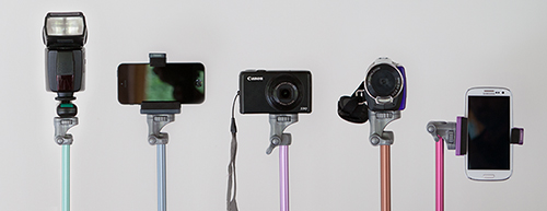
For anyone who has been searching for a light-weight, multi-functional support device, the very thing might just have been announced today. It's called the Lollipod and it is designed to switch between acting as a tripod, monopod, boom, and lighting stand. The Lollipod weighs 320g, is 320mm when collapsed, can extend to a maximum of 1,130mm, and is capable of supporting a camera, flash, or smartphone up to 430g in weight. That means any point-and-shoot should be fine on it and you might get away with a Canon 100D, too. But chuck your camera (or strobe or whatever else) on a set of scales first to check.

Strobe, phone, or point-and-shoot

It comes with a standard fit ball head, which means that you'll need to purchase an adapter to secure your smartphone. Lollipod will be introducing their own universal one sometime early next year. Until then, the team recommends the Joby JM1–1ww GripTight. There's also a stabilising kit for windy days and carrying bag for convenience.

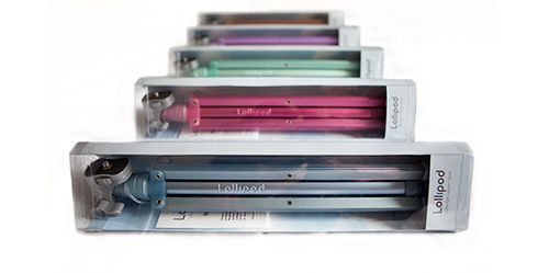
You can choose from gold, dark blue, light blue, hot pink, violet, and minty green and they're on sale at an introductory price of £29.99 (usually £34.99); €37 (usually €41.99); or $48 (usually $55.66), plus shipping. They're not, however, available in Australia, South East Asia, or France. All purchases are made direct from Lollipod.

Pick a colour!

Now, if only someone would develop a microphone-stand-come-tripod; ideal for all those photographer-musicians in the world.

Non-destructive editing capability built into Android Kitkat

Google gave us a few new things to think about last week, including improved photo editing and archiving tools in Google+ and an update to Snapseed, but something seems to have been overlooked. Sitting quietly in the Gallery app on Android devices running Kitkat, you'll find a new and rather tasty peach of an addition to your mobile post-production needs: a non-destructive editing programme that's equipped with some powerful tools. Developed by Nicolas Roard and his team, you can use the suite to adjust curves, apply graduated filters, make local adjustments, and fiddle with individual colour channels, as well as create your own pre-sets.

There's a demonstration video to show you even more of what it's capable of accomplishing, but nothing beats a bit of experimentation.

There's only an auto-white balance function, which is something of an oversight in my opinion, layers capability is on the way (from what I can tell), and there's no Raw support; all the same, the Google team is showing that they are growing in stature when it comes to their image editing options.

Some people have wondered how this sits alongside Snapseed and the photo editing options in Google+. For a start, Snapseed is universally available whereas the Gallery editor is Android-only. If you're an Android user, they do different things. The Gallery editor is non-destructive and lets you play around a lot more than Snapseed; Snapseed is super for making quick adjustments and applying ready-made effects. It all depends on what you want for your photos.

(Headsup to Engadget)

Adobe's security breach in October was far more serious than believed

Adobe announced that it had suffered a security breach in early October that had resulted in the compromise of approximately 3 million customers' data as well as the loss of some proprietary source code. Attackers made away with customers' names, encrypted payment card numbers, and card expiration dates as well as the code for the ColdFusion web application and its Acrobat programmes. KrebsOnSecurity, the firm that spotted the initial attack has now placed the figure of customers affected by the breach at some 38 million, and the source code that was lifted is also said to include Photoshop. According to the KrebsOnSecurity blog, it has taken some time to uncover the extent of the violation because:

At the time, a massive trove of stolen Adobe account data viewed by KrebsOnSecurity indicated that — in addition to the credit card records – tens of millions of user accounts across various Adobe online properties may have been compromised in the break-in. It was difficult to fully examine many of the files on the hackers’ server that housed the stolen source because many of the directories were password protected, and Adobe was reluctant to speculate on the number of users potentially impacted.

Over the weekend, a large file of username and hashed password pairs was posted by AnonNews.org, which appear to be Adobe account details.

Adobe has contacted all of the active customers whom it believes to have been affected and claims that there has been no 'unauthorised activity' on any of the compromised accounts since the attack. It now remains for the inactive customers to be contacted. And regardless of whether users were active or inactive, their passwords were reset if Adobe believed that they were affected by the attack.

Whether Adobe chose to downplay the extent of the attack earlier in the month because it couldn't be certain of the number of affected customers or because it prefered to minimise the damage does not present it in the best light. One scenario makes it look careless, the other deceptive. I wonder how many customers are now looking for alternative products and providers... or waiting for a replicant based on the stolen code?

(Headsup to Engadget)

Update! Heather Edell, Adobe's Senior Manager of Corporate Communications emailed me in the early hours of 30 October. She stated that:

In our public disclosure, we communicated the information we could validate. As we have been going through the process of notifying customers whose Adobe IDs and passwords we believe to be involved, we have been eliminating invalid records. Any number communicated in the meantime would have been inaccurate. So far, our investigation has confirmed that the attackers obtained access to Adobe IDs and what were at the time valid, encrypted passwords for approximately 38 million active users. We have completed email notification of these users. We believe the attackers also obtained access to many invalid Adobe IDs, inactive Adobe IDs, Adobe IDs with invalid encrypted passwords, and test account data. We are still in the process of investigating the number of inactive, invalid and test accounts involved in the incident. Our notification to inactive users is ongoing. We currently have no indication that there has been unauthorized activity on any Adobe ID account involved in the incident.

In short: 2.8 million users had their names, encrypted payment card numbers, and card expiration dates filched by the attackers. An additional 38 million users had their user IDs and encrypted passwords stolen. However, because Adobe was unable to validate the number of users affected by the loss of user IDs and encrypted passwords, it did not disclose this initially. It has waited until it has more accurate figures.

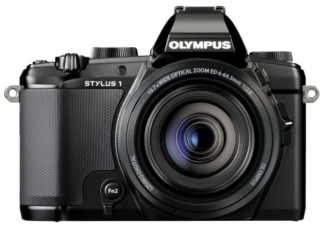
Olympus' Stylus 1 feels like a curate's egg of a camera

The best way that I can describe Olympus' new Stylus 1 premium compact camera is as a curate's egg: it's good in parts. Some elements of it really appeal and some leave me indifferent at best. For a camera that Olympus had hoped would shake up the top end of the compact camera market it feels rather lack-lustre. Channeling the OM-D series of cameras, but scaled down in size

For a start, the zoom range is impressive. At the equivalent of 28 to 300mm, it beats its Nikon, Canon, and Fujifilm rivals into a cocked hat. None of those (the Nikon P330, Canon S120, Fujifilm XQ1) goes beyond 120mm. And the Stylus 1 has a constant ƒ/2.8 aperture across the range; there's no dropping down to ƒ/5.6 as you zoom in on your subject. But this is where some trade-off comes in. The others have bright ƒ/1.8 apertures at their lenses' widest angles, which narrow as the focal length increases. What would you prefer?

I'm not convinced by that 'hump' in my pocket

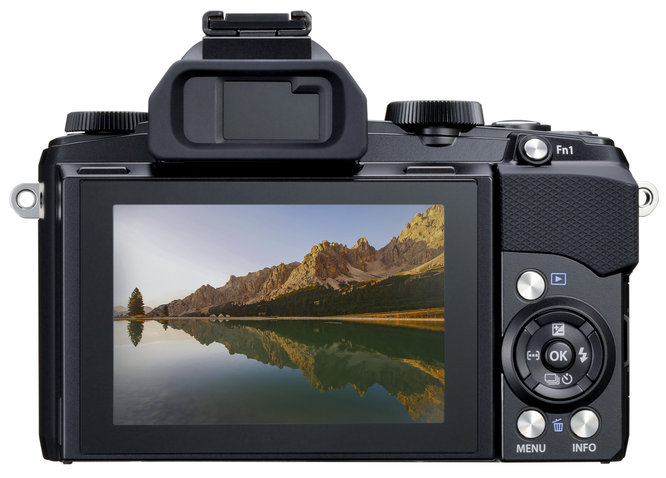
The standard resolution for this type of camera is 12 megapixels and Olympus hasn't deviated from that. Is there any need to? There's wi-fi, which you'd expect; a customisable lens ring and to button to put your most-used functions where you want them; it has a sensitivity range of ISO 100 to 12,800; and everything is powered by a TruePic VI processor.

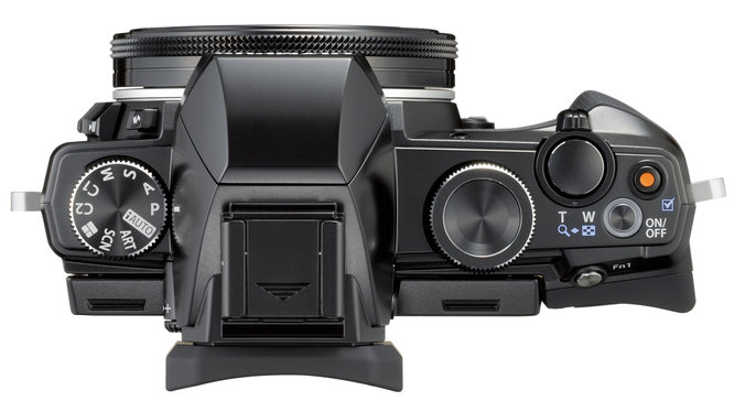
Aesthetically, the Stylus 1 is channeling the OM-D E-M series, a look that is driven home by the inclusion of an EVF that comes with a 'hump'. This is a strange addition for something that is designed to slip into a pocket; it measures 116 by 87 by 56.5mm, but would you want something lumpy sitting against your thigh? There appears to have a disconnect between the camera's technical intentions and its ergonomics. It's not a design that's blowing back my hair and I'd be inclined to pass it over in favour of the Fujifilm XQ1.

All the controls you'd expect from a top-end compact

The biggest disappointment, though, is the 1/1.7" sensor. Fujifilm squashed a 2/3" sensor into the XQ1 and Sony has managed a full-frame sensor in a compact body. We know that it can be done and this is where Olympus really could have broken away from Canon and Nikon, but it hasn't. And at £550 (or $700), it feels very unsatisfactory.

There are things to like about the Stylus 1, but for me, there isn't enough. Olympus, you could have done better.

Are you seeing Dubble?

The notion of multiple exposure photography is familiar: take a photo and then re-expose the same frame, or merge together two or more digital photos, to create a fun, or a ghostly, or a creative image. It's something that photographers have been doing since the dawn of photography, sometimes deliberately and sometimes accidentally, and whether you choose to shoot double exposures with your Holga or engage the multiple exposure setting on your Canon 6D, it's not that hard. But what about turning double exposures into something even more fun, very easy, and incredibly social? This is precisely what Adam Scott, Angelo Semeraro, Ben Joyce, and Uldis Pirags are aiming to do with their app Dubble.

dubble

You take a photo. You upload it to Dubble and share a few details about it. The Dubble algorithms then work their binary wonder and combine your photo with another from the Dubble community. Bingo! A socially, randomly generated double exposure. You and your Dubble counterpart can then both share your joint creation and take joint credit for it on Facebook, Flickr, and Twitter. By the end of the year there should be Instagram and Tumblr integration, too.

Dubble tutorial

The Dubble community started up in the summer of 2013, with 40 family and friends of the founders, across 18 countries, taking and sharing their photos to create Dubbles. They've merged Spanish music festivals with the family pet, a flamingo with a cityscape, and a fairground carousel with a French beach. Now, the iOS app is publicly available for download and dubbling fun.

Adam Scott, Dubble's CEO is understandably excited about the app: 'We’ve worked really hard to develop an app that we hope will tap into the fantastic social and creative potential of collaborative multi-exposure digital blending with a complete stranger. Our ambition is to become the most exciting collaborative photography community in the world.'

I think I might go give this one a try!

What's Nokia brought to the mobile photography landscape with its new phones?

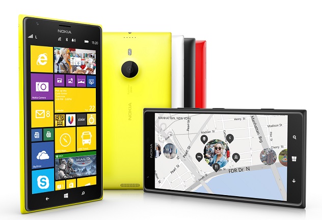
There's been a lot of love for the cameras that Nokia have been squishing into their mobile phones of late. It isn't just about the 41 megapixels found in the Lumia 1020, but more about their cameras' quite impressive low-light capability, image stabilisation, and the control that the camera app affords you. With the anouncement of the Nokia 1520 and 1320 in Abu Dhabi today, has anything new been brought into play in the smartphone landscape? Let's start with introduction of a Windows phone-compatible Instagram app. Instagram is hardly new to smartphoneography and if filtered, shared photos don't float your boat, it'll hardly seem like a big deal. However, for people at Microsoft and Nokia, the lack of an Instagam app on their phones was considered to be a significant factor in holding back sales of their devices when compared against Instagram-friendly iOS and Android. The Windows phone has now been opened up to a wealth of people who might otherwise have dismissed it out-of-hand, and with it, its camera's capabilities and functionality have been pitted against those of other manufacturers.

That's the 20 megapixel Lumia 1520

Lots of the other toys might not bring anything revolutionary to the Lumia cameras, but they are fun and functional.

The new Refocus app isn't new to camera technology—it's the same idea as a Lytro, allowing you to refocus your images after you've taken them—and something similar is available for iPhones, with the Focus Twist app, but it is bringing more functionality to Nokia phones and giving more options to users. Refocus also allows your Facebook friends (and other socially networked people) to fiddle with your photos and interact with them.

The Beamer app and the Storyteller function are meant to make Nokia phones more interactive, too. Beamer will allow you to share photos with anyone whose screen is compatible via a via social media, email, or SMS link. Storyteller creates a temporal story of your photos, placing them on a map along with chronological notation.

Previously, there were two separate camera apps in Nokia phones: Smart Cam and Pro Cam. These have now been combined into a single Nokia Camera app, which should make shooting quicker and simpler.

But the introduction of Raw file support does signal that Microsoft/ Nokia does mean business with its cameras. If they can do it, why shouldn't or couldn't any other camera manufacturer? We're seeing the gradual adoption of larger and larger sensors into smaller and smaller camera bodies; why not the introduction of Raw files into smartphones as standard?

Rihanna's Sheikh Zayed Grand Mosque photo shoot curtailed

Rihanna does seem to have a knack for making faux-pas when it comes to on-location photo shoots. In September 2011 a Northern Irish farmer asked her, politely, if she wouldn't mind putting on some more clothes or choosing a different location other than his field to film the music video for We Found Love. This weekend she was asked to leave the Sheikh Zayed Grand Mosque in Abu Dhabi after posing for some 'inappropriate pictures.' According to the mosque, at first she tried to gain access via an entrance that isn't intended for visitors. When she did make it in through the correct gate, she proceeded to pose for some photos. Photography in the grounds of the mosque isn't forbidden, but its guardians do keep an eye on how it's done. They don't want the sanctity of the space to be violated by lascivious lounging or provocative posing. Anyone can take photos for personal use without permission, but commercial photography does need to be pre-arranged. While it is unclear if Rihanna was a little too risqué in her modelling, she definitely didn't have permission. According to a spokesperson for the mosque, Rihanna's trip hadn't been co-ordinated with the admnistration and she, and her entourage, was asked to leave.

At least she turned up appropriately dressed, in a black jumpsuit and headscarf. Her experiences in a field in Northern Ireland seem to have taught her something. It's probably a good idea to speak to management before starting a photoshoot in the grounds of one of the UAE's most visited buildings, however.

If you're interested, some photos taken outside the mosque wound their way onto her Instagram stream.

Headline image courtesy of Wikipedia.

Headsup to Yahoo! News

2013 Wildlife Photographer of the Year competition

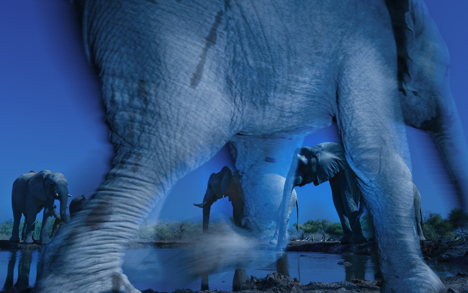
I spent a rather glorious morning at the Natural History Museum today, persuing the winners of the International Wildlife Photographer of the Year awards and speaking with some of the photographers. If you have the opportunity to drop by and take in the show, you really should. I loved every single photo in the the animal portraits category, and many more. The winners are here for your enjoyment, the rest of the finalists can be seen on the NHM's website. A word for anyone who thinks that wildlife photography is the preserve of the long lens: Greg du Toit used a wide-angle lens to capture the elephants in his winning photo, Essence of elephants and he wasn't the only photographer to make use of a shorter focal length. You expect to see them used for acquatic images, but here they were used to photograph birds and big cats, too. At least four photographers made use of fisheye lenses and one opted for a tilt-shift. It isn't just about the telephoto.

Essence of elephants, by Greg du Toit (South Africa) Nikon D3s + 16-35mm f4 lens + polarising filter; 1/30 sec at f22; ISO 800; Nikon SB- 900 flash + SC28 remote cord; mini-tripod; Nikon cable-release.

I was struck by the intense blue of Greg's image. As he said, it has an underwater intensity to it. He particularly wanted to convey the mysterious energy that he feels when he's around elephants and felt that this shade, captured around sunrise and helped on its way with a polarising filter and white balance, did just that.

Mother's little headful by Udayan Rao Pawar (India) Canon EOS 550D + 100-400mm lens; 1/400 sec at f13; ISO 1600

With a few more young wildlife photographers like Udayan, the genre is in very safe hands. It's not just his obvious ability, but also his passion and dedication. Whether he chooses to pursue conservation photography or a place in the Indian air force, he'll go far.

The exhibition runs from 18 October 2013 until 23 March 2014 at the Natural History Museum, Cromwell Road, London.

Triggertrap Redsnap goes live on Kickstarter

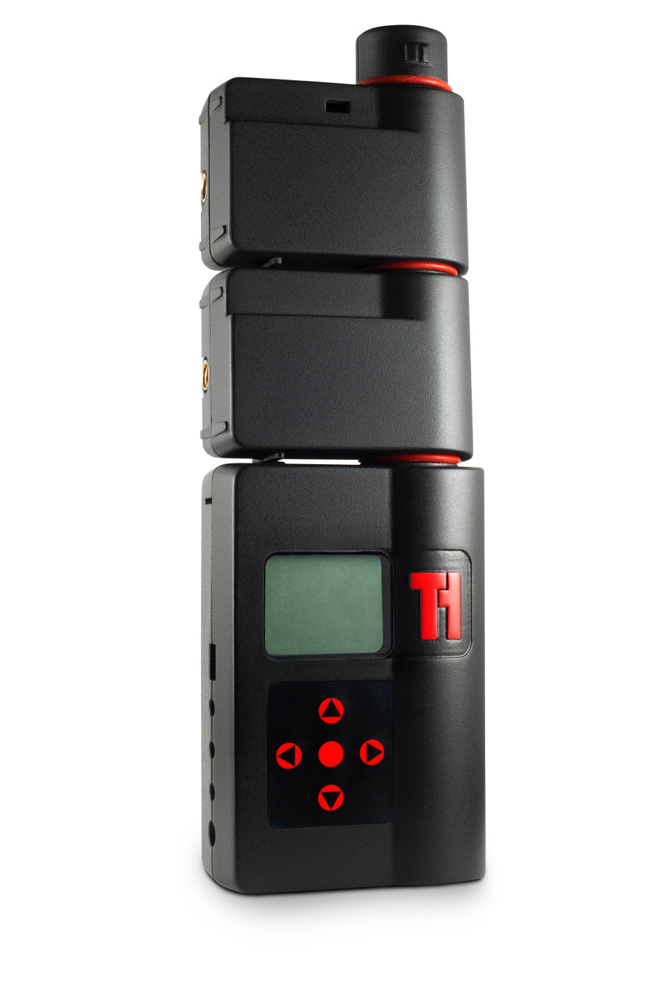
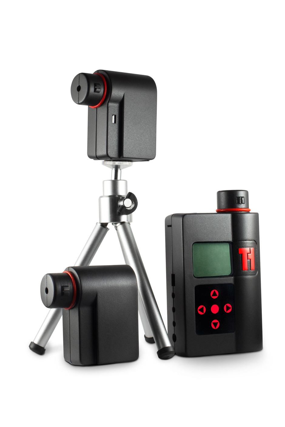
When Haje Jan Kamps (that is the very same Haje Jan Kamps who publishes Photocritic) launched his first Kickstarter project to deliver the Triggertrap universal camera trigger, back in 2011, little did he know that it would spawn a mobile app with 14 ways to trigger your camera, a high-speed triggering device, and an actual company with offices and employees. Now, Triggertrap is returning to Kickstarter to bring you Redsnap: an infinitely expandable high-speed camera triggering tool. Redsnap is a modular system, offering photographers the ability to build the camera trigger that they need for each shoot.

Triggertrap Redsnap 19

The base block includes the time-lapse options Triggertrap is known for: timelapse, TimeWarp (timelapses that include acceleration), long exposure HDR, and star trail mode. On top of that you can add a high speed laser sensor, great for capturing a bullet in flight; a high speed sound sensor, to capture bursting balloons and smashing vases; a high-speed light sensor to make sure you snap a lightning strike; and a passive infrared sensor (PIR) that's ideal for stalking lions and tigers and bears. Or butterflies, if you feel like something a little less adventurous. That's the initial offering of modules; more are in the works.

Redsnap has three outputs to connect it to three cameras, three flashes, or a combination of both. There's also a connector that allows it to communicate with the Triggertrap mobile device, bringing its triggering options into play, too.

What do you get for your Kickstarter backing, then? The timelapse kit is £35; the wildlife kit is £120; and multiple-sensor kits are priced between £125 and £190. If you're really, really desperate, you can pledge £1,000 and be first in line for a pre-production prototype.

Even more information awaits you on the Kickstarter page, and of course there's a video, too.

Triggertrap Redsnap 16

Instagic picks your 10 best Instagram shots and mails them to you each month

When I was a little one (not that I'm very much bigger now, but never mind), every time that I dropped a roll of film into the chemists to be developed, I would be engulfed by anticipation. How would my photos come out? Were they as good as I'd hoped? How many had I screwed up this time around? And of course, it was easy: drop in the film, leave your name, turn up the next day, and pay your fee. Now, I sepnd hours piddling about uploading the images that I want printed to whichever site is currently in my favour, I piddle about some more resizing them, I piddle about paying for them and sorting the delivery address, and then I have to wait for them. Some of the romance has gone, knowing what will be coming through the letterbox. Instagic is aiming to restore some of that romance and anticipation when awaiting the arrival of prints, starting with your Instagram feed.

You pay a monthly subscription fee of $9.99. Instagic picks the ten best photos from your Instagram feed each month, prints them in 4×4 format, and sends them to you wherever you are in the world.

The Instagic elves select the best photos from the previous month, to keep things current. They take into consideration the creative and technical make-up of your photos and how you've used filters, as well as the social feedback that your shots have accumulated. Don't worry if you've been low on photographic inspiration for four weeks, they'll have a peek back into the archives and pick some of your better, previously unprinted images, to make up the numbers.

There's no option to pay a one-off fee (although I think that could be a winner) for someone who doesn't feel that they warrant a monthly subscription, but existing subscribers can add one-offs to 'top up' their subscriptions if they've had a prolific month. The Instagic team is considering a range of other subscription packages, too. Ten seemed to be the 'magic number' for prints and Instagram felt like the right platform to start their venture, but there are plans to branch out to other subscription levels and different platforms, for example Flickr and Facebook.

I can understand how some people might feel a bit uneasy leaving algorithmic elves to choose their 'best' photos each month, but I'm rather charmed by the surprise of the concept. And I certainly appreciate not having to wade through the rigmarole of sending images for printing. Instagic could be onto something here.

Pinhole, Printed - a 3D printed pinhole camera on Kickstarter

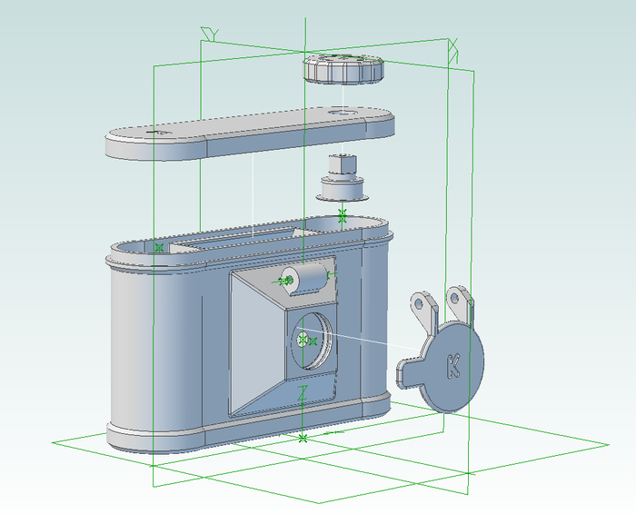
So much of the fun of pinhole cameras, apart from the pictures that they produce, is their simplicity. They're the very basis of photography: light, a box, and something to capture your image. What's more, they're simple enough that you can make them yourself, out of coffee cans, cardboard boxes, or canibalise a bodycap to make one for a dSLR camera. But what about if you introduced new world technology to old school simplicity, and you 3D printed a pinhole camera? Step forward Clint O'Connor and his Pinhole, Printed project on Kickstarter. By backing his project you can snap up a print-it-yourself kit that comes complete with the items that can't be printed—pinhole, O-rings, red window, screws—for $29. If you're not endowed with a 3D printer, you can buy a ready-printed camera along with two rolls of film and the STL files for $49. Whichever reward you opt for, it includes a guidebook to help you get your exposures right, too.

The pinhole camera you'll produce is the Flyer. It is printed in ABS, Acrylonitrile Butadiene Styrene—the same material used to make Lego—making it light but sturdy. It takes 120 format film, has a 70&deg field of view, an ƒ-stop of 133, and can be mounted on a tripod. Old school meets new world.

Pinhole, Printed

Pinhole, Printed managed to achieve its Kickstarter goal within 13.5 hours of going live on 10 October 2013, so now it's a case of staking your claim on one of the limited edition Kickstarter versions of the Flyer (they're marked with a 'K') or on the files so that you can print own (they don't come with a 'K'). You've until 10 November 2013 to make a pledge.

Flickr's new photo page beta is an exercise in feedback

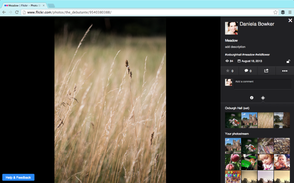
Flickr unveiled a new photo page layout beta this week. It's part of the overhaul that it started to roll out earlier in the year; I suppose that major revamps to a site that's been left to moulder and sink under its own ennui can't be enacted quickly. The beta version is opt-in and Flickr is soliciting feedback from its users. Reassured that I could revert to the previous layout, I switched to the new style photo page early on Friday morning. This allowed me to poke around, see what I liked and didn't, and leave some comments that I hoped wouldn't sound like haranguing but would help the developers on their way. I could also get a feel for what other people were saying about the new layout in the feedback forum.

Even if you've no particular interest in Flickr and its photo page layout, new or otherwise, you can regard this as an exercise in how to give and receive feedback. It just happens to reference the new Flickr photo page layout.

Gosh the feedback forum is a shouty place.

Flickr's photo page beta

There are quite a lot of people who hate the new layout. We're not talking being marginally unimpressed and having a bit a sniff about it; we're talking ALL CAPS threatening to quit levels of disgruntlement. However, apart from 'It's too much like Facebook,' the general complaint is that the potential new layout makes the Flickr experience poorer. However, there are very few suggestions or specific examples as to how the new layout makes the Flickr experience poorer. If Flickr is to improve the beta, it needs to know what works and what doesn't. This has to be articulated by the complainants, not grizzled and gurgled in a fit of toddler-type rage.

Having some kind of structured feedback mechanism can help to manage the comments and suggestions. It focuses people's opinions and it makes it easier to analyse how many people are thinking along the same lines. Unfortunately, that can deter people who want to say something from speaking up, too. They don't want to work through a ten or 20 question form to make one suggestion that isn't even covered by the standard questions. They don't want to feel as if the questions are corralling or leading them. It's a tricky business, but sometimes you need something systematic to ensure that feedback is constructive.

A bit shouty, a bit light on content

Apart from the 'Oh My God what have you done its ghastly and hideous and I hate and I'm going to leave in a huff and never come back' exclamations, there have been some legitimate criticisms and some sensible suggestions. There are also some features that we're accustomed to that haven't yet been implemented. They are in the works. Lots of the complaints concern these omissions. Flickr: I'd recommend reassuring users that features they know and love that don't appear in the beta yet but will be there soon, will be there soon. This will save your moderators untold waves of consternation and keep users happy. Better yet, make sure that they're included in the beta before it's released.

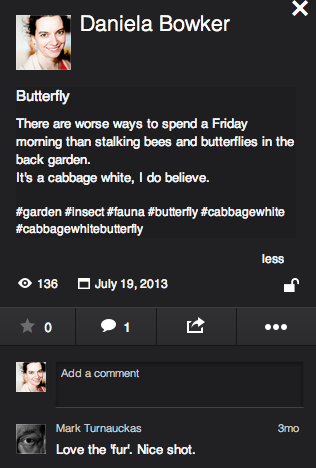
Please fix the tags, Flickr. And the comments box.

The legitimate criticisms concern comment boxes, tags, and 'favorites'. The comment box is now very small and there's no ability to insert images into it. I'm not a fan of the stickers and banners and awards that some people feel compelled to bestow on pictures and shove into comments, so that's not exactly a great personal loss. It can, however, be useful to augment a comment with an image. This is something that the developer team needs to reassess.

The new tagging format has also come under justified criticism. We know what tags are on Flickr, they don't need to be preceded by a hashtag to identify them as they do in a character-limited tweet. And we rather like having spaces between words, too. The Flickr moderators have stated that this is under review; hopefully that isn't lip service.

In the new layout, it's impossible to determine who has marked a photo as one of her or his favourites. Rather, the number of times as photo has been 'favorited' is indicated. The team is 'gathering feedback' on this feedback. If you feel strongly about it, pitch in.

Some people have suggested that the new layout isn't respecting aspect ratios. I've had a look at photos in various different aspect ratios and this isn't evident to me. If this were a bug that's now been squashed, confirmation from Flickr would be appreciated, and reassuring for those who've noticed it or are disturbed by its prospect.

Sensible suggestions include: the option to view images on white, the ability to minimise the side bar, and retaining the photo's title and description beneath it and not placing it to the right.

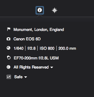
Can I have my full location and rich EXIF data back please?

As for the features that we appear to have lost but probably haven't because they're still percolating their way through the layers of re-coding and bug-squashing are: all-sizes and Lightbox viewing, rich EXIF data, HTML and BBcode snippets, the ability to assign images to groups and sets from the photo page, geo-location and map-placement data, and editing options. These are many of the features that I like about Flickr and their omission does leave the beta experience lacking. For this reason, I shall be switching it off and hoping that the Flickr team does listen to the keenly observed and well-argued cases for improvement. They might also do well to listen to the critiique that launching a beta with only skeleton functions in place is like unveiling a car without a steering wheel, gearbox, or engine.

When Marissa Mayer was appointed CEO of Yahoo!, 'The Internets' sent her an open letter asking her to 'Make Flickr awesome again.' To her credit, she's given the Flickr team the means and the impetus to overhaul the site and there does seem to be a genuine desire to restore Flickr to its once-held pinnacle of picture-sharing prowess. And they're asking the users for their input. Flickr users shouldn't throw this back in Flickr's face with unconstructive comments that only makes them look ungrateful. Likewise, the Flickr developers do need to listen to what the users have to say. We're the ones who have to interact with it, afterall. The feedback process is a two-way engagement. I do hope that everyone is listening.

Using the Light Blaster in commercial work

I've got to say; I've had a Light Blaster for quite a while now, and I love mine, but I'm finding myself spending relatively little time in the studio recently. Well, that is, until we started working on a brand new Triggertrap product... But that's not what this post is about, and I'm not able to share those shots yet, so... Check out these three videos of people using the Light Blaster in commercial jobs, and feel the creativity sizzle...

http://youtu.be/H3mYTHuelhI

http://youtu.be/zSzokXLAv0o

http://youtu.be/_0p3bHva-Bo

True-View is a Kickstarter campaign to let you make 3D photos and videos with your smartphone

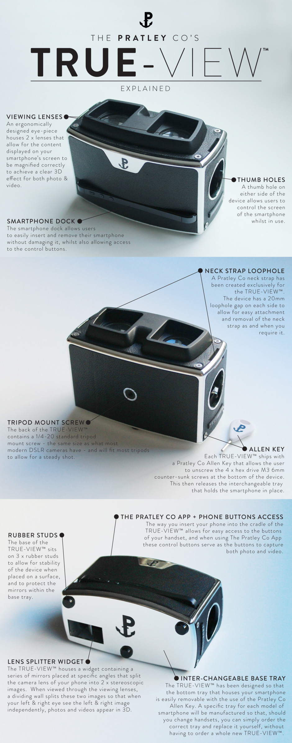
If you're looking for an example of a small company with big dreams and an ethos of 'doing things right', have a look at the Pratley Company. They're two brothers, Peter and Martin Brennan, and their friend Oscar Fernandez and they have just launched a Kickstarter appeal to help get their dream of the True-View off the ground. The True-View is a device that allows you to take photos with your smartphone but see them in 3D. So how does it work? Through mirrors and physics. When you place your smartphone into the True-View, a series of mirrors inside it reflects light off of each other, effectively splitting your phone's lens into two. This produces a pair of stereoscopic images. When you view them through the True-View the two images are displayed side-by-side. The left eye sees the left image, and the right eye sees the right image. Then it is down to the brain, which amalgamates them into a single image where there's a perception of depth. It appears to be 3D.

True-View explained

If you think that this sounds similar to the Poppy, a 3D viewer that met its Kickstarter goal within a remarkably short period of time, you would be right. However, the Pratley team is keen to point out the differences. First, and perhaps most significantly, the True-View is Android-compatible, whereas the Poppy only catered for iOS devices. For anyone with a non-Apple phone who felt excluded from the Poppy party, now's your chance.

The Pratley Co presents - The TRUE-VIEW™ from ThePratleyCo on Vimeo.

It isn't just that True-View caters to a larger market than an iOS-only device, however. It has been designed to be a sustainable and more artisan product. If you change phone you won't need a new True-View, you just have to replace its base, where the phone is secured. Quite a bit of it is hand-crafted and the Pratley team has gone out of their way to meet with engineers and manufacturers to get the right people for the job. In their words: 'We could send our design files off to a cheap factory in China and see what comes back, but it just didn't feel like the right way to do this.'

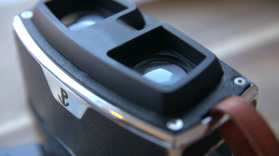
They also wanted something that was beautiful and not just functional: the True-View has a leather stipple effect similar that of more retro cameras and a silver chrome piping finish.

Leather and chrome

All of this means that the True-View has an enormous Kickstarter goal of £125,000. This requires a lot of people to pledge £65 (approximately $105) for a True-View. These guys want to change the way that we think about 3D imagery; if you love stereoscopy, check out their Kickstarter.

Well Done U - a short film competition

Have you ever said something off-the-cuff and then after a moment's pause you realised that it was actually a rather good idea? This happened a few weeks ago, on live radio. Simon Mayo and Mark Kermode have a film review show on BBC Radio 5 Live on a Friday afternoon. They insist it's more two middle-aged men wittering on, with the odd mention of films, hence its moniker 'Wittertainment'. That's slightly by-the-by, but when one of them came out with 'Well done you!' in response to a listener's correspondence, the other mumbled something about it being a good title for a film competition. So it came to be. The BBC Radio 5 Live Kermode and Mayo Film Review Show's Well Done U short film competition.

If you want, you can watch two middle-aged men wittering on about the competition in this video:

What are the judges looking for? Pretty simple in concept but probably not so easy to achieve: a well done 'U' certificate film. As you'd expect, it needs to be creative and technically competent, but the judges want you to think about what you're producing, too. You need to write a brief summary of what you're looking to achieve with your film and they'll look to see if you achieve it.

Your film needs to be two minutes in length and conform to the BBFC's 'U' certification criteria; you need to be an amateur film-maker and a UK resident.

You have until 8 November to submit your entry and if you want to work as a team, that's perfectly acceptable. The entry form and full requirements and terms and conditions can be found on the Well Done U competition page.

Judging happens in two stages. The Wittertainment production team will narrow down the entries to a top 25 by 6 December 2013. These films will be exhibited on the BBC 5 Live website and on the Kermode and Mayo YouTube channel. Mark Kermode and Simon Mayo will select a top three and anounce the grand winner on their film review show on 20 December 2013.

What do you win? Not so much, save for the glory of being chosen to appear on a major BBC radio station to talk about your film, a trophy, and to have the film formally certificated by the BBFC. I'd take it.

Wild Tales: an exhibition of images by Graham Nash

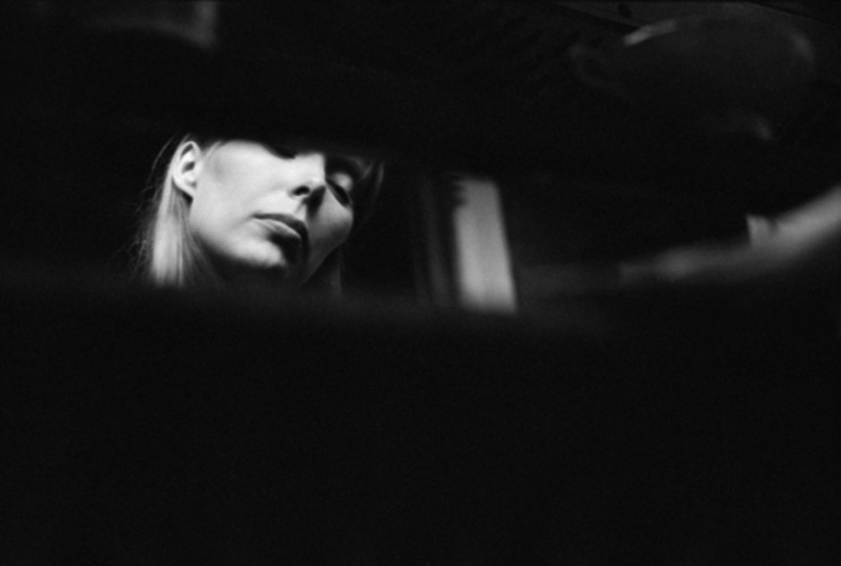
When you hear the name Graham Nash you'd be forgiven for your brain automatically leaping to The Hollies and He Ain't Heavy, He's my Brother, or jumping on the Marrakesh Express with Crosby, Stills and Nash. As singer/songwriters go, he's rather on the influential side. (He's managed to be inducted into the Rock and Roll Hall of Fame and the Songwriters Hall of Fame twice.) However, Nash owned a camera before owned a guitar and he's a bit of a photographer, too. Over the years he's amassed a portfolio of images that documents his life on the road and the people he's worked with along the way. To mark the release of his memoir, Wild Tales, an exhibition of his pictures and drawings, also called Wild Tales, is being held at the Proud Camden gallery in London.

'Joni Listening to Music, 1969 ' © Graham Nash

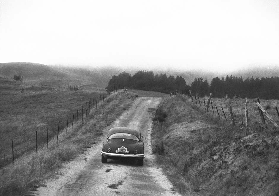
It gives you the opportunity to gaze at Joni Mitchell lost in a song, peer at Neil Young and he drives off into the distance after a recording session, and ponder his self-portraits.

'Neil Driving Home, Northern California, 1988' © Graham Nash

The exhibition is free to enter and runs from 9 to 20 October 2013 at Proud Camden, The Horse Hospital, Stables Market, Chalk Farm Road, London, NW1 8AH.

(Featured image 'Graham Nash, Self Portrait, Plaza Hotel, 1974' © Graham Nash)