News

Illustrative images in the news: unfair or acceptable practice?

Perusing my copy of the Guardian yesterday afternoon, my eye was caught by the Open Door column where the readers' editor addresses readers' suggestions, complaints, and concerns. Yesterday, Chris Elliott, said readers' editor, was responding to criticism of the use of generic photos to illustrate news stories. As it happens, it is hardly a condition restricted to the Guardian. Before the 'Your Letters' section of the BBC website was so cruelly snatched away from us earlier this year, someone would pipe up every time that 'Drunk Girl' was used to illustrate an article, usually pertaining to binge drinking. At the end of June this year the ever-insightful Liz Gerrard wrote about the endangerment to photojournalists by news publications through the persistent use of generic images.

Back with the Guardian, the dissatisfied reader had asked the question 'How many stories can be illustrated by the same picture?' before now without receiving a response, but had been riled again by the use of a photograph of Angela Merkel gesticulating towards David Cameron that was illustrating an article headlined 'GCHQ surveillance: Germany blasts UK over mass monitoring'. On closer reading, Angela Merkel hadn't come close to remonstrating with David Cameron over the issue; rather, the German justice minister had written to the UK justice secretary and home secretary about things. It was an old image hauled out to give life to the story.

Exactly how fair is this practice?

Elliott responded by stating there are rules to ensure that readers are not misled by the images attached to articles. Specifically: 'Photographs: digitally enhanced or altered images, montages and illustrations should be clearly labelled as such.' Well that's a relief to know. But what about the accuracy of an unadulterated image as it pertains to a story?

He also referred the complaint to a senior sub-editor who is responsible for web content. Her reply was that images are crucial for SEO purposes and all online stories should have one. As a consequence, the use of generic pictures and 'identification shots' to illustrate stories when there are no live images is quite common. Her comment on the image in question is a little perlexing, however: 'I would have thought that a picture of Cameron with Merkel, even if it wasn't live, would be a legitimate way of illustrating a story about the two of them (though [the reader's] complaint seems broader – that she wasn't involved as much as we suggested) – especially if the caption makes no claims it happened yesterday/today.'

So, was it or wasn't it a legitimate use of the image? The senior sub-editor doesn't address this directly. I'm inclined to agree with the reader: the link between the image and the article is too tenuous to be sustainable. But Roger Tooth, the Guardian's head of photography, has a different interpretation:

Surely the point is that an intelligent use of photography means that we don't have to be too slavishly literal. In the case of Cameron/Merkel they are symbols of, as well as leaders of, their respective countries. Pictures are very often used in the Guardian in an illustrative way.

There is something that rankles with me about this comment. Illustrative photography is entirely respectable in certain situations, for example feature articles, but when you're dealing with hard news stories, it's often the image that acts as the reader's lever into it. For this reason, there is a reasonable expectation of accuracy between the photo and the copy. It isn't just a case of luring eyeballs towards an article under less than faithful pretences, but also about conveying an accurate version of events, especially if people don't go on to read the entire piece.

With respect to the specific image mentioned by the Guardian reader, there's something disingenuous about its use because it suggests that the contretempts took place at the highest level when really it didn't. In this case, illustrative picture use doesn't do the story justice. On a more general level, the use of broad 'illustrative images' does little to support the integrity of news publications and even less for the straightened circumstances in which news photographers now find themselves.

Even if editors aren't deliberately manipulating the use of images to support copy, the continued, careless deployment of pictures is only eroding the validity of the press at a time when it can scarce afford to be blase. No, it isn't the most significant obstacle that the press faces right now, but it's one that does have an impact on the public perception of the journalistic craft. And it isn't a difficult fix.

Shutter Magazine's crumbled Chinese wall between editorial and advertising

Whenever I read a magazine—which I do, actual dead tree publications, usually involving food, I'm a sucker for food magazines—I always find myself skipping over the pages that are discreetly marked 'Advertisement' towards the top or the bottom of the page, but that look suspiciously similar to editorial content. I don't need the gushing exultations of PR people telling me how wonderful, life-changing, and revolutionary a product is; it's the publishing world's equivalent of the infomercial. I'm far more interested in a reviewer's impartial and honestly held opinions. That's rather the point of buying a magazine or subscribing to a blog. It sticks in the throat a bit when you realise that some publications are entirely prepared to, and will even solicit the exchange of money to run copy covering products that masquerades as a review. You read what people have to say because you trust them (or in some cases because they provide a cracking laugh), not because they've been paid by a manufacturer or developer to say it. You might expect that some review models or copies would have been provided gratis for the purposes of the review, but that goes with the territory.

The exchange of money is a slightly different prospect.

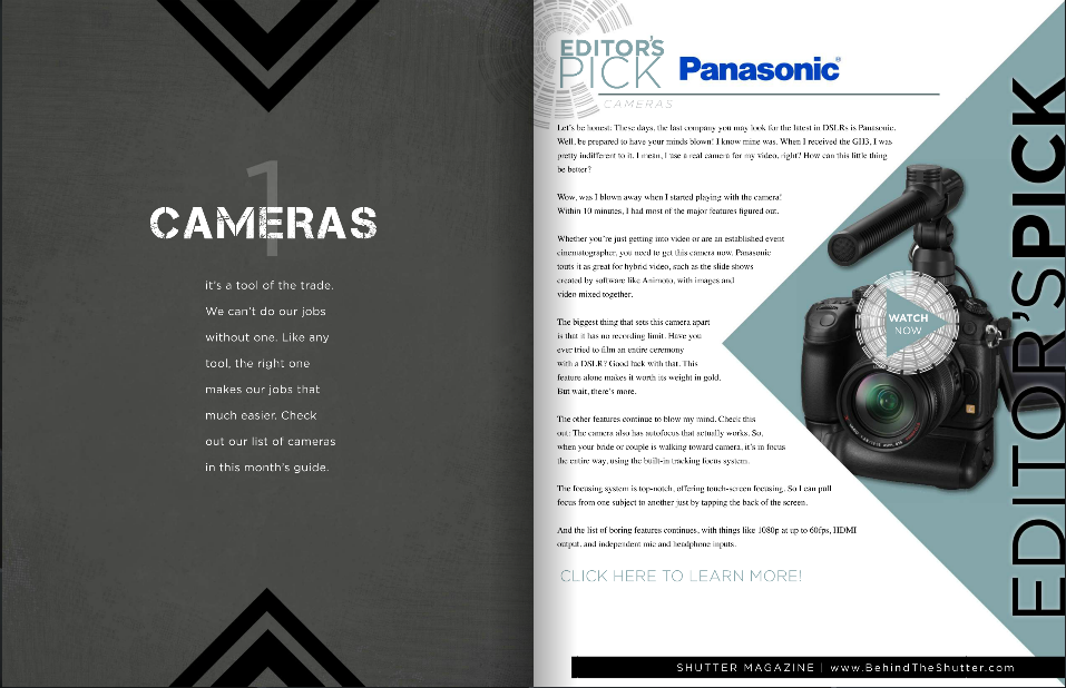
When the delineation between editorial and advertisement disappears, how do you trust what the publication says at all? Where does real end and the sunshine and rainbows existence of advertising executives start? My throat is currently jammed up like a beaver's dam because that's exactly what happened when Shutter Magazine approached Triggertrap to feature it as its 'Editor's Pick' for September.

For the fee of $2,000, Shutter Magazine was prepared to endorse Triggertrap's Flash Adapter as a monthly 'Editor's Pick', which would include a full page editorial review of the product, a hi-res image of it, and a video review hosted by Sal Cincotta, Shutter Magazine's publisher. I've taken a very close look at Shutter Magazine and nowhere do I see any previous 'Editor's Picks' labelled as advertisements or paid-for content. Furthermore, it was the publication's Advertising Sales person who made the approach, not the editor requesting a product for review.

Thinking this was rather disingenuous, Haje Jan Kamps (CEO of Triggertrap, publisher of Photocritic, and former editor of gadget website T3.com) probed a little further.

I can't see any kind of advertising disclaimer here. Can you?

Shutter Magazine claimed that the $2,000 fee was primarily to cover the video production costs (having looked at one of the videos, I reckon my grandmother could have done a better job in her living room, but what do I know?) but it would be possible to secure a half-page 'review', without a video, for $600.

'When I was an editor,' says Haje Jan Kamps, former editor of gadget website T3.com, 'running advertising as editorial on my website would have been completely unacceptable, and for good reason: It would completely have ruined the reputation of the site. The importance of the "Chinese wall" between editorial and advertising cannot be overstated. After all, who would trust any recommendations from a publication that sells its Editor's Picks to the highest bidder?'

That sums up the situation effectively: the integrity of any publication depends on its impartiality and for its readers to be able to determine what is genuine editorial content and what has been paid for. There's nothing intrinsically wrong with advertising - we'd be lying if we said we didn't want any here on Photocritic; bloggers have to eat, too - but it needs to be obvious and transparent.

We responded to Shutter Magazine's Advertising Sales person, highlighting that we found the practice distasteful and verging on the unethical, and requested a comment from the editor and the publisher. We're awaiting the director's comment, but Shutter Magazine has been keen to point out that the 'Editor's Picks' run in 'a separate section from our monthly magazine, and that we incur video costs. I also made it 100% clear that we're selective over our Picks as well.' Unfortunately, I cannot find any evidence of the 'Editor's Picks' being indicated to Shutter Magazine's readers as advertorial content, and I'm not convinced there's a world of difference between discerning back-handers or indiscriminate ones.

Kamps' opinion is perhaps even more strident than mine: 'It's entirely possible that this is just an over-zealous sales-man overstepping his mark, but in my mind, passing off paid-for content as editorial awards and editorial content is getting dangerously close to fraud.'

We understand publishing and we understand advertising. We wouldn't expect any publication to forego advertising revenue if that's what it needed to put out copy every issue. We just want to know where the fantasty ends and the reality begins and that when a journalist or writer says something, she or he really means it. Shutter Magazine, we're looking at you.

How many photos do we take?

According to a piece of research commissioned by SmugMug and conducted by pollsters YouGov, we manage to take a quite astonishing 600 million photos every week here in the UK. Ah-ha, 600 million pictures of kittens, puppies, kiddies, and sunsets. Wondering how they got to that figure? It goes like this.

  • The adults questioned for the survey gave the average number of photos they took each week at 19. That doesn't include holidays or special occasions.
  • There're 47,754,569 adults in the UK, 30% of whom do not take photos in an average week.
  • Seventy per cent of 47,754,569 do take photos. That's 33,428,198 people.
  • Multiply 33,428,198 people by 19 photos, and you get just over 635 million.

That's a lot of photos.

Roughly half of those photos are of people, about a fifth are landscapes, and a tenth are of pets and other animals. No one was brave enough to put a figure on how many of those portraits were selfies.

However, 56% of those questioned had lost images because of technical failure, theft, or even human error and almost three-in-ten didn't have a back-up routine of any description. That leaves me wondering, just how valued are images now? Are they becoming so ubiquitous that people aren't too bothered if a swathe of their photographic library suddenly disappeared into the cyber-abyss, or is it more a case that they've never stopped to consider what a catastrophic hard drive failure or a stolen phone might mean? These are slightly different prospects to the threat of fire or flood to printed photos.

The good news is that backing up your photos isn't that difficult and storage is cheap now, too!

Anyway, what do we think? Is 19 a fair number of photos a week? I'd totally skew the figures: I don't think that my potential response of 'Ehm... a few hundred last week,' really counts!

Learning by doing with the Bigshot DIY camera

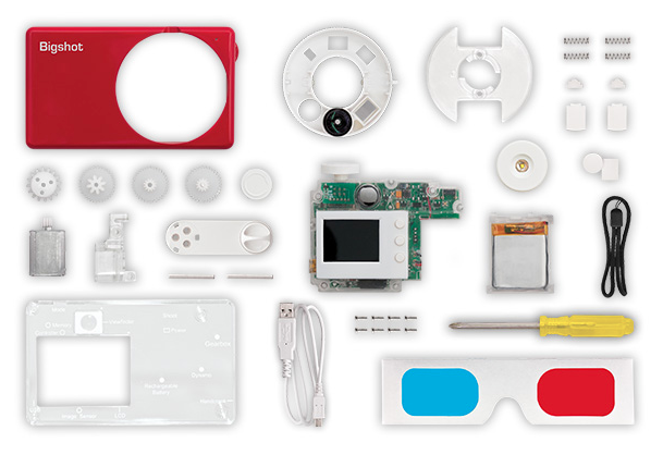
I've just stumbled across a magical photographic triumvirate: DIY, getting kids involved in photography, and education. It's called the Bigshot Camera: a self-assembly camera that teaches whomsoever is building it, whether aged eight or 108, about key science concepts in the process. It's a rather tasty science and creativity sandwich.

Bigshot in bits

The camera has to be assembled in a specific order, but there are detailed instructions on the website to make sure that you get it right. Even more importantly, as you work through each stage you have the opportunity to learn about the science underpinning it, from optics to mechanics via electromagnetism and electronics, and back again. When it's complete, you should have a fully functional camera with a rotating wheel that houses normal, wide-angle, and 3D-capable lenses. If the battery dies, you can crank it back into life yourself.

One of the motivating factors behind Bigshot is learning by doing, and inspiring young people to get involved with science and engineering. It's the sort of project that a parent (or auntie) can work on with their child (or niece... I'm looking at you, Eva), but there's plenty of support for teachers who want to incorporate it into their teaching plans, too. Each camera costs about $90, but Bigshot has an extensive outreach programme, Bigshot for Good, that aims to bring the project to less privileged children, wherever they are.

Bigshot assembled

From an idea that sprang to life in 2006, the Bigshot has been developed by Shree Nayar, a Professor of Computer Science at Columbia University. Along the way he has received research and design support from students led by Guru Krishnan and Brian Smith and funding support from a Google research award and an ONR Instrumentation Grant. Nayar founded Kimera, a social venture aimed at bringing the Bigshot to children and teachers the world over, in 2011. And from this month you can go ahead and order yourself one from the Bigshot website.

As for future plans, the Bigshot team is exploring two potential avenues: to continue to deepen the Bigshot camera experience by developing new features and enhancing the learning platform, or to develop other gadgets that lend themselves to the Bigshot concept of building, learning, and using.

The Bigshot website is well worth a wander: it's a veritable hive of knowledge and information, whether or not you want to buy a camera. Me? I'm totally in the queue for when they start shipping beyond North America!

Faceifi lets you identify people using photos

'Why can't I find out more about somebody from just a photograph?' That was the question that started Faceifi, which is a bit like a social directory where you identify people using images of them rather than by name. That makes it an actual, digital facebook, I suppose. The theory goes Faceifi helps you to control your online identity. You create a Facifi profile by uploading at least five photos of yourself and providing a link that tells people more about you. The link can direct to Facebook, Twitter, a blog, or anywhere you like. Using the Faceifi database anyone can search for you, either by looking for your image or by using a photo of you that they have, and then find out more about you from your link. Yep, if you have a Faceifi profile and someone snaps a picture of you on the Tube, they can find out whatever you've chosen to share. And that's not creepy. At all.

Right now, Faceifi has a desktop and an iOS interface, with an Android version in the works. It's also planning on expanding what users can share, for example with a short biography, and introducing in-app messaging. But it doesn't have very many users, which means that at present you're unlikely to find the person for whom you're searching. That has the potential to change as and when more people sign up to Faceifi, but will they?

I can't say that I'll be signing up for Facifi anytime soon. Sometimes, I rather appreciate being nothing more than a face in the crowd.

What do you think? Useful, or just a bit over-indulgent?

(Headsup to The Next Web)

Nikon's Photo Contest 2012-2013 winners

In a year with a record number of entries—99,339, from 153 different countries and territories—Nikon has announced the winners of its Photo Contest 2012-2013. Understandably, the competition was very definitely Nikon-oriented, with one of its four categories dedicated to the motion snapshot function found in Nikon 1 series cameras (that's the Harry Potter-esque feature that combines stills and video) and a special award for the best photo taken with a NIKKOR lens.

There were three other categories: single photo, photo story comprising a series of two to five images, and a photographic video up to 45 seconds in length.

The judges selected their grand prize winner from a total of 48 first, second, and third placed entries made from the photo, photo story, and photographic video cateogies and three winners from the motion snapshot category. They were looking for the photographer's ability to tell a universal story, diversity, the strength of their message, creativity, and the techniques used.

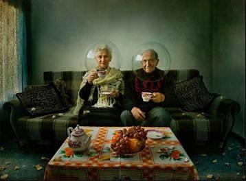
Elegy of Autumn, by Dina Bova

The Grand Prize was awarded to Dina Bova for her Elegy of Autumn. Chris Rainer, one of the judges, said of it: 'Our Judges loved this image. It tells so many stories. It is at once traditional and respecting of the elders set in a classic living room, yet whimsical with the reference to space travel. It points to our future while honoring our past.'

The winning images will be exhibited in Tokyo from August to September and Osaka between September and October this year.

When Rihanna sued Topshop over a t-shirt

Topshop, the clothing emporium that was some kind of mecca for my friends when we were teenagers but never, ever had clothes to fit me, has just lost a multi-million pound court case to Rihanna, who accused it of 'passing off' a t-shirt with her mug on the front of it.

The t-shirt in question was a square-cut sleeveless jobby called the 'Rihanna Tank' by Topshop and it featured an image of her with her hair piled on top of her head. The original photo was shot during the video shoot for We Found Love. Yes, that's right, it was taken during 'that' shoot when a Northern Irish farmer politely told her to put on some more clothes if she wanted to film on his land. (What a contentious song it have proved to be.) Topshop then licensed it from the photographer, printed it on a bundle of t-shirts without Rinhanna's approval, and found themselves with a hefty legal bill.

There doesn't seem to have been any issue about the actual photo, just the way that Topshop used it. So what was the problem? To be proved as 'passing off,' the accusation needs to stand three tests:

  1. The claimant (in this case Rihanna) needs to have established a reputation (she's got one of those)
  2. The defendant (here, Topshop) needs to have misled the public (that is, caused them to think Rihanna endorsed the t-shirt)
  3. Some form of 'damage' (in this case to Rihanna's reputation) needs to have occurred.

The judge, Mr Justice Birss, thought that Topshop was responsible for passing off. However, he was quite clear that there is 'no such thing as a general right by a famous person to control the reproduction of their image' and that the photo didn't breach Rihanna's privacy.

My not-legally-trained and using-common-sense reading of the judgement is that the image Topshop used was too similar to the images that appeared on the album artwork for Talk that Talk. As a consequence some poor misguided souls who actually want to go around wearing a t-shirt with a picture of Rihanna on it might have bought it thinking that she had some how approved it and it was potentially related to the album.

With respect to Rihanna, the judge ruled that this could be deemed damaging to her 'goodwill' and reputation in the fashion spehere. Obviously Rihanna needs to protect her reputation in the fashion sphere now that she has endorsed a range of clothes at Topshop-rival River Island. Make sense now?

Do we have to start worrying about people suing the pants off of photographers in an attempt to protect their images? Probably not yet. The judge was quite clear about that.

Headsup to the BBC and the Guardian

iblazr, a synched flash for smartphones, is looking for Kickstarter support

Most of the time when I'm taking photos with my iPhone I accept it for what it is and try my best to work within its limitations; it's far from my primary camera so it's not that much of a bother. However, I do get frustrated with its dismal low-light performance and glarey flash. So when I saw this Kickstarter project for a synchronised flash for smartphones and tablets, I sat up and took notice. It's called the iblazr and its the brainchild of a Ukrainian team of developers and designers.

Black and White

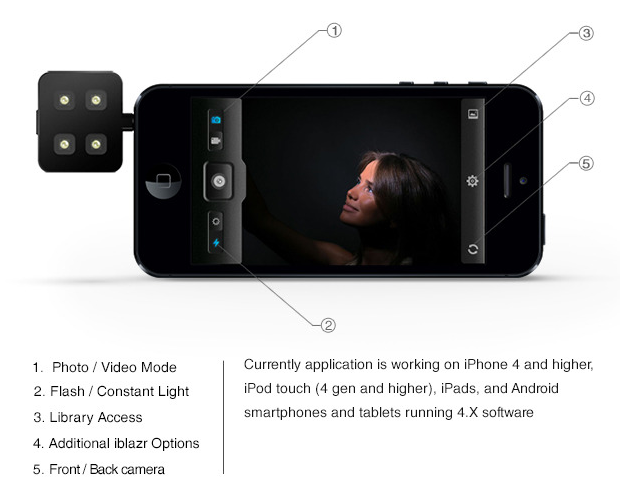
The iblazr synchs with a smartphone or tablet via its headphone jack and is compatible with both the front- and rear-facing cameras. It charges via a USB cable and is good for about 1,000 flashes or 40 minutes of continuous light. Its functionality, including a choice of stills or video mode and adjustable brightness, is controlled via the free iblazr app.

Screen Shot 2013-07-26 at 15.56.19

If you want some off-camera flash action, you can hook it up using a headphone extension cable and you can even have a dual flash with a headphone splitter.

You can watch the video to learn a bit more:

The project needs to hit $58,000 to reach its goal; it's already on $26,000 with 39 days still to go. If you put $39 into the project, you can choose between a black or a white iblazr as a reward. For people who are serious about their smartphoneography, it seems a reasonable proposition.

Tried the BJP iPad app? They've made a video to show you what you're missing

The British Journal of Photography has been around since 1854 and has evolved from a weekly to a monthly magazine with a website and a fairly-recently launched iPad app. The journal definitely works to keep itself relevant on all platforms so if you've not tried out the iPad app, they've just released a video to show you what you're missing. (Assuming that you have an iPad, of course.)

The BJP app brings readers the highlights of the monthly print editions, as well as iPad-extra features, photos, and multi-media content, every quarter. BJPOnline can be accessed from the app and there are the usual sharing options for articles. The moving image cover was created by Reed+Rader. Where the iPad app probably stands out the most, however, is in its ability to cover motion picture news and features in a way that a print magazine can't.

The shell app is free to download and there's an entire range of subscription options to meet your needs.

Metroprint launches Instragram print app

Photo 22-07-2013 09 44 00 When Metroprint, a British-based photographic print service, launched its Instagram print service in November last year, I did rather haul it over the coals. For a start, when I first gave it a go, I couldn't order prints direct from my smartphone, but had used a desktop interface, and when this piece of bad design or flawed planning was finally rectified, the interface sucked. I was far from impressed. You can probably tell from my article.

Anyway, eight months on and Metroprint has announced that it might just about have caught up with the times. Perhaps they even took notice of an email that I sent to them and I'm sure a good few other people might've told them something similar. There is now a Metroprint Instagram print app.

I downloaded it straight away (that bit's free).

metroprint 2First impressions are indeed favourable. You hook up with Instagram from the app, select the images you'd like printed, opt for glossy or matt, upload the images, and pay via Paypal. Prints are 42p each. UK delivery is £2.65, European delivery costs £5, and anywhere else in the world is £5.50. You would, therefore, do well to bulk order as it's a little pricey for a single 5×5 print.

From iOS you can also choose images from your camera roll and Metroprint are planning on more features soon.

If I do decide to get a print, I'll let you know what they're like. Otherwise, you can download the app from Apple's App Store or Google Play.

Blasting images into images with Light Blaster

mail_blast_header_250 What do you get when you combine old 35mm slides, a speedlight, a lens, and the genius of the DIYPhotography hackers? You get the brand new Light Blaster: a strobe-based image projector that lets you transform your photos in a flash.
By inserting a 35mm slide into the Blaster and synching it up to your camera it'll project the slide's image wherever you direct it when you release your shutter. You can create textured backgrounds, send secret messages, or give people wings!

You'll need to provide a strobe (any commercial speedlight will do) and a lens to get things working, but if you don't have any old 35mm slides kicking around, or no way easy way of printing any yourself, the Light Blaster team has put together four collections of slides: backdrops, effects, wings, and a totally random selection. When they say totally random, they really do mean it. You have no idea what might turn up in that box.

light-blaster-07-500

As for the lens requirement, the Light Blaster is compatible with any EF or EF-S Canon lens out of the box. Only have Nikon lenses to hand? There's an adapter for those. By changing the lens attached to your Blaster, you can alter the expanse of your projection: shorter focal lengths create wider projections, longer focal lengths project your image into a more compact area.

After that, it's all down to your imagination! (Or you can check out what other people have been doing with it, for some inspiration.)

A Canon-mount Light Blaster costs $99; with a Nikon adapter, it's $116. A box of slides is $17. You can learn more and pick up yours from the Light Blaster website.

What's in a name? Pentax Ricoh to become Ricoh

From 1 August 2013, the Pentax Ricoh Imaging Company Ltd will be no more. Instead, it will be the Ricoh Imaging Company Ltd. It took a little while in coming, but a new name wasn't wholly unexpected after Hoya sold Pentax to Ricoh in 2011. The Pentax name won't be going away entirely, however; it'll remain as the brand name for dSLR and interchangeable lens cameras as well as binoculars. The Ricoh brand will apply to compact cameras and new technological innovations.

After Olympus and Fujifilm axed the lower half of the compact camera ranges earlier this year, Pentax/ Pentax Ricoh/ Ricoh is taking a slightly different tack. Rather than axing the line (something that might happen in the future), the cameras are being severed from the Pentax name. That's one way to maintain brand integrity!

Aspiring young food photographers, get your entries in to Pink Lady competition!

Aged 17 or under? Love taking photos of food? Pink Lady (yes, those very same pink-skinned apples) have a competition for you! It runs between today and 31 Janaury 2014 and the panel of judges includes David Loftus (Jamie Oliver's food photographer) and Yotam Ottolenghi (one of my favourite chefs). Any photograph that features food is fair game: food in the field, food in preparation, or food on a plate and you need to be 17 or under on 31 January 2014 to be eligible. The entire category has been divided into three age ranges: 15 to 17, 11 to 14, and 10 and under.

If you win your category there's a trophy to mark your success and vouchers towards new camera kit to celebrate it. Your photo will also go on display at an exhibition at the Mall Galleries in London in spring next year along with the finalists from the adult categories.

There are some specific entry requirements for your images, for example they can't be posted on social media networks or have been entered in any other competitions, so please do read the conditions carefully. And whilst the adults might have to pay to enter their categories, there're no fees for the youth competitions. You can also be anywhere in the world to submit an entry. Last year's overall winner came from Romania.

You can have a look at last year's winning and commended photos to see what you're up against, but what do you have to lose? It sounds like a tasty competition to me!

Poppy - turning your iPhone into a 3D camera

Did you have a Viewmaster stereoscope as a kid? One of those 3D viewing contraptions into which you'd insert a 'reel' of images that were in a cardboard disc, look through the eye holes and then depress a lever to rotate the images through the viewing mechanism? Yes! One of those! I had one, too. In fact, it's probably still at my parents' house, somewhere. But if Joe and Ethan from Hack Things have anything to do with anything, there will soon be an iPhone compatible equivalent that lets you turn photos and videos into stereoscopic masterpices. It's called Poppy, and they've just launched their Kickstarter appeal to get things moving.

Nothing about Poppy is digital—apart from your iPhone—it works entirely with optics. You insert your iPhone into the device and a set of mirrors captures a pair of binocular images on your iPhone's lens. When you look through Poppy's viewfinder, the images are combined to create a 3D scene.

Have a look at the video, because Joe and Ethan explain it better than I ever could.

You can watch your own videos in 3D through Poppy, or whatever you fancy off of YouTube. If you make a video using Poppy and want to share it with your friends, they can see it in 3D with the stylish addition of a pair of red-blue glasses.

If you head over to Kickstarter and pledge your support to raise $40,000, you can help bring Poppy into production and maybe even get your hands on one of the first models. I'm not a fan of 3D at all, that's no secret, but the nostalgia of this really appeals!


Update! 27.vi.2013 16:30 BST: Less than 24 hours after launching their Kickstarter appeal, Ethan and Joe have exceeded their funding requirement for Poppy. Wow!

Triggertrap brings high speed photography zooming to a camera near you

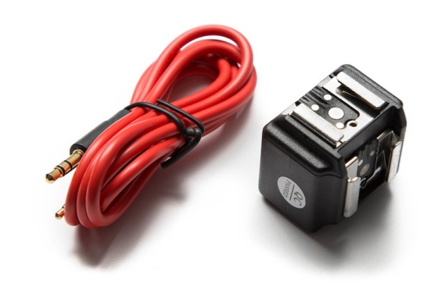
If your attempts at capturing balloons bursting, glass shattering, or droplets forming a perfect corona have been less than successful until now, the team at Triggertrap—who love to find creative ways to let you trigger your camera—might just have a solution for you. Not only have they succeeded in making Triggertrap Mobile's triggering system upto 12 times faster (from 60 milliseconds to five milliseconds depending on your device), but they've released the Triggertrap Flash Adapter, too. Strawberry Cream Milk - Chris Martino

By combining a new Triggertrap Flash Adapter with a Triggertrap Mobile Dongle, an iOS device running Triggertrap for Mobile, and a hot shoe-compatible flash (there wouldn't be much flash photography going on without one), you should be capable of freezing motion, however fast it's happening.

Triggertrap Flash Adapter TT-FA1 Product Photo 03

Set yourself up in a darkened room with your camera on a long exposure, your camera and flash ready to trigger using one of Triggertrap's firing mechanisms, and whatever you're trying to capture at high speed, and off you go!

If you want to see the Flash Adapter in action, there's a video waiting for your perusal:

Introducing Triggertrap Flash Adapter from Triggertrap on Vimeo.

Or you could just head over to the Triggertrap store and order one. They're retailing at $29.95 - but remember that you'll need the mobile dongle and the app running on your smartphone, too.

Video on Instagram, with filters

It wasn't really the surprise that Facebook had been hoping for, after TechCrunch had speculated that today's announcement would involve Instagram and video, and be a competitor to Twitter's Vine. So what does Instagram's video-clip sharing feature have to offer? Well, first and foremost there are filters. Thirteen of them to be precise. How could there not be?

Then users can choose the length of their videos, anywhere between three and 15 seconds.

Clips can be stitched together to form a collage.

And unlike Vine, videos won't loop.

Finally, if you're using the service on an iOS device, you can deploy the Cinema Stabilsation function, to help reduce camera-shake.

My guess is that it won't tempt people to Instagram who weren't already there, but it might well eat into Vine's market of existing Instagram users.

We might not be able to make our own panoramas on Mars, but we can look at Curiosity's

Over the course of almost six weeks towards the end of last year, Curiosity roved around the area of Mars called 'Rocknest', collecting over 900 photos. The majority of the images (850) came from Curiosity's telephoto camera Mast Camera instrument, as well as 21 from the Mastcam's wider-angle camera, and 25 black-and-white shots (most of which were of Curiosity itself) from the Navigation Camera. These have been stitched together to create a 1.3 billion pixel image, showing Mars' dusty landscape across its horizon to Mount Sharp.

A panoramic snapshot

The image is ready and waiting for public perusal on Nasa's website. You can even choose between raw and white balanced versions. There's also a slightly more manageable 159MB version available for download, too.

You can zoom in and out, exploring the finer details of Mars' landscape and the differences in the dustiness of the atmosphere. You might be there some time!

(Headsup to Engadget)

Has the Creative Cloud storm encouraged Adobe to rethink its prices?

Well this is intriguing. Photo Rumors is reporting that Adobe recently surveyed some of its customers about a restructure to the not-very-well-received new Creative Cloud subscription model. Instead of the proposed $49.99 a month for the complete Cloud, or $19.99 a month for a single product subscription it asked how customers felt about paying $9.99 a month for Photoshop or $29.99 for all of Creative Cloud on a three year contract. At the end of the period, you'd be entitled to a permanent copy of CS6 and a promise to keep it updated for file types and camera. Now I didn't receive one of these fabled questionnaires and I've not heard of anyone who did. Whether it did or didn't survey a selection of its users, Adobe is under no obligation whatsoever to respond to the findings. And if it thinks that it can get away with the new pricing structure then why should it change. If there is a change to the subscription model in the offing, the rumoured structure is quite a departure from the original plan. I'd suspect it would be somewhere between the two. Let's wait to see.

(Headsup to Photo Rumors)

Surreal Photography: Creating the Impossible is now on sale!

The worst bit of writing a book isn't the early morning starts, or the stress of scrambling for a deadline; it's not the 22nd revision or edit that you need to make after you thought that the 21st would be the last; it isn't even waking up in a cold sweat panicking that you forgot to submit a particular image way after it has gone to print. No. It's none of these. The worst bit is waiting for your printed books to be shipped from China to where they're going on sale. They're in existence, they're ready, but they're suspended in a maritime limbo.

As if a slow boat from China isn't bad enough, it's even worse when the ship in question is held up by a typhoon in the South China Seas.

This is, of course, precisely what happened to my newest book, Surreal Photography: Creating the Impossible. It feels like a very long time since I submitted the final manuscript last autumn, crammed with information on how to shoot surreal-looking images in-camera, create them from scratch, or composite them digitally, and including 25 gorgeous step-by-steps to creating surreal images from 25 highly talented photographers. But at last it's ready to rock-and-roll in bookstores and our go-to online retail behemoths in the UK and the US. If, however, you'd prefer to place your paws on an e-version right this very second, you can download it from the Ilex Instant store.

Now that it's made it, you should check it out!

Competition rights grabs don't just exploit photographers, they destroy the industry

When we feature competitions here on Photocritic, we do our best to ensure that they're entrant-friendly: we don't like to promote contests where you run the risk of losing control over your images and we prefer not to support paid-for contests, either. If we're the slightest bit suspicious, the competition PR takes a one-way trip to the delete bin. And if we do feature a competition, we always urge you to check the terms and conditions to ensure that we haven't missed something and that you're happy with the rules.

Last night, I received a communique from an agency representing an internationally renowned publishing house requesting that Photocritic promote a competition aimed at up-and-coming photographers. The prize could be a huge break for an as-yet unrecognised but talented fashion photographer, with a commission, mentoring from some significant individuals, a gallery exhibition, and a chunk of cash.

A closer inspection of the rules, however, has ensured that this competition will not be featured positively here on Photocritic. Indeed, rather than being consigned to the dustbin of broken dreams, I'm going to highlight it for what I believe it is: a rights-grabbing exploitation of ambitious young photographers that has the potential to do them, and the photography industry as a whole, more harm than good.

The issue lies in clause 7a of the contest's rules, covering Ownership and Licence:

All entry materials become the property of the Sponsor and will not be acknowledged or returned. The copyright in any Submission shall remain the property of the entrant, but entry into this Promotion constitutes entrant's irrevocable and perpetual permission and consent, without further compensation, with or without attribution, to use, reproduce, print, publish, transmit, distribute, sell, perform, adapt, enhance, or display such Submission, and the entrant's name and/or likeness, for any purpose, including but not limited to editorial, advertising, trade, commercial, and publicity purposes by the Sponsor and/or others authorized by the Sponsor, in any and all media now in existence or hereinafter created, throughout the world, for the duration or the copyright in the Submission. Sponsor and/or others authorized by the Sponsor shall have the right to edit, adapt, and modify the Submission.

The translation? The competition organisers can use all the images submitted to the competition any way that they want to, across any media known or currently unknown to man, without informing, compensating, or even acknowledging the photographers for the duration of the copyright.

Not only is this an exploitation of the photographers who might submit their images to the competition, but it is damaging to the photography industry as a whole. For every rights-stripped photograph entered into the competition, that's a potential commission taken out of the market. The competition organisers have created for themselves an image archive that they are at liberty to use in perpetuity without compensation. Why would they need to commission material or purchase stock when they have this at their disposal?

Flick through any magazine and you'll see hundreds of images used to bring colour and interest to articles. We use them here on Photocritic. The images aren't intrinsic to the pieces and the content won't suffer from their omission, but the articles look better for them. Team Photocritic tends to trawl through its archives in search of suitable images, but magazine publishers might turn to a stock agency or an in-house photographer for their needs.

For one of the largest and most powerful international magazine publishing houses, it doesn't matter that the images they've harvested from a particular competition are fashion shoots and won't necessarily be front cover material or suitable for splashes. They can be used to illustrate all manner of feature articles across a huge range of publications that need nothing more than a generically beautiful image: 'Ten tips for a tan-ready tummy in twenty days' or '52 things to do before you die'. These free photos can be used time and time again in a huge number of magazines, and in so doing they deprive in-house and stock photographers of work. Cover shots and fashion spreads are the prizes in fashion photography; they're not the bread-and-butter work that keeps rooves over the heads of photographers and food on their tables.

By looking for their big break when they enter a competition that's aimed at up-and-coming photographers, the entrants are quite likely doing themselves out of work in the long run. Please: always read the terms and conditions before entering a competition and don't relinquish your rights cheaply.